Just Draw! Part 2: indoors
February 19, 2015
Following on from my recent discussion on returning to drawing, this article presents a variety of suggestions for drawing indoors.
Feel free to pick and choose from this selection of drawing ideas and to approach them in any order. These “exercises” are primarily designed to get people drawing again, but they also encourage us to look at the world afresh and to think.
1) Create a pleasing line drawing from the objects in front of you, Matisse-style
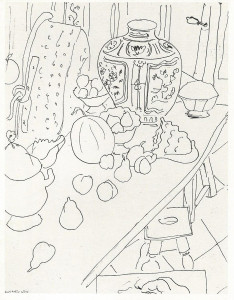
Above: Henri Matisse, “Still Life, Fruit and Pot”, 1940
Medium: Pen on cartridge paper.
Subject: A group of objects, as you find them, in your home or studio. Rounded items, such as pots and fruit, are pleasant to include but not essential. Paint tubes and brushes as you find them on a table, items on a kitchen counter-top or shoes on a rack are a few other suggestions.
Also include the space around the object, which may include the wall behind, a section of floor and perhaps even your own hand (see Matisse’s drawing, above). You can (optionally) move the items around just a little before you start to draw, but do not spend ages setting up a traditional still-life arrangement.
Looking at the subject: Even if the objects do not immediately strike you as beautiful, perhaps their shapes have some pleasing properties. Look both at the objects themselves, and at the negative shapes between them. Are there adjacent areas of pattern (e.g. tiles, wood-grain, wallpaper) that you might like to include? A strong diagonal shape within the image can be helpful but not essential (e.g .the table edge in Matisse’s still life, above, and in Bob Dylan’s image, below). The spaces between the objects and the edge of your drawing are going to be key, so think in advance about how you’ll fit what you see onto your page. You may like to use a cardboard viewfinder to help find the most pleasing composition.
The drawing: You’ll be aiming at a rather decorative line drawing with an emphasis on shape and pattern. Do not worry about the technical “correctness” of your finished drawing. Accurate perspective and measuring are not important here.
If you have used a viewfinder to help plan the composition, then start by checking that your drawing will be in proportion to that viewfinder. You could either use an entire sheet of paper for your drawing, or draw out a rectangle to represent the edges of your image, and then work within that.
Feel free, if you wish, to make a few initial marks in pencil so that you know where your objects will sit within the picture, or perhaps to start with a faint pencil gesture drawing. Then proceed in pen. Keep your pen marks lively and confident. Ignore tone- just represent edges of objects and any patterns that you see. Make sure that your pen lines are not all clustered in one part of the drawing. If necessary omit details and patterns in certain areas of the image and emphasise them in others. A pleasing image will have a balance of lines and quiet spaces.
Optional: Taking this idea further
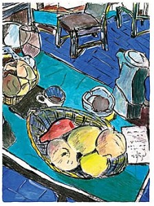
Above: Bob Dylan, “Still life with peaches”, 2007, mixed media on paper, 76x61cm
If you are yearning for colour, then consider adding some in to your drawing in a rather abstract way. Such a flat style of line drawing provides a good “excuse” for not aiming at photographic realism when adding colour.
Once you are happy with the balanced composition of your pen drawing then you have some options. You may choose to add colour directly to your drawing using marker pens, gouache, crayons, etc.
Alternatively, you could scan and print your uncoloured pen drawing onto artists’ paper, perhaps with some enlargement (a basic computer and printer set-up can be used). Colour is then added to the printed copies using any medium of your choice. If you print multiple copies, then you can try out all kinds of colour combinations and techniques while still retaining your original pen drawing.
For example, Bob Dylan included six differently-coloured versions of his “Still life with peaches” in his “Drawn Blank” series, my favourite of which is shown above. Others were coloured in earthy or warm brown-orange tones. The use of colour changes the emphasis within the composition, and also gives each image its own emotional “punch”.
2) An intuitive approach to structural drawing
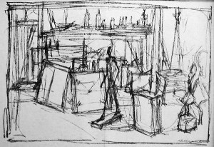
Above: Alberto Giacometti, “Man Walking”
Medium: Pencil on cartridge-type paper
Subject: Any room with some freestanding furniture on the floor. One or more chairs, and perhaps a standard lamp, an easel and/or general household mess are all great to include (don’t tidy up first!).
Looking at the subject: Find yourself somewhere to sit or stand (you’ll need to settle in one place for the duration of this drawing) and take at least two minutes to look at the room in front of you.
- Which objects are nearest to you?
- Notice that the edges of some objects may seem to overlap the edges of others (simply because some objects are in front of others).
- Notice that some objects appear to be lower down than others because they are nearer or further away from your eyes.
- If the room is not cluttered, look out for sizeable areas of floor or wall in between the objects that act like blank “negative spaces”.
- Try moving your head a little….Does this affect the spaces between the objects?
The drawing: In this exercise, you’ll aim to create a simple line drawing of the room, a bit like Giacometti’s studio drawings (one of which is shown above). The focus here is on spatial relationships, i.e. how the objects are positioned relative to one another. The search for structure is key, so guidelines and overlaid corrected lines can form part of the finished drawing.
Start drawing edges of the main objects using a gentle, “searching” type of pencil mark. Keep looking back at the subject for more clues. In your drawing, mark in where any two objects overlap one another. Feel free to draw faint guidelines between the objects to help align them on the page as follows:
- Do any objects appear to your eyes to be lined up exactly, either one above the other, or lined up horizontally? If so, you may like to draw vertical or horizontal lines to help you position them appropriately within your drawing.
- Look out, as well, for diagonal relationships between objects. E.g. you may imagine a diagonal line running from the corner of a table to the top corner of a cupboard. You could draw this imagined diagonal line into your picture as a structural guide, to help establish the position of cupboard and table (click here for tips on estimating the slope of a diagonal line). If, in real life, the cupboard is behind the table, then you can imagine your diagonal line moving deeper into the picture plane as you draw it travelling from table to cupboard. Feel free to add in as many imagined diagonal lines between objects as you wish…perhaps ending up with a web of light lines suggesting space between near and far objects.
Another way to approach this kind of drawing: Once you get the hang of the structural drawing approach, start to focus more on the negative shapes between the objects. What kinds of negative shapes do you see? Is there a pleasing balance of lines and negative shapes in your picture, as in Giacometti’s studio drawings, or is your entire image too “busy”? You may like to try out more drawings of the same room, perhaps from different viewpoints, with this in mind.
3) Draw your own unmade bed
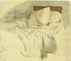
Above: Eugene Delacroix “An unmade bed”, watercolour over graphite, 20.6×24.1cm
Medium: Whatever is to hand (pen or pencil, crayons or watercolour, etc.)
Subject: Your unmade bed, just as you find it. This is a great subject for the following reasons:
- Your own bed is personal to you, the artist.
- It will look different every morning depending on which position the bedding has happened to take.
- Those random twists and folds in pillows, sheets and quilt are interesting and deserve a second look.
- Bedroom lighting (from a lamp, or through half-opened curtains) emphasises interesting masses of tone or pools of light on your bedding.
- This is a good excuse not to make your bed.
Drawing approach: In order to keep this drawing fresh and immediate, I strongly recommend setting yourself a time limit. This could be 10-30 minutes depending on your chosen medium. If there is something that you really want to include (e.g. a directional twist to the sheets, or a dramatic pool of shadow) then be sure to get this in within your time limit.
Include as much or as little of the bed as you wish (if observing it from within a small room, then it may be best to include just one section, as you will not be able to step back far enough to see the whole bed without moving your head).
Other personal subjects in the home or studio: If ever stuck for ideas for what to draw, remember that you need not leave your front door in order to find inspiration. Some of the best subjects are those that are most personal to us. These are often overlooked. Here are a few more examples:
- Your shoes, just as you find them on the floor (perhaps refer to Van Gogh’s shoe paintings).
- Your cup or glass once you’ve finished drinking from it. Notice where it is positioned, as this says something about the hand that has just left it. Do include the edges of any adjacent objects in your sketch.
- Your coat or other clothing on a chair. This could be an energetic image like Cezanne’s watercolour, below. Alternatively, you could think more of the weight of the fabric hanging from the chair.
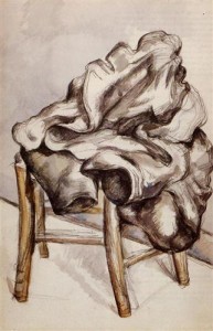
Above: Paul Cezanne “Coat on a chair”, 48x31cm, watercolour, 1892
Draw a room, this time giving light more importance than objects.
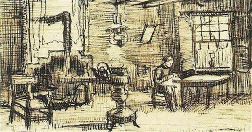
Above: Vincent Van Gogh “Interior with woman sewing”, c.1885
Medium: Pen on cartridge-type paper.
The subject: Any medium to large room of your house, or your studio. If drawing during daylight hours then make use of light through the window. If it is dark outside, then light from a directional lamp (e.g. a domestic table or floor lamp) will work better than that from a central ceiling light.
Looking at the subject: Do take at least a couple of minutes to look and think before you start to draw. In this drawing, you’ll be focusing both on the spaces between the objects in the room, and the effect of the light, so there is plenty to think about. Notice the following:
- Where is your own eye level? That is, how high up are your eyes in relation to the rest of the room. I suggest starting by drawing a faint horizontal pencil line across your drawing paper to represent your eye level. Any object which is above your eyes in real life will then be drawn above that line, whereas any object that is below your eyes will be drawn below it.
- Where is the light coming from? Note the position of any sources of light such as window(s), open doorway, lamp(s). Out of all of these, there may perhaps be one main light source. E.g. in Van Gogh’s “Interior with woman sewing”, the light is coming from the upper right side of the picture, with shadows falling to the left of the objects. There is light coming from the window next to the sewing woman, but the fall of the shadows suggests that there is another bright window or open doorway in the far right, not included in the picture.
- Where are the main pools of light and shadow in the room? Screw up your eyes to simplify the tones that you see.
- How much of the room do you want to include in your picture? Use a cardboard viewfinder (or frame the view with your fingers) to help choose a rectangular image from what you can see in front of you. Include some pleasing patches of both light and shade within your chosen composition.
The drawing: Start by laying the picture out with a few faint pencil lines before embarking on the pen drawing. Your pencil marks are just rough guides as to where key parts of the picture will go. Do not make a complete pencil drawing and then slavishly work over it in pen!
Look at the room with screwed-up eyes to check tonal values then, starting in a dark area of the room, start to use pen lines to build up the picture. Vertical and/or horizontal pen lines (as in the Van Gogh picture above) are useful for suggesting tone in the room that is not associated with any particular object. Use thicker or overlaid lines to create darker areas of tone. Leave the paper untouched to suggest pools of light.
Use your pen to add in furniture and a few architectural details but, when doing this, don’t add more pen lines than needed. Give the light and shade in the room more emphasis than the objects themselves. Some of the furniture’s edges may even seem to “disappear” within a pool of hatched shadow.
A view through a window, Matisse-style
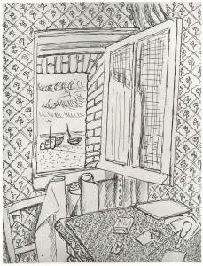
Above: Henri Matisse, “Open window at Etratat”, 1920
Medium: Pen on cartridge-type paper.
The subject: An open or closed window in your house or studio, whatever you can see through that window, plus a view of some of the room’s interior This may just be objects on the window-sill or, as in Matisse’s drawing shown above, you could include space above, below and in front of the window.
Looking at the subject: When looking from the inside of a room at a window, we naturally focus either on the view through it, or on the window-frame plus surrounding walls, etc. For this exercise, the challenge is to look at the interior of the room, the window-frame and the view through the window all at once.
Do the objects outside the window have any relationship to what is inside? Whether you are looking out onto a street, a brick wall or a landscape, see if you can relate outdoor shapes and patterns to those seen indoors.
The drawing: As in the other Matisse-inspired drawing (no 1, above), again use pen lines to create patterns and object edges. Shapes, patterns, and their relationship to one another and to the edges of the drawing, are key to this style of work.
In making this drawing, see if you can make sense of your window image without adding any tonal shading whatsoever. If you do decide to add a little tone (and you may well do if there is bright light streaming through the window) then use it sparingly as Matisse did in “Open Window at Etratat”. Instead of resorting to shading techniques, try adjusting your line thickness or changing the density of your patterned marks to suggest tone.