Warm-up exercises for artists (2)
January 19, 2013
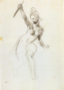
Warm-up no. 4: Free line and wash exercise inspired by Auguste Rodin
Above: Auguste Rodin drawing with wash
You need:
a) Drawing(s) of dancers by Auguste Rodin (find them within this blogpost and elsewhere online).
b) You will also need a photo of a dancing figure.
c) For drawing, have paper that is thick enough to cope with some water (approximately A4 is a good size) and either pencil or graphite stick.
d) In addition, you will need a fairly large round paint-brush (e.g. size 6 or over) and your choice of watercolour paints or dilute ink.
When to do this warm-up: To free you up mentally and physically before drawing or before working in watercolour. Set aside no more than 20 minutes for this exercise.
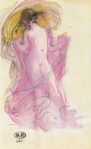
Above: Auguste Rodin “Cambodian Dancer”, 1906
Above: Auguste Rodin drawing 186x300mm
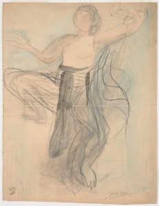
Above: Auguste Rodin “Woman with swirling veils”, 1890
To do: You have chosen a photo of a dancer – take a good look at it. Which parts of the dancer are moving? Which parts, if any, are supporting his or her weight?
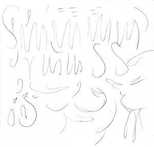
Also look at your chosen drawing by Auguste Rodin. Notice how Rodin has used expressive lines to give his figure a sense of energy and movement. See how both the lines and colour wash are visible in his finished drawing. The sense of energy is more important than any sense of meticulous finish.
When you are ready, you will draw the dancer from your photo using pencil or graphite stick. Decide where to position the figure on your sheet of paper. How big will you make the figure? If it gives you confidence, make a few initial light marks on the page to indicate where the main parts of the figure will go.
Now proceed boldly with the drawing. Have the Rodin drawing by your side for inspiration and aim for a similar effect. Using pencil or graphite stick, draw the figure with flowing, sweeping lines. Don’t labour over any details within the figure. A sense of energy and movement in this drawing is much more important than accuracy.
Having drawn the figure, choose one to three colours to use within your design. Do not aim to mimic the actual colour of skin or clothing. Just choose colours that most appeal to you. Perhaps you have a tube or bottle of beautiful colour that you had bought purely because you loved it, but have since had little opportunity to use it? Or perhaps there are colours within your set that suggest “energy” to you?
Using dilute ink or watercolour paints, add colour to your image in great sweeping strokes. You could leave the figure itself as white paper and create swathes of colour around him or her. Or you could apply colour to the figure itself. If so, be sure to apply the colour boldly, in as few strokes as possible. It is fine if your colour overlaps the lines of your drawing, or if white gaps are left between pencil lines and brush-strokes.
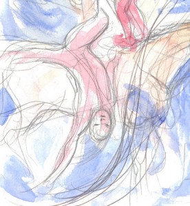
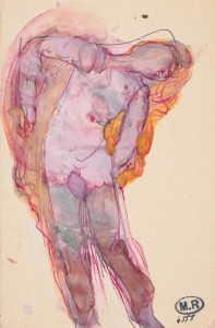
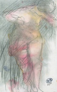
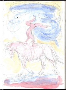
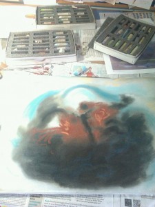
Above and below: My own warm-up drawings inspired by the drawings of Auguste Rodin. I based these on photos of equestrian vaulters. Pencil and watercolour wash.
Warm-up no. 5: Continuous line drawing
You need:
a) Sketchbook or loose sheets of paper.
b) A life model, still life, interior or landscape to draw from life.
c) Any medium that flows across the page, e.g. pencil, flowing pen, graphite stick, etc.
When to do this warm-up:
Any time! Continuous line drawing helps to get rid of inhibitions while also switching the brain to an artistically useful way of seeing. This warm-up is therefore perfect at the start of life-drawing sessions. It is also good as a “mental ice-breaker” when you first get your sketchbook out in any situation, e.g. in a cafe or museum.
To do:
The aim is to create a line drawing while barely lifting your drawing tool off the paper.
Aim to include both foreground and background in your drawing. For example, if you were to make a continuous drawing at the start of a life drawing class, you would’nt just draw the model herself, but would include something of her surroundings. So your drawing could include the life model, something of the floor in front of her, and the wall / doorway/ easels, etc. behind her. You might even include other people within your drawing if you can see them in front of you.
Above: A warm-up drawing made just before a jazz concert.
Start drawing near the centre of your page. A good place to start your drawing is at a point where two to three lines meet. In a studio, cafe or other interior, that could mean starting at the corner of a doorway. If working outdoors, you might want to start your drawing at the point where a building meets the horizon, or at the point where strong tree branches cross each other.
Let your pen flow across the page. You might, for example, start drawing the edge of a doorway, and then let your pen glide from there into drawing the edge of a person who is standing in front of that doorway.
To get your pen from one edge of the figure to the other, you can make up an imagined line that crosses the inside of them, perhaps following the folds of their clothing or the edge of a shadow.
You might, at times need to double back on yourself to take the pen back to a point at which a fresh line should branch off.
The drawing should look quite scribbly. Don’t worry – it is only a warm-up.
To maintain some sense of reality in the picture, try to include the edges of things as they slope away from you into the distance. In an interior, that means including edges such as where the walls meet the ceiling and floor as well as door-frames and windows. In a landscape, try to include the edges of paths, roads and hedges as they slope away towards the horizon.
Above: This sketchbook cafe drawing started as a continuous line warm-up. I then added a few lines of a different colour in the foreground.
Warm-up no. 6: A warm-up for the oil painter
You need:
a) A small piece of primed canvas or canvas paper or gessoed board. It should be about 25 by 18cm.
b) A set square and pencil.
c) Oil paints, brushes, palette, turpentine or other thinner, etc.
d) An object to draw, e.g. a piece of fruit. You might want to put this onto a piece of white or coloured cloth.
e) A stopwatch
When to do this warm-up:
At the start of an oil-painting session, especially if you are returning to oil painting after a long break and need to get back into the swing of it again. This is my longest warm-up exercise. It takes a full hour of intensive painting if you paint the full six views!
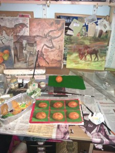
Above: My clementine warm-up in oil paints
To do:
Use set-square and pencil to divide your canvas into a grid of six equal rectangles or squares. By all means, leave a rim of blank canvas around the edge if this makes it easier to measure out. Rectangles of 8cm x 6cm would be fine.
The aim is to paint the object very rapidly and simply in an alla prima fashion. Time yourself a strict ten minutes to paint the object within one retangle. Then rotate the object and paint a fresh view of it. Continue until you have filled your grid.
Before you start, I suggest that you make a decision about which colours to use. It is generally best to restrict yourself to just 3-5 colours, plus white, as you’ll be working rapidly here. For example, a palette of cobalt blue, alizarin crimson and yellow ochre plus titanium white is successful in many situations. Or you may have your own preferred combination.
For each little image of your object, decide how to place it within its allotted rectangle. If you wish, draw a quick outline using turpentine-thinned paint on the tip of a brush. Then proceed boldly, blocking in dark and light tones of thicker paint where they occur on the object and on its immediate background. You may like to half-close your eyes in order to see the tones on the object more clearly.
If you can multi-task at this speed, make simple decisions about where the colour of the object and background are “warmer” (i.e. more orange) and where they are “cooler” (i.e. more blue) and apply juicy brush-strokes of colour accordingly.
Top tip: Don’t try to match colour exactly. Just aim to clarify where the lights and darks are and, if possible, where warm and cool areas are.
Adapt this warm-up: You can do this warm-up with acrylic paint instead of oils:
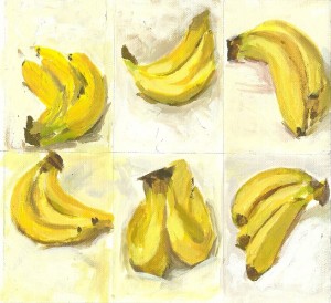
Above: My bananas warm-up using acrylic paints
If you are impatient, then by all means restrict yourself to a series of just three views of your object:
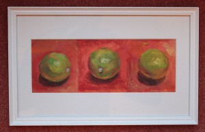
Above: My limes in oils. Just three views this time.
| Tags: blog, oils, Rodin, sketchbook, warm-ups
Warm-up exercises for artists (1)
January 4, 2013
Some good ways to start your session in the studio
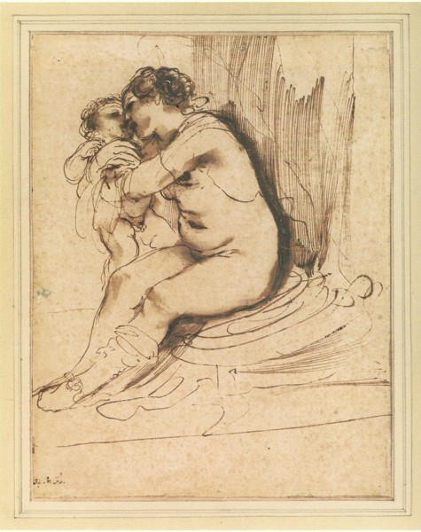
Above: Guercino “A nude woman, seated, embracing a child”, 23.4×18.1cm, pen with brown ink, brush with brown wash
Why warm up?
Warm-up exercises are important for artists just as they are for athletes and musicians. There are three main reasons to “warm up” at the start of a drawing or painting session:
1) Physical (control of your drawing/painting hand)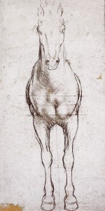
Drawing and painting require good hand coordination. The quality of pen and brush strokes improves with practice, and will improve within the session if you focus on them for a brief period before tackling your main drawing or painting.
Some types of mark (e.g. fine cross-hatching) require a steady, very controlled hand. But more informal styles of work also require a technical warm-up . Loose, freely-drawn lines require the artist to move the arm in a sweeping fashion without losing control of the pen, pencil or paintbrush. The drawing hand needs to be relaxed without gripping, yet retain control of the drawing tool. Practice makes perfect, and it is good to remind your arm and hand muscles of what is required before you get going with the rest of the session.
Right: Leonardo da Vinci front view study of the proportions of horses, showing remarkably delicate line control. Click on the image for a closer view.
2) Perception training (remind yourself how to look at the world!)
There are many different ways of looking at the world. When going about our day-to-day lives, we need to view our surroundings in a functional way in order to cope. We recognise shapes, patterns, and snippets of this and that in order to get through the day, whether we are walking on a busy street, recognising and greeting our friends or shopping. On the other hand, for most types of drawing and painting, the artist needs to view the world in a whole different way.
When we enter the studio and embark on drawing or painting, we need to switch from functional everyday perception to a different way of seeing, and this can take some preparation.
What do I mean by the artist’s way of looking and seeing? When working from life, many artists concentrate closely on one or more aspects of their subject. For example, they may look at shapes, tonal values, colour contrasts or proportions.
If I asked you to put your phone on the table and draw it, you would need to look at it in an analytical, focused way while completing the task. Whether you embarked on a realist or semi-abstract image, your perception of your phone would be quite different to the way that you saw it the last time that you took a call.
3) To reduce worry and inhibition
The task of producing a masterpiece from a blank canvas or sheet of paper can feel daunting. Warm-up exercises are completed for themselves rather than being destined for the gallery wall, so they can get you going in a more relaxed way at the start of your session.
Some warm-up ideas
These warm-up ideas are intended to help prepare you mentally and physically for a session in the studio rather than providing you with a creative idea for your next project. I suggest doing just one or two of the exercises at the start of your session. A useful warm-up could take from one to about twenty minutes. If you spend much longer on such exercises, you risk procrastinating and avoiding the main creative task of the day.
Warm-up no. 1: Lines from Old Master drawings
When to do this warm-up: This is a good all-purpose warm-up exercise. It is particularly useful if you intend to draw from a photo during the remainder of your session as it is very freeing. I also recommend doing this warm-up before copying any Old Master drawing as it helps to train your hand to make marks similar to those of the original artist.
You need: A copy of any drawing that you admire, preferably one with sweeping lines. I particularly recommend using drawings by Guercino, Rembrandt, Delacroix, Leonardo da Vinci or Rodin, but the list goes on and on. Pick a medium similar to that of the original artist, e.g. pen and ink, pencil or compressed charcoal stick. You also need your sketchbook or a loose sheet of paper.
Above: Eugene Delacroix study for “Liberty leading the people”, graphite with white heightening on wove paper, 32.4×22.5cm
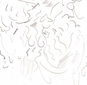
To do: Fill a page of your sketchbook with marks copied from the Old Master drawing. You should end up with an abstract page of scribble. Do not copy sections of the original drawing. Just pick out individual marks and copy these as best you can.
As you copy the lines from your chosen picture ask yoursef the following questions: Are the lines sweeping, flowing, stabbing, curved or straight? If curved, then how much do they curve, and in which direction? Do the lines start faint at one end, then get fatter and heavier in the middle, then fade out again? Do the lines in the original picture vary in strength, or are they all the same?
Your page of marks may look something like this:
Above: My warm-up marks copied from the Delacroix drawing shown above
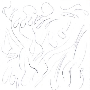
Above: Auguste Rodin “Red-haired woman standing”, pencil and watercolour wash, 30x19cm, n.d.
Below: warm-up pencil marks copied from this Rodin drawing:
Tips and hints: Whenever I try this exercise, I am always surprised by how difficult it is for my hand to copy another artist’s marks. Don’t be disheartened! Experiment with letting your wrist or elbow go more floppy and moving your pencil with a sweep of the whole arm. Also try out different pencil-holds. Try standing up, or sitting more squarely in your chair. If you are right-handed like me, then you may find it frustrating trying to copy Leonardo da Vinci’s drawings because he drew with his left hand.
Start off by trying to copy the original artist’s marks but, in the end, the character of the lines is more important than an exact copy. Be aware of what the artist was aiming at with each line (a sweeping line or an elegant loop) even if your own hand doesn’t make quite the same mark.
Above: Guercino “Bathsheba attended by her Maid”, pen and brown ink, 25.5×17.9cm, 1640
Below: Marks copied from the Guercino drawing. I have used a dip-pen and brown ink:
Adapt it:To warm up before a painting session, you can copy brush marks rather than drawn lines. Do this exercise on a piece of canvas paper or old board, or work over the top of a disastrous picture that was heading for the rubbish bin anyway.
Try filling the space with marks copied from your favourite painter, e.g. Rembrandt or Constable. Aim to copy the length and direction of the brush strokes. Are they curved, sweeping or stabbing kinds of marks? Do they merge into one another, remain separate or overlap?
You can use totally different colours from those in the original painting (perhaps use paint from yesterday’s palette if there is any left over) but aim for a similar consistency of paint as the original artist as far as possible. You may want to blend a painting medium (e.g. Liquin Impasto medium) into your paint so that your brush strokes leave clearer marks on the canvas.
Warm-up no.2: Potassium permanganate observe and draw
When to do this warm-up: To loosen you up, to reduce inhibitions and to inspire your curiosity.
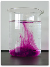
You need: A pyrex jug or bowl (e.g. 1L volume). A tablet of potassium permanganate. You’ll only need one tablet at most for this, but a pot of them can be obtained over the counter at chemist shops in the UK as Permi-Tabs. You’ll also need a kettle to boil water. Disposable gloves (or tweezers)are useful for handling the potassium permanganate and a craft knife is required if you are going to cut the tablet up.

Choose your own art materials for this. You could just opt for pencil and paper. Or for a more bold graphite stick and paper. Or use one or more pastel sticks (colours of your choice) on paper or on gessoed card.
You could even use oil paint if you wish. In that case, use one or more large brushes, well-primed canvas or board, and paint of your choice. I suggest using just one or two tube colours plus white. The chemical itself will appear vivid pink, but you could paint in a completely different colour if you wish.
To do: Have your art materials ready (see above). Boil the kettle.
I use just a quarter of a Permi-Tabs tablet in 1 litre of water. Wear disposable gloves and use a craft knife to cut the tablet. It may stain surfaces, so rest it on a bit of old disposable plastic or similar when cutting.
Pour boiling water into your Pyrex jug or bowl. Drop the small piece of potassium permanaganate into the water. The tablet starts off as almost black, but produces billowing, vivid-pink swirls as it dissolves:
Now just start drawing something of what you see. Rather than attempting an exact copy, start simply by suggesting the direction of the chemical streaks. If using pen, pencil or other drawing medium, then you may like to make flowing, sweeping lines to suggest these streaks.
If using pastel or paint, then you could either draw with your medium and make sweeping lines, or you could create bold zones of colour that merge into one another.
As you watch the chemical, the pink areas will move within the jug. You will probably see streaks emerge from a dark centre in a rather interesting way. Don’t attempt to create a photographic image of what you see at any one moment. Instead, see if you can create an interesting design on your page that is inspired by this vortex-like motion. You could start at the centre and work outwards, but there are no hard and fast rules. Notice how far from the original that I have strayed in my example, below:
Above: Abstract image inspired by potassium permanganate dissolving in water. I have used Unison pastels.
But don’t do: Don’t get the undiluted chemical on your hands or anywhere near your face as it stains skin and can be irritant. Don’t be tempted to draw with potassium permanganate itself – it produces an unpleasant brown mark and damages the paper.
Warm-up no.3: Tonal perception
When to do this warm-up: This is a good one to do now and again before embarking on any composition as it’ll put you into the right frame of mind for the task of picture creation. It’ll get you thinking about tone and shape.
You could do this before you even arrive at the studio, or as you first walk in. I suggest setting yourself a time limit on this warm-up so that you don’t get sucked into it for to long, e.g. 20 minutes.
You need: A digital camera, preferably one that you can set to shoot in black and white. If working indoors, I recommend using a camera on which you can disable the flash temporarily.
Or sketchbook and pencil.
A location of your choice (e.g. your garden, your studio, a room of your house or a section of your street).
To do: Let’s look at the camera option first. Set your camera to shoot in black and white. Look around your chosen location for interesting shapes of light and dark tone. If you see a pattern of tones that could be interesting then view it through your camera. Can you point the camera to fill your shot with an interesting balance of light and dark shapes?
Use your camera like an artist’s rectangular viewfinder, and decide which view is most balanced and pleasing. You can look from any angle.
You can look from a distance:
Or zoom right in close:
Remember to look at shapes rather than objects. For example, folds of a jacket combine with their own shadows to create interesting dark and light shapes:
The purpose of this warm-up is simply to get you thinking about tone and shape in a rectangular picture format. You are taking these photos in order “to practise seeing”. The plan of this warm-up is not really to find soure material for your work that day.
Don’t upload your photos or print them out during your warm-up period. This would only waste time. You can view and evaluate your photos much later if you wish (e.g. the next day), before filing or deleting them. But this exercise does not aim at producing a gallery-worthy photograph!
Practical tips: If possible, avoid using flash on your camera for this exercise. This exercise is possible using simple automatic cameras and cameraphones (my art group have done this successfully). However, some control over your camera settings is preferable if you are shooting in dim lighting.
When shooting indoors, set the camera ISO number to as high as possible (e.g. ISO 1600) and reduce the f-number to quite low (e.g. around 6). As you can see from my jacket picture above, I put up with a slow shutter speed and nasty camera shake as long as this avoids me having to flood my picture with flash light. These pictures were taken on a Canon SLR 1000D.
If you prefer to draw rather than to shoot photos, then use your pencil and sketchbook and make a series of little “thumbnail sketches”, each about 4cm by 6cm. Draw a rectangle or square as a picture boundary for each of these before you start. Find a view of your environment that has interesting shapes of light and shade.
Draw a few lines within your rectangle to show where things should go. Look at your subject with half-closed eyes to help visualise shapes of light and dark. Then “block in” the shapes of dark tone within your rectangle using bold pencil cross-hatching. Leave paper white to show where the lightest shapes of tone should go.
Adapt it: If your interest is colour then by all means use colour photography. See my own examples of this by clicking this link: Things seen on Walking the Dog.

Other warm-up ideas
I’ll share more ideas for warm-ups in my next blogpost. There will be a line and wash warm-up, a continuous line exercise, and a warm-up for the oil painter.
My plan is to draw and paint more and to talk less, so I expect these blogposts to become a little less frequent, perhaps every two to three weeks. If you would like future blogposts to arrive in your email inbox then just add your email address to the box at near the top of the page and click “Subscribe”. This service will of course always be free of charge.
Comments (4) | Tags: Delacroix, Guercino, photos, Rodin, warm-ups
Art workshops in Jan/Feb 2012 in Codicote, Herts
December 24, 2012
Colour Workshops
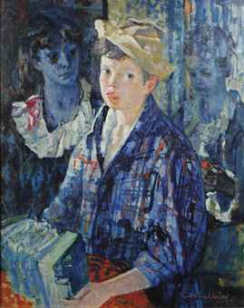
Above: Luigi Corbellii, 1901-1968, “Boy with accordeon”
The next block of art classes will be all about colour, and is scheduled for January and February 2012. To book your place, contact me by clicking here.
“How to use colour” is a topic that involves science, emotion, knowledge and intuition. As always, I shall come prepared with plenty of information and ideas for each class and illustrated notes are included in the cost of the sessions. Yes, I shall have facts about the science of colour perception up my sleeve but, rather than blinding you with science, I’ll approach the subject from the artistic side. There’ll be plenty of ideas for discussion, books of work by famous artists as reference, and of course the opportunity to draw.
In these workshops, you’ll have the choice at most stages of either working figuratively (e.g. still life, work from photos, etc.) or of creating abstract images.
Venue: 169 High Street, Codicote, Herts SG4 8UB (close to junction 6 of the A1(M))
Time: Arrive after 10am. Class is from 10:30am to 12:30
Cost: £30 for the whole block of four sessions.
Please bring: Coloured pencils & cartridge-type paper. Or pastels & a textured paper that you would feel comfortable working on.
To book your place: Please contact me by clicking here
Dates and topics of the classes
Friday 11th January:
Colour wheels…..Warm and cool colours………Using colour to suggest space and depth.
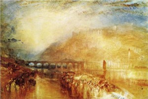
Above: William Turner “Heidelberg”, 1846
Friday 18 January:
Colours and composition……….Colour links and contrasts.

Above: Herbert Beck (1920-2010), watercolour image of two heads
Friday 1st February:
A personal response to colour…Specific colours and emotion.
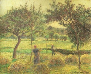
Above: Camille Pissarro “A bountiful harvest”
Friday 15th February:
An expressive use of colour.
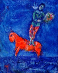
Above: Marc Chagall “Child with a dove”, 1977
| Tags: blog, classes, Codicote, colour theory, Herts, workshops
How to use top-lighting in drawing or painting a portrait
December 14, 2012
Investigating an unusual lighting set-up for portraits
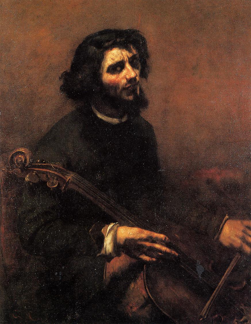
Above: Gustave Courbet “The Cellist, Self Portrait”, 1847
Today’s art class on lighting for portraiture
I have just completed a series of art classes on how to use tone. The final session looked closely at the use of light and shade in portraiture. Of course, this fascinating topic inspired plenty of discussion, though most people did get their drawing books out eventually.
There are many possibilities for directional lighting of the head. We discussed the full range and tried some lighting set-ups out using a plaster head. There were portraits to look at by artists from Leonardo da Vinci up to recent BP portrait award exhibitors. How had the artist lit their model in each case, and how did the lighting set-up benefit the picture?
I don’t have space here to discuss each type of lighting in detail and have chosen to restrict this article to one of the more unusual lighting set-ups, top-lighting.
Before going on to discuss top-lighting, here is a complete list of lighting set-ups that we dicussed in the class today:
The most popular indoor lighting set-ups:
- Three-quarter lighting (with full-face view of model)
- Broad lighting
- Short lighting
Other lighting set-ups for portraiture:
- Side lighting
- Top lighting
- Frontal lighting
- Contre-jour (back lighting)
- Light from below
- Multiple light sources
- Outdoors on an overcast day, at noon or at sunrise/sunset
What is top-lighting?
This is quite an unusual lighting set-up for portraiture.
In a top-lit portrait, the main light comes from above the sitter. This light is typically a ceiling light positioned above and a little in front of the model’s head.
You can tell that the sitter has been lit from above by recognising typical shadows in the portrait. There will be pronounced shadows under the chin, below the nose and under the eyebrows. The brightest highlights on the face will be on the forehead, nose and on the upward-facing surface of the chin.
Above: Gustave Courbet self-portrait
Why is it unusual to light your sitter from above?
The illuminated forehead and nose, and the pronounced low shadows on the face, do not tally well with our contemporary idea of beauty. Light from above also emphasises any horizontal skin creases, bags under the eyes and other facial “imperfections”. It can be quite an unflattering light.
In some top-lit images, the eye sockets and perhaps most of the mouth are thrown into deep shadow. This can make it very difficult to understand the expression on the sitter’s face and, as these shadows contrast strongly with the brightly-lit forehead and nose, the effect can be menacing or disturbing.
But we do routinely see people as lit from above
Though paintings and photos of heads lit from above are unusual, we live much of our lives in a top-lit world. Many homes have ceiling lights, often a strong central pendant light in each room. Offices, workshops, schools and sports centres also tend to be lit by strip lighting or by other ceiling lights.
Outdoors, the sky illuminates us from above (of course). Around midday when the sun is high in the sky, people appear top-lit with marked shadows under nose and chin. If the sky is overcast then the top-lit effect persists, with bright forehead and nose, though shadows will be less dramatic.
So we are used to seeing our friends and colleagues lit from above, even if we should exercise caution before using this lighting set-up for a picture.
If you are drawing a friend at home, or drawing from a life model in a group session, have a look at the lighting set-up before you start. Life drawing groups often have to work in a top-lit hall or studio in order to provide enough “task lighting” for all of the artists and unflattering low shadows may be cast on and around the model’s head by the overhead lighting.
Some successful portraits that use top lighting
Lucian Freud self-portrait: “Reflections”
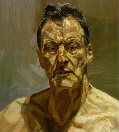
In the best types of self-portrait, flattery is of no importance. This image by Freud is a wonderful example of self-scrutiny. Wrinkles, pouches of skin under the eyes, and asymmetry of brow muscles are all emphasised by the overhead light source here.
As a viewer, I look at this picture and try to glean information about the man’s character. Is he good or bad? Is he trustworthy? Many of us make quick judgements about someone’s personality having taken just a brief look at them. This image, however, invites much longer study.
We are perhaps conditioned to equate flawless beauty and facial symmetry with goodness of character. The top-lighting shows up every imperfection here, creating an image which is initially rather repellant. But Freud also makes himself look vulnerable by showing all those flaws and details, especially with his shoulders bared. It is, surely, an honest self-portrait. And then we look closely at the eyes to try and gain more information. Due to the lighting effect, these eyes are in shadow and rather inscrutable. This makes for a more psychologically intriguing portrait.
Honore Daumier self-portrait:
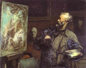
Daumier often lit his figures from above, simplifying the head into a series of light and dark shapes for dramatic effect. In this self-portrait, the harsh overhead lighting turns his face into a powerful caricature in contrast to the gentle, softly-modelled image of his canvas-in-progress within the picture. The bright glow on the top of Daumier’s head draws the viewer’s eye to the head and face. The top lighting then produces strong contrasts within Daumier’s face and turns his eyes to black sockets. Is he supposed to look manic? Perhaps he is showing himself as a frantic working genius? Daumier comes across to me here as a man who is possessed by a wild artistic spirit.
Look, below, at these laughing men drawn by Daumier. The effect of overhead lighting on the central figure is to help suggest some kind of madness or loss of self-control:
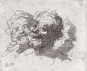
Above: Honore Daumier “Three laughing men”
Mark Rothko self-portrait, 1936
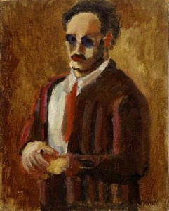
Like Daumier, Rothko saw bold shapes of light and dark in the top-lit head and simplified these further in his self portrait. This image is a big step away from the traditional portrait set-up, in which lighting would be carefully placed to flatter or to provide interest. When I see someone briefly across a room in an average interior with overhead lighting, they look much like the man in Rotho’s image. The lit shapes of forehead, cheeks and nose, are immediately understandable as a “face”, and make me recall remembered images of real faces that I might have come across at work, at school, or at parties, rather than reminding me of faces from traditional portraits. This, for me, is what makes Rothko’s self-portrait so powerful.
“Swallow” by Alexandra Gardner, shown at BP portrait award 2012, National Portrait Gallery
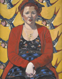
The above picture is unusual for its use of overhead lighting to joyous effect! The sitter in Gardner’s image was her friend, Laura, a hairdresser. At first, the lighting here seems unimportant compared with the decorative effect and bright colours. Light is coming from above and to the right of the sitter , hence the strong shadow under her chin on her left side.
I like the way in which all of the shapes within this canvas are related to the joyous, swooping image of the swallow. The bird is curved with elegantly-pointed tail ends. Look at the shapes of red fabric, and the shapes of darker-patterned blue and black fabric between the red. These are very similar to the swallow’s outline, being rather curved and pointy with a bit of assymetry. The shape made by Laura’s interlocked hands and arms is similar again, and so is that of her black hair bow.
Now look at the shapes of light and shade produced by the overhead lighting. There is a large assymetric curved and pointy patch of light on Laura’s chest and neck. The shape of shadow under her chin is similar. These are echoed by the gentle shadows below each cheekbone, and by the shapes of the sweeps of light above the cheekbones.
Albrecht Durer self-portrait, 1500
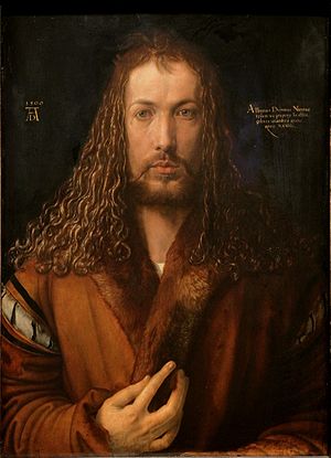
In Durer’s gorgeous self-portrait from 1500, the light streams down from a point above and to the right hand side of his head. This could be classified as three-quarter lighting, but with a very high light source. There is enough top-lighting here for me to include this image in this article (hence the brightness on the man’s forehead), and I wanted to mention this picture as it illustrates another use of overhead lighting:
Durer has presented himself here as a Christ-like figure, and the soft stream of warm-coloured light streaming down on his face suggests a glow from the Heavens. It has been said that, in painting this idealised and rich image, Durer was suggesting that his artistry came from his Creator, and I feel that the lighting from above does indeed give this portrait a transcendental quality.
Notice how Durer’s top-lit image is beautiful and idealised, while Freud’s “Reflections” is quite the opposite. To “soften” your light for a more flattering effect, try using a lampshade or diffuser instead of a bare bulb. A wide north window can also be a good source of soft, diffuse light, though it is rare to find a high enough window for overhead lighting.
In summary
- Take care when using top-lighting because it can create an unflattering and/or disturbing image.
- Overhead lighting can emphasise pouches and folds of skin on the face.
- It can create intriguing compositional shapes of light and shade on the face and torso.
- Top-lighting emphasises the forehead and nose.
- But it can throw the eyes into deep shadow and make the figure’s expression difficult to read.
| Tags: blog, Courbet, Daumier, Freud, lighting, portraits
Conveying Movement
November 30, 2012
I’ll give an illustrated talk in Hertford next Tuesday

Above: Auguste Rodin “Woman with Swirling Veils”, c.1890, graphite, pen, red and brown ink and watercolour gouache, 17.5x11cm
The sense of movement in pictures is a great passion of mine. As part of the Hertford Society winter programme, I’ll give a presentation on “Conveying Movement” next week. After discussing how a sense of movement can add an extra dimension to your work, I shall go on to explain the numerous techniques available to achieve this.
This presentation was initially billed as a “workshop”. However, I have enough ideas on the subject to fill the whole evening with talk and discussion. Towards the end of the evening, I shall suggest practical tips and exercises for those who plan to try these at home.
The talk is free to Hertford Art Society members. Non-members are also welcome, and will be charged just £2 on the evening.
Time: 7:30-9:30pm, Tuesday December 4th
Venue: Cowbridge Hall, Cowbridge, Hertford SG14 1PG
| Tags: blog, classes, Herts, movement, workshops
Memory pictures in progress
November 19, 2012
Exploring ideas around identity and memory

Above: Vincent Van Gogh “Landscape with ploughed fields”, 1889, oil on canvas
Starting points for art: Working from life vs. an emotional starting point
I spend much of my time drawing and painting from life. Shapes, colours, tones and volumes interacting with one another in the real world are intriguing and can inspire work that is infused with emotion. For example, think of Van Gogh’s landscapes, such as the one shown above.
A fresh approach for me is to start with an emotion and then to build an image around it. Colours, shapes and symbolic forms can be used within the picture, and reference to living things is used as a tool rather than as a starting point. This way of working requires a “focus” of emotion to enable the artist to reach a meaningful conclusion. It is an extremely personal way to create a picture, and the process of planning the image not only documents the artist’s emotions, but can also help the artist to process and understand what they are thinking.
A personal response to the death of a pet as the starting point for pictures
I am currently working on a series of paintings following on from the death of my old dog, Freddy, but do please read on. While my initial thoughts on the subject were bleak, I am now finding (7 months on) that these pictures automatically fill with warm colours and are optimistic.
None of these are completely finished, glazed or framed, and the final one is still rather at the sketch stage. I have decided to write something about them in this blog, even at this unfinished stage, to share some of the self-questioning behind the images.
The distortion of shape and colour in remembered, emotional images
On trying to make sense of losing the dog in the first few days, the image in my “mind’s eye” no longer placed him in the real world in a logical fashion. Having previously done so many sketches of him lying on the floor, or next to a table, or resting in the garden, I could now no longer think of him and his surroundings as being predictable volumes. My visual understanding of the situation reminded me of Chagall paintings, with figures, trees, land and sky no longer connected in a real, three-dimensional sense but distorted and curled around one another, and with colours relating more to emotion than to the effect of light on the objects.

Above: Marc Chagall “The Concert”, 1957, oil on canvas
Deciding to paint a picture based on the subject of pet loss has forced me to grapple with ideas about identity, death and memory. If we have visual images relating to such subjects, they may be floating, fleeting, distorted and continuously changing. How should one “pin down” these images and paint them within the confines of a traditional rectangular canvas?
Burial, the passage of time and the natural recycling of life
My first thought was to create an image of the dog beneath the garden with plants flourishing above and around him. I had thought of making a series of similar pictures of the same garden and the same body as the seasons changed, perhaps one with roots curling down and shoots coming up, one of an over-lush intensely green summer, a painting with the warm colours of autumn and one under a blanket of snow. I was interested in the thought of a body having a permanent “resting” place, while life went on around it. However, my first attempt, “Freddy is in the garden: Autumn”, made me think and reconsider.

Above: “Freddy is in the Garden: Autumn”, oil over acrylic on prepared board, 30x36cm
The portrayal of an identity after death: A dilemma
Thinking clearly and logically, I knew that the dog was now a lifeless, unfeeling but still perfectly three-dimensional body, and was buried in my garden. Whereas, when he was alive, the answer to the question “where is Freddy?” would of course have been to point at his body, now I am not so sure. Yes, the body is still “Freddy” in one sense, but we could also now think of it as a decomposing, lifeless, “empty” thing, and not “Freddy” at all. In discussing this recently, a friend described a buried body as an “empty vehicle” and, yes, this rings true with me in some way.
So, how should one draw or paint a buried body? My strongest visual memories of him are close to the oil sketches that I had made earlier this year. In the painting, above, I had used the rather endearing image of him curled and resting, as shown below:

Above: Freddy oil sketch from life
This is a typical posture of a relaxed, sleeping dog. It is soothing for us to think of a dead body in a sleeping position. But now I questioned myself: Perhaps the creation of a pleasing image is not a good enough reason for me to paint him curled up? Indeed, he was even unable to lie curled like this in the last few days of his life due to arthritis and spinal pain and, after death, would anyway be crushed under a weight of earth. My curled, resting image harked back to an old memory rather than relating to an actual dead dog. Had I painted a lie?
Had I been too dishonest in showing a sleeping, happily curled dog underground? Another option would be to paint a squashed, rotting body – would that be more honest? If I insisted on painting “what is physically there in that place” then, yes, perhaps I would need to show an actual decomposing body. But what I had really set out to show was not an empty, anonymous, decomposing “vessel” but this particular individual dog, a representation of his identity or of his “Freddiness”. An image of his rotting body would no more show “him” than would a clipping of his fur, or a little collection of his dropped milk teeth, or a vial of his blood taken last year and stored (don’t worry, I don’t have that final one!).
Also, consider this: On the microscopic level, a dead body is gradually absorbed by surrounding micro-organisms and “taken up” by the garden. The plants consequently absorb the released nutrients and grow but of course they do not assume the identity of the dead dog. Insisting on using the body as a representation of identity becomes more problematic the more I consider it.
In my opinion, to suggest the dog’s identity in the picture, an image from life is more helpful. To show this from my own point of view, a representation either purely from my memory, or based on a sketch that I had originally made myself, would be more appropriate than one copied from a photo. As for showing him in a sleeping position, this is interesting in itself and could inspire some discussion. It is almost instinctive to curl a pet up into a sleep-like position before burial. This says more about us as living people than about them as dead animals.
A warm image to encourage people to stop and think
Taken as the final word on the subject, the concept of my painting, “Freddy is in the Garden (1): Autumn”, is perhaps flawed. However. I have concluded that it is worthwhile as part of a series of images.
The curving lines that echo one another are there to represent the cycle of natural decay and regeneration which I certainly do believe in (i.e. the decay of dead bodies allows plants to flourish, and further animals then feed on the plants). The lyrical, curved shapes, the warm colours and the comfortable representation of the dog create a picture that is easy to look at. In painting this, I am not trying to say that death is a great comfort or that an underground grave is a warm and pleasant resting place. The warmth of this picture draws the viewer in and gives them a chance to wonder for themselves about this subject. Rather than making people flinch away, anyone can look at this and think and talk, even young children.
A link between identity and memory
So it seemed that this picture had more to do with memory (mine) and identity (his, as seen by me) than to the physicality of death and burial. After picking up a second-hand copy of a book about Expressionism, I decided to make a “memory picture” of the dog in the house, perhaps suggesting the way in which an old dog seems to become part of the room and how, when gone, they leave a strange and awkward gap. This was based on an oil sketch made earlier in the year from life. Interestingly, I found myself drawn to using plenty of pinks in this image. There is currently a huge cultural push insisting that “pink is for a girl”. That is not why I used pink here. I liked the warmth of the colour, and the way in which I could flood the inside and the outside of the dog (the background floor) with the same pink.

Above: Memory picture (1)
Colour “flooding through” the dog image
This has led on to another “memory picture”. If the inside and outside of the dog can be flooded with the same colour, then how about taking this to another stage and just showing him as an outline? In the painting, below, he has almost become a symbol. I do not believe in ghosts, but it is interesting how they are sometimes portrayed as tranluscent beings within a physical world, perhaps as shadow-less outlines.

Above: Memory picture (2), acrylic on prepared board, 41.5 x 33.5cm
The dog in the above painting was copied from a pen drawing from one of my old sketchbooks. Inspired by Matisse, I felt free to use colours and patterns of my own choice around him. Some of the squiggly lines are copied from lively sketchbook drawings of my children. In the original sketches, these lines represented folds of clothing or bits of arms or legs. Other shapes hint at food treats or toys. I aimed to suggest a dog in a living room surrounded by mess and typical lively family chaos, but also enjoyed adding and overlaying shapes and patterns to balance one another in an abstract sense across this painting.
So, where is Freddy? Another dilemma and a deliberately ambiguous image
For my next picture, I have returned to the thought of a dog who has lived and died and who now has a place within the garden. Rather than attempting to show a static image of dead body, or a ghost, spirit or visible soul, I am aiming to keep this picture very ambiguous. I started the painting in a very “loose” manner, and have deliberately left it unclear as to whether the dog is remembered as alive or dead, resting or dying as seen from above, or perhaps even running as seen from the side. There is also ambiguity as to whether he is represented in a hole in the ground, resting on the surface of the land or, perhaps, hovering.

Above: “Freddy is in the garden (2)”, unfinished, oil over acrylic on prepared board, 32 x 31.5cm
As for representing the garden in the above picture, I have suggested patches of light and shade and, in some places, I am painting plants that really do grow in my garden. Some are painted as seen from above, and others are perhaps viewed from the side. The quince grows in my garden and is used here as a symbol of long-standing plant fertility and for the warmth of its yellow colour.
The aim is to retain enough ambiguity for this painting to read as a memory picture rather than as a three-dimensional attempt at physical accuracy. From looking at the picture, the viewer should have a chance of understanding something of what I was thinking, but should not have enough information to make a three-dimensional sculpture of my image.
Shared ideas
One reason for sharing this small group of pictures is that they offer an interesting talking-point. They could be “read” simply as images of pet death, or these optimistic-looking pictures could open up thought and discussion around more terrible kinds of loss. These paintings have certainly made me question my own beliefs about identity, death and visual memory. If you have further ideas, comments, or differences of opinion, then you are very welcome to discuss by adding to the comments box below.
Comments (1) | Tags: acrylics, blog, death, dogs, Freddy, identity, memory, oil painting, oils
Things seen on walking the dog
November 5, 2012
Are you bored…?

…try looking at your surroundings in a new way.
Browsing through some old photo files on my computer the other day, I came upon a set of snaps that I had taken when walking my old dog, Freddy, early in 2012. In the last few months of his life, my dog-walks had to be incredibly slow as his legs were failing. Sometimes it appeared that we were barely moving at all, and occasionally I cheated and carried him part of the way.
Observing the world in an abstract way
These round-the-block walks were a highlight if his day but, being both blind and deaf, he didn’t mind if my focus was elsewhere. I routinely took this opportunity to listen to vet lectures downloaded onto my ipod. But on a couple of occasions, I set myself the task of “seeing pictures” in the world around me, and recording them as a set of photos.
I am not a photographer, and these images are not intended to be perfect in themselves. I embarked upon this in the spirit of a game, in order to see the world around me in a new and rather abstract way.
Shapes and colours
However, it is good to have a few of these pictures filed as they remind me of my time with the dog. Here he is sharing a picture with a piece of old string. When I look at this, I keep glancing from the string to the dog’s light grey hairs and back again, as the pale colour and muted tone of string and hairs seem to unite them. The whole image is a curious combination of different shapes, both straight and curved-edged, and of shapes between other shapes:

Patterns in the natural world
Our walking route was the same every day and a strategy to avoid boredom was required. One trick is to look at things with great curiosity. Looked at intently, a spray of tiny flowers in someone’s front garden is as interesting as a sculpture. The groups of white flowers do not form a neat dome as I would have expected. But their arrangement is not random. They seem to create some kind of wave-like surface pattern. I find it rather compelling close-up:

Interesting three-dimensional shapes
Litter can be shameful and embarrassing, but also rather sculptural. This rounded, reflective bottle could be seen as a thing of beauty. The fact that it is a hazard to wildlife, and the carelessnesss with which it must have been discarded, do not make it any less visually appealing. The wild plants are growing around and enclosing it:

Other items on the road and pavement are interesting for their two-dimensional shapes:

And the contrast between man-made waste (this time on glass recycling day) and nature can be striking:
An extreme close-up view
A rose is expected to be a thing of beauty, but do take the opportunity to look very, very closely at it:

Search for light and colour
Do not ignore the abstract shapes created by shadows and by other tricks of the light:

Even on a “grey” day, the colours of the world can be inspiring:

Imagined stories
Occasionally, looking at the world at very close quarters may suggest part of a story. I was a little intrigued by this Ikea receipt neatly wedged into the gap in this wall:

Sources of inspiration
The set of pictures, above, were fun to take at the time, and are interesting as a personal record.
Taking this a step further, I could choose to use each image as a source of inspiration for a new piece of artwork. The thing to remember is this: In each case, there was something that had sparked my interest and made me take a photo. If developing the idea into a fresh piece of artwork, I would have to retain the quality that had inspired me to take the photo in the first place.
For example, where colour combinations were the initial interest, I could take the same colours in the same proportions as the original photo, and use them to create an oil painting or collage. Two-dimensional shapes could similarly inspire an abstract painting. Alternatively, I could choose to set up a still-life inspired by shapes, colours and/or tones in one of the original images.
Those images containing intriguing three-dimensional forms could even inspire a piece of abstract sculpture. I particularly like the idea of the folded paper wedged into the brick wall, above.
Get to it
Don’t use my images for imspiration. Go and look at your own surroundings and come up with your own ideas. The important thing is to look and think. Bring ideas back to the studio either as remembered images, photos or sketches. Whether your surroundings are a hedgerow-lined lane, a suburban street, your own kitchen, a hospital ward or even a prison cell, it is possible to find curious ideas and images.
You are more than welcome to share links to any similar projects of your own by adding your message to the comments box, below.
Comments (2) | Tags: blog, finding inspiration, Freddy
Portrait drawing: how high is the collar?
October 20, 2012
Some thoughts on necklines in portrait drawing

Above: Picasso “Boy with a Pipe” 1905
The importance of positioning the collar correctly
In our draped model class last week, we looked closely at necklines. Where does the collar cross the back of the model’s neck? How high up does the collar sit? It is very important to judge this well when drawing a portrait, as the position of the collar changes the whole impression of the sitter. It can help to give the viewer an idea of the model’s age, personality and emotional state.
The height of the collar on the “average” person
A standard shirt collar on an “average” adult crosses the neck at about the same level as the centre of the mouth. I understand this from looking at many people in the street and on trains, etc. So the collar comes up rather higher than many people realise. It is a common “beginner’s error” to draw the collar too low, with the head seeming to perch precariously above it.

Above: Bernard Dunstan “Self Portrait”, showing a typical collar height
The top of a shirt collar of this type generally reaches the lower part of the back of the neck. Surprisingly, the neck tends to angle forward so much that this point is level, at the front, with the mouth.
The collar comes up lower on the neck in children
Children typically have a more upright neck posture than adults. A schoolchild’s collar therefore tends to cross the neck well below the mouth. Below is a figure designed to encapsulate the public school ideal of the early 1900s, showing the upright neck and low-sitting collar typical of a boy of this age:

Above: C.Pilkinton Jackson (1887-1973) “The Loretto Boy, 1909, bronze, 68.5cm
The collar comes up higher as the person gets older
As a general rule, the neck and the top part of the shoulders tend to angle forward more and more as a person gets older. Because of this, the collar reaches higher up the head with increasing age.
Below are a few self portraits by Rembrandt. Look at the point at which the collar crosses the back of the neck in each case. Is it level with the centre of the mouth, or is it higher or lower than this?

Above: Rembrandt “Self Portrait”, 1630, oil on copper, 15×12.2cm

Above: Rembrandt self portrait, 1640, oil on canvas, 102x80cm

Above:Rembrandt self portrait 1659, 84.5x66cm
Notice how, in the self portraits by Rembrandt, above, the collar reaches higher up the head as the sitter ages.
In the painting below, the posture of the sitter immediately tells us that he is old. The back of the collar reaches up even higher than the end of the nose:

Above: Quinten Massijs “Portrait of an Old Man” c.1517
If you are looking down on someone, their collar appears to reach higher up the back of their head
The apparent position of the collar is affected by the artist’s eye level. In the drawing below, we are looking down on the boy. Notice how high up the collar appears to reach. The top of the collar crosses his head at the level of his nose. (This boy is also slumping, which contributes to this effect):

Above: John Eardley Philip “The Fat Boy”, c1950, pastel and chalk on paper
When we look up at someone, we see more of their neck emerging from the top of their collar and the collar appears to cross the neck lower down. There is something of this effect happening in the photo of the bronze boy, “The Loretto Boy”. higher up this page.
Athletic people and dancers tend to have a more upright neck position
As a general rule, sports-people and dancers have a more upright neck posture and tend not to round the tops of their shoulders forward. Such well-coordinated people usually have good core muscle tone and supple hips and shoulders, so that they do not feel the need to slump their shoulders and neck.
As a result of this, dancers and athletes tend to have collars that sit lower on their neck, below the level of the mouth.
Some ballet dancers have a relatively long neck in addition to wonderfully upright posture and, taken together, these factors lead to their collar sitting very low on the neck.
For example, look at the shirt collar on the Cambodian ballet dancer, Sokvannara ‘Sy’ Sar in the photo below:
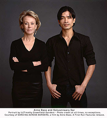
Above: Anne Bass and Sokvannara ‘Sy’ Sar, a photo portrait by Timothy Greenfield-Sanders
Slumped, sloping shoulders and neck suggest negative emotions
When people become weary, their shoulders and neck tend to slump or angle forward a little more. So the back of the collar reaches higher up when the sitter is tired. Watch out for this if you are drawing from life. You may choose to note the collar height of your sitter when they are still “fresh” early on in the sitting, and be aware that their neck may slump a little towards the end of the sitting, perhaps in a slightly unflattering way.
Shoulders and neck may also slump when someone is feeling negative in other ways. We talk about feeling “down”, and such negative feelings can go along with a downward slump of the neck and shoulders. This slump results in the back of the collar reaching higher up when the sitter is feeling depressed, dejected, sulky or generally miserable.
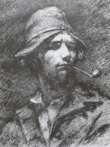
Take, for example, this tramp. He looks world-weary, largely due to his slumped posture and the low position of his head relative to the shoulders:

Above: J.S.Sargent “The Tramp” watercolour on paper, 50×33.5cm
Of course, your sitter may be perfectly cheerful but simply have “bad posture”. Watch out… it is easy for the viewer to make immediate assumptions about someone who has a slumped posture. The collapsed neck and shoulders with a high collar can be very unflattering, suggesting that your sitter is “old and miserly”, or “withdrawn and sulky”. A tailored shirt collar will make the posture even more obvious. In drawing such a person, you may opt to have them looking up and sideways at something interesting, or to draw them from a low viewpoint. These are two suggestions that may help to disguise the unflattering collapsed neck posture.
Upright neck and low collar suggest positive emotions
We sometimes refer to trustworthy, reliable people as “upright characters”. A person with an upright neck posture and thus a low shirt collar position appears to be such a person.
An upright neck also suggests that the sitter is alert and interested.
My first example is a 2008 painting of Nelson Mandela. Notice the low position of his shirt collar relative to his head. He has a wonderful appearance of alertness and control in this image:

Above: Richard Stone “Portrait of Nelson Mandela” 2008, 20x24in
Another example is this drawing of a lady wearing a low-cut neckline and viewed from a low vantage point to accentuate her long, upright neck. Sargent has emphasised her elegant neck posture to give an impression of physical grace, mental alertness and charm:

Above: Portrait drawing of Mrs George Swinton by J.S.Sargent
In summary
Take note of your portrait sitter’s head and neck posture. This posture suggests information to the viewer regarding age, character and mood. Do pay close attention to the level at which the collar crosses the back of the sitter’s neck.
| Tags: blog, portraits, Rembrandt
More art classes in Hertfordshire
October 14, 2012
Art class schedule: November and December 2012

Above: detail from “Head of a Muse” by Raphael c.1490, black chalk over pounce marks, traces of stylus
There is a series of four classes scheduled for Nov/Dec 2012 in Codicote on the theme of tone. If you are interested, then contact me (the sessions are almost fully booked, but we’ll see what we can arrange). Total cost for all four sessions is £30. Unless otherwise advised, all sessions run from 10:30am-12:30.
Nov 2nd: “Shadows and form; advanced pencil techniques”
Understanding light and shade on objects and people. Please bring cartridge-type paper and a small selection of pencils from HB to 6B or even softer.
Nov 16: “Shadows and drama”
We’ll investigate the psychological impact of shadows and consider how to use lighting to create a mood. Please bring pencils and/or charcoal, plus your choice of paper.

Above: Christopher Le Brun “The Departure”
Nov 30: “Shiny things and highlights”
From hair to jewellery, we’ll investigate how to draw shiny things convincingly in monochrome.
Dec 14: “Light and shade in portraiture”
How directional lighting will change the appearance of a head. We’ll consider how to set up lighting for a portrait. Please bring pencil, charcoal or other monochrome media of your choice.

Above: Rembrandt self portrait at age 22 years
| Tags: blog, classes, Codicote, Herts, workshops
Lighting the artist’s model…human or equestrian
October 11, 2012
Starting to think about tone, value and mood

Above: Edward Hopper “Seated Male Nude” 1923-4
A tonal approach to life drawing
Going back and forth to repeated life drawing sessions, it is easy for artists to run out of ideas and inspiration. Why not just stay at home and work from photos (we have no shortage of them?). Why bother to organise a model in the first place?
I love to draw from a live model, whether clothed or nude, human or animal. Here are my reasons:
-
I can see how the light is falling on the model and use the interesting effects that this creates.
-
I can move around to different viewpoints (or just move my head slightly) and get a better understanding of the three-dimensional structure of the model within the studio space.
- Life drawing can push me to work in a more spontaneous way because time is limited.
- The model is a real person or animal, and their personality can feed into the picture.
In this article, I shall spur you on to think about the first point in my list, that of making best use of the light. When we look at a life model, we are really looking at the effect of light on them and on the studio around them. Light pools over the skin from one direction while, on the opposite side of the model, there are great swathes of shadow.

Above: Edward Hopper: “Study for Morning Sun” 1952
When we look at a simple tonal picture, we can understand what it represents quite easily. Numerous lines are not always needed:

Above: A rapid warm-up drawing in charcoal
If light is set up so that there is both light and form shadow over the model, it becomes easier for artists to emphasise the 3D structure that is there. This can involve a single main light source (typically from above and to one side of the model). A lamp or bright sunlight from a window can help to emphasise the bold structure of the form as in the Edward Hopper drawing, below:

Above: Edward Hopper “Standing Nude With Drape”, c1923-4, conte
A softer, less glaring light, can highlight the subtle details of the figure. The light will show surface detail most clearly where it falls on the skin at a shallow angle, so try moving your model and/or studio lamp around and see what works best. This gentle study by Leonardo da Vinci is very inspiring:

Above: Leonardo da Vinci “Study of a child’s upper chest and shoulders seen from front and back”, red chalk, c1497-9; the light (perhaps window light?) is positioned between the artist and the model, and it shines from above left. Diagonal hatching represents shadow on the child’s skin, and the detailed form of the child’s chest and shoulders has been built up by this means.
Sometimes more than one light source is used. This can also be interesting, especially if the light from one lamp does not land within the shadows created by the other lamp.
Dramatic lighting
There is something about shadows that really taps into our emotions and imagination. Here are some dramatic lighting situations that you might attempt to set up in your life drawing session.
1) CONTRE JOUR lighting (back-lighting):
The main light comes from behind the model. You can achieve this by positioning your subject in front of a low window on a bright day. (For nude life drawing, do be aware of who else can see them from outside the building!)
How does the back-lit figure appear? Parts of the figure may be silhouetted and lose much of their detail while others appear to glow. This can lead to an interesting Impressionistic approach such as that achieved by Degas, below:

2) CHIAROSCURO EFFECT
Light shines on the model, but the figure seems to emerge from a dark background.
Attractive glowing highlights on the model’s skin contrast with some shadowy, indistinct edges. This is the effect that we see in paintings by Rembrandt, but is not so easily replicated in the studio.

Above: Rembrandt “A Young Woman Trying on Earrings”
To achieve a chiaroscuro effect similar to that seen above, position your lamp not directly at the model but at an angle of about 45 degrees. There should be no other strong sources of light in the room (do cover the windows). The area behind the model should be as dark and non-reflective as possible. Try covering white walls and cupboard fronts with dark drapes.
You might not achieve an exact chiaroscuro set-up in a studio, but can nevertheless start to highlight the model in a dramatic way. The wonderful drawing below, also by Rembrandt, shows how the human figure can be placed in front of a shadowy background:

Above: Rembrandt “Male nude standing, resting his left arm on a cushion”, c.1646, pen and wash in bistre
Another way to achieve a chiaroscuro effect is to put your model just within the doorway of a building and to view them from outside the open door. See how well this works, below, with Polo the horse:

Above: Polo the horse at the equestrian life drawing day last weekend. A chiaroscuro lighting set-up.
If your model (horse or human) has dark skin, then a chiaroscuro set-up can create a great air of mystery.
Take the example of a dark horse in a dark interior. I have long been fascinated by the way in which the horse’s edges, on the less-lit side, merge completely with the dark background. This effect has been used very successfully by Paddy Lennon, below. The pictures that result are thought-provoking:

Above: Paddy Lennon “Three Heads”, charcoal on board, 46x36in

Above: Paddy Lennon “Iberius”, charcoal on board, 38x48in
3) DRAMATIC CAST SHADOWS
When most people talk about their “shadow”, they usually mean their “cast shadow” that is visible next to them on the pavement on a sunny day. Cast shadows can look strange and dramatic (and can, at times, give children nightmares).
If there is just one main light source on the model, then cast shadows should be visible. Bringing the light source low down will lengthen the cast shadows.
I have played around with a Daylight Company art lamp and a Schleich toy horse to investigate some possible effects. Here are some quick pencil drawings of three possible lighting scenarios:


Notice, above, how the mood of the picture can be altered by changing the direction and height of the main light source.
4) COMBINED EFFECTS
Light may fall on part of the figure, while another part remains in shadow. This can give a sense of intrigue and drama, though it is not such an unusual situation in real life. Here is a photo of an Andalusian horse which makes use of direct sunlight, reflected light and interesting shadows. For those who are interested, I have added some tone terminology labels (click on image to view larger version):

Links
Paddy Lennon homepage with more equestrian drawings: click here
Edward Hopper further information: click here