The essence of an object (2): The thing-ness of a thing
September 16, 2013
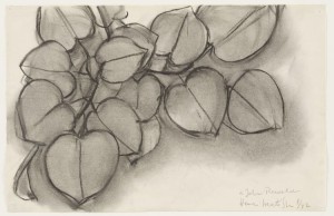 Above: Henri Matisse “Branch of a Judas Tree”, 1942, charcoal on paper, 25.2×39.4cm
Writing in 1947 about some fig leaves that he was drawing, Matisse described how he was searching for the qualities that made them “almost unmistakably fig leaves”. He did not want to record exact copies of particular leaves, complete with their idiosyncratic folds and imperfections. Instead, Matisse worked to find the “common quality” that united things despite their visible differences. He wrote of searching for an “inherent truth” about the fig leaves.
As we can see from Matisse’s drawing of another plant, the Judas Tree, above, the general shapes and spacing of the leaves, and the shapes of the gaps between them, give the plant an immediate identity.
As humans, we find it easy to identify objects by their general shape (either the shape of an outline, or by the shapes of dark or light tones):
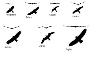
Above: Various types of birds of prey, quickly identifiable by their general shape
Thing-ness, identity and emotion
Though each differs from the next, all of the above bird silhouettes have a recognizable bird-identity. What is it that makes all of these shapes so recognisably bird-like; what gives them all a quality of “bird-ness”? It is the general shape, and the relative proportions of head, out-stretched wings and tail.
If we so wished, we could create a new imaginary bird silhouette that was still recognisably bird-like, without having been copied from any existing bird species.
When playing around with new bird-like shapes, when do our drawings lose the quality of bird-ness, i.e. when can they no longer be “read” or “understood” as birds? Feel free to experiment with this yourself.
The quality of “thing-ness” can produce a strong emotional response. Imagine showing a drawing of a spider to someone who is terrified of spiders. You would expect them to be upset, whichever type of spider you had drawn. Now, what if the spider drawing was distorted. Would the arachnophobic person still be repulsed by your image? How much would you need to distort the image to make it acceptable to an arachnophobe? Would it be sufficient simply to make the legs of the spider extremely short, or to make its body very long, or to give it a different number of legs? To someone who has a great terror of spiders, you may need to distort the image considerably before it loses its quality of “spider-ness” for them.
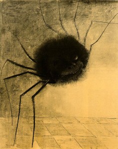
Above: Odille Redon “The Smiling Spider”, 1891
The Platonic Ideal
This discussion of things and identity brings me to Plato’s ideas. He talked of the Ideal of a given form, which was the embodiment of all the particular examples of that form.
In order to see or imagine such an ideal form, one needs a reasoning mind. Here is an extract from “The Journal of Speculative Philosophy” Volume 4 , by William Torrey Harris, 1870:
“When Plato spoke of the goblet-ness and table-ness, Diogenes the cynic said, “I see indeed the table and the goblet, but not the table-ness nor the goblet-ness”.
“Right” answered Plato; “For though you have eyes which serve to see the table and the goblet, yet the wherewith to see the table-ness and goblet-ness, i.e. Reason, you have not”.”
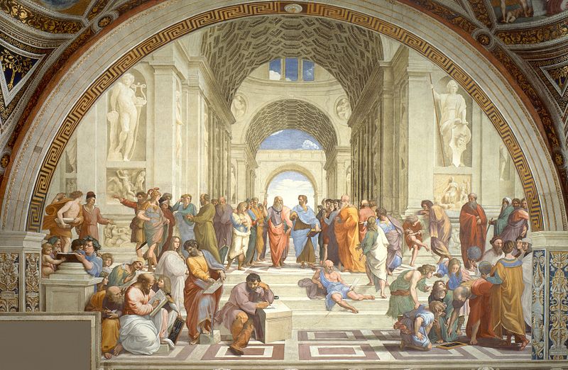
Above: Raphael “School of Athens” , fresco, Diogenes is lying on the steps, and Plato is standing in front of the central open archway, wearing red and purple robes.
The perfect Platonic Ideal Form might be something that no human has ever come across. For example,
“No one has ever seen a perfect circle, nor a perfectly straight line, yet everyone knows what a circle and a straight line are”. (based on Plato’s “Cratylus”, paragraph 389)
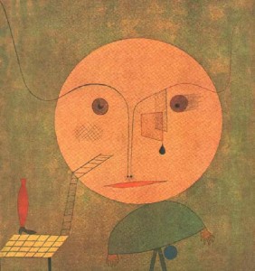
Above: Paul Klee “Error on Green”, 1930
How might the Platonic Ideal be applied to drawing and painting?
Artists have long intended to create images representing the perfect example of an object, being or landscape. They might go out with sketching tools in order to record the many random quirks of nature, but the final picture tends to be a long-considered ideal image. The artist collates all his or her previous observations in order to make a final enduring image.
When I talk here about the “ideal” image, I do not necessarily mean one that is the most beautiful or pleasing. It may rather be the image that best sums up the appearance of a stormy sky, or the character of a complicated individual.
John Constable gave lectures on landscape painting at the Royal Institute in 1836, and this is what he had to say about condensing information into an ideal image:
“…the whole beauty and grandeur of Art consists…in being able to get above all singular forms, local customs, particularities of every kind…
[the painter] makes out an abstract idea of their forms more perfect than any one original”
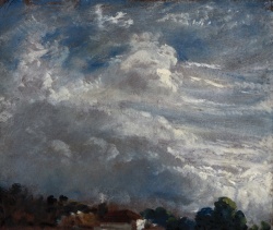
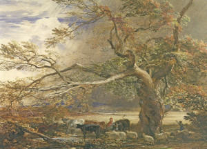
Above: John Constable “Cloud study, horizon of trees”, oil on board, 1821. Though he was a great observer of landscape detail and weather change, Constable strove to create a perfect final image that summarised and surpassed all of this.
How do we recognise objects?
The human brain performs an amazing feat when it identifies an object. We take the complexity of this task for granted. Take, for example, our ability to recognise a pencil as a pencil, at first glance and without thinking about it. The pencil could be under any type of lighting conditions, and could be in any position. It could be any type of pencil. The possibilities are endless. In addition to this, our heads tend to be moving all the time as we go about our daily lives, so our eyes’ view of the pencil would be moving and fleeting, rather than a fixed frame like a photographic image.

In his fascinating paper, “Art and The Brain”, published in Daedalus in 1998, the neurobiologist Semir Zeki proposed that we have a kind of Platonic Ideal of each object in our mind “such that a single view of an object makes it possible for the brain to categorize that object”. He suggests that this Ideal image would be developed from the brain’s stored memory record of all the views of all the objects that it has seen. Considering the Platonic system, Zeki writes that “there can be no Ideals without the brain”. So the brain is of great importance here.
Which part of the brain is most involved in object recognition? According to Zeki, it is a region known as the inferior convolution of the temporal lobes that somehow processes stored memory records of all previously-seen objects.
The purpose of art and the “Ideal” or quintessential image
We look at real-life objects in many situations and remember numerous images of them. In addition, we can add to our brain’s stored memory record by looking at pictures. Art helps curious people to learn about the world, and pictures that portray a quintessential, or Ideal image have a special function here.
According to Zeki (Inner Vision 50-51), art, like the brain, seeks:
“to represent the constant, lasting, essential and
enduring features of objects, surfaces, faces, situations, and so on, and thus
allow us to acquire knowledge, not only about the particular object, or face,
or condition represented on the canvas but to generalise from that to many
other objects and thus acquire knowledge about a wide category of objects or faces”.
The art of simplification
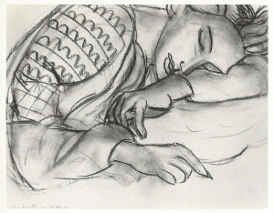 Above: Henri Matisse “Young woman sleeping in a Rumanian blouse”, 1939, charcoal on paper, 37x47cm
Referring to the process of drawing a clothed figure, Matisse said:
“The fabric of the blouse has a unique character. I want to express, at one and the same time, what is typical and what is individual, a quintessence of all I see and feel before a subject.”
How should artists go about achieving this “quintessence”?
For many, simplification is key.
For example, many of Eugene Delacroix’s journal entries discuss the importance of suppressing detail. Here is an extract from 23 April 1854 in which he discusses the way in which an artist keeps the first pure expression throughout the execution of his work:
“can a mediocre artist, wholly occupied with questions of technique, ever achieve this result by means of a highly skilful handling of details which obscure the idea instead of bringing it to light.”
Matisse himself is known to have worked over many of his drawings repeatedly, not adding and over-working the image, but erasing and replacing marks until he was satisfied that he had placed each curve and line optimally.
Here Matisse describes his simplification process when drawing lace:
“You see here a whole series of drawings I did after a single detail: the lace collar around the young woman’s neck. The first ones are meticulously rendered, each network, almost each thread, then I simplified more and more; in this last one, where I so to speak know the lace off by heart, I use only a few rapid strokes to make it look like an ornament, an arabesque without losing its character of being lace and this particular lace. And at the same time it still is a Matisse, isn’t it?
I like Matisse’s emphasis on drawing studies until he “knows the lace off by heart”, i.e. has a deep understanding of it. In fact, once the stage of knowing the object off “by heart” is reached, the artist is capable of making a simple drawing from memory. In conveying the essence of an object, memory is of the utmost importance. But I shall come back to this point in a future article.
| Tags: blog, Delacroix, essence, essence of an object, Ideal, Matisse, Plato, Zeki | More: Blog
The essence of an object
August 26, 2013
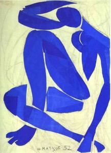
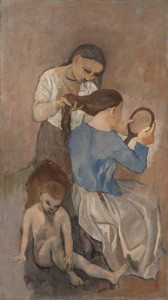
Above: Henri Matisse “Blue Nude”, gouache and collage, 1952
Here is a phrase that I often come across: “Convey the essence of the object (or figure, landscape, etc.)”. These words are repeated in books, art classes and demonstrations. Is this just meaningless “art-speak”? I have been wondering… What on earth is an object’s essence, and how can an artist set about conveying it?
With my background in both science and art, I have been happy to seek more information. I’ve been looking at writings of neuroscientists such as Semir Zeki as well as those of artists including Delacroix, Matisse and Hockney. Looked at from multiple viewpoints, the subject is fascinating, and I’ll share my ideas with you here in this and some future blog posts.
A response to the French Impressionists
Let’s start by remembering the French Impressionists of the late 19th century. They aimed to depict a fleeting visual impression of the scene before their eyes. Each Impressionist picture conveys the play of light across the scene as it was observed by the artist.
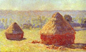
Above: Claude Monet “Haystack, End of the Summer Morning”, oil on canvas, 1891. Monet was very aware of the fact that objects look completely different under natural light at different times of day and in different months of the year.
Though, more than a century later, Impressionism has an enduring appeal, the movement was not without its critics. The Impressionist painters were virtuosic at painting the effect of light on the surface of objects, landscapes and figures, but did their pictures convey much more than a superficial effect? Take, for example, what Henri Matisse had to say about Impressionist painting in “Notes of a Painter”(1908):
“A rapid rendering of a landscape represents only one moment of its existence. I prefer, by insisting on its essential character, to risk losing charm in order to obtain greater stability”.
and
“Under this succession of moments which constitutes the superficial existence of beings and things and which is constantly modifying and transforming them, one can search for a truer, more essential character, which the artist will seize so that he may give to reality a more lasting interpretation.
Can a painting robot convey the “essence” of something or someone?
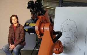
Above: A drawing robot created at Robotlab at the Centre for Art and Media. Though this is technologically amazing, I doubt that robots could ever convey the artistic “essence” of an object or being.
A robot with a camera eye could convey a visual “snapshot” of a scene. While the robot may create a realistic image (perhaps with sophisticated paint-brush technology on canvas), that robot is not an artist. How can a human artist be better than a robot at conveying the essence of an object?
This is debatable as there is no single correct answer (do use the “comments” box below if you wish to add your knowledge or opinion).
Unlike the robot, the artist’s aim is to record the physical and emotional experience of looking at the object. All of us humans are capable of experience, emotion and thought, and this puts us ahead of any robot (however photo-realistic the work of that robot may be).
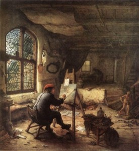
Above: Ostade van Adriaen “The Artist in his Studio”, 1663, oil on wood, 38x33cm. The artist looks, considers, remembers and paints.
Some factors to consider when attempting to convey the “essence” of an object or being
In responding to the object in paint, the artist is free to emphasise, exaggerate or omit elements of the scene.
When aiming to convey the essence of an object, the artist may wish to consider some or all of the following:
- Their own emotional response to the object
- The appearance of the object from different viewpoints
- The physical relationship between the object and its surroundings
- Shapes, angles, directions and proportions that make the object recognisable. (and that trigger the memory of its identity)
- The effect of time passing (changing light, movement, etc.)
- Past memories and cultural references relating to the object
(Would you add anything to the above list? If so, please join the discussion by writing in the comments box at the bottom of this page).
It is up to the individual artist as to how far they wish to go with such exaggerations or omissions. The freedom to experiment with emphasising or suppressing these elements is exciting, as it creates an array of possibilities, from visual realism to many forms of abstraction.
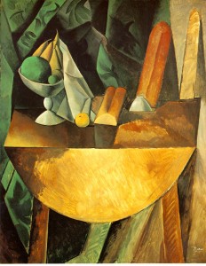
Above: Pablo Picasso “Bread and Fruit Dish on a Table”, 1909
Do these ideas necessarily lead to abstraction?
If we emphasise, exaggerate or omit beyond a certain point, then the picture may end up looking very different to the object. Is this a problem? Opinions differ, but many believe that is necessary to depart from visual realism in order to convey sufficient meaning. For example, Jacque Rivière, the cubist art critic, wrote in 1912 (Present tendencies in painting, Revue d’Europe et d’Amerique) of how the essence of an object should not resemble its appearance:
“The true purpose of a painting is to represent objects as they really are; that is to say, differently from the way we see them. It always tends to give us their sensible essence, their presence, this is why the image it forms does not resemble its appearance.”
On the other hand, artists such as Rembrandt have found ways to make their work meaningful while still retaining a great sense of realism. For example, in each of Rembrandt’s portraits and figure studies, the sitter is portrayed as a personality with a complex character. Rembrandt mastered the use of exaggeration, emphasis and omission but, instead of resorting to abstraction, he achieved these effects by the use of controlled composition, lighting and varied brush-strokes:
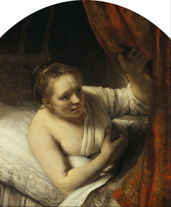
Above: Rembrandt van Rijn “A Woman in Bed”, c.1645-6, oils
Comments (1) | Tags: essence of object, Matisse, Rembrandt | More: Blog
Holiday Sketchbook: Rome and Santa Marinella
July 12, 2013
Above: Santa Marinella beach, near Rome
Our recent family holiday in Italy was a good mixture of sightseeing, exploration, eating out, beach time and relaxing together. I continued to draw and sketch, aiming to make the images as varied as the holiday itself. Here are some pages from these sketchbooks:
Santa Marinella
 Above: Holiday roof terrace
Above: Santa Marinella beach seems to be a popular place to meet friends and family.
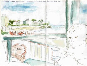
Above: Sitting inside the restaurant at Santa Marinella beach, there is a view of sand stretching into the distance.
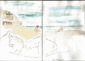
Above: Just out of season, the beach is quite empty and perfect for family relaxation
Travelling to Rome
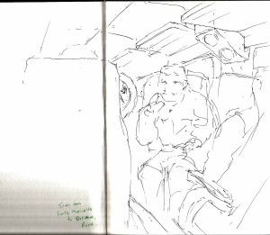
Above: Inside the train carriage, travelling from Santa Marinella to Rome. The journey takes about one hour.
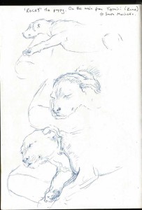
Above: A puppy on the train
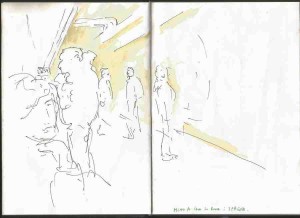
Above: The platform of a Rome Metro station. The system has a similar feel to the London Underground, with people going about their daily business and gazing past one another.
Days spent in Rome
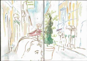
Lunch with my daughter at a street café
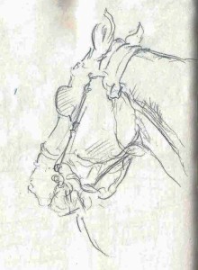 Above: A carriage horse waiting next to the Trevi fountains
Above: The ancient Greek marble “Lion attacking a Horse” on display in the Capitoline museum, Rome
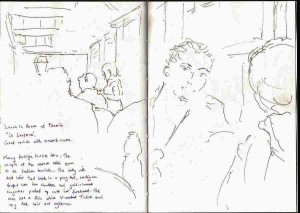
Above: People-watching in Rome
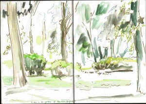
Above: We strolled through an informal part of the gardens of the Villa Borghese
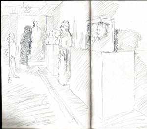
Above: Beautifully-lit statues on display at the Centrale Montemartini museum. This is my favourite museum so far, an old thermoelectric centre with ancient marble shown alongside the engines. It is away from the busy tourist route, a short walk from Garbatella Metro station.
Nature notes
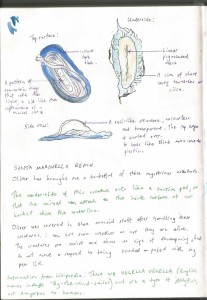
Above: “By-the-wind-sailors”, harmless jellyfish-type creatures found washed up on the beach at Santa Marinella
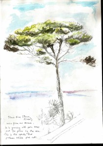
Above: Does this tree remind you of Mediterranean holidays? It is a stone pine, here seen close to the sea-front at Santa Marinella
Tarquinia
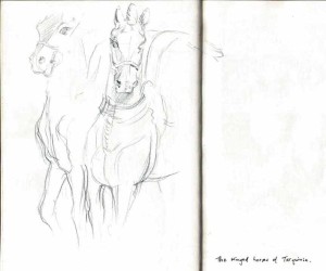
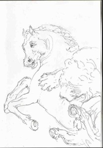
Above: This pair of Etruscan winged horses really captured my imagination. They are on display on the top floor of the Vitelleschi palace in the beautiful old town of Tarquinia.
Comments (1) | Tags: beach, sketchbook, sketches, travel journal | More: Blog, Sketches
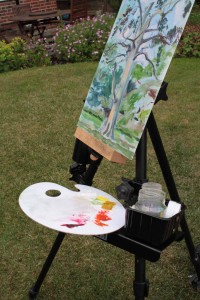
Easel perfection
June 27, 2013
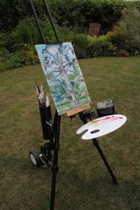
Above: A David Potter portable easel with my own personalised storage attachments
Portable Easel
Do you love to paint outdoors, but hate the hassle of getting all the equipment organised? Perhaps, like me, you need the freedom to paint wherever you choose, and the ability to move to a fresh viewpoint whenever you feel like it? In the British summer, it is of course a good idea to be so mobile that you can get under cover quickly when rain gets too heavy.
With a standard wooden sketching easel, I have endured embarrassing situations in which the opening up of my easel has been the “main show” for passers-by, and I have then had to hold the structure steady with one hand while painting with the other. But this summer, I have a system that works at long last….
Pictured above is my new portable sketching easel from David Potter. I like it for its stability, and for the ease with which it can be opened up and folded away. Telescopic legs are secured with easy open-shut clips, and there is a neat single knob to secure the angles of the legs and of the canvas support. So far, I have not got too exasperated or needed pliers.
For further details about this easel, check out the David Potter website. Ordering seems to go most smoothly if you contact the company directly by phone. I’ll warn you that this easel is more expensive than many others on the market, though it does a far better job. Thank you, lovely family, for getting me this for my last birthday.
Brush holder
There are small and large wooden shelves available for this David Potter easel. However, I personally failed to get on with the design of these, finding them rather unwieldy. As I like to move frequently from one painting location to another, I really need accessories that can remain attached to the easel when it is folded and then opened up again.
I was very proud to discover this brush holder, which is in fact a drumstick holder designed for musicians:
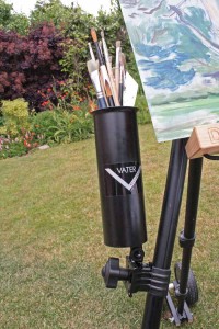
Above: Vater multiple drumstick holder, here shown clamped to my David Potter easel.
This is a good size for most brushes and palette knives, and it clamps on really securely to the leg of the easel. I can certainly leave this brush holder clamped in place when I pack away at the end of the session, and I even leave the brushes in there when I wheel my easel. Click on the product image below for further details:
Palette shelf
Yes, I know… I could get a beautiful wooden pochade box for oil painting outdoors. However, I’m very attached to my white plastic palette as it is easy to wipe clean, light to carry and because I can see the colours so clearly. Sometimes I hold my palette with my left hand while painting with my right, but I like to have the option of putting it down at times.
Too often, I used to find myself putting the loaded palette down on the ground while I worked, and then nearly standing in my own paint!
This week, my brilliant solution involves a metal clamp-on shelf and a set of small magnets. I have found a black, rectangular clamp-on metal “gig tray”:
Here is the same tray in use on the easel:
Above: Kinsmore gig tray used as a shelf . Here it is shown clamped upside-down to my David Potter easel, supporting a palette and plastic box that have magnets glued to their undersides.
The Kinsmore tray attaches very firmly to the leg of the easel. But I wanted to have my palette, etc., rest securely on the shelf even in high winds and even when the angle of the easel legs causes the shelf to slope. My solution was to superglue several tiny molybdenium magnetic discs to the underside of my palette. The magnets secure my palette to the shelf very reliably, but I can still pick the palette up with an easy flourish when I feel like painting with it in my left hand.
As part of the easel itself is also metallic, I can attach the palette securely like so when the easel is folded up:
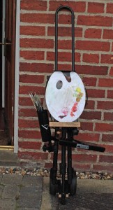
Above: Oil palette attached with magnetic fixings to my easel ready for transport.
It is safe to stow the palette like this even when wheeling the folded easel through the park, though I do wrap cling-film over exposed paint just in case of accident.
Multimedia use of easel
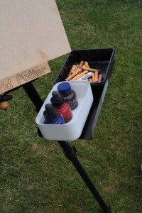
Above: Black, metallic Kinsmore gig tray supporting boxes of art materials. These boxes have magnets super-glued to their undersides.
I tend to accumulate little plastic boxes and trays in the art room, often those that used to contain food. As shown above, these are perfect for carrying all kinds of art materials. I have attached little magnets to their bases to hold them secure on the metal tray. Notice how I’ve chosen to turn the metal Kinsmore tray the “right” way up this time.
For water-soluble media, I have ordered a cup-holder that should clamp onto the easel leg and hold a water jar. On other occasions, I could use this to hold a pot of pencils or pens (the brush-holder is a little too deep for most of these) or of course a cup of coffee. For further details, click on the picture link below:
Wheels
The wheels were ordered from David Potter along with the easel. If you are not built for heavy lifting then I definitely recommend them. They were rather fiddly to attach onto the easel in the first place but are now a permanent fixture, folding back while the easel is in use.
I have been out with the accessorised easel a few times, and it seems okay to wheel it with all my personalised attachments clamped in place and with the palette attached magnetically to the vertical bars. Paint tubes, little screw-top containers of paint medium, a tiny folding tripod stool and boxes of other art materials come along in a separate rucksack.
Magnets
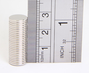 Above: Neodymium magnets. These were used to attach the palette and storage boxes to my metal shelf.
I recommend using neodymium magnets as they are particularly strong. Mine came, promptly and well-packaged, from an eBay store called Guy’s Magnets.
The next step was to glue the magnets to the underside of my palette and art storage boxes. I used Araldite superglue. It is a fiddly business. Plan exactly where each magnet should go before you start, indicating with marker pen if necessary. Before mixing up the glue, check which way up the magnets should go. You want the un-glued side to be attracted to the metal on the easel, not repelled by it!
Some precautions to take when using strong magnets:
Do take care with strong magnets. As far as I am aware, you should not get too close to them if you have a pace-maker. They could also damage some electronic equipment such as ipods if stored too close. And it is definitely a bad idea to swallow them.
Any other ideas?
If you are interested in personalising your own easel, then I suggest browsing online for accessories that clamp onto pushchairs, wheelchairs and music stands Do share any further ideas for personalising an easel by adding to “comments”, below. How about a light fixing? Or a parasol holder!?
Comments (4) | Tags: easels, shopping, working outdoors | More: Blog
Perspective and emotion (3): Our place in the world
June 08, 2013
Above: Samuel Palmer “Sheltering from the storm”, 1846, watercolour and gouache
Notice how often we use the term “perspective” in the English language when trying to convey our feelings. Take some examples:
“Try to see this problem from my perspective“, i.e. “from my point of view”
“A complete change of perspective“, meaning a change of opinion
“I know that things seem difficult, but let’s keep this in perspective“, i.e. let’s look at this rationally; let’s not be overwhelmed by its importance.
Just as we use the word “perspective” when talking about issues that are meaningful to us, so we can use techniques of perspective to add emotional meaning to pictures. As artists, we have the choice to emphasise or distort the vastness of a landscape, the nearness of a figure, the slope of a hill and so on.
Don’t be put off by the technical aspects of perspective…Read on and be inspired.
Our place in the world
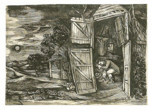
Above: John Minton “Young man asleep in a barn”, pen and ink wash, 1946
One of the greatest subjects in art is “Our place in the world”. As individuals or as a group, where do we “belong”? How do we relate to the landscape around us?
What do I mean be “where do we belong?” Taken most simply and literally, this could just refer to where we are on the planet in the physical sense. This in itself is a fascinating subject and can generate plenty of discussion… For example, why do people congregate in great numbers in some places and not in others?
Thinking more laterally about the question, “our place in the world?”, could lead to further discussion. What is “home” to each one of us and to our communities? What is our importance in the world? Much of our natural environment is currently at risk of destruction – how do we relate to this, as carers or as passive onlookers?
We could also consider the effects of time. This place where we now stand – will it still exist long into the future? What was here many years ago?
A basic diagram can show where a figure stands on the planet. An interesting piece of artwork can go much further than this, perhaps leading us to think about other aspects of that person’s “place in the world”.
For example, take a look at John Minton’s pen and ink drawing, above. It is prosaically titled “Young man asleep in a barn”, but it has a thought-provoking, even spiritual feel. The man appears safe and comfortable in an intimate space. The barn doors are angled in such a way that we, the viewers, are visually led into the building. Looking at this picture, I feel as if I am being invited to imagine myself in the place of the resting figure.
Outside the barn, fields and sky stretch out into the distance. This drawing gives a clear sense of a “here” and a “there”. The figure should perhaps feel vulnerable sleeping “rough” with the doors wide open to that unending landscape, and yet this image has an atmosphere of peace and protection. Was Minton suggesting the presence of a kind, protective god in drawing that atmospheric landscape around the barn (notice how the shape and tone of the moon echo those of the man’s face, as if they are somehow in sympathy with one another here)?
From the technical point of view, notice how Minton has used linear perspective to give his image spatial depth. There is a path that narrows into the distance, and the barn is drawn at an angle so that its edges lead us into the picture. The simple device of drawing objects smaller in the distance is also used here to good effect, e.g. in the rendering of trees.
Scale and a sense of wonder
Think how tiny a person is compared with a vast landscape, whether a mountain range or a great plain. A great expanse of visible land compared with us, the little figures, can be awe-inspiring.
You do not need to explore distant lands to experience this. Just look up – the great dome of the sky physically dwarfs each one of us.
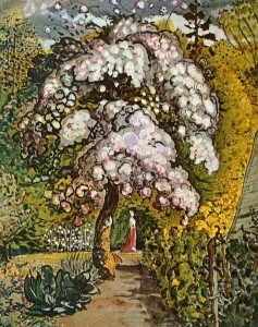
Above: Samuel Palmer (1805-1881) “Garden in Shoreham”, watercolour and gouache
The English artist, Samuel Palmer, imbued his landscapes with a sense of wonder and is often described as a “visionary” artist. He did travel to Italy and paint both towering trees and awe-inspiring views from mountain sides. To Palmer, the leafy countryside back home in Shoreham was also full of wonder and he shared this experience with us in his landscape paintings. He is perhaps best-known for his intense monochrome images of sheep, rolling countryside, villagers and churches in the dusk.
In his painting of a Shoreham garden, above, Palmer shares with us the joy of seeing a tree in full blossom. Whether a miracle of God or of nature, this is a precious sight to behold. Palmer has added an elegant figure to this painting, tiny because she is distant. Despite the beauty of the figure, our eyes are always drawn back to the incredible tree in front of her. We are used to seeing paintings of elegant women with a pretty garden backdrop but, in emphasising the size and exuberance of this tree, what is Palmer suggesting about the importance of the natural world?
The artist’s viewpoint
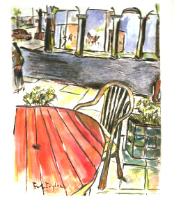
Above: Bob Dylan “Sidewalk Café”, 2007, mixed media on paper
Above and below are two images from a series by Bob Dylan in which he shares something of his experience of looking at the world about him. He developed these from his own sketchbook drawings.
What is it like to be a great singer-songwriter, celebrated wherever you perform? In these images, Bob Dylan mostly shares rather mundane experiences of travel and of waiting, to which we can all relate.
From the use of perspective in these pictures, we can tell where Dylan was sitting as he drew in his sketchbook and now, we, the viewers, are invited to imagine ourselves in such a place. Notice how he uses any lines that he can see (pavement tiles, paths, wooden slats on a table, etc.) to emphasise the effect of linear perspective.
For the café image, above, Dylan must have been sitting at the round table facing the road, perhaps leaning back in his seat. It is a thought-provoking image. I can empathise with the experience of sitting contentedly at a table, gazing curiously at the world around me. But, with the empty chair and table, could this also be understood as a sad picture, a lonely stop at a café?
Bob Dylan’s use of linear perspective always makes perfect sense to me (I can understand where he was sitting or standing as he drew) but is not always mathematically correct or consistent. This is fine by me. In real life, we do not see the world from a completely fixed viewpoint like a camera on a tripod. We naturally move our eyes and head almost continuously, and see different parts of the image from slightly different viewpoints. For example, if sitting at a café table, it is difficult to focus our eyes simultaneously on the table top and on the shop across the street. We are aware of the existence of both the table and the shop, but would tend to move our gaze down to look at the table because it is so close by.
Another reason for allowing perspective to be distorted is to help give the impression of moving past the object. Below, for example, is an imposing house as seen from the road. Even if the artist has stopped for a while to draw this house, the resulting picture suggests a view from a moving car, perhaps a meaningful landmark on a well-travelled route.
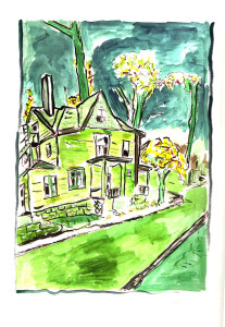
Above: Bob Dylan “House on Union Street”, 2007, mixed media on paper
Some practical ideas
Starting out with perspective:
If you are not yet familiar with basic perspective techniques, then I recommend spending time learning these from a book, teacher or website before you go any further. A quick search online has brought up quite a few websites in which the techniques of perspective are explained, in some places more clearly than others.
For a clear, practical overview of one-point perspective, try this link: http://www.instructables.com/id/How-to-Draw—Basic-Linear-Perspective/
If you are not afraid of long words, try clicking here for a more in-depth explanation. And if you can recommend a book or website that you have found to be a great resource in learning perspective techniques, then please do contact me so that I can add the link to this page.
Gaining an intuitive feel for perspective:
When drawing in your sketchbook, don’t just record objects surrounded by blank space (a face, your dog, a bowl of fruit, etc.), but add in a few background lines. If drawing a pet or a pair of shoes on the floor, do mark in the edge of that floor, and perhaps add in a few lines of floor tiles if they are present. If sketching people, a very few lines to suggest a table edge, door edge, floor edge, etc., can make sense of where those people are in relation to you.
If confused about which way to angle the background lines, always remember that horizontal lines that are at your own eye level will be horizontal on your page, and that lines below this will angle up towards a vanishing point, while lines above the eye level should tilt down. You can also check angles now and again by holding up a straight edge .
Linking perspective and emotion
As you get more confident at drawing things in three-dimensions, start to be bolder in what you include in your sketchbook. In daily life, do you come across situations in which size or scale surprise you? Have a go at drawing any of these. Some examples:
A fully-grown tree next to a house. You might position yourself at an angle to the building, so that its straight edges slope away from you in the drawing. Which is more massive, the tree or the building?
A railway platform with one or more people on it. How big is a person compared with the available space? Look along the platform for a clear view of receding tracks and edges.
A statue in a public space. How massive is the sculpture, life-size or bigger? Is it above or below your eye level? Mark in a few basic lines before you spend time drawing the statue itself, and do include something of its plinth. If people walk in and out of view, you might want to sketch a figure in lightly, at least to show how tall a person is compared with the statue itself.
A tiny child on a chair.
Gravestones within their setting. Are they positioned in regular rows, or is each memorial an individual?
Museum exhibits (anything from taxidermy to ancient relics) next to one another in their current setting. What is the reaction of other visitors to these objects? Is it possible to fit a figure or part of a figure into your drawing, perhaps gazing at your object of interest?
| Tags: blog, Bob Dylan, perspective, Samuel Palmer | More: Blog
Perspective and Emotion (2): The space around an object
May 12, 2013
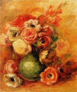
Above: Auguste Renoir flower painting, oils, 1901
An object in a painting can seem to have such a physical presence that I am stopped in my tracks. Whether a vase of flowers or a pair of shoes, the image may insist that it really is there, a solid presence in its own space.
In this second article about using perspective to increase the emotional “punch” of an image, I’ll suggest how to understand three-dimensional space to give your still life a sense of solidity and depth.
To me, this clear sense of space/ depth in a picture can have an even more startling effect if other aspects of the image, such as the colour, stray far from reality. Take, for example, the vase of flowers by Renoir (above). The three-dimensional quality of the flowers, vase, and surrounding space are so convincing that they seem to scream “REAL!” at me, while the luscious visible brushstrokes and warm colour-scheme do not strive for a trompe l’oeil effect and shout “IMAGINARY”. Such an approach, teetering on the boundary between strong illusion and a dream-like image, makes the painting especially thought-provoking.
Creating a sense of space around your object

Above: Cezanne “Study for l’autopsie”, c.1867-9, charcoal, 31x48cm
So this is an article about still life, and here I am using a figure drawing as illustration! I chose this image as it beautifully demonstrates how to fit a body or object into a convincing space.
Cezanne was always fascinated by the whole business of how objects “fit” next to one another and within space. He is of course well-known for his brightly-coloured still life paintings that in some ways used traditional perspective, and in others broke many rules, but nevertheless appeared convincing as objects in space. Cezanne had this ability to play around with three-dimensional space, but this skill was grounded in a good understanding of perspective.
The first point to note is that a preparatory drawing from life can be very useful in understanding how an object fits into its surroundings. This holds true whether you are drawing a complex figure or a simple vase.
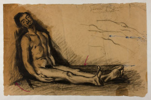
Above: Cezanne “Study for l’autopsie”. My red arrows point to Cezanne’s floor edges.
One interesting thing about Cezanne’s figure is the way in which it is slumped against a corner. In this study, Cezanne has included the edges of the floor as clear lines (indicated by my red arrows, above) to indicate the position of the walls around the figure. The artist may or may not opt to include such edge lines in the finished painting, but look how they clarify the sense of space in the preparatory drawing.
Putting this into practice with a simple still life subject
When drawing a typical still life of flowers, fruit or other objects, two or more edges of the supporting table are often visible. There may also be edges of a wall or window-frame behind your object(s). Try including some of these edges as lines in your preparatory study to help understand the space around your still life.
Notice how edges of floor, skirting board, tables, etc., need to be angled compared with the edges of your drawing paper. Take a little time to get these angles so that you are happy with them – they are the fundamental structure of your picture.
Some tips on getting sloping lines “right”:
If, in real life, horizontal lines are just as high off the ground as your own eyes, then they should be horizontal in your picture.
If horizontal lines are higher or lower than your eyes, then they’ll need to slope (unless the line is just directly in front of you).
To estimate the slope of a line, you can hold your pencil up in front of it. Follow this link for a demonstration.
If, like me, you are not mathematically-minded, you may wish to assess slopes in terms of time on a clock instead of numbered angles. I explain that more fully in the link.
Positioning the figure or still life object within your picture:
Take care to position your object relative to other parts of your picture. In Cezanne’s autopsy study, notice how moving the image of the body slightly to the right, to the left or up or down on the piece of paper, would suggest that the figure is nearer or further from the edges of the floor. The positioning of it the figure is clearly important.
In Cezanne’s drawing, there are negative spaces between the floor edge and the edge of the man’s leg. If you are unsure where to position a figure or object, it can be easier to draw these negative spaces than to do a lot of measuring.
If your still life object has straight edges then you can judge the slope of these as described in the section above. For an object as complicated as the human figure, you may need to imagine some straight lines and judge how these would slope. For example, there is a line (a groove between muscles) that runs vertically down the front of the man’s torso, and this tips as his torso tips. Drawing figures in three dimensions takes plenty of practice, so stick at it!
Using directional marks when drawing, to give a sense of space
![]()
Above: Cezanne “Study for l’autopsie”. My navy arrows point to regions of hatching that suggest solid surfaces. My green arrows point to areas of inky black shadow.
In Cezanne’s drawing, above, the body appears to be touching three surfaces: The floor, a vertical wall by his left shoulder, and a near-vertical surface behind him. On closer inspection, the structure behind him is not a flat wall as it is slightly irregular and stops level with his head. It could be a draped low cupboard in the studio.
Creating a preparatory drawing with the body positioned between these three surfaces provides enough information to develop this into an interesting painting, perhaps with the surfaces reimagined as outdoor ground and rocks. How does Cezanne get structural information into this preparatory drawing?
Notice how Cezanne has hatched (shaded) the three surfaces with directional marks. There are navy arrows pointing to these areas of hatching in the picture above. Parallel hatched lines can be used to suggest a flat surface, e.g. the wall that touches the figure’s left shoulder.
Using directional marks when painting
Painting with bold, visible brush-strokes, can help to create a sense of structure in your picture. Brush marks can be used in a similar way to pencil or charcoal hatching lines, to suggest the structure of a surface. The paint marks may be subtle and softly slurred or scrubbed into one another or, as in the Van Gogh still life, below, they could be discrete and contrasting in colour.
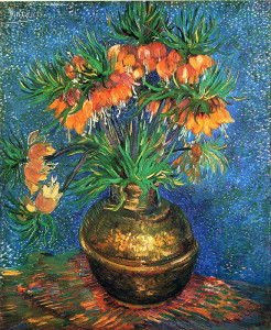
Above: “Fritillaries in a copper vase” by Vincent van Gogh, 1887
Van Gogh has used brush strokes to suggest the flat surface of the table or mat on which the vase is standing. See how these marks (indicated by my yellow arrows, below) angle into the picture due to the effect of linear perspective.
Notice how, in Van Gogh’s painting, the edge of the table is unclear or absent, and the space behind the flowers is a sparkly, blue void. These and other aspects of the picture are dream-like, but the vase is securely “grounded” on its supporting surface in three dimensions.
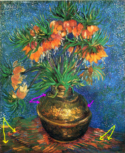
Above: “Fritillaries in a copper vase” by Vincent van Gogh, 1887, my arrows point towards some of Van Gogh’s directional brush-strokes. Click on the image for an enlarged view.
Painting or drawing rounded objects
Many still life images contain simple rounded objects such as a vase or dish. Look closely at how the edges of the round object seem to curve . If you are looking down on an object (like van Gogh’s vase), it’s near edges will seem to curve in the direction of a smile. Make this effect clear in your picture and the object will appear more three-dimensional. In the image below, my green arrows point towards the decorative band around the vase. Look how van Gogh emphasised this with strong marks and tonal contrast. The curvature of this band helps to make the vase appear more rounded.

Using tone when working in three dimensions
If light angles across your still-life set-up, part of it will be illuminated and part in shadow. There may also be shadows cast by your object(s).
The shapes of any patches of light and shade will help to explain the structure of your still life. For example, look at the bright highlights on the vases in both van Gogh’s and Renoir’s flower pictures (Renoir’s image is up at the top of this article). These highlights help to make the vases look more rounded.
Shadows cast by an object can really help to explain where that object is positioned within the picture. For example, look again at the inky black shadows in Cezanne’s “l’autopsie” study, (indicated by green arrows, below). They emphasise where the figure contacts the floor and how close he is to the vertical supporting surfaces on either side of him:
![]()
Above: Cezanne “Study for l’autopsie”. My navy arrows point to regions of hatching that suggest solid surfaces. My green arrows point to areas of inky black shadow.
Cast shadows do follow the rules of linear perspective, but usually it is sufficient just to mark in their abstract shapes instead of doing elaborate measuring.
Putting all the ideas together to achieve a sense of space in your still life
To sum up, there are several tricks used to help create a sense of space within a still life image:
- Emphasise edges of objects that angle away from the viewer into the picture.
- Include some edges of floor, wall, table , window-frame, etc. within your picture to give a sense of space and scale.
- Clear tonal modelling of objects and of the surfaces around them.
- Directional marks on objects and on background surfaces (i.e. draw hatched lines, or paint with visible brush strokes).
- Accurate rendering of shadows cast by the still life objects, paying attention to their shape and direction.
- Emphasise curved edges of rounded objects.
- Bold contrasts of colour and tone in foreground, compared with less contrast further back in the picture.
You might or might not choose to use all of the above at once. It is of course possible to ignore some of these techniques but, in so doing, it is a good idea to make good use of others from the list.
For example, an attempt at photographic illusion may avoid visible brush-strokes, but would then benefit from excellent tonal modelling and from the emphasis of edges that angle into the picture, as in the Spanish still life, below:
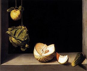
Above: “Quince, cabbage, melon and cucumber”, 1602, by Juan Sánchez Cotán
In contrast, Vincent van Gogh chose a different approach in his painting of pears heaped on a swathe of fabric, below. The artist has here opted not to paint the edges of the table. So we are left with the impression of a riotous tumble of fruit. To make sense of how the fruit and fabric are positioned in space, van Gogh used directional brush strokes (on pears and fabric), strong cast shadows under the heap of pears, and bold contrasts of tone and colour in the foreground.
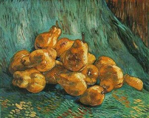
Above: “Still life with pears”, 1888, Vincent van Gogh
| Tags: blog, Cezanne, perspective, Renoir, still life, Van Gogh | More: Blog
Perspective and emotion: Spaces between people
April 25, 2013
As artists we focus on ideas and emotions, so why should we bother with perspective?
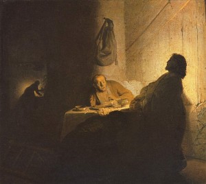
Above: Rembrandt “The Supper at Emmaus”, 1629, oil on panel.
Art ideas are full of contradictions. Here is one example that fascinates me: Art itself is primarily about emotional concepts, yet artists are expected to master the technical challenges of perspective. With its ruled lines, vanishing points and strict right or wrong answers, the mathematical side of perspective terrifies some artists. How can this very technical subject have anything to do with art and emotion?
To some, it is tempting to forget about perspective completely. One can argue that, with the assistance of photography, etc., we don’t even need much knowledge of perspective to create a realistic drawing.
I have noticed that a true understanding of perspective empowers artists to create an illusion of depth and space linked to emotion. Copying images from photos without any understanding of three-dimensional space in the original image will not produce the same effect.
The spaces between people
In our lives, distance and space are closely linked to emotion. The most obvious example is that of “personal space“. How close can someone approach you before you start to feel uncomfortable or nervous? 3 metres, 1 metre, 30cm, 6cm? The answer would vary depending on who the other person is in relation to you, whether a close family member, a friend or a complete stranger.
Where people (and indeed other mammals) are concerned, space or the lack of it is closely linked to emotion, whether that be intimidation, intimacy, loneliness or maternal love. Theories of personal space as related to culture, emotion and body language would come under the subject heading “proxemics“.
A nightmarish image can be created by cramming figures into a tight space. Henry Moore made a series of drawings inspired by his experiences in the London underground stations that served as public air raid shelters during the second world war. Below is a frightening picture in which people like you and me are packed into a tunnel receding into the distance:
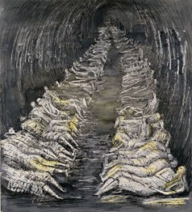
Above: Henry Moore “Figures in a Cave”, 1936, chalk, brush and wash
Notice, below, the effect of setting one figure apart from the crowd. In Moore’s drawing, one female figure sits alone. What is she thinking? How does she feel? Notice how Moore has clarified the space around her, using crayon lines to suggest brickwork, wood texture and flooring. On one side she is enclosed by walls and bench, but beyond her the tunnel and crowd recede into the distance.
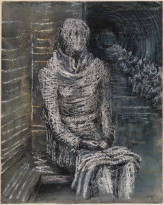
Above: Henry Moore “Woman Seated on the Underground” 1941, gouache, ink, watercolour and crayon on paper
Vincent Van Gogh is known for his emotionally-charged paintings and drawings, but it was actually an instructive book on linear perspective that really grabbed his attention in his youth. Many of Van Gogh’s most moving images have a clear sense of space, and he often used brushstrokes or pen marks to emphasise linear perspective. The drawing of peasants working, below, is one obvious example. Notice how the field’s furrows converge towards the distance. This dramatic use of perspective shows the vastness of the landscape compared with the figures, and suggests the immensity of their task. The peasants’ work is tough, without an end in sight, but Van Gogh gives the figures a sense of togetherness by showing them so close to one another within the massive field:
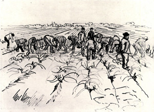
Above: Vincent Van Gogh “Farmers Working in the Field”, April 1888, Arles
Creating an illusion of depth and space
If you are keen to give your own work a sense of space, I highly recommend taking some time out to study traditional linear perspective. Even if your own images do not contain buildings or railway tracks, the knowledge gained will feed back into your work.
There are plenty of books and websites that explain the principles of perspective, so I shall not go into them here. Whichever text you go for, make sure that it is clear about eye level: “The artist’s eye level is the same as the horizon line”.
Lines that are at the same level as the artist’s eyes will appear horizontal in a picture. Lines above or below this will appear to slope.
It helps to play with perspective exercises so much that the subject starts to become “second nature” to you, i.e. intuitive.
Using perspective in your pictures
One obvious approach is to include a wall, table edge, path or other straight edge that leads into your picture. You do not need to draw the whole lot. Just hinting at a row of brickwork or suggesting top and bottom edges of a window will be sufficient.
Try positioning such straight edges so that they angle away from you and into the picture. In some cases, this can enhance the emotional impact of the image.
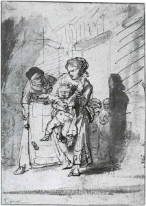
Above: Rembrandt “The Naughty Boy” c.1635, pen and bistre. Notice how the angled frontage of the building leads us to look at the struggling figures. The three main figures (the frantic child, the stressed mother and the old woman stooping towards them) are confined uncomfortably to the space delineated by the building and the shadows.
Any pattern of tiles or wooden panels or, in a landscape, lines of crops or ruts in a field, can recede into the distance. Keep your marks lively and interesting as you suggest these patterns. Straight lines need not be continuous.
Using lively marks or brush strokes, it is possible to give a sense of perspective without including any architecture in your picture. Brush strokes in both the background and the figures can be angled so that they appear to recede into the image. For ways in which colour and definition can suggest depth, read up on aerial perspective. My own article on colour and depth can be reached by clicking here.
Cezanne often tied figures to the imagined space of their surroundings by the use of colour and the handling of the paint. Around 1906, Picasso developed similar ideas in his own figure painting. The modelling in paint of the figures sometimes extends to their immediate background. Take, for example, this image of three figures, with its minimal background but strong sense of space:
Above: Pablo Picasso “La Coiffure”, 1906. Like a sculpted group, these three figures give a clear sense of how they are positioned relative to one another.
By developing these ideas further, it is even possible to give an exciting sense of “presence” to mundane objects such as shoes and pots. In my next blog post on this subject, I’ll take a closer look at remarkable still life images by Vincent Van Gogh and others. Do such images have a strong sense of space, if so then how is this created, and does this tie in with any emotional impact of these pictures?
Comments (2) | Tags: blog, figures, perspective, Picasso, Rembrandt, spaces between people, Van Gogh | More: Blog
An update
April 03, 2013
Having received a few recent enquiries about art classes, I’d better add a note of explanation to this website as to why there are no blocks of classes arranged at the moment.
The main reason is lack of time! I have always loved teaching the group sessions, but the preparation for each class, and the behind-the-scenes administration, were simply becoming too time-consuming to continue on a regular basis.
Certainly, I have had far more time and energy for my own picture-making in these past few weeks.
So, what have I been doing lately?
This is an art blog, so I’ll not include unrelated activities here.
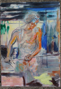
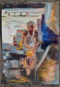
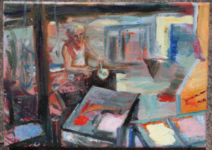
Thinking back to last year’s visit to the glassworks at Biot, near Nice, I have started a series of oil sketches, some of which are shown below. It was the combination of control, focus, and energy that amazed me about this glassworker. Throughout this creative and but highly technical process, he moved about his work-space without hesitation, rather like a dancer.
I have visited the Picasso exhibition at Somerset House. It continues until 27 May 2013, and I recommend it whole-heartedly. Related reading has since included “Picasso in Paris 1900-1907” by Marilyn McCully (this one is very relevant to the exhibition), and “Picasso’s World” by John Finlay. These books are both lavishly illustrated.
The exhibition of portraits by Manet at he Royal Academy in London has been another personal highlight.
Plus the British Museum, including the incredible current exhibition of Ice Age art.
Sketchbooks continue to be filled, as ever.
I join in with meetings at the Hertford Art Society – a welcoming group of like-minded people and an excellent source of new ideas.
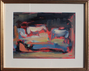
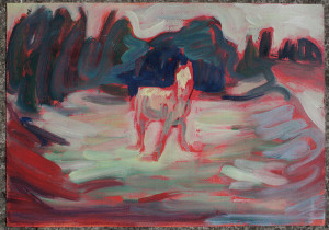
Other oil sketches have been based on last summer’s graphite drawings of horses grazing in the late evening. Above and below are two images of “Night Grazers”:
I have continued a series of paintings relating to the absence of my old dog, Freddy. Some are completed though, like Spring itself in this country, an image referring to springtime has not yet got past the idea stage.
There are also a couple of larger oil paintings that are near completion, so please watch this space.
Further ideas, including those relating to musicians, prisoners, news stories and horses (but not all in the same picture!) are currently just scribbles in a notebook. Certainly, extra time and “mind-space” (i.e. the opportunity to focus on artistic things without urgent distraction) have proved to be great for creativity.
As an artist, should one focus all energy and time on creating pieces of art?
This is debatable.
Pablo Picasso certainly thought so, and his vast artistic output was incredible for its wealth of ideas and clarity of vision. He said of himself when speaking to his lover, Françoise Gilot:
“Everybody has the same energy potential. The average person wastes his in a dozen little ways. I bring mine to bear on one thing only: my painting, and everything else is sacrificed to it – you, and everyone else, myself included.”
Many of Picasso’s images possess tremendous energy and he produced vast quantities of work. However, Gilot deserved better, and the relationship did not end well!
On the other hand, a working artist surely needs the chance to observe the world, to think a little, and to interact with other people if they are to create images that are more than superficial. Picasso did of course get out into the world, observe different situations and create images in response, whether of circus performers, prostitutes, landscapes, bull-fights or children playing. Perhaps part of his artistic genius lay in his very rapid and interesting response to whatever he observed. He maintained that focus of energy, and a minimum of thinking time was required.
Should a good artist also be a good human being and reserve enough energy and focus for their family and society? In my opinion, yes. Can anyone truly achieve this? I don’t have the answer to this but will listen to your ideas if you wish to share them in the “Comments” section, below.
In the quotation above, it is interesting that Picasso spoke of energy rather than time. I agree that increased mental energy can lead to increased artistic productivity. An increase in available time is not always as helpful as it at first seems.
Are there any future workshops planned?
As explained above, I currently have no classes arranged.
However, I do love teaching and sharing ideas. The very occasional day-course would be great to teach, so do get in touch here now or in the future if you would be interested. Good workshop subjects for a small group include anything from using lines to colour and composition to animal life drawing. Though, for the latter, some warm weather would be helpful!
| Tags: oil sketches, Picasso, workshops | More: Blog
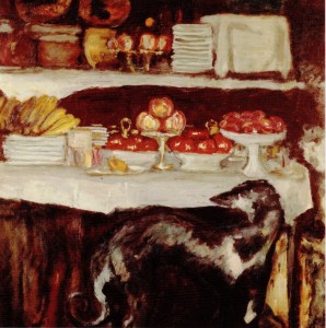
A Dog’s Place
March 20, 2013
Some thoughts on drawing dogs indoors, with reference to Pierre Bonnard
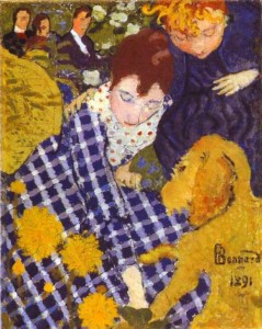
Above: “Carafe, Marthe Bonnard with her dog”, by Pierre Bonnard, c.1912-15. This little dachshund is small but determined. His upright shape will not allow the viewer’s eye to wander out of the left side of this picture.
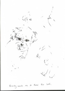
We occasionally have a special house-guest: Brandy the little white dog. She looks something like this:
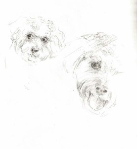
Above: My pencil sketch of Brandy’s face
Her special talents include ball games and making people smile. I can’t resist sketching her, but this is tricky as she rarely stops for breath. My usual tactic involves holding her ball up in front of her while I draw with the other hand. I do have to throw the ball after a few seconds, and can then repeat the process.
It is just as well that I am not too bothered about drawing fine details or this would become far too frustrating!
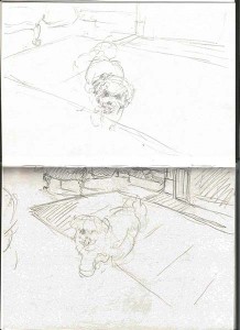
Above: Quick pen sketch of Brandy as she waits for me to throw her ball
This exercise has had me looking at things in a new way: If the image of the whole little dog is simplified (I try looking at her with my eyes half-closed to get this effect), she could be seen as a pleasing curve-edged shape. Brandy has plenty of Bichon Frise in her breeding, and her body and tail form joyous curves rather like the dog silhouettes in Bonnard’s “Two Poodles”, below:
Above: Pierre Bonnard “Two Poodles”, 1891, oil on canvas. The dogs form delightfully fluid two-dimensional shapes. Green negative spaces between the dogs also form very pleasing shapes.
When attempting a silhouette (or flat shape), it is extremely easy to slip into total abstraction (i.e. the shape no longer looks like a dog). On the other hand, when attempting a rapid drawing of a recognisable dog, notice how difficult it is to keep those curvy outlines (see below)! Here I have seen Brandy as a white shape in the doorway and sketched her in that setting. What attracted me to that image was the rather humorous curvy-edged white shape of the dog framed by the rigid lines of the doorway and tiled floor. In my attempt to draw a dog with an identifiable face, body and legs, the curves and some of the humour have been lost:
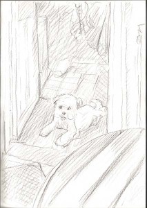
Above: My attempt to sketch Brandy in the kitchen doorway. The edge of a round, slatted table is in the foreground.
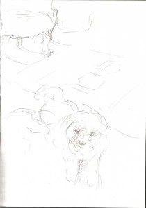
In contrast, look at the sketch below by Pierre Bonnard. He developed his painted compositions from his own sketches. Here we have a dachshund presiding over an overladen table. Bonnard has given the dog, objects and room an excellent sense of three-dimensional space. He has also caught the dog at such an angle that its body, and the negative (background white) shapes around it form pleasing curvy shapes. The resulting image is witty and makes me smile:
Above: Pierre Bonnard sketch of interior with dog
Above: “Woman with Dog” by Pierre Bonnard, 1981. Here is an image of the artist’s sister bending forward towards the family dog. Notice how the dog, and the areas of fabric around it, form pleasing two-dimensional shapes within the composition.
A practical approach to sketching bouncy pets indoors
Here is my preferred approach to drawing a bouncy dog in a room. Sketch the essentials of the room (edges of sofa, rug, etc.) while the dog is otherwise occupied. When the animal does stay still for a moment then draw a fleeting image of them within your sketched interior. It is rather like creating a stage-set, and then placing a character into it.
Why work this way?
Drawing the important parts of the room will give your image a sense of space and structure. This also creates a framework on your page within which you can add a rapid sketch of the pet. Making a point of drawing the room first is also a practical idea because it takes the immediate focus away from the animal. Many pets resent being stared at, and will be more relaxed if you don’t stare fixedly at them as soon as you open your sketchbook!
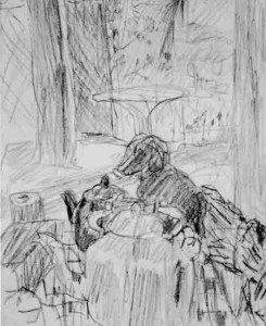
Above and below: My fleeting drawings of Brandy in my lounge. Edges of rug and some furniture have been sketched in first
If the dog is very energetic then there is no opportunity to hold up a pencil for traditional measuring techniques. To check proportions, two other techniques are much quicker: Firstly, check which bits of the room align with the main parts of the dog. Secondly, notice the approximate shapes of “negative” spaces around the dog and scribble these down as best you can. If you’d like me to go into these techniques in more detail then please add to “comments”, below, or contact me here, as this could be the topic of a future blog post.
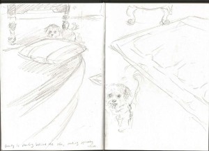
Above: More quick pencil sketches of Brandy. The writing on the left-hand page says “Brandy is standing behind the sofa making squeaky noises”
My fleeting sketches of Brandy are unimpressive but, through these attempts, I am just starting to see something that interests me and to get it down onto paper. With animals, a pleasing shape as the creature turns, or a momentary glance, may be the whole point of the picture, and is all too easily missed when drawing.
Above: “Greyhound and still life”, 1920-25, by Pierre Bonnard. The dog turns to look hopefully at the delicious food. Not only has the artist captured the turn of the dog’s head, but he has also noticed attractive shapes around the animal and has emphasised these in the finished image.
In summary: Tips for sketching dogs indoors
- Decide what interests you most about your particular dog (e.g. it’s posture, huge bulk or curvy shape) and be sure to get that down in your sketchbook as a priority.
- When time is short, omit all details.
- Look at the dog with your eyes half-closed to help you to see the essential shapes before putting pencil to paper.
- Don’t stare for too long at the dog. They consider it bad doggy etiquette. Blink quite frequently and look away at times.
- When drawing an awake dog, you may need to have two drawings on the go at once as the animal will move from one position to another.
- Include the interior (furniture edges, doorways, etc.) in your image to give your dog a sense of posture, balance and scale.
- Try drawing the interior before you add the dog to the image.
- Photos can perhaps be useful as a record of coat markings, etc. A sense of immediacy and character can be lost in a photo. Try taking a short video of the dog instead. You can always freeze-frame it later.
| Tags: Bonnard, dogs, shapes, sketchbook | More: Blog
Sketchbook drawing: Girl begging on a train
March 13, 2013
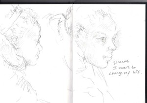
It was snowing lightly on Sunday evening and I was on my way back home from Kings Cross. Ten minutes into the journey, a homeless girl came through my train begging for money. There was a long and awkward silence amongst the passengers in the carriage. People looked away nervously. I asked the girl if she’d mind being drawn, then gave her a little money and had her sit next to me for a sketch.
When I had finished drawing, I asked Dionne to write the words “I want to…”, and to add in whatever words that she could think of. To my relief, she did seem to relish adding a few words to my book (a horrible thought had just flashed through my mind that she might be unable to write).
What did I take away from this? My pencil sketches do not plumb any emotional depths. They do not illustrate anything of the odd relationship between a begging girl and comfortable train passengers, nor do they hint at her worry over where she would spend the coming night. From the artist’s point of view, I’d need to think better on my feet if I’m to come up with more meaningful images.
My basic little drawings seem to have brought up many questions and left them without answers. In fact, the images themselves are rather unsatisfying, but the experience of creating them has led me to think.
Though I didn’t attempt flattery, the shape of the girl’s face is quite attractive, and she looks young enough to have plenty of life to look forward to. My sketches (she was pleased to realise), do not show the skin sores on her face which in real life make people look at her in horror.
And what of Dionne – though she consented to be drawn, was I somehow exploiting her in this situation? She wrote that she wanted to change her life, and I said a few well-meaning words to her. Once I’d confirmed that she was getting good healthcare (yes) and would have somewhere under cover to sleep that evening (it would probably be a night bus), I pointed out that she was good at sitting still, and that artists or art groups in London would pay for models. In my ignorance, I could not think of anything truly constructive to say. Who takes on a model without a fixed address?
I eventually left the train with the uncomfortable feeling that I had failed this girl in some way. Yes, she’d asked for money and I had given her some of this (though not enough for a night’s stay at the YMCA). But as a fellow human being, and also as someone who’d looked closely at Dionne and drawn her, I wished that I’d had more to offer for the longterm, perhaps genuinely helpful advice or a good contact for her.
Perhaps the most positive aspect of our exchange was the way in which, despite the skin sores which she said repelled people, I had Dionne sit next to me and looked at her in the same way as I would any other human model.
And our drawing time did also give other passengers a chance to think. As soon as I had finished, the lady across from me offered Dionne some fruit, and I noticed that she was then given money by others further along the carriage.