Drapery for artists: Why bother with it?
July 2, 2012
Today I review a few uses of drapery in art and investigate whether or not drapery can be exciting.
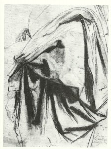
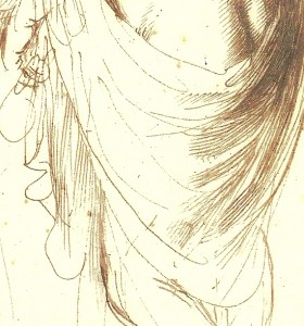
Above: Dominique Ingres (1780-1867) Study for the Drapery of Moliere in the “Apotheosis of Homer”, black chalk with stumping, 12x10in
Last week’s drawing classes on drapery
My initial thought, on being asked to teach classes on drawing drapery, was that this is a dry and uninspiring subject. But do read on, as I eventually started to change my mind.
Fabric folds are complex and it takes sustained concentration and technical skill to create an illusionistic image. I fear starting to draw and getting “lost” in the complexity of the folds, helpless and confused as if in a nightmare involving spaghetti.
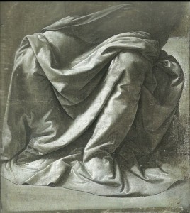
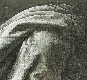
The first drapery images that come to mind are those truly illusionistic studies by Leonardo da Vinci and his contemporaries. Above is one of his drapery studies for a seated figure from the 1470s. The amazing three-dimensional appearance of this fabric is created by the build up of tones of grey and white tempera, indicating the light falling on the intricate folds. It is said that Leonardo would soak fabric in dilute plaster and then arrange it over a mannikin and leave it to set in place, thus allowing study over a long period. This would presumably allow him to return at the same time each day to ensure that the fall of light on the subject did not alter when he was working. Below is a detail from the same image:
Towards the end of the workshop, I shared a method of working in compressed charcoal on white paper that allows a similar build-up of tones. A putty rubber is used to create highlights, and stumping is used to blend tones and to increase the depth of the shadows.
Before getting too engrossed in this rather technical way of working, we discussed how drapes can suggest movement and energy, and attempted some very loose warm-up drawings of fabric based on drawings by Guercino.
Fabric, movement, energy and emotion
The great thing about fabric, for artists, is that we can do what we like with it. While the appearance of figures is limited by anatomy, a scarf or cloak can be arranged with great freedom, swirling or billowing to energise whichever part of the picture that we choose.
A master of this was the great draughtsman Guercino (1591-1666, Italy). His figure drawings are known for conveying great emotion. When working in pen or brush and ink, he would use very free, swirly lines to suggest movement or emotional turmoil and he made great use of any fabric to heighten this effect.
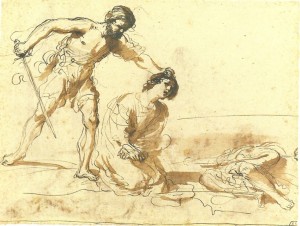
Above is one of Guercino’s studies for a subsequent painting of “The Martyrdom of Saints John and Paul”. One of the faithful men who is about to be beheaded kneels in the centre. His body is suggested by a few pen strokes and sweeps of brown wash that represent the folds of his cloak. The expression on his face is upsetting to view, but the gentle sweeping marks of his cloak suggest a quiet, passive, enclosed figure.
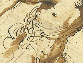
The executioner on the left is viewed at a moment of stillness, grasping the saint by his hair. His hands and feet look, to me, rooted to the spot, but there is an energy bubbling at the centre of this figure. Below is a detail from this image, showing the swirly lines of drapery at his waist. This man is about to make a terrible violent swipe of the sword. This does not look like a cold, calculated execution. The lines around the standing figure suggest bubbling anger and wrath.
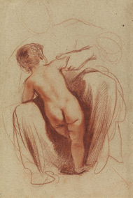
Now take a look at this famous red chalk drawing by Guercino, “A child seen from behind, standing between his mother’s knees”. The fabric of the mother’s skirt forms a warm, enclosed space for the figure of the child. Once again, drapery has been used to suggest emotion:
Fabric and composition
Guercino’s mother and child drawing, above, also demonstrates how the shape of drapery can make an interesting composition. Areas of dark tone form two-dimensional shapes within the picture. This is also the case with light-toned areas bounded by lines. These shapes surround and visually balance the central figure of the child.
Also consider the type of shapes within the fabric. Different shapes in pictures can hint at different emotions. Most of the shapes in this mother and child picture are rather elongated with one or more gently curved edges. Such shapes suggest a peaceful, gentle rocking. There are no explosive-looking jagged or rigid blocky shapes within the fabric of the mother’s skirt here.
For a fabric study with a more explosive feel, take a look at this one in black chalk by Dominique Ingres:
This drawing is a wonderful composition of triangles and boomerang-like forms rotated and repeated around the picture. It is a study of folds within fabric, but has the feel of a successful abstract composition. Indeed, it seems that drawing fabric is one good entry point to the realm of abstraction.
Back to reality
Once we have arranged our fabric on the table, hanging on the wall or on a mannikin, how should we go about drawing it? For the second half of the session, artists in the drawing classes had the choice of working in either pen and ink, or in stumped charcoal.
Pen lines can convey the form of fabric folds and the position of light and shade. Working in pen, the artist rarely aims for pure illusion as blended tone cannot be achieved. Each artist comes up with their own system in which lines are used to suggest structure and tone.
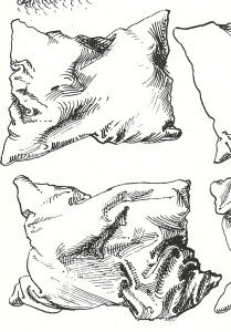
One traditional method is to draw “cross-contour” shading lines curving over the fabric folds. In areas of deep shadow, there are many cross-contour lines and some lines cross-hatched in the other direction. Light-toned areas are kept free of cross-contour lines. This method was used by Albrecht Durer in his pen and ink drawings:
Albrecht Durer: study of pillows (detail)
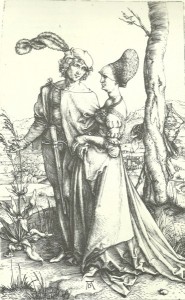
…and in his engravings:
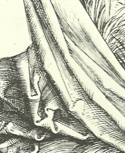
Albrecht Durer: “Young couple threatened by Death” 1498 (detail of drapery shown below whole image)
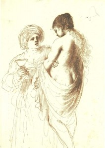
If emphasising the weight or flow of fabric hanging between creases, it is sometimes best to take the shading lines in the direction of that weight or flow. Here is another drawing by Guercino, this time showing how shading lines are can be taken parallel to the main fold lines instead of across them:
Guercino: “Bathsheba attended by her maid” , 1640, pen and ink (detail is shown below main image)
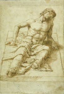
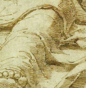
The third method of linear shading involves taking parallel diagonal lines “hatching” across any parts of the image that are in shadow. These hatching lines are combined with some edge lines. In the drawing, below, by Mantegna, almost all of the shading lines within the figure and drapery are taken diagonally from left up towards the right. The shadow on the right side of the stone slab is, though, made of horizontal lines.
Andrea Mantegna: “A man lying on a stone slab” 1470s, pen and ink (detail is shown below main image)
What now?
As an artist, it is encouraging to see that one need never be bored again. All it takes is a scarf, a pillow or any scrap of fabric and a new composition can be formed.
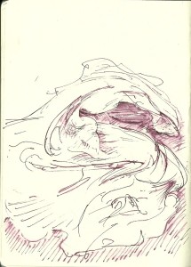
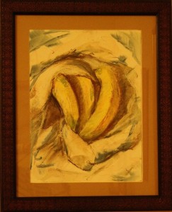
There is a wealth of possibility in arranging fabric and objects or figures. I have started playing with other ideas. What about, for example, wrapped bananas?
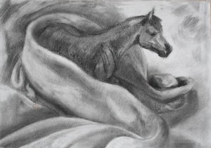
Or wrapped horses?
…the possibilities are limitless….
