How to make yellow oil paint appear to glow, part 1
July 19, 2012
Here I investigate ways to achieve a stunning yellow glow within an oil painting
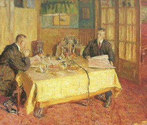
Above: detail from Edouard Vuillard “Portrait of Henry and Marcel Kapferer” 1912
Introduction
I am currently reading a wonderful book about Edouard Vuillard (1868-1940), copublished by The Montreal Museum of Fine Arts and the National Gallery of Art, Washington (there is a link at the bottom of this page). Most of his work is reproduced in this enormous volume. I recommend taking a look at Vuillard’s paintings for their psychological intrigue, their interesting take on domestic interiors and their experimental use of lighting, colour and tone.
Vuillard used the colour yellow over and again in different ways. Some of his pictures are notable for containing yellow areas that seem to glow so bright that they almost make the viewer squint with surprise. How did he achieve this effect? I know from experience that yellow, enticing as it looks on the palette, can easily be disappointing if not handled well in a painting.
Back at the “art lab” I have been investigating the topic, and here I list and illustrate ways to make normal yellow oil paint appear to glow. Today I review methods involving the yellow patch of paint itself. Further glow effects are actually enhanced by colours and tones used elsewhere in the same picture and, for ideas about that, check back here at the end of July for my next post.
Make the yellow area light in tone
The “tone” of a painted patch is how light or dark it is. Light-toned yellow areas tend to glow within a picture composed of medium tones.
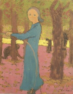
Above: Edouard Vuillard “Girl with a Hoop” c1891
How can we decide which are the lighter and darker tones within a picture? We can compare different tonal values within a painting by looking at it with half-closed eyes or, if still unsure, by reproducing it as a monochromatic image “in black and white”.
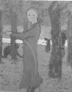
In “Girl with a Hoop”, above, I am amazed by the glowing horizontal band of yellow behind the girl. This seems to shine like metallic gold. What makes the yellow stand out next to the adjacent pinks and blues? Below I have reproduced the image in black and white:
As you can see, the yellow horizontal band is by far the lightest tone in the picture and it still “shines” out in the monochromatic image above.
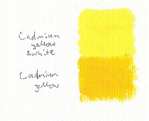
Below, I’ve painted two rectangles of cadmium yellow. The upper one has white added to it in order to lighten its tone. In my opinion, the upper rectangle of lighter-toned cadmium is more prominent and glowing than the patch of pure cadmium yellow neat from the tube:
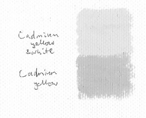
Do you agree with me? Opinions may differ. Here is the same image of two yellow rectangles reproduced in black and white. This demonstrates the tone difference between the two yellow patches:
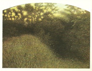
Here is another example of high tone being dazzling, this time within a picture:
Above: Giuseppe Pelizza da Volpedo”The Bramble Bush”
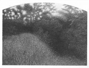
In da Volpedo’s picture above, the yellow light shining through the hedgerow is dazzling. I have reproduced this image in black and white to show how the glow is caused by tone, not by warmth or intensity of colour. See how the bright light in the upper right of the image is darker in tone than pure white, but still reads as an extremely bright light source. This picture also illustrates the phenomenon of “light spillage” into adjacent dark areas, about which I’ll discuss more in the next post.
Choose a yellow of high colour intensity (high chroma)
A colour of low chroma appears to be greyed-down or “muddied”, whereas a high chroma colour appears to be bright and intense.
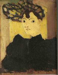
Above: Vuillard “Hat with Green Stripes” c1890
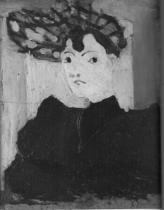
This Vuillard picture is interesting in that it places two yellow patches of similar tone, one apparently in front of the other. To me, the background yellow appears to glow more than the lady’s face. I wasn’t sure which yellow was lighter in tone, and whether tonal differences were affecting the “glow” effect, so I tried reproducing the image in black and white:
In fact the background yellow is very slightly darker in tone and yet, in the colour version, it glows more. This is due to the high chroma value of the bright background yellow compared with the woman’s face. The face yellow is slightly pink-tinged and is perhaps also dulled with white. The glowing background yellow is closest to cadmium yellow with perhaps just a little white added to it. It seems that, in this case, chroma intensity trumps tonal value.
To get a high chroma yellow using opaque oil paints, we need to experiment. There is no scientific way to measure the chroma or vividness of a colour (please add to “comments” if I am wrong in saying this) so comparing chroma values of paint colours is subjective.
Colours are supposed to be vivid (high chroma) if used straight out of the tube, though some are clearly more vivid than others. Some people say that the pure pigment has a very high chroma value and that this is dulled when other pigments are added. For sure, if I were to add a touch of grey or purple to any of my yellow tube paints, they would appear duller.
What about comparing paints used straight from the tube? This must vary between brands. In fact, some of my tube colours already contain more than one pigment and this may reduce their chroma and vividness from the outset. My tube yellows may differ from your own selection:
Lemon yellow (Arylamide yellow 10G PY3) Cadmium yellow hue (Arylamide yellow G 6X; Diarylamide Yellow HR70 PY73/PY83) Naples yellow (PW6/PY154/PBr24) Yellow ochre (iron oxide PY42)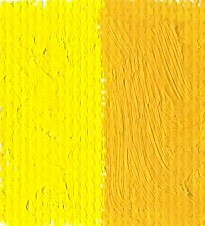
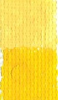
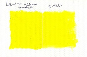
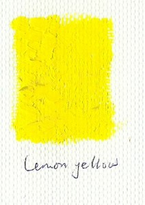
Here is Lemon yellow on the left and Cadmium yellow hue on the right (both Daler Rowney Georgian range). I think that the lemon yellow on the left is more vivid, but this may be partly due to its lighter tone. It is a very subjective decision.
Here is Naples yellow (Van Gogh range) shown above Cadmium yellow hue (D-R Georgian). The cadmium is clearly more vivid though the tones of these two yellows is similar.
Transparent glazes of colour overlaid onto a white ground
Oil paint can be thinned with turpentine and painted onto a white support as a “glaze”. This tranlucent layer if paint is allowed to dry fully (it may take several days), then overlaid with another glaze, and the process repeated until a glowing effect is produced. The white of the support shows through the tranlucent paint and contributes to the effect:
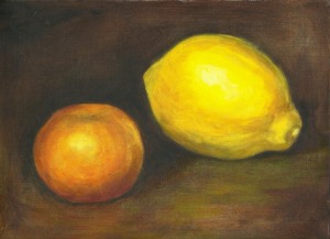
Above: fruit that I painted using some overlaid oil glazes and some opaque oil colour as a (very lengthy) exercise
The glazing process works best with certain tube colours. You need transparent colours for the most glowing glaze effect. In many ranges, lemon yellow, chrome yellow, and aureolin would be suitable for glazing, whereas Naples yellow and cadmium yellow would be too opaque. It is also correct not to add white paint when mixing colour for a glaze.
I have attempted to demonstrate an effect of glazing using lemon yellow:
In the image above, the paint was applied in one thick, opaque yellow on the left. It was built up as four turpentine-thinned glazes to the right. I waited until each glaze was just about touch-dry before applying the next, though ideally would have waited at least overnight. Would you agree that the right-hand glazed area glows more than the opaque paint on the left side?
I am convinced that the answer is “yes” when I look at my canvas. This is not so clear to me in the scanned image.
Individual brush strokes of opaque colour
An alternative approach is to use very opaque paint, building up visible juicy brushstrokes. These may be so thick and three-dimensional that they catch the light and appear to scintillate in the finished picture. For an example, take another look at Vuillard’s “Hat with Green Stripes”, above.
Or the individual adjacent brush strokes may vary in tone, brightness and/or hue. This can also give the effect of a twinkling light source as in the sky, below:
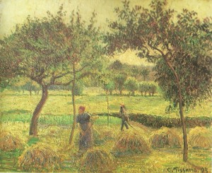
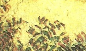
Above: Camille Pissarro “Bountiful Harvest” 1893; Below: A detail from the same painting.
I love the way in which the sky in the above picture appears to glow warmly, without being either extremely light in tone or of maximum chroma intensity. This has something to do with the individual brush strokes used to paint it, but is also due to the colour and tone of the trees (and there will be more information about that effect of adjacent colours in the next post).
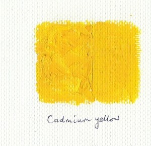
Here I have painted rectangles of colour, the sections on the left being somewhat impasto with thick, visible brushstrokes, while the sections on the right are a smooth opaque layer of paint:
In the images above, the impasto strokes seem to make the colour more prominent and glowing. This effect is even more obvious on the original canvas, when light shines across it and catches the ridges of the brushstrokes.
To sum up…how can a patch of yellow be made to glow?
-
Use a yellow of high tonal value compared with everything else in the picture.
-
Choose a high chroma (very vivid) yellow tube colour.
-
Avoid mixing other colours into the yellow if possible as this may dull your colour.
-
Build your colour up in glazes of a transparent yellow diluted with turpentine or another glazing medium.
-
Or lay the colour as thick, visible brushstrokes of opaque paint.
-
Several further tips involving relating the yellow patch to other colours and tones in the picture….Take a look at my next post to find out more.
Hi
Didn’t get your name – intense glow is achieved by artist ANDREW COATES using very small dots of varying yellows. I have tried to emulate this effect but with limited success. I actually turned over one of his paintings to look for an artificial light source!
It takes a long time he says.
Enjoyed your series so far. R
Having read your comment, I’ve just looked up Andrew Coates and am amazed by the effects of sunlight that he achieves in some of his landscapes. On my computer screen, his paintings initially appear photorealistic but, yes, there does seem something clever and painterly about the way he handles light. For example, in title=”High Summer Andrew Coates” target=”_blank”> , he goes far beyond photography to achieve the effect of light shining through dandelion seed-heads, and the dazzle effect of the sun dipping behind the hilltop. It is interesting to hear that he has used tiny dots of varying yellows in order to achieve this. The shadow areas and foliage masses also contain suggestions of colour including vivid greens and warm reds. I can imagine that, like Pissarro, Coates has used tiny brush-strokes of colour throughout the landscape. It would be fascinating to know more about Coates’ methods, especially which pigments are used and when.
Marianne