Which colours recede, and which appear to come forward?
February 8, 2013
Have you ever noticed how some colours within a picture can give the impression of jumping out towards you, while others seem to melt back into the distance?
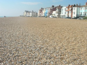
Vivid, vibrant colours tend to be very prominent, especially when surrounded by dull greys and browns. Take, for example, the bright blue seafront house halfway along the row of buildings in my view of Aldeburgh, above. Once you’ve noticed it, the blue facade of this house is difficult to look away from. The less vividly-coloured buildings on either side seem to be fading away into the distance, while the blue house remains prominent.
The way in which different colours can suggest space and depth, near and far, is a subject in itself. This is not only fascinating, but has great practical use for figurative and abstract artists who wish to create an illusion of three-dimensional space, and also for those who wish to suggest ambiguous space within their paintings.
The basic principle of colour and depth: aerial perspective
Look at any vast landscape in real life or from a photo. Distant objects (mountains, trees and so on) look paler and greyer in colour than nearby objects.
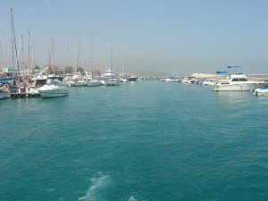
Above is a photo of a harbour in Cyprus. Mountains in the distance are just visible as very pale grey shapes. After taking this snap, we went on a boat trip and passed these same mountains. Close up, they loom high and are covered with dark olive-green scrubby plants and shrubby herbs and dark grey-brown rocks. However, haze caused by small particles in the atmosphere makes these same mountains appear pale, dull and a cool grey colour from a distance. This is a good example of aerial perspective (sometimes called “atmospheric perspective”).
In the middle distance, a similar effect is seen on the boats. See how pale distant masts appear compared with those close by.
In the foreground, the sea appears a wonderful, vibrant turquoise. Compare this colour with that of the sea in the far distance.
In looking at a picture such as my harbour scene, above, the faded colours and pale tones in the distance help us to differentiate “near” from “far” within the image without even thinking about it.
How can we apply this to our painting?
First, I’ll mention the traditional use of colour and space as applied to landscape painting.
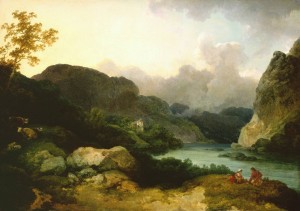
Above: An example of aerial perspective, Philip James de Loutherbourg “Lake Scene in cumberland: Evening” 1792, oil on canvas, 42.5 x 60.5cm
In Loutherbourg’s landscape, above, the golden-brown rocks and vegetation in the foreground are “brought forward” by their warm colour. They look convincingly nearby. The two figures are also painted in warm colours and are wearing red. This helps to make them more prominent and to place them in the foreground.
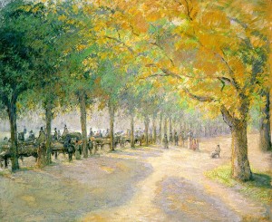 Above: Camille Pissarro “Hyde Park, London”, 1890
Pissarro’s study of trees receding into the distance, above, is another excellent example of aerial perspective. The nearest tree to us, on the right hand side of the picture, is a warm, vibrant golden-yellow. Very distant tree trunks along the path are pale in tone and tend towards a cool violet colour.
Colour and aerial perspective
- Warm colours (orange, orange-red and yellow-orange) tend to look nearer than cool colours
- Vivid, intense colours (e.g. bright red, bright blue) tend to look nearby
- Dark tones tend to appear nearer than pale ones
- Dramatic contrast in both tone and colour is usually more obvious in the foreground of an image compared with the distance.
- Objects in the far distance tend to appear a cool, pale grey. The colour may be close to a pale blue-grey or mauve-grey.
Can these colour-distance principles be applied to figure painting and still life?
Yes, absolutely!
In reality, the near and far parts of a figure or small still life are so close together that they do not appear greyer or paler as they recede into the distance.
However, we can emphasise spatial depth in our paintings nevertheless. Reserve the strongest tonal contrast, the most vivid colours and, perhaps, the warmest colours for the foreground of the picture.
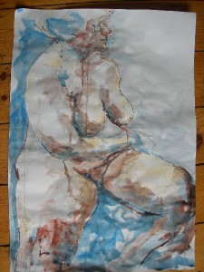
In my drawing of a sitting nude, above, I have emphasised the nearness of the woman’s knees, especially the one to the left side of the picture. The far edge of her body is allowed to recede somewhat into the whiteness of the background.
The warm, quite vivid, red earth FW ink helps to make the nearest knee very prominent. This same colour is cooled by mixing with indigo FW ink, and is made far paler by mixing with water, when used in the more distant parts of the figure.
An experiment with line, colour and space
If you are interested in line, colour and space, then try this exercise. It can also double as a good drawing warm-up for yourself or for a class.
You will need:
- A sheet of white paper (A4 cartridge is fine)
- 5-7 objects that are small enough to be lifted in one hand. Plastic toys, small garden tools, egg cups and other items from the kitchen are all good. If you want to practise your drawing skills then go for complex objects such as toy animals and kitchen utensils. Or keep this simple and rather abstract and go for stones, twigs and rounded fruit.
- A selection of coloured pencils, one for each object
- Pencil and ruler
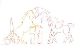 To do:
Place your piece of paper horizontally (landscape-style). Using pencil and ruler, draw a faint horizontal line across the paper, parallel to and about 4cm away from its bottom edge.
Take one of your objects. Make a simple line drawing of the object using just one coloured pencil. Draw this first object near the middle of your page, not to the right or left side.
In your picture, each object should be a side view and it should be just resting on your ruled pencil line. As you draw each object, it may be best to hold it up with your free hand so that you are not looking down at it. That is how I achieved the side views of the scissors, spray-bottle, etc. for the image above.
Having drawn your first object, select and draw another object. Use a different coloured pencil for this one. The second drawing should overlap the first. As these are just line drawings, this creates an ambiguous image. Which object is in front and which is behind?
Continue the exercise, drawing each object in turn. Use a different colour for each object. Remember to keep your objects resting on the horizontal line. Make sure that each line drawing overlaps the next.
Assessing your drawing
You have used a different colour for each object. Do the colours make some objects more prominent than others?
In my drawing of toy horses, spray bottle, etc., the golden-red rearing horse “reads” as being the nearest object. It is difficult to see the colours now that I have scanned the image into the computer (pencil colours are difficult to scan). The beaker was drawn in an earthy-red pencil, and is the least prominent object, both in the original drawing and when scanned. The other objects were each drawn in a different shade of pink or purple, all quite vibrant colours.
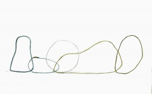 Above: An example of the exercise using simple still life items including stones as drawn by a member of my art class
In the drawing, above, done as a warm-up exercise in my “warm and cool colours” class, the round central object looks far away because it is a pale, neutral to cool grey colour, similar to the colour of distant mountains. This circular object clearly sits behind the objects on either side.
The quiet, earthy colours and contrasting shapes of the objects in this image are very pleasing. As these colours are so closely related, the image becomes rather ambiguous. Apart from the mountain-coloured circular object, it is unclear as to what is near and what is far and this is rather curious. White space around and within these objects is also interesting and restful to the eye.
Someone who strayed away from the brief
Before giving this exercise to my Friday art class, I tried it out at home myself and with my eleven-year-old daughter. It was her idea to get the plastic horses in there and, in fact, that is all she wanted to use:
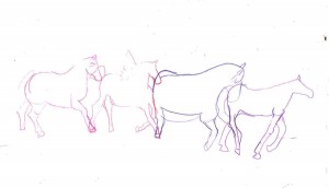 Above: My daughter’s take on this exercise
Notice how, rather than doing what she was told, she allowed her objects (Scleich horses) to come off the horizontal line. Objects that are lower down on the page will appear to be nearer. See, also, how small toy animals are challenging to draw (she is in fact very good at observational drawing but this is a tricky one) but that any distortion in the drawing contributes to the flowing effect of the picture.
Look at the effect of the line overlap and of the colours in this pleasing image. The horses seem to flow from left to right, but the curious colours make this a bit ambiguous. The vivid magenta-purple at the point of overlap between the second horse’s head and the third horse’s rump seems to jump forward. The strong pink of the left-hand horse’s front hoof is also very prominent.
To sum up: choosing colours for a sense of distance in pictures
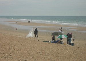
Above: I saw a wedding couple walk onto the beach for their photo-shoot on this blustery day in Andalucia a few years ago. The strong black vs. white tonal contrast of the couple make them prominent within this slightly surreal image. Odd shapes of colour also seem to jump forward, e.g. the bright green of the umbrella.
- Colours seem to recede if they are close to those of distant mountains (pale grey, very pale muted blues and mauves)
- Tone trumps colour! Strong tones appear nearer than pale ones.
- Dramatic tonal contrast (e.g. in the wedding couple, above) appears to jump forward.
- Warm colours (e.g. orange) tend to appear nearer than cool colours (but a vivid cool blue can also be prominent).
- If undiluted, the following strong colours can all seem to “jump forward” in a picture: Orange, red, yellow, blue, purple, pink, green.
- To make a colour seem to recede or to “knock it back”, you can mix it with white, thin your paint mixture down, mix the colour with its complementary colour or with grey. If working in pencil or pastel, apply the colour more gently (or rub into it with a piece of putty rubber) so that underlying paper is just visible.
very informative article. Just what I was looking for. Thankyou. I shall try these techniques