How to use top-lighting in drawing or painting a portrait
December 14, 2012
Investigating an unusual lighting set-up for portraits
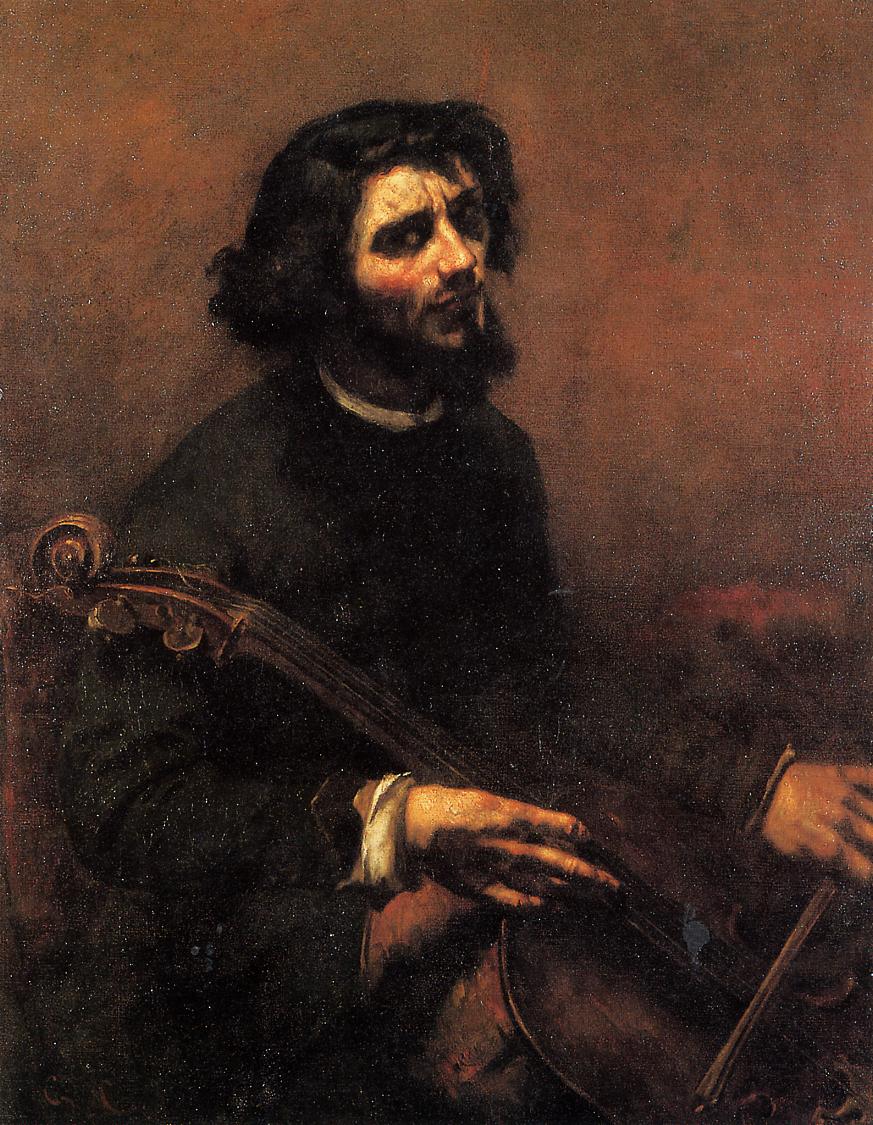
Above: Gustave Courbet “The Cellist, Self Portrait”, 1847
Today’s art class on lighting for portraiture
I have just completed a series of art classes on how to use tone. The final session looked closely at the use of light and shade in portraiture. Of course, this fascinating topic inspired plenty of discussion, though most people did get their drawing books out eventually.
There are many possibilities for directional lighting of the head. We discussed the full range and tried some lighting set-ups out using a plaster head. There were portraits to look at by artists from Leonardo da Vinci up to recent BP portrait award exhibitors. How had the artist lit their model in each case, and how did the lighting set-up benefit the picture?
I don’t have space here to discuss each type of lighting in detail and have chosen to restrict this article to one of the more unusual lighting set-ups, top-lighting.
Before going on to discuss top-lighting, here is a complete list of lighting set-ups that we dicussed in the class today:
The most popular indoor lighting set-ups:
- Three-quarter lighting (with full-face view of model)
- Broad lighting
- Short lighting
Other lighting set-ups for portraiture:
- Side lighting
- Top lighting
- Frontal lighting
- Contre-jour (back lighting)
- Light from below
- Multiple light sources
- Outdoors on an overcast day, at noon or at sunrise/sunset
What is top-lighting?
This is quite an unusual lighting set-up for portraiture.
In a top-lit portrait, the main light comes from above the sitter. This light is typically a ceiling light positioned above and a little in front of the model’s head.
You can tell that the sitter has been lit from above by recognising typical shadows in the portrait. There will be pronounced shadows under the chin, below the nose and under the eyebrows. The brightest highlights on the face will be on the forehead, nose and on the upward-facing surface of the chin.
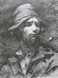
Above: Gustave Courbet self-portrait
Why is it unusual to light your sitter from above?
The illuminated forehead and nose, and the pronounced low shadows on the face, do not tally well with our contemporary idea of beauty. Light from above also emphasises any horizontal skin creases, bags under the eyes and other facial “imperfections”. It can be quite an unflattering light.
In some top-lit images, the eye sockets and perhaps most of the mouth are thrown into deep shadow. This can make it very difficult to understand the expression on the sitter’s face and, as these shadows contrast strongly with the brightly-lit forehead and nose, the effect can be menacing or disturbing.
But we do routinely see people as lit from above
Though paintings and photos of heads lit from above are unusual, we live much of our lives in a top-lit world. Many homes have ceiling lights, often a strong central pendant light in each room. Offices, workshops, schools and sports centres also tend to be lit by strip lighting or by other ceiling lights.
Outdoors, the sky illuminates us from above (of course). Around midday when the sun is high in the sky, people appear top-lit with marked shadows under nose and chin. If the sky is overcast then the top-lit effect persists, with bright forehead and nose, though shadows will be less dramatic.
So we are used to seeing our friends and colleagues lit from above, even if we should exercise caution before using this lighting set-up for a picture.
If you are drawing a friend at home, or drawing from a life model in a group session, have a look at the lighting set-up before you start. Life drawing groups often have to work in a top-lit hall or studio in order to provide enough “task lighting” for all of the artists and unflattering low shadows may be cast on and around the model’s head by the overhead lighting.
Some successful portraits that use top lighting
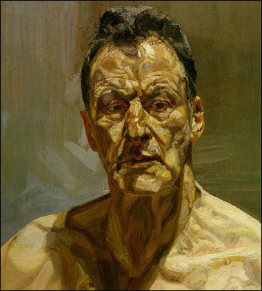
Lucian Freud self-portrait: “Reflections”
In the best types of self-portrait, flattery is of no importance. This image by Freud is a wonderful example of self-scrutiny. Wrinkles, pouches of skin under the eyes, and asymmetry of brow muscles are all emphasised by the overhead light source here.
As a viewer, I look at this picture and try to glean information about the man’s character. Is he good or bad? Is he trustworthy? Many of us make quick judgements about someone’s personality having taken just a brief look at them. This image, however, invites much longer study.
We are perhaps conditioned to equate flawless beauty and facial symmetry with goodness of character. The top-lighting shows up every imperfection here, creating an image which is initially rather repellant. But Freud also makes himself look vulnerable by showing all those flaws and details, especially with his shoulders bared. It is, surely, an honest self-portrait. And then we look closely at the eyes to try and gain more information. Due to the lighting effect, these eyes are in shadow and rather inscrutable. This makes for a more psychologically intriguing portrait.
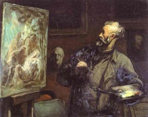
Honore Daumier self-portrait:
Daumier often lit his figures from above, simplifying the head into a series of light and dark shapes for dramatic effect. In this self-portrait, the harsh overhead lighting turns his face into a powerful caricature in contrast to the gentle, softly-modelled image of his canvas-in-progress within the picture. The bright glow on the top of Daumier’s head draws the viewer’s eye to the head and face. The top lighting then produces strong contrasts within Daumier’s face and turns his eyes to black sockets. Is he supposed to look manic? Perhaps he is showing himself as a frantic working genius? Daumier comes across to me here as a man who is possessed by a wild artistic spirit.
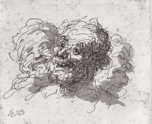
Look, below, at these laughing men drawn by Daumier. The effect of overhead lighting on the central figure is to help suggest some kind of madness or loss of self-control:
Above: Honore Daumier “Three laughing men”
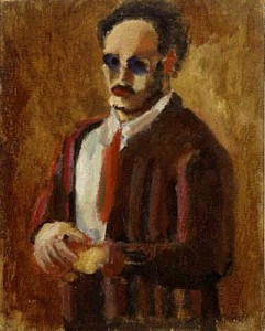
Mark Rothko self-portrait, 1936
Like Daumier, Rothko saw bold shapes of light and dark in the top-lit head and simplified these further in his self portrait. This image is a big step away from the traditional portrait set-up, in which lighting would be carefully placed to flatter or to provide interest. When I see someone briefly across a room in an average interior with overhead lighting, they look much like the man in Rotho’s image. The lit shapes of forehead, cheeks and nose, are immediately understandable as a “face”, and make me recall remembered images of real faces that I might have come across at work, at school, or at parties, rather than reminding me of faces from traditional portraits. This, for me, is what makes Rothko’s self-portrait so powerful.
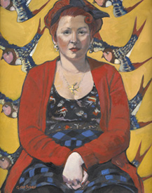
“Swallow” by Alexandra Gardner, shown at BP portrait award 2012, National Portrait Gallery
The above picture is unusual for its use of overhead lighting to joyous effect! The sitter in Gardner’s image was her friend, Laura, a hairdresser. At first, the lighting here seems unimportant compared with the decorative effect and bright colours. Light is coming from above and to the right of the sitter , hence the strong shadow under her chin on her left side.
I like the way in which all of the shapes within this canvas are related to the joyous, swooping image of the swallow. The bird is curved with elegantly-pointed tail ends. Look at the shapes of red fabric, and the shapes of darker-patterned blue and black fabric between the red. These are very similar to the swallow’s outline, being rather curved and pointy with a bit of assymetry. The shape made by Laura’s interlocked hands and arms is similar again, and so is that of her black hair bow.
Now look at the shapes of light and shade produced by the overhead lighting. There is a large assymetric curved and pointy patch of light on Laura’s chest and neck. The shape of shadow under her chin is similar. These are echoed by the gentle shadows below each cheekbone, and by the shapes of the sweeps of light above the cheekbones.
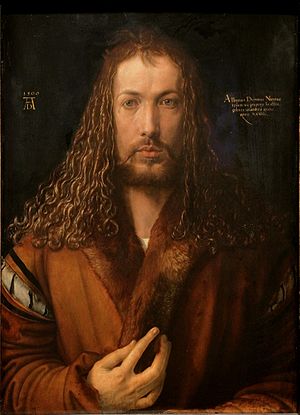
Albrecht Durer self-portrait, 1500
In Durer’s gorgeous self-portrait from 1500, the light streams down from a point above and to the right hand side of his head. This could be classified as three-quarter lighting, but with a very high light source. There is enough top-lighting here for me to include this image in this article (hence the brightness on the man’s forehead), and I wanted to mention this picture as it illustrates another use of overhead lighting:
Durer has presented himself here as a Christ-like figure, and the soft stream of warm-coloured light streaming down on his face suggests a glow from the Heavens. It has been said that, in painting this idealised and rich image, Durer was suggesting that his artistry came from his Creator, and I feel that the lighting from above does indeed give this portrait a transcendental quality.
Notice how Durer’s top-lit image is beautiful and idealised, while Freud’s “Reflections” is quite the opposite. To “soften” your light for a more flattering effect, try using a lampshade or diffuser instead of a bare bulb. A wide north window can also be a good source of soft, diffuse light, though it is rare to find a high enough window for overhead lighting.
In summary
- Take care when using top-lighting because it can create an unflattering and/or disturbing image.
- Overhead lighting can emphasise pouches and folds of skin on the face.
- It can create intriguing compositional shapes of light and shade on the face and torso.
- Top-lighting emphasises the forehead and nose.
- But it can throw the eyes into deep shadow and make the figure’s expression difficult to read.
