Lighting the artist’s model…human or equestrian
October 11, 2012
Starting to think about tone, value and mood
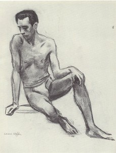
Above: Edward Hopper “Seated Male Nude” 1923-4
A tonal approach to life drawing
Going back and forth to repeated life drawing sessions, it is easy for artists to run out of ideas and inspiration. Why not just stay at home and work from photos (we have no shortage of them?). Why bother to organise a model in the first place?
I love to draw from a live model, whether clothed or nude, human or animal. Here are my reasons:
-
I can see how the light is falling on the model and use the interesting effects that this creates.
-
I can move around to different viewpoints (or just move my head slightly) and get a better understanding of the three-dimensional structure of the model within the studio space.
- Life drawing can push me to work in a more spontaneous way because time is limited.
- The model is a real person or animal, and their personality can feed into the picture.
In this article, I shall spur you on to think about the first point in my list, that of making best use of the light. When we look at a life model, we are really looking at the effect of light on them and on the studio around them. Light pools over the skin from one direction while, on the opposite side of the model, there are great swathes of shadow.
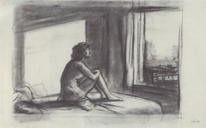
Above: Edward Hopper: “Study for Morning Sun” 1952
When we look at a simple tonal picture, we can understand what it represents quite easily. Numerous lines are not always needed:
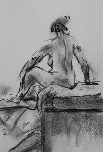
Above: A rapid warm-up drawing in charcoal
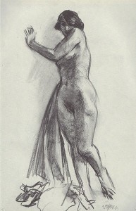
If light is set up so that there is both light and form shadow over the model, it becomes easier for artists to emphasise the 3D structure that is there. This can involve a single main light source (typically from above and to one side of the model). A lamp or bright sunlight from a window can help to emphasise the bold structure of the form as in the Edward Hopper drawing, below:
Above: Edward Hopper “Standing Nude With Drape”, c1923-4, conte
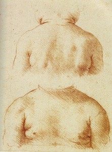
A softer, less glaring light, can highlight the subtle details of the figure. The light will show surface detail most clearly where it falls on the skin at a shallow angle, so try moving your model and/or studio lamp around and see what works best. This gentle study by Leonardo da Vinci is very inspiring:
Above: Leonardo da Vinci “Study of a child’s upper chest and shoulders seen from front and back”, red chalk, c1497-9; the light (perhaps window light?) is positioned between the artist and the model, and it shines from above left. Diagonal hatching represents shadow on the child’s skin, and the detailed form of the child’s chest and shoulders has been built up by this means.
Sometimes more than one light source is used. This can also be interesting, especially if the light from one lamp does not land within the shadows created by the other lamp.
Dramatic lighting
There is something about shadows that really taps into our emotions and imagination. Here are some dramatic lighting situations that you might attempt to set up in your life drawing session.
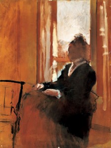
1) CONTRE JOUR lighting (back-lighting):
The main light comes from behind the model. You can achieve this by positioning your subject in front of a low window on a bright day. (For nude life drawing, do be aware of who else can see them from outside the building!)
How does the back-lit figure appear? Parts of the figure may be silhouetted and lose much of their detail while others appear to glow. This can lead to an interesting Impressionistic approach such as that achieved by Degas, below:
2) CHIAROSCURO EFFECT
Light shines on the model, but the figure seems to emerge from a dark background.
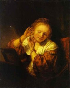
Attractive glowing highlights on the model’s skin contrast with some shadowy, indistinct edges. This is the effect that we see in paintings by Rembrandt, but is not so easily replicated in the studio.
Above: Rembrandt “A Young Woman Trying on Earrings”
To achieve a chiaroscuro effect similar to that seen above, position your lamp not directly at the model but at an angle of about 45 degrees. There should be no other strong sources of light in the room (do cover the windows). The area behind the model should be as dark and non-reflective as possible. Try covering white walls and cupboard fronts with dark drapes.
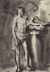
You might not achieve an exact chiaroscuro set-up in a studio, but can nevertheless start to highlight the model in a dramatic way. The wonderful drawing below, also by Rembrandt, shows how the human figure can be placed in front of a shadowy background:
Above: Rembrandt “Male nude standing, resting his left arm on a cushion”, c.1646, pen and wash in bistre
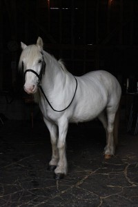
Another way to achieve a chiaroscuro effect is to put your model just within the doorway of a building and to view them from outside the open door. See how well this works, below, with Polo the horse:
Above: Polo the horse at the equestrian life drawing day last weekend. A chiaroscuro lighting set-up.
If your model (horse or human) has dark skin, then a chiaroscuro set-up can create a great air of mystery.
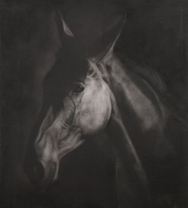
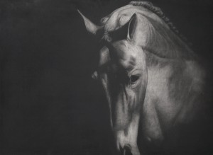
Take the example of a dark horse in a dark interior. I have long been fascinated by the way in which the horse’s edges, on the less-lit side, merge completely with the dark background. This effect has been used very successfully by Paddy Lennon, below. The pictures that result are thought-provoking:
Above: Paddy Lennon “Three Heads”, charcoal on board, 46x36in
Above: Paddy Lennon “Iberius”, charcoal on board, 38x48in
3) DRAMATIC CAST SHADOWS
When most people talk about their “shadow”, they usually mean their “cast shadow” that is visible next to them on the pavement on a sunny day. Cast shadows can look strange and dramatic (and can, at times, give children nightmares).
If there is just one main light source on the model, then cast shadows should be visible. Bringing the light source low down will lengthen the cast shadows.
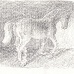
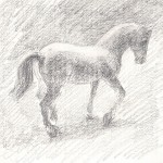
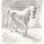
I have played around with a Daylight Company art lamp and a Schleich toy horse to investigate some possible effects. Here are some quick pencil drawings of three possible lighting scenarios:
Notice, above, how the mood of the picture can be altered by changing the direction and height of the main light source.
4) COMBINED EFFECTS
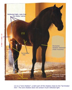
Light may fall on part of the figure, while another part remains in shadow. This can give a sense of intrigue and drama, though it is not such an unusual situation in real life. Here is a photo of an Andalusian horse which makes use of direct sunlight, reflected light and interesting shadows. For those who are interested, I have added some tone terminology labels (click on image to view larger version):
Links
Paddy Lennon homepage with more equestrian drawings: click here
Edward Hopper further information: click here
Thank you for this post! I recently conducted a survey through our weekly online life drawing groups and the most common dissatisfaction with them was our lighting. I did an internet search and this page was the only thing offering solutions that everyone seems pleased with. We are very grateful!