Perspective and Emotion (2): The space around an object
May 12, 2013
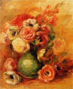
Above: Auguste Renoir flower painting, oils, 1901
An object in a painting can seem to have such a physical presence that I am stopped in my tracks. Whether a vase of flowers or a pair of shoes, the image may insist that it really is there, a solid presence in its own space.
In this second article about using perspective to increase the emotional “punch” of an image, I’ll suggest how to understand three-dimensional space to give your still life a sense of solidity and depth.
To me, this clear sense of space/ depth in a picture can have an even more startling effect if other aspects of the image, such as the colour, stray far from reality. Take, for example, the vase of flowers by Renoir (above). The three-dimensional quality of the flowers, vase, and surrounding space are so convincing that they seem to scream “REAL!” at me, while the luscious visible brushstrokes and warm colour-scheme do not strive for a trompe l’oeil effect and shout “IMAGINARY”. Such an approach, teetering on the boundary between strong illusion and a dream-like image, makes the painting especially thought-provoking.
Creating a sense of space around your object
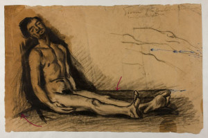
Above: Cezanne “Study for l’autopsie”, c.1867-9, charcoal, 31x48cm
So this is an article about still life, and here I am using a figure drawing as illustration! I chose this image as it beautifully demonstrates how to fit a body or object into a convincing space.
Cezanne was always fascinated by the whole business of how objects “fit” next to one another and within space. He is of course well-known for his brightly-coloured still life paintings that in some ways used traditional perspective, and in others broke many rules, but nevertheless appeared convincing as objects in space. Cezanne had this ability to play around with three-dimensional space, but this skill was grounded in a good understanding of perspective.
The first point to note is that a preparatory drawing from life can be very useful in understanding how an object fits into its surroundings. This holds true whether you are drawing a complex figure or a simple vase.
Above: Cezanne “Study for l’autopsie”. My red arrows point to Cezanne’s floor edges.
One interesting thing about Cezanne’s figure is the way in which it is slumped against a corner. In this study, Cezanne has included the edges of the floor as clear lines (indicated by my red arrows, above) to indicate the position of the walls around the figure. The artist may or may not opt to include such edge lines in the finished painting, but look how they clarify the sense of space in the preparatory drawing.
Putting this into practice with a simple still life subject
When drawing a typical still life of flowers, fruit or other objects, two or more edges of the supporting table are often visible. There may also be edges of a wall or window-frame behind your object(s). Try including some of these edges as lines in your preparatory study to help understand the space around your still life.
Notice how edges of floor, skirting board, tables, etc., need to be angled compared with the edges of your drawing paper. Take a little time to get these angles so that you are happy with them – they are the fundamental structure of your picture.
Some tips on getting sloping lines “right”:
If, in real life, horizontal lines are just as high off the ground as your own eyes, then they should be horizontal in your picture.
If horizontal lines are higher or lower than your eyes, then they’ll need to slope (unless the line is just directly in front of you).
To estimate the slope of a line, you can hold your pencil up in front of it. Follow this link for a demonstration.
If, like me, you are not mathematically-minded, you may wish to assess slopes in terms of time on a clock instead of numbered angles. I explain that more fully in the link.
Positioning the figure or still life object within your picture:
Take care to position your object relative to other parts of your picture. In Cezanne’s autopsy study, notice how moving the image of the body slightly to the right, to the left or up or down on the piece of paper, would suggest that the figure is nearer or further from the edges of the floor. The positioning of it the figure is clearly important.
In Cezanne’s drawing, there are negative spaces between the floor edge and the edge of the man’s leg. If you are unsure where to position a figure or object, it can be easier to draw these negative spaces than to do a lot of measuring.
If your still life object has straight edges then you can judge the slope of these as described in the section above. For an object as complicated as the human figure, you may need to imagine some straight lines and judge how these would slope. For example, there is a line (a groove between muscles) that runs vertically down the front of the man’s torso, and this tips as his torso tips. Drawing figures in three dimensions takes plenty of practice, so stick at it!
Using directional marks when drawing, to give a sense of space
Above: Cezanne “Study for l’autopsie”. My navy arrows point to regions of hatching that suggest solid surfaces. My green arrows point to areas of inky black shadow.
In Cezanne’s drawing, above, the body appears to be touching three surfaces: The floor, a vertical wall by his left shoulder, and a near-vertical surface behind him. On closer inspection, the structure behind him is not a flat wall as it is slightly irregular and stops level with his head. It could be a draped low cupboard in the studio.
Creating a preparatory drawing with the body positioned between these three surfaces provides enough information to develop this into an interesting painting, perhaps with the surfaces reimagined as outdoor ground and rocks. How does Cezanne get structural information into this preparatory drawing?
Notice how Cezanne has hatched (shaded) the three surfaces with directional marks. There are navy arrows pointing to these areas of hatching in the picture above. Parallel hatched lines can be used to suggest a flat surface, e.g. the wall that touches the figure’s left shoulder.
Using directional marks when painting
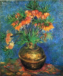
Painting with bold, visible brush-strokes, can help to create a sense of structure in your picture. Brush marks can be used in a similar way to pencil or charcoal hatching lines, to suggest the structure of a surface. The paint marks may be subtle and softly slurred or scrubbed into one another or, as in the Van Gogh still life, below, they could be discrete and contrasting in colour.
Above: “Fritillaries in a copper vase” by Vincent van Gogh, 1887
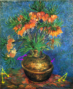
Van Gogh has used brush strokes to suggest the flat surface of the table or mat on which the vase is standing. See how these marks (indicated by my yellow arrows, below) angle into the picture due to the effect of linear perspective.
Notice how, in Van Gogh’s painting, the edge of the table is unclear or absent, and the space behind the flowers is a sparkly, blue void. These and other aspects of the picture are dream-like, but the vase is securely “grounded” on its supporting surface in three dimensions.
Above: “Fritillaries in a copper vase” by Vincent van Gogh, 1887, my arrows point towards some of Van Gogh’s directional brush-strokes. Click on the image for an enlarged view.
Painting or drawing rounded objects
Many still life images contain simple rounded objects such as a vase or dish. Look closely at how the edges of the round object seem to curve . If you are looking down on an object (like van Gogh’s vase), it’s near edges will seem to curve in the direction of a smile. Make this effect clear in your picture and the object will appear more three-dimensional. In the image below, my green arrows point towards the decorative band around the vase. Look how van Gogh emphasised this with strong marks and tonal contrast. The curvature of this band helps to make the vase appear more rounded.
Using tone when working in three dimensions
If light angles across your still-life set-up, part of it will be illuminated and part in shadow. There may also be shadows cast by your object(s).
The shapes of any patches of light and shade will help to explain the structure of your still life. For example, look at the bright highlights on the vases in both van Gogh’s and Renoir’s flower pictures (Renoir’s image is up at the top of this article). These highlights help to make the vases look more rounded.
Shadows cast by an object can really help to explain where that object is positioned within the picture. For example, look again at the inky black shadows in Cezanne’s “l’autopsie” study, (indicated by green arrows, below). They emphasise where the figure contacts the floor and how close he is to the vertical supporting surfaces on either side of him:
Above: Cezanne “Study for l’autopsie”. My navy arrows point to regions of hatching that suggest solid surfaces. My green arrows point to areas of inky black shadow.
Cast shadows do follow the rules of linear perspective, but usually it is sufficient just to mark in their abstract shapes instead of doing elaborate measuring.
Putting all the ideas together to achieve a sense of space in your still life
To sum up, there are several tricks used to help create a sense of space within a still life image:
- Emphasise edges of objects that angle away from the viewer into the picture.
- Include some edges of floor, wall, table , window-frame, etc. within your picture to give a sense of space and scale.
- Clear tonal modelling of objects and of the surfaces around them.
- Directional marks on objects and on background surfaces (i.e. draw hatched lines, or paint with visible brush strokes).
- Accurate rendering of shadows cast by the still life objects, paying attention to their shape and direction.
- Emphasise curved edges of rounded objects.
- Bold contrasts of colour and tone in foreground, compared with less contrast further back in the picture.
You might or might not choose to use all of the above at once. It is of course possible to ignore some of these techniques but, in so doing, it is a good idea to make good use of others from the list.
For example, an attempt at photographic illusion may avoid visible brush-strokes, but would then benefit from excellent tonal modelling and from the emphasis of edges that angle into the picture, as in the Spanish still life, below:
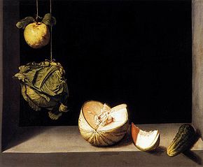
Above: “Quince, cabbage, melon and cucumber”, 1602, by Juan Sánchez Cotán
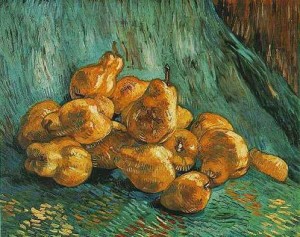
In contrast, Vincent van Gogh chose a different approach in his painting of pears heaped on a swathe of fabric, below. The artist has here opted not to paint the edges of the table. So we are left with the impression of a riotous tumble of fruit. To make sense of how the fruit and fabric are positioned in space, van Gogh used directional brush strokes (on pears and fabric), strong cast shadows under the heap of pears, and bold contrasts of tone and colour in the foreground.
Above: “Still life with pears”, 1888, Vincent van Gogh
