Perspective and emotion: Spaces between people
April 25, 2013
As artists we focus on ideas and emotions, so why should we bother with perspective?
Above: Rembrandt “The Supper at Emmaus”, 1629, oil on panel.
Art ideas are full of contradictions. Here is one example that fascinates me: Art itself is primarily about emotional concepts, yet artists are expected to master the technical challenges of perspective. With its ruled lines, vanishing points and strict right or wrong answers, the mathematical side of perspective terrifies some artists. How can this very technical subject have anything to do with art and emotion?
To some, it is tempting to forget about perspective completely. One can argue that, with the assistance of photography, etc., we don’t even need much knowledge of perspective to create a realistic drawing.
I have noticed that a true understanding of perspective empowers artists to create an illusion of depth and space linked to emotion. Copying images from photos without any understanding of three-dimensional space in the original image will not produce the same effect.
The spaces between people
In our lives, distance and space are closely linked to emotion. The most obvious example is that of “personal space“. How close can someone approach you before you start to feel uncomfortable or nervous? 3 metres, 1 metre, 30cm, 6cm? The answer would vary depending on who the other person is in relation to you, whether a close family member, a friend or a complete stranger.
Where people (and indeed other mammals) are concerned, space or the lack of it is closely linked to emotion, whether that be intimidation, intimacy, loneliness or maternal love. Theories of personal space as related to culture, emotion and body language would come under the subject heading “proxemics“.
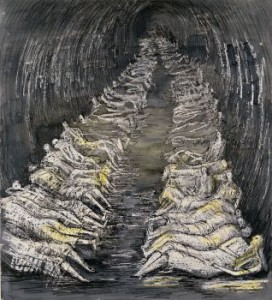
A nightmarish image can be created by cramming figures into a tight space. Henry Moore made a series of drawings inspired by his experiences in the London underground stations that served as public air raid shelters during the second world war. Below is a frightening picture in which people like you and me are packed into a tunnel receding into the distance:
Above: Henry Moore “Figures in a Cave”, 1936, chalk, brush and wash
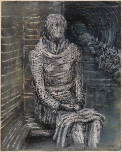
Notice, below, the effect of setting one figure apart from the crowd. In Moore’s drawing, one female figure sits alone. What is she thinking? How does she feel? Notice how Moore has clarified the space around her, using crayon lines to suggest brickwork, wood texture and flooring. On one side she is enclosed by walls and bench, but beyond her the tunnel and crowd recede into the distance.
Above: Henry Moore “Woman Seated on the Underground” 1941, gouache, ink, watercolour and crayon on paper
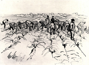
Vincent Van Gogh is known for his emotionally-charged paintings and drawings, but it was actually an instructive book on linear perspective that really grabbed his attention in his youth. Many of Van Gogh’s most moving images have a clear sense of space, and he often used brushstrokes or pen marks to emphasise linear perspective. The drawing of peasants working, below, is one obvious example. Notice how the field’s furrows converge towards the distance. This dramatic use of perspective shows the vastness of the landscape compared with the figures, and suggests the immensity of their task. The peasants’ work is tough, without an end in sight, but Van Gogh gives the figures a sense of togetherness by showing them so close to one another within the massive field:
Above: Vincent Van Gogh “Farmers Working in the Field”, April 1888, Arles
Creating an illusion of depth and space
If you are keen to give your own work a sense of space, I highly recommend taking some time out to study traditional linear perspective. Even if your own images do not contain buildings or railway tracks, the knowledge gained will feed back into your work.
There are plenty of books and websites that explain the principles of perspective, so I shall not go into them here. Whichever text you go for, make sure that it is clear about eye level: “The artist’s eye level is the same as the horizon line”.
Lines that are at the same level as the artist’s eyes will appear horizontal in a picture. Lines above or below this will appear to slope.
It helps to play with perspective exercises so much that the subject starts to become “second nature” to you, i.e. intuitive.
Using perspective in your pictures
One obvious approach is to include a wall, table edge, path or other straight edge that leads into your picture. You do not need to draw the whole lot. Just hinting at a row of brickwork or suggesting top and bottom edges of a window will be sufficient.
Try positioning such straight edges so that they angle away from you and into the picture. In some cases, this can enhance the emotional impact of the image.
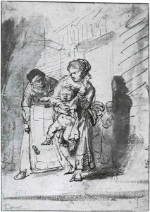
Above: Rembrandt “The Naughty Boy” c.1635, pen and bistre. Notice how the angled frontage of the building leads us to look at the struggling figures. The three main figures (the frantic child, the stressed mother and the old woman stooping towards them) are confined uncomfortably to the space delineated by the building and the shadows.
Any pattern of tiles or wooden panels or, in a landscape, lines of crops or ruts in a field, can recede into the distance. Keep your marks lively and interesting as you suggest these patterns. Straight lines need not be continuous.
Using lively marks or brush strokes, it is possible to give a sense of perspective without including any architecture in your picture. Brush strokes in both the background and the figures can be angled so that they appear to recede into the image. For ways in which colour and definition can suggest depth, read up on aerial perspective. My own article on colour and depth can be reached by clicking here.
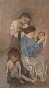
Cezanne often tied figures to the imagined space of their surroundings by the use of colour and the handling of the paint. Around 1906, Picasso developed similar ideas in his own figure painting. The modelling in paint of the figures sometimes extends to their immediate background. Take, for example, this image of three figures, with its minimal background but strong sense of space:
Above: Pablo Picasso “La Coiffure”, 1906. Like a sculpted group, these three figures give a clear sense of how they are positioned relative to one another.
By developing these ideas further, it is even possible to give an exciting sense of “presence” to mundane objects such as shoes and pots. In my next blog post on this subject, I’ll take a closer look at remarkable still life images by Vincent Van Gogh and others. Do such images have a strong sense of space, if so then how is this created, and does this tie in with any emotional impact of these pictures?

As an artist without technical perspective training and have difficulty understanding books on the subject, I found your article stimulating and most helpful to follow your links to continue. I know in the back of my mind it is imperative to get it right.. eventually!
Thankyou and keep them comming.
I agree that many books on perspective are overly technical and off-putting. Well done for sticking at it. And if anyone comes across a really helpful bit of writing on linear perspective then please share the web link or book name in the comments list here.