The volume simplification class, and my last ever drawings of Freddy
May 5, 2012
What is volume simplification?
Yesterday I discussed volume simplification with the class. The idea of this is that complex figures can be represented as a set of simple geometric shapes either as an exercise or on the route towards abstraction. It is well worth trying with human and animal figures, as it forces the artist to ignore distracting surface details and to focus on the most important facts about the body, namely the positions of all its main parts.
Representing each part of the body by a simple 3D shape
At its most basic, the body can be thought of as being made up of several units (head, shoulder girdle, chest/belly, hips, etc.) and each of these sections can be represented by a geometric volume such as a cuboid, wedge or cylinder. It is important to show how each “unit” is tipped or angled. For example, people often stand with their shoulders tipped one way and their hips tipped in the opposite direction.
A dog drawn as simplified volumes
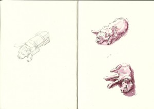
To illustrate this way of thinking, here is a recent double page from my sketchbook. These sketches are the very last that I made of my dear old terrier, Freddy. He unfortunately had to be put to sleep on Wednesday and is very sorely missed. At some point soon I shall put happier pictures of him onto this website.
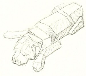
On the right-hand page are two pen and ink drawings made using a Rotring Artpen. On the left is a volume-simplified Freddy. I did my best to ignore his shaggy coat that gave him an amorphous surface appearance, and attempted to show something of the twist through his body from head to tail and the directions of his front legs.
See how I have left imaginary gaps between the sections of his body to allow “segments” to rotate relative to one another. What I do feel that I have achieved here is a convincing image of a very weak dog who is lying completely flat on a level surface, not on his bed. The drawing lacks clarity in the connection of the legs to the body and perhaps fails to show enough twist of the tail end of the spine towards Freddy’s right side…
A relationship between drawing and sculpture
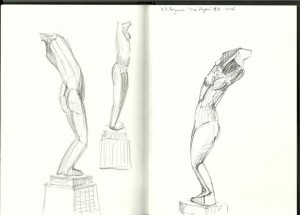
I feel as if “volume simplification” is one point in the drawing experience in which there is a portal through to sculpture and back again. Last month I spent an afternoon at the Tate Britain gallery and particularly enjoyed J.D. Fergusson’s wood sculpture “Oak Rhythm” (1925), which represents a dancing figure. The volumes of this sculpture are simplified, but not by separating the figure into simplified anatomical units. It can instead be seen as a series of interleaved upright curved segments of wood running from feet up through the body to the neck. To me, this suggests the thrust up through the dancer’s feet, allowing a twist through the body. I do not have a photo but can share a page of drawings from my sketchbook:
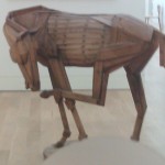
I have labelled the wooden sculpture of the horse at the top of this page is as I do not know the title or artist’s name. If anyone can enlighten me about this then please get in touch. It was a work that I glimpsed through a locked glass door at, I think, the London Southbank centre within the last two years. I admire this for its simplification of volumes just enough to make good sense of the horse’s posture and balance without attempting detailed anatomical accuracy.


