Border Terrier in Pastels
June 09, 2012
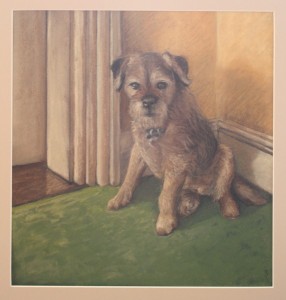
A drawing of my terrier, Freddy, in pastels
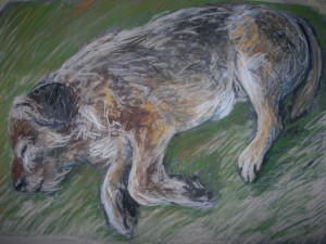
Border terriers are renowned for being healthy and lively well into their old age. When my little dog suddenly slowed down at about 15 years old, I not only started him on painkillers and Aktivait but also made it my priority to do this portrait. This was two to three years ago.
Drawing hairy pets in pastel
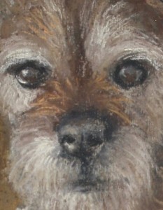
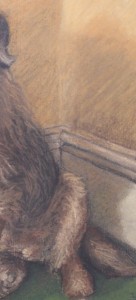
Pastel is an ideal medium for drawing furry creatures. The pastel sticks can be turned on their sides for “blocking in” tone. Marks can be smudged with a piece of kitchen towel in order to represent shapes and masses. The pointed edges of sticks can be used to draw linear marks that suggest fur:
Pastel marks of different colours can be overlapped to suggest a gradual change of colour or tone as in the cast shadow on the wall behind Freddy:
I used a mixture of hard pastels (my collection includes both Faber-Castell and Pitt pastels) and soft ones (Rembrandt and, my favourite brand, Unison) for this picture.
Unison pastels are both round-ended and soft so are not the obvious choice for making fine lines. However, I really am seduced by their superb colours and do find myself working with shards of broken Unison pastel even for hairs and whiskers.
What was I aiming for?
- A sense of place. I wanted to show Freddy in this corner of our upstairs landing. At the time of making that drawing, this was where he would sit (usually ignoring his own bed), and he would be ready to greet people coming either up the stairs or out of nearby doorways.
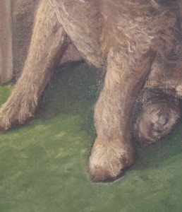
- A suggestion of his sore front left leg:
- A combination of 3D form and overlying hair. This was a two-step process. I decided to block his body shape in with light and dark tones of pastel, then to suggest individual hairs over the top of this.
- A memory. Yes, there is a little success here. It wasn’t long before Freddy couldn’t get up and down the stairs on his own so this picture does mark a point in time. Yes, it is unashamedly sentimental. But so am I. And it did capture his kind expression. I worked from a selection of my photos but kept running out to the landing to look at Freddy in order to get the details right.
Comments (2) | Tags: blog, dogs, Freddy, pastel | More: Blog
Drawing horse heads: The main planes of the head
May 31, 2012
Today I explain the basics of horse head structure for artists
Quite a lengthy post this time, but plenty of ideas and beautiful images to enjoy….
First, a quick look at two-dimensional horse head images
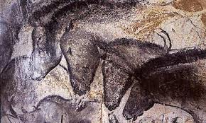
A very simple horse head can be drawn using just a few lines to create a recognisable and beautiful image. For example, the following drawings have great character, spirit and symbolic meaning. On the left we have charcoal images made about 30,000 years ago on the walls of the Chauvet-Pont-d’Arc cave in southern France. On the right is a logo created for Madinat Jumeirah, a luxury hotel in Dubai. This head is created from Arabic calligaphic letters that translate as “The Palace”:
The beauty of these fantastic images, above, lies in their incredible use of line and space. The shape of the horse head can make a wonderful two-dimensional design on the page or wall.
Drawing in a more three-dimensional way gives you more scope as an artist
When faced with drawing a real horse from life, it can be tempting to aim straight away for the “iconic” profile illustrated above, perhaps working largely from memory. However, this approach risks missing much of the beauty of the living creature.
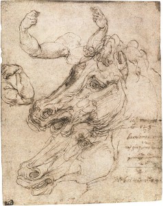
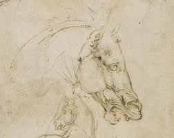
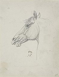
On the other hand, here are studies made with real understanding of the horse’s structure. That on the left by Perina del Vaga (Rome, 1501-1547). The study on the right was by Leonardo da Vinci.
Understanding the actual three-dimensional shape of the horse’s head allows us to produce work that relates more closely to our experience of the animal in real life. This empowers us to draw the horse from any angle and to understand the fall of light and shade on it. We can then return to more two-dimensional work, if we wish, with a fuller understanding of our subject.
Planar analysis and heads
A “plane” of an art subject is considered to be a flat and level part of its surface. In studying the human head, some artists aim to simplify its shape into a number of planes. This process is called planar analysis. Where possible, these planes are made flat (though some do curve slightly) and adjacent planes meet at a sharp edge. It is even possible to buy a special model to study and work from for human heads, the one below being available from from the website: Planes of the Head
Why bother with planar analysis?
- This way of working ensures that we understand the structure of our subject.
- It helps us to get the light and shadow correct. Planes facing the light source will be very light in tone. Those facing away from the light source will be in deep shadow. Planes that are in line with one another should have the same amount of light falling on them (assuming that there is no cast shadow, e.g. from a tree or from the mane of the horse).
- It helps a lot with foreshortening, especially once we start working without a live model.
- If the planar structure is emphasised, it can give a handsome, well-chiselled appearance to the image of the horse head.
Horse head structure: Notable points
I’ll go through the main planes and landmarks of the horse head in this today. There are Old Master drawings, images of statues and live horses to illustrate these points.
The diamond shape at the front of the head
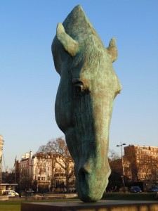
At the front of the horse’s head is a fairly flat large diamond-shaped area. This is made up of some skull bones that are fused together, these being the nasal bones (running down the length of the nose) and the frontal bones (at the front of the forehead). When simplifying for artistic purposes, we can consider this diamond to be one flat plane.
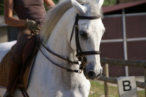
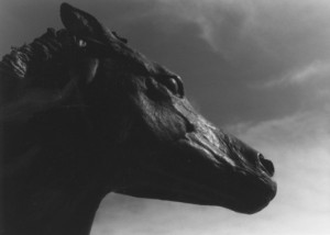
The sculpture above is a horse head by Nic Fiddian Green in London. I have included it to show how light will illuminate the front of the horse’s head in a diamond shape. The sculpture is somewhat stylised, but see how the relationship between the eye and the diamond-shaped plane is the same in the sculpture and in the photo of the live horse, above.
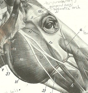
Here are diagr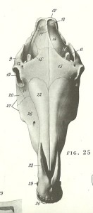 ams from “An Atlas of Animal Anatomy for Artists” by Ellenberger
 , Dittrich and Baum, showing that diamond-shaped area at the front of the horse’s head. Run your hand over the front of a real horse’s head and you’ll be able to feel the bone just under the skin in this area.
In fact, there is a slight crevice along the centre of the horse’s head in the middle of the “diamond” (see diagrams above). It always helps to have a midline marker when drawing a complex subject, so feel free to make good use of this one.
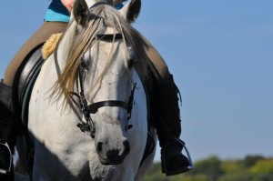
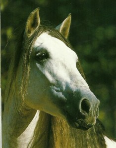
In the photo, below, of a fine horse from the Kent-based stud “Dancing Green Lusitanos”, the bone structure is very clear. The left side of the horse’s face is in shadow. See the shape of this shadow, and the clear change of plane between this shaded area and the front of the face. The slight groove down the centre of this horse’s nose is also visible in this picture
Masseter muscle of the cheek
Now consider the semicircular cheek muscle at each side of the head. This is the Masseter muscle, and in real life its surface is almost a flat plane without needing any simplification. On the left, below, is another detail from Ellenberger et al’s “An Atlas of Animal Anatomy for Artists”, the Masseter muscle being labelled with an “m”. On the right is a drawing by Jacques Louis David with the Masseter muscle clearly shown:
Go up to a friendly horse and stroke your hand over the semi-circular Masseter muscle. Feel how flat this muscle is. At the front edge of this muscle, you’ll encounter a sharp change of plane and a “step” as the horse’s head narrows at this point.
The facial crest
Try running your hand up over the flat Masseter muscle towards the eye. Here, you’ll encounter a bony ridge and a definite change of plane. This bony ridge is the zygomatic arch, which is also called the facial crest (labelled 27 in the above diagram). Be aware of this ridge as it is a very prominent feature on every horse head. See how the facial crest is illuminated by sunlight in this photo, and how it casts its own shadow:
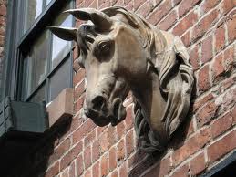
This photo of a horse sculpture on an old stable building in New York (below left) clearly shows the structure of the Masseter, facial crest and surrounding planes, as does the photo of a horse, below right):
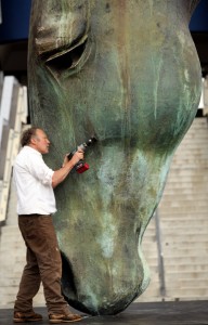
To further illustrate the marked change of plane at the edge of the masseter muscle, here is a photo of Nic Fiddian-Green working on his horse head sculpture as it is installed at Ascot racecourse. See how there is space for him to fit his body in along the giant horse’s nose while his right arm is in line with the facial crest:
The round Masseter muscle makes a fantastic shape within a composition. Make good use of it if you can.
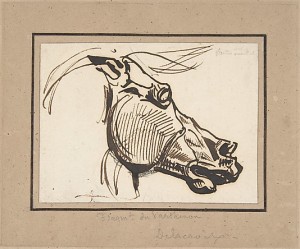
Here is Delacroix‘s dynamic drawing based on a horse from the Parthenon sculptures. See how hatched lines follow the changing planes to give a clear sense of form. The rounded shape of the Masseter muscle and of the eye contrast here with the more angular, choppy shapes around the nose and ears, contributing to the powerful design:
Position of the eye
Let’s now consider how the eye fits into the head. First, notice that the eye and its lids are embedded within a deep hollow in the skull, the bony orbit. So, though the itself is large and round, only the surface of it protrudes:
The eye within its bony rim is set at an angle. The lowest corner of each eye (the corner nearest to the nose) is closest to the midline. The clearest illustration for that is, again, the New York horse sculpture on the old stable building:
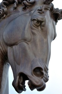
Also see the angle of the eye of this statue by Leonardo da Vinci:
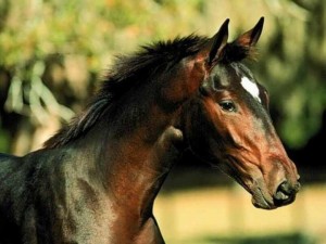
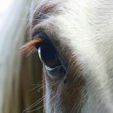
And in the real horse:
What is the widest point of the horse’s head?
The very widest point of the head is at the orbital arch, which is the rim of bone just above and behind the corner of the eye:
The funnel-shape above each nostril
All I shall say about the nose today is that there are muscles in the shape of a funnel or pyramid attached to each nostril. These can pull the rim of the nostril outward to enlarge or dilate the nostril:
The temporal fossa
Note the concave valley, the “temporal fossa” which is just above each eye and a little towards the midline (marked “10” on the diagram below). In some horses this fossa is more of a flat plane. In very thin horses and in those of certain breeds such as Arabs, the temporal fossa is a deep hollow.
The ridge of the Zygomatic arch
There is a bony ridge extending from the upper corner of the eye back towards the base of the ear. This is the “zygomatic arch” (not to be confused with the zygomatic crest) and is labelled “9” on the diagram above.
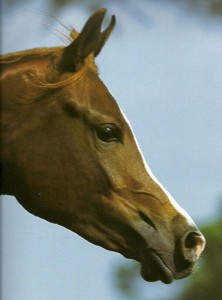
Here is an Arab horse with a very prominent zygomatic arch extending back from the eye:
The region between the corner of the mouth and the Masseter muscle
The muscles here form ridges and valleys that move as the horse chews food and sometimes when he is excited.
Do look again at the Arab horse profile view, above, to see these muscles clearly defined. In some situations, there is a clear change of plane extending back from the mouth producing a dramatic shadow. See how the light affects these planes in the Arab head above, and also in this close-up view of Robert Glen’s Las Colinas Mustangs (Texas) :
Now what?
The best way to understand the structure of the horse’s head is to get to know a horse in real life, and to feel for yourself where all of those “landmarks” and changes of plane are positioned.
Modelling a horse head in clay or simply in Plasticine will also do wonders to improve your understanding.
This very lengthy post has really just overviewed the structure of the head. I shall happily post in future in more detail, e.g. about the eye area.
News and workshops
I shall be travelling in the coming week, so am taking a short holiday from adding to this blog.
There are still places available on the Horse Life Drawing day on June 17th near Ware, Herts. If you are interested, please do get in touch. You can phone or email if you already know me, otherwise click here: Contact
This workshop is open to all, from sixth form school students up to very experienced artists.
Links
Dancing Green Lusitanos (Kent-based stud with beautiful horses)
“An atlas of Animal Anatomy for Artists” by Ellenberger et.al (My favourite artists’ anatomy book) see link below:
| Tags: anatomy, blog, horses, planar modelling | More: Blog
Sketching pets: which medium to use
May 27, 2012
Sketching pets in various media
Today I discuss which media are best suited to sketching your pet. The illustrations here are pictures from my own sketchbooks, mostly of my Border Terrier, Freddy.
Pen and ink drawing
For the last few years, pen and ink has been the main medium used in my sketchbooks. Both rollerball and cartridge-type pens are wonderfully convenient. There is no mess, they do not spill, fade or smudge. Wherever I go, I usually carry a sketchbook and pen in my bag.
The double-page spread, above, illustrates the adaptability of pen lines for both fl uid “loose” sketching and for a more detailed build-up of detail.
My current favourite sketching pens are Artpens made by Rotring. These have a slightly flexible nib that can produce a “lively” line. I prefer the feel of old-fashioned dip pens even to my Artpens, but, following an incident, am now too nervous of spilling ink to take a dip pen and ink bottle around with me for sketching. The Artpens (“Fine” and “Extra fine”) are a good second best to dip pens.
Above are two drawings made with an Artpen, showing how detail can be built up with crosshatching and fur can be suggested using lines.
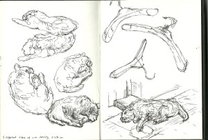
Here I had a day of being curious about how things looked from different angles:
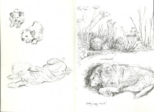
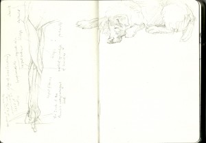
In the sketchbook, below, I sat down and drew both plants and my dog with some attention to detail on the right-hand page, again using an Artpen.
The bolder drawings on the left-hand page were drawn in black chinagraph pencil which I shall discuss more fully later in this post.
The only cartridges that can be used in an Artpen are made by Rotring themselves. These are available in various colours. So far I have tried out black and brown inks and these are both watersoluble. A brush pen filled with plain water is handy for working back into the pen lines.
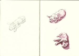
Both the black and brown inks take on a rather purplish tone when water is added. The following drawings (right-hand side of the book) were done with brown Rotring ink in the pen:
See how much bolder the ink drawings look (above) compared with the pencil drawing on their facing page.
Watercolour
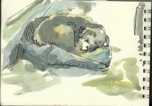
I don’t seem to have used watercolour very often for drawing my dog. It can be used very informally in a sketchbook just to fill areas in with a wash of colour. I like to combine watercolour with pen or pencil lines when sketching, often using up whatever colour is left on my palette:
Brush and ink
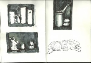
In the sketchbook, below, I was working on ideas for a still-life picture. The lines for these drawings were made with an Artpen, then dark tone was added using black Daler-Rowney FW ink and a brush. I’ve included this double-page here to show you how this does give quite a striking effect within the sketchbook. Once again, the dog found his way onto the page as a line drawing:
If you are careful to avoid spillage, dilute ink can be carried about in a container and added to a line drawing as you work:
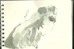
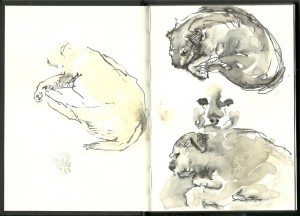
Black Quink ink tends to separate into subtle colours when diluted with water, and this produces an interesting effect:
Coloured pencils
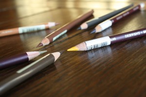
The pencils shown above are from the Faber-Castell Polychromos and Derwent Coloursoft ranges, and were used in this drawing:
A few black pen lines were included to increase the definition of the drawing.
The range of wonderful coloured pencils available is tempting. I need little excuse to visit the art shop and to choose yet more colours. A few strokes of one pencil can be used to suggest the exact colour of an animal’s tuft of hair, or light strokes can be layered to blend the colour. Derwent Coloursoft pencils are particularly blendable.
Pencil
Pencil is handy for sketching in that it is very easy to carry around, and is easily erased if errors occur. Unfortunately, it smudges and fades unless fixed, and does not have much impact or reproduce well.
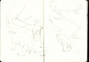
In the following images, I was drawing my own arm in pencil, but then got distracted by the dog who is of course far more interesting:
Chinagraph pencil
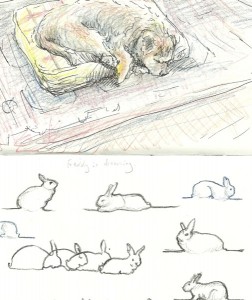
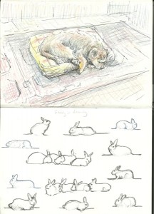
Normal coloured pencils produce subtle lines and are easily smudged. For bold, permanent lines consider using a chinagraph pencil. Below is a detail from a double page of my sketchbook. The dog was drawn in coloured pencils and pen, then the rabbits were added in black chinagraph pencil:
The waxy chinagraph pencils are available in black, white and a limited range of other colours. I do find it difficult to keep them sharp, and they easily break when I re-sharpen them. Aside from this frustration, they are great for sketchbook work as they do not smudge at all and encourage a bold, direct approach.
Working in soft pastel
For a completely different effect, try sketching in pastels. Keep the colours simple. It helps to start off each picture with just four colours of your choice: Pick a warm light colour (e.g. a cream), a cool light colour (e.g. a bluish light grey) and a warm and a cool dark colour. In the image below, I used a stick of soft willow charcoal for some of the initial drawing:
The available range of pastel colours is amazing. Once again, I find it hard to stop buying when I am in the art shop. My favourite brand for softness and delicious colour is Unison (right):
I also love to use conte sticks which have a much firmer texture:
For sketching, the main drawback with pastels is their tendency to smudge. They can also leave your hands, bag and surroundings covered with powder.
You may get away with using a little firm conte crayon in your routine sketchbook (leave the facing page blank), but it is advisable to use a dedicated pastel book to protect your work. I like the Daler-Rowney pastel books, which come with textured paper of assorted colours. Each page is protected by its own piece of greaseproof-type paper, so your work won’t smudge when you turn the page.

Looking ahead…
I am looking forward to the next horse life drawing class which is set for Sunday June 17th:
https://art2art.org.uk/workshops/equestrian-life-drawing-sunday-june-17
Do contact me to reserve your place.
My next post will probably be related to drawing horses. Let me know if you have any special requests for post topics, otherwise just watch this space!
| Tags: blog, dogs, Freddy, sketchbook | More: Blog
Sketchbook dog drawings
May 24, 2012
Ideas and tips for sketching your pet at home
Today I shall share some of the dog drawings from my sketchbooks. This post is in memory of my Border Terrier, Freddy, who recently died at age 17 years.
Here are some suggestions for drawing pets, this time illustrated by sketches of my own dog. These tips are applicable to drawing any animal from life.
A variety of poses per page
Pets make great models, but you never know when they will change position. Be prepared to start more than one drawing on a double-page spread of your sketchbook. It doesn’t matter if one or more of these poses remain unfinished.
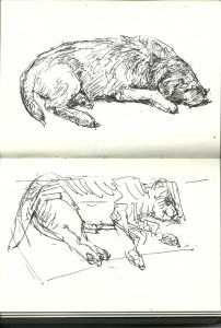
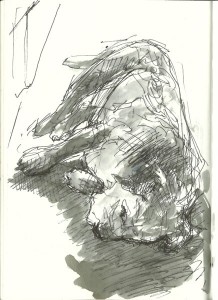
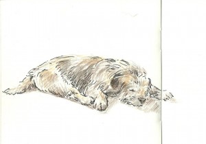
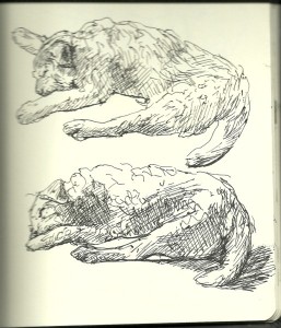
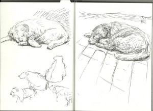
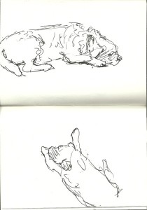
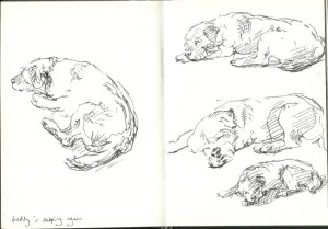
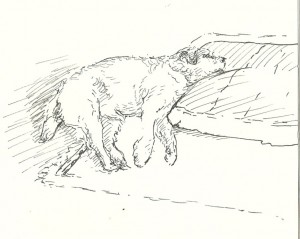
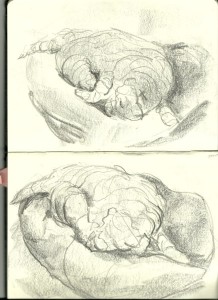
In the two sleeping poses above, I had time to build Freddy’s structure up with pen cross-hatching, and also to suggest his shaggy coat with pen strokes.
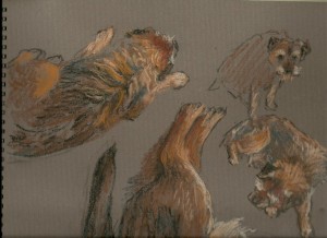
In the awake poses, below, I have used a more fluid style of line to suggest his posture without any attention to tone or texture.
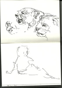
With a panting dog, consider what can and cannot be seen of the lips, teeth and tongue. In a shaggy Border terrier, the upper teeth and lips are obscured by hair, and we see a little of the lower canines (those are the long teeth) and tongue).
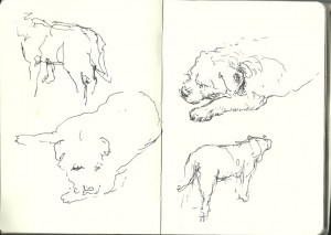
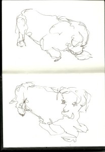
In the sketchbook below, I did a few scribbly drawings of Freddy moving about before he settled down for a sleep. The attempts to draw him in various fleeting postures adds a little character to the pictures of him sleeping.
I made these two resting views into self-enclosed peaceful shapes, one on each opposite page.
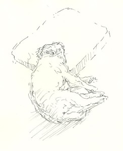
Here are three poses as seen almost from above as he changed sleeping position. He had long, shaggy fur over his back that parted in the midline. The shagginess could sometimes make it difficult to understand the actual structure of him and it is important not to fall into the trap of drawing every strand of hair. Sometimes the fur could be useful in my drawings, e.g. to help delineate where the middle of his back was positioned. Here I used the bulk of the fur to suggest his posture:
Sometimes I would embark on what I expected to be a longer drawing of him resting, only for him to move unexpectedly. This can be a blessing in disguise. See how most of these lines are left fluid and dynamic. The small amount of cross-hatching is restricted to one side of his head, and this is just enough to suggest which way the light is falling:
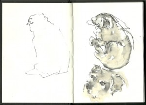
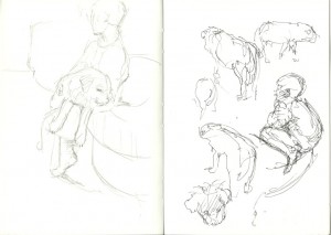
The brief sketch on the left page, below, merely hints at the terrier’s outline. He then moved position, but this was enough to give plenty of information about how he was sitting:
My pen drawings of Freddy were all made very directly, without any erasable under-drawing. Errors can be incorporated into the drawing. Indeed, multiple lines resulting from error can be beneficial, suggesting that the dog is moving or about to move.
What does your pet do?
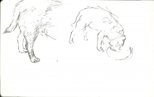
It is easiest to draw your dog as he or she sleeps, but do try to sketch your pet engaged in their usual day-to-day activity if at all possible. A good place to start is to draw them eating. You will hopefully have at least a minute or two to work:
If your pet tends to sit with a certain person, see if you can sketch them together. Freddy got on particularly well with my little boy, Oliver, who was forever picking him up. Here (on the left-hand page of the sketchbook, below) is Freddy draped comfortably over Oliver’s knee:
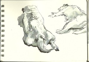
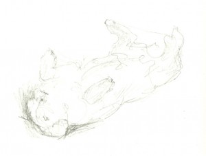
Does your dog lie in a funny position? In his old age, Freddy went through a phase of wanting to lie upside-down and would rest like that for a few minutes. This is a challenging pose to draw (watch out for all that foreshortening) and he tended to roll slowly back onto his side so I had to draw rapidly:
The dog in his environment
Do suggest bits of your pet’s surroundings in your pictures. Cats and dogs choose places where they tend to rest in the home. The way in which they sit or lie in these spaces is meaningful and worth recording.
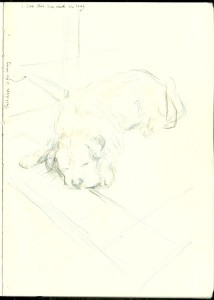
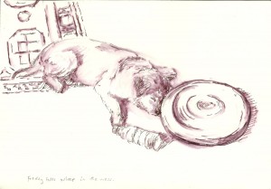
Here is Freddy towards the end of his life. By this stage, he was painful at times and wanted to lie with the left side of his head resting on his bed. He needed human help to get into this position but, once there, he would rest happily.
Here is Freddy surrounded by household mess that the children have left on the floor. He doesn’t mind. There is one of those soft wobbly balance cushions as well as a plastic water bottle. Being both blind and deaf, I think Freddy quite liked to be in contact with objects to give himself a point of reference:
Experimental approaches to drawing
Pets are completely uncritical of our efforts, do not insist that we flatter them, and they do not mind a bit if we try unconventional drawing methods.
For example, here I used a chunky sticky of graphite to build up an image in cross-contour lines. These are lines that appear to curve over and around the form of Freddy and his bed.
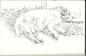
This is a line drawing made with a Rotring pen, this time thinking of Freddy as more of a blank empty space and creating his image by building up short lines around him:
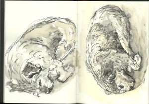
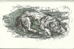
This drawing is layered with scribbly pen lines and ink wash. He emerges from the scribble on the page:
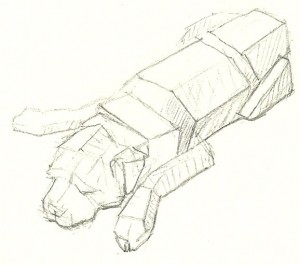
And here is the volume simplification drawing that I made of him just a few weeks ago:
A note about sketchbook layout
It is a good idea to change your drawing approach as often as possible within your sketchbook. This ensures that your sketchbook looks interesting to those who take a look through it. Different drawing methods also keep you on the ball as an artist, and ensure that you do not keep repeating the same picture over and again.
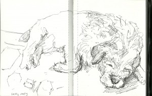
From time to time, you can even be a bit whimsical if you wish. In the double page spread, below, I drew Freddy sleeping yet again, but then imagined that he was dreaming of rabbits. He used to love to chase rabbits but never caught one:
The most obvious way to keep your sketchbook interesting is to work in a variety of media…
Remember to check this blog again on Sunday, as I shall be posting about sketching dogs in various media, from pen to pastel.
| Tags: blog, dogs, Freddy, sketchbook | More: Blog
Sketching in Hertford: The Memorial Stag
May 23, 2012
Sketching on location: the Hertford Memorial Stag
In summer, Hertford Art Society members meet outdoors to sketch and paint. Yesterday evening the weather was balmy, and we gathered in the Fore Street area of Hertford itself…
…before going for a drink at the Salisbury Arms.
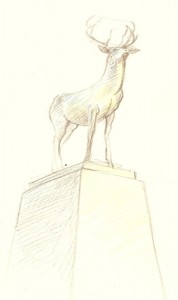
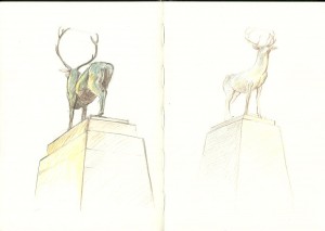
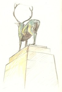
What really interested me most was the war memorial that stands in Parliament Square at the end of Fore Street. This is a tall stone plinth on which stands a magnificent bronze stag sculpted by Sir Edward Alfred Brisco Drury. This monument is surrounded by name panels commemorating those who died in World War I and World War II.
For more information about this memorial click this link:
http://www.roll-of-honour.com/Hertfordshire/Hertford.html
I sketched the stag from two positions. It is a challenge to draw an animal from below like this as foreshortening will be extreme. The first drawing was made with Durer and Inktense water-soluble pencils and a water-brush:
The second was drawn with coloured pencils without water.
Hertford Art Society is very active in the area and gives a warm welcome to new members. To see their full range of activities and exhibitions, follow this link:
http://hertfordartsociety.co.uk/
| Tags: sketchbook | More: Blog
Oil sketches of Freddy
May 19, 2012
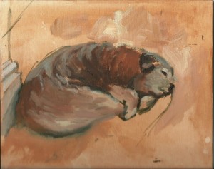
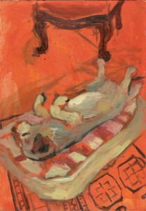
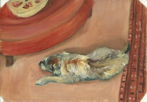
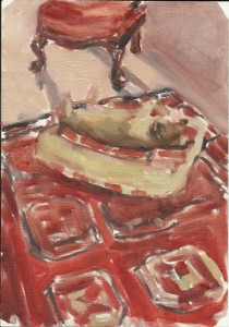
In this post I share some oil sketches that I made of my old terrier…
This post is in memory of my dear border terrier, Freddy, who died at the beginning of this month.
Over two weeks have passed since the end of his life and, though I felt devastated to start with, I can now start to think again of funny stories about him even if just in a wistful way. For example, there was the time that he ate through someone’s leather rucksack in order to reach their sandwiches. And on another occasion he went missing and was eventually found trapped (quite happily) inside the lidded compost bin which he had thought was a suitable lunch venue.
There is no shortage of pictures of this little character. My sketchbooks are full of them, and he obligingly posed at drawing classes towards the end of his life.
The decision to sketch in paint
He had been ambling about as a blind and deaf dog for a year or so, but was then ill in February 2012 and I was not sure at the time whether or not he would pull through. I managed to get him comfortable again through a combination of electrolytes, home-cooking and medications. It must have been a sense of panic at Freddy’s rapid aging that got me to bring my easel downstairs, protect the furniture with sheets, and get down to some oil sketches of him from life.
The process of painting Freddy made me feel a bit better about his ageing process. It forced me to observe him closely as he rested, and it was clear that he absolutely relished relaxing and could be happy and comfortable in various positions, whether curled on the floor or (a February 2012 favourite) upside-down on his bed.
Pictures and memories
I never quite knew when Freddy would move as I painted him, and the immediacy of working from life brought an emotional directness to these pictures. These little paintings are all technically flawed, but those that I have included in this post are more successful than a photo in that they are closer to my personal memory of him.
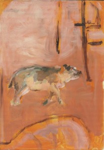
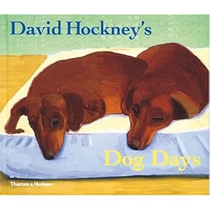
Have you seen David Hockney’s oil sketches of his dachsunds? Check out this charming book which is full of Hockney’s paintings of his dogs, Stanley and Boogie. This was an inspiration to me. Much of the point of these pictures is the portrayal of dogs in their environment, just fitting into the space and with one another. http://www.amazon.co.uk/David-Hockneys-Dog-Days-Hockney/dp/0500238340
I am currently sorting through a great pile of old sketchbooks, looking for pictures of Freddy. Remember to check back here on Thursday as my next post will focus on my sketchbook dog drawings.
Comments (4) | Tags: blog, Freddy, oils | More: Blog
Yesterday’s equestrian life drawing session
May 14, 2012
Photos and a short report from the 13 May 2012 horse life drawing day
Thanks to the people and animals who made this all possible
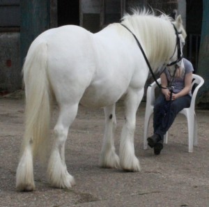
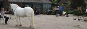
Yesterday’s equestrian life drawing session was a great success. The setting was lovely, the horse behaved beautifully and the sun even shone. We are extremely grateful to Polo the horse, Martin who owns the farm and who made the day possible for us, and to his daughter Lily who held Polo still and who even performed some inspiring horseback gymnastics.
As you can see from the photos, Polo was perfect to draw, having well-defined muscle structure. I know how difficult it is to get such a horse to look white. Lily certainly went to great trouble to get Polo looking splendid for us.
The set-up for the day, and some inspiring Old Master drawings
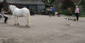
Ten artists set up easels around Polo, our model. Working in a variety of media including charcoal, chalk, watercolour, Neocolour wax pastels and graphite, they drew the horse from differ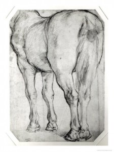 ent angles.
After warm-up exercises using continuous line drawing, I suggested working tonally and really looking at the clearly-defined planes and masses on this horse. In her conformation, she does remind me of the horse in Ruben’s “Rear View” study (right).
Though she kept her forelimbs very still, Polo had to shift the weight from one hindlimb to the other every ten minutes or so. The best trick seemed to be to have two pictures on the go at once, one with her resting her left hind and the other with her resting her right hind leg. It was then possible to move from one picture to the other when the weight shifted.
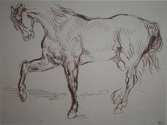
I then suggested a more energetic and broad way of working, in which every mark was to respond directly and decisively to the horse. This drawing by Delacroix was one of those suggested as inspiration:
And also this one (you can tell that I am a big fan of Delacroix’s drawings):
A surpise acrobat!
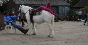
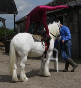
Lily, who had been patiently holding the horse for us all morning, couldn’t resist changing into her vaulting gear and jumping on. She is a very experienced and successful equestrian vaulter and held these positions absolutely still.
It was a rare and unexpected treat for the group to have the chance to draw an acrobat balancing on a horse! Lily was able to hold horseback poses beautifully for several minutes at a time.
Considering how to draw figures balanced on top of one another
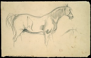
The main focus had to be the points of balance of horse-rider on the horse. Polo had to be shown as convincingly 3-dimensional and able to support the girl’s weight. For the artist this is quite a challenge. I had this very direct drawing by George Jones in my file as an example of a figure balanced on a horse:
A tour of the farm
At the end of the day, Martin gave us a tour of the farm, walking us through fields of glossy cattle, past pollarded woodland and land set aside to encourage wildlife. He was proud to point out mixed-species hedges that he had planted, and talked to us about the numerous birds and wild-flowers that thrive on this land.
Next month’s equestrian life drawing class
All in all this was a very interesting and successful day. I have another horse life drawing workshop planned for Sunday June 17 (same venue). Click on “Contact”, above, to book your place.
| Tags: blog, equestrian life drawing, horses | More: Blog, Equestrian Life Drawing
Equestrian life drawing, Sunday June 17
Time: 10am-3pm
Venue: Standon Green End Farm, nr. Ware, Herts, UK
Cost: £25 if you bring your own easel and backing board, £30 if you need me to bring an easel for you. I shall provide drawing materials for everyone including paper, charcoal, chalk and graphite.
You need to bring: Clothing suitable for the weather, farm-friendly footwear, your own picnic lunch, easel, bulldog clips (or similar) and A2 backing board if you have them.
This session is set up much like a tutored human life-drawing session with artists working at easels around a posed model. In this case the model is a horse. We hope to use Polo (the white horse shown above) again, as she is excellent at standing still and has very defined muscle structure.
If weather is wet then we shall work in a covered barn.
If conditions allow, we may have another chance to draw Lily posing on this horse. She is a trained equestrian vaulter and it was very exciting to be able to draw her balancing on Polo during our horse drawing day in May.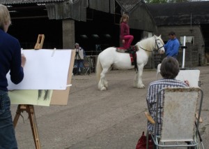
This is a working farm with other animals including sheep, cattle and pigs as well as very attractive areas of land managed for wildlife. Artists will have the option of spending some time drawing elsewhere on the farm during the day.
Places are limited, so please get in touch with me to reserve your space (Click on “Contact” at the top of the page).
Comments (2) | Tags: equestrian life drawing, workshops | More: Equestrian Life Drawing, Workshops
Ideas for holiday journals, July 6
Time: 11:30-1:30pm
Cost: £8
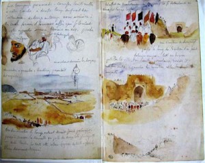
Whether you wish to create a traditional travel journal complete with writing and pictures, include a few holiday images in your sketchbook this season, or are simply curious, this early-summer session is the one for you.
We shall look at pages from famous travel journals including that of Delacroix’s visit to Morocco (above). I shall also have my own holiday sketches to share with you, and copies of other contemporary artists’ travel sketches.
This will be a very practical session looking ahead to the summer holiday season. I shall suggest materials most appropriate for holiday use and enjoyable ways to use them. We shall look at ways to lay out various types of journal and sketchbook.
Please bring some basic materials (your choice of pencils, pens, a few watercolours and coloured pencils) as we shall try out holiday-friendy techniques working either from photos or, if good weather, out in the garden.
| Tags: workshops | More: Workshops
Drapery and fabric folds, June 28 and 29
Dates: Thursday 28th June and repeated on Friday 29th June
Time: 11:30-1:30pm (those who want coffee/tea and a chat can arrive from 11am)
Cost: £8 per session
Availability: There’s a place available on each session. Contact me if you’re interested in coming.
Materials: If you have them, please bring willow charcoal, chalk and A3 pastel-type paper. Pen, pencil and cartridge paper would also be suitable.
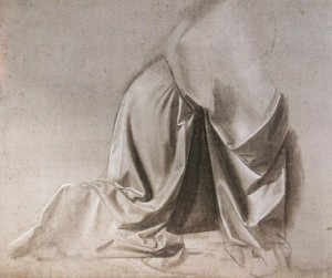
In this session we shall draw draped fabric, exploring ways to show form, tone, texture and the hanging weight of it. We shall refer to drapery studies by artists inculding Leonardo da Vinci and Durer.
Places are limited, so please get in touch to reserve your spot.







![[title not known] null by George Jones 1786-1869](https://art2art.org.uk/wp-content/uploads/2012/05/George_Jones_19th_century_Horse_Drawing_Untitled_Tate_Britain-300x200.jpg)
