Heads: Planar analysis, 1st June 2012
May 14, 2012
Date:1st June 2012
Time: 11:30-1:30pm
Cost: £11 per person (extra cost this time as we have a model)
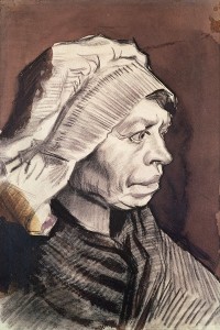
I have a human model booked for this session. We shall focus on the head and shoulders, looking mainly at their planar structure.
You may wish to bring charcoal and chalk, or to work in pencil or pen.
Places are limited, so please get in touch to reserve your spot.
| Tags: workshops | More: Workshops
Thoughts on horse anatomy: The hindlimbs
May 12, 2012
Some thoughts on horse hind limbs with reference to Great Master drawings
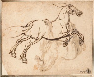
Above: Jacques Callot (1592-1635) “Study of a Horse”, quill and reed pen and iron gall ink, 23.5×28.6cm
Basic structure of the hindlimbs
The hindlimbs have the kick and thrust to propel the horse forward. Much of the muscle bulk is up high in the rump (see my post from 9th May 2012, “More lovely horse anatomy”). The lower parts of the hind legs are made up mostly of bone and tendon.
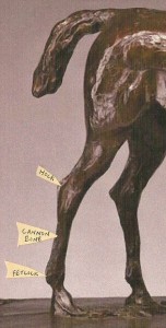
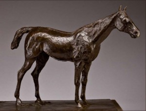
Below I have labelled an equestrian sculpture by Edgar Degas to show the positions of two major joints, the hock and fetlock, and the bone between them which horse-people call the cannon bone:
Right and left: Edgar Degas. The original wax for this bronze cast was modelled around 1881-82.
Angle of cannon bone compared to the ground
See how bent the leg is at the hock in the standing horse. At rest, the horse puts most of his weight on vertical front legs while the hindlimbs have more freedom to be placed further forward or back. The cannon bone of the hindlimb is rarely vertical as seen from the side.
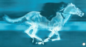
An image of a galloping horse
Just for fun, here is an image of a galloping horse showing something of bone structure and limb flexibility:
The Achilles tendon
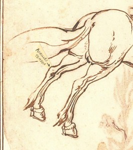
From the rear, the shape of the Achilles tendon at the back of the hock joint is clearly visible. The combined tendons of several muscles (the superficial digital flexor, biceps femoris, gastrocnemius and semitendinosis) run down the back of the leg as a tense band, the Achilles tendon. Part of this attaches to the bony point at the back of the hock. Part continues over the hock and as a long tendinous band down the back of the lower leg (the superficial digital flexor tendon). Here is a detail of a 17th century quill and reeed pen and ink drawing by Jacques Callot featuring the Achilles tendon (the full picture is shown at the top of this post):
Above: detail from Jacques Callot (1592-1635) “Study of a Horse”, quill and reed pen and iron gall ink, 23.5×28.6cm
Volumes and planes around the hock joint
Tendons around the hock joint appear as clear-cut structures with well-defined edges because they are under tension. They form a wedge-like shape above the hock, and the different tones on the planes of this structure can be used to best advantage when drawing the horse.
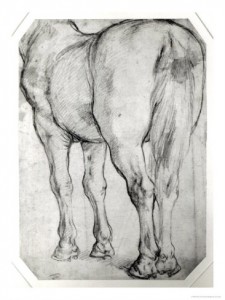
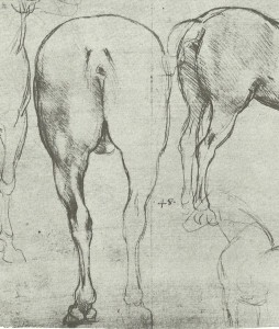
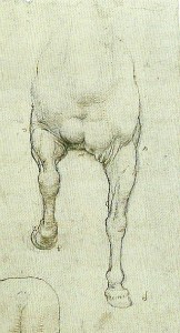
To illustrate this, I have included a drawing by Peter Paul Rubens showing the rear view of the horse with great structural clarity. See how the light hits the triangular top surface of the tendon, creating an interesting shape within the picture:
Above: Peter Paul Rubens (1577-1640) “Horse’s rear”, pencil on paper
Tonal modelling of the hock region
By changing the lighting, the structures of the hock can form further interesting shapes of light and shade:
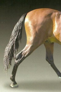
Above: Photo of horse’s hindquarters under strong directional lighting. Notice the interesting shapes of light and dark tone around the right hock joint.
How the Achilles tendon connects to the rest of the leg
The Achilles tendon is not isolated, but runs up to the muscles high in the rump, and is also continuous with tendons running down the back of the lower leg down towards the foot. Leonardo da Vinci showed in a lovely fluid way how the tendon runs from muscle, over the hock and down the back of the leg in this study, one of those for the Sforza monument:
Above: Leonardo da Vinci “Studies of a horse” c. 1490
Appearance of muscles when legs are carrying more weight
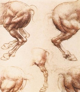
Here is another horse study by Leonardo da Vinci, this time in red chalk. He has focused on how those tendons run towards the muscles. In this drawing, bulges in tendons and muscles are thought of as rounded structures rather than the more angular shapes portrayed by Rubens in his “Rear view of a horse”, above. See how those muscles bulge when the horse takes full weight on the hind legs:
Above: Leonardo da Vinci “Study of horses”, red chalk on paper, 1504-6
An unsettling picture by Agostini
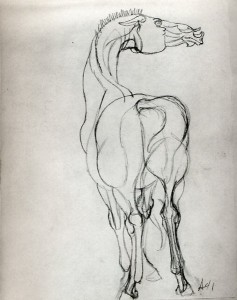
In the image below, muscles bulge as emphatic rounded forms. The effect is one of unsettling tension, with taut tendon lines running up the back of the legs to those tight muscles.
Above: Peter Angostini (1913-1993) “Horse”, graphite
Rounded and angular compositional shapes within the hindlegs
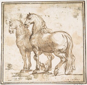
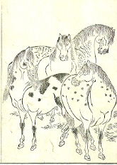
Finally, here are two proud and prancing horses. Though the handsome heads are the main focus of the picture, the contrast between the rounded rump of the near horse and the angular bent leg beneath it gives the image much of its energy. Try covering the rear end of the horse with a piece of paper, then look at what remains of the picture, and see how this takes the oomph out of the image.
Above: Two Horses Attributed to Allegrini, pen and brown ink, 11.7×11.7cm, 1624-63
| Tags: anatomy, horses | More: Blog
More lovely horse anatomy: The rear view
May 09, 2012
Tips on drawing the back end of the horse, with reference to paintings by Great Masters
If, when drawing a horse, you find yourself positioned behind it, you have not drawn a short straw. The rear of the horse is full of design possibilities. You have the great masses of muscle ready to propel the animal forward and, below, the structure of the bones and tendons of the back legs is easily visible even in a thick-set horse.
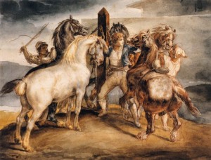
Look at these powerful compositions, “The Rear View” by Peter. P. Rubens ( below) , and “Horse Market, Five Horses at the Stake” by Theodore Gericault (above).
Let’s first consider how to draw the muscular rump of the horse. The muscles of the rear end drape over the bones of the pelvis. This gives the rump a recognisable shape with left and right sides mirroring one another.
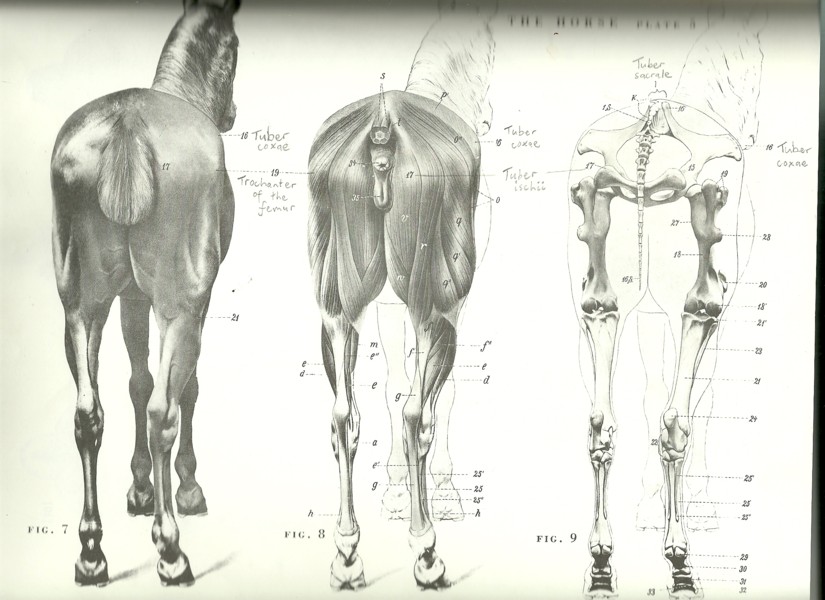
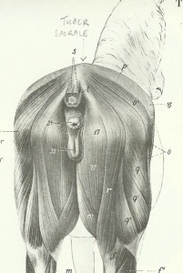
Diagram from “An Atlas of Animal Anatomy for Artists”
My favourite anatomy book is “An Atlas of Animal Anatomy for Artists” by W.Ellenberger, H.Dittrich and H.Baum. I have the 2nd edition which was published in 1956. It covers the horse, dog, cow and lion, with a few oddities in the appendix. I just wish that I had come across this book years ago when studying veterinary medicine as I find these diagrams more pleasing to look at, clearer and easier to relate to living animals than the standard vet anatomy diagrams (and the lion would have been a good distraction). Here is one plate from this book (the pencil scrawl is my own):
The above drawings show three representations of the rear view of the horse. On the right hand side is the bony skeleton. The middle drawing shows how the muscles fit over the bones. On the left we see the rear of the horse complete with skin. Even in this drawing, it is possible to appreciate the direction and shape of the muscles, and to see how these are attached to or stretched over prominent bones.
Deciding where the horse’s midline is positioned
In drawing the horse from the rear end, the first thing to be aware of is where the midline is positioned. Some horses have a coat marking (a “dorsal stripe”) over the spine leading back to the tail, as if just to help artists:
If not, then you just have to imagine a line in this position. The two sides of the rump should be symmetrical on either side of this line which means, from almost every viewpoint, the artist needs to take special care with foreshortening.
Considering the overall shape of the rump
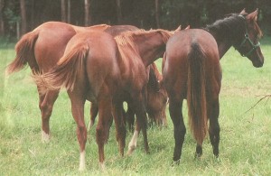
Although the silhouette of the rump is curved from every viewpoint, it cannot really be simplified down to a sphere or into two hemispheres. The rump is taller than it is wide, and rather slab-sided. It helps to be aware of the most prominent “landmarks”:
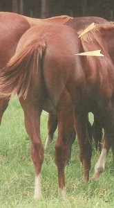
The highest point is the tuber sacrale:
I have marked this high point (the tuber sacrale) on the diagram on the left. If you scroll up to the diagram of the 3 horse rear views, you will see it also marked on the skeleton quite far forward where the pelvis attaches to the spine.
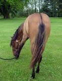
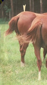
In the photo on the right, I have marked the position of the tuber sacrale with a cream arrowhead. See how the rump slopes down from here back to the base of the tail.
Widest points of the rump
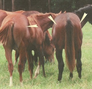
On each side of the horse’s rear, two wide points are the tuber coxae (further forward) and the greater trochanter of the femur (further back). In the photo below, I have used cream arrowheads to mark the positions of the greater trochanters of the femur. This trochanter is simply a knobbly bump on the outside surface of the thigh bone.
Position of greater trochanter and tuber coxa marked on a photo
In the photo, below, I’ve marked the greater trochanter again with a cream arrowhead and, above this in the photo, I’ve marked the tuber coxa with another arrowhead.
From some angles, it can help to think of an imaginary line running from the tuber coxa and angling slightly down and back to the greater trochanter. This imagined line marks a change of plane over the horse’s rump.
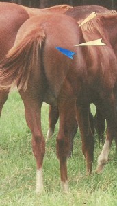
The point furthest back on each side is the tuber ischium
In the next photo, I’ve highlighted the final “landmark” with a blue arrowhead. This is the tuber ischium. There is one of these on either side of the tail, and they just out at the back of the pelvis. These three “landmarks” define the edge of a slab-like surface at the top of the rump.
Planes resulting in tonal change over the rump
Now take a look at the same photo without the arrowheads and see how the sunlight reaches the slab-like top of the rump in a patch bounded by those three landmarks:
Planar modelling and design possibilities
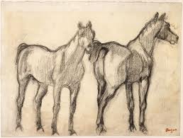
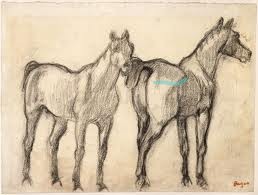
This change of plane over the rump has been exploited by artists for its design possibilities. Here is a drawing by Degas (Two Standing Horses, below left) showing the intriguing change in appearance of the rump when seen from different angles. On the right, I have shown the picture again, having marked an approximate line from the tuber ischii to the greater trochanter to the tuber coxa, so that you can see how this fits in with Degas’ strong planar modelling of the horse:
In Gericault’s “Horse Market: Five Horses at the Stake”, below, we see again how the anatomy of the rump has been emphasised. The bony landmarks are quite obvious in the right-hand horse, in which they create an illuminated oblong that is important within the composition.
The slight hollow down the side of the thigh
Under the tuber coxa to greater trochanter line, there is a slight concave valley down the side of the thigh. Take a look at this rear view drawing by Leonardo da Vinci, one of his preparatory drawings for the Sforza monument. The edges of the rump are shown by a series of elegant curves. My light pink arrowhead points to the concave “valley” down the side of the thigh.
Those of you who come along to the equestrian life drawing day on Sunday should have the chance to lay your hands on the horse and feel where the important bones are positioned, which sections are concave and which are convex. This will help you to understand the structure of what you are seeing.
Don’t forget to check back here on Saturday as I shall post some thoughts on drawing the lower parts of the hind limbs.
| Tags: anatomy, horses | More: Blog
Equestrian life drawing May 13
May 07, 2012
Sunday 13 May 10am-3pm: “Equestrian Life Drawing”
**One place has just opened up. Please get in touch if you’d like to come**
This day is planned much like a day of tutored life drawing in the studio, except that we have horses to work from instead of humans and shall be on a farm. Handlers will do their best to keep the horses still for us. We shall work outdoors if weather is fine, or in a large covered barn if wet.
Venue: Standon Green Farm, nr. Ware, Herts
Basic materials are provided (paper, charcoal, chalk, some graphite and other bits) though you are welcome to bring your own.
Cost: £25 if you bring your own easel, or £30 if you need me to bring an easel
| Tags: equestrian life drawing, workshops | More: Equestrian Life Drawing, Workshops
Workshop 18 May: How to draw movement
Workshop on conveying movement: Friday 18 May, 11:30-1:30pm, Codicote.
We shall look at how various great artists have tackled this subject, including Guercino and Degas, then shall work from photos of athletes, moving animals and dancers.
What to bring: Any medium that glides across the page would be good, e.g. pencil, pen, graphite stick and/or other media of your choice. I have some water-soluble neocolour pastel sticks that you may wish to try out.
There is one space left. Please contact me if you are interested.
| Tags: workshops | More: Workshops
The volume simplification class, and my last ever drawings of Freddy
May 05, 2012
What is volume simplification?
Yesterday I discussed volume simplification with the class. The idea of this is that complex figures can be represented as a set of simple geometric shapes either as an exercise or on the route towards abstraction. It is well worth trying with human and animal figures, as it forces the artist to ignore distracting surface details and to focus on the most important facts about the body, namely the positions of all its main parts.
Representing each part of the body by a simple 3D shape
At its most basic, the body can be thought of as being made up of several units (head, shoulder girdle, chest/belly, hips, etc.) and each of these sections can be represented by a geometric volume such as a cuboid, wedge or cylinder. It is important to show how each “unit” is tipped or angled. For example, people often stand with their shoulders tipped one way and their hips tipped in the opposite direction.
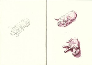
A dog drawn as simplified volumes
To illustrate this way of thinking, here is a recent double page from my sketchbook. These sketches are the very last that I made of my dear old terrier, Freddy. He unfortunately had to be put to sleep on Wednesday and is very sorely missed. At some point soon I shall put happier pictures of him onto this website.
| Tags: Freddy, sketchbook | More: Blog
Edges: last Friday’s class and, in particular, some thoughts on combining edges and cross contour lines
May 02, 2012
Last Friday’s “What to do about edges” class
It turns out that there is no single best approach for drawing edges, rather many possible ways of working. In the class, each artist took a picture by a “great master”, from Leonardo da Vinci to Henry Moore, discussed how edges had been tackled in that picture, and attempted to apply these methods to still life drawing.
This meant that people attending the workshop drew in completely different ways from one another, and several media were used from red chalk to ink line and wash.
I had come up with a long list of possible edge strategies. There was plenty to discuss at the workshop, lengthy notes to take home, and I have probably only scratched the surface of this subject.
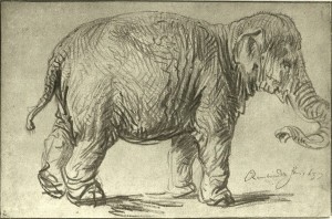
Looking at how Rembrandt used edges in one of his elephant drawings
Out of the great master drawings that we analysed, one of my favourites is Rembrandt’s black chalk drawing entitled “An Elephant”, from 1637. This is in my rather battered but beloved copy of “Rembrandt as a Draughtsman” by Otto Benesch, which I had bought from a library sale for the measly sum of 30p. The orginal drawing is 233 x 356mm.
This elephant study is remarkable in that it shows the bulk, roundness, and shifting weight of the massive creature completely convincingly, while not attempting to create a total illusion of reality.
A close look at a soft slipper to further our understanding of edges and cross-contour lines
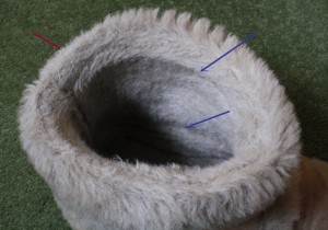
Rembrandt achieved these effects by the seamless combination of edges and cross-contour lines. To show the point of this, I have photographed my slipper, which has soft rounded curves like the elephant:
The red arrow points to the outer edge of the slipper (some artists use the term contour to describe the outer edge). As the opening of the slipper curves inwards, the light falls on some surfaces more than others, creating internal edges (“lines” of tonal contrast). I have marked two of these with blue arrows. Well, we could argue whether or not to call them edges, as their appearance is dependent on how the light falls, and indeed they merge into the curved surface of the slipper. If I were sketching the slipper in pen, I might be tempted to indicate some of these internal edges by using lines.
The inside of the soft slipper, with various curves merging into one another, can be seen as similar to the rounded elephant. One of Rembrandt’s aims in drawing the elephant was to show how curved or rounded its body was. For example, its belly is not a sphere, but is rounder low down and further back (due to the great weight of its contents) and relatively flat high up where it drapes over the spine.
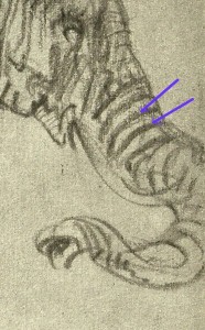
Rembrandt achieved this by combining outer edge lines with cross-contour lines. The latter are lines that appear to curve around the surface of the elephant. Look at these cross-contour lines around the elephant’s trunk. I have marked them with purple arrows.
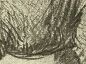
There is some kind of edge line (made up of many gestural marks) all around this elephant. In some places these outer edge lines are very heavy, to suggest parts of the body in shadow, but also to emphasise the weight of the elephant hanging down. The underside of the animal’s belly is represented by weighty charcoal edge lines which merge into heavy cross-contour lines.
On the other hand, the edge lines over the elephant’s back are light and floaty as this is where the light is falling:
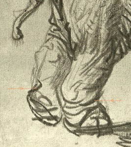 Now see how Rembrandt handled the stomping back feet of the animal. There are curved, tapered charcoal marks (I’ve marked them with orange lines) here that suggest an outer edge leading into a cross-contour line but also somehow suggest the energetic lift and stomp of the feet. I would perhaps not have quite enough information from this sketch with which to sculpt the hind feet of this creature but, in a few charcoal marks, Rembrandt has hinted at their roundness, weight and movement.
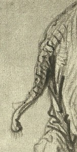
Look at the information Rembrandt gives us about the tail. He combined edge lines and cross contour lines to suggest that it is not plump, but is wrinkled, creased and rather knobbly.
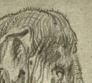
There are even little hairs suggested on the top of the elephant’s head and on the end of its tail.
Rembrandt’s elephant drawing tells me what it might be like to stand next to, and to touch, the real animal. This is not a photo-realistic image but, in a few varied charcoal marks, Rembrandt has given me more information than a photograph.
| Tags: cross contours, edges, Rembrandt | More: Blog
Some beautiful aspects of horse anatomy
April 26, 2012
Today I shall consider beautiful edge contours of the horse. In particular, I shall look at those of the chest and front limbs.
I’m currently thinking about the beauty of edges, and am also looking ahead to next month’s equestrian life drawing class.
Initial impressions of the horse
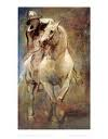 As an artist standing in front of a real, breathing horse, the two things that initially strike me are the sheer chunky volume of the animal, and the beautiful elegance of its edges. When attempting to draw the creature as it moves, my instinct is to get those flowing edge lines down in my sketchbook as fast as possible; the curve of the neck, the sweep of the belly round and up as it merges into the back, the curve of the shoulder and haunch.
Symbolism of the horse’s shape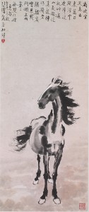
The horse silhouette is instantly recognisable and, perhaps, inspiring. His head carried proudly on an arched neck could symbolise pride, strength and elegance. Dressage trainers look at the moving horse’s “outline”, which is the term they use for the sweeping curve over the top of his back and neck, using this in conjunction with his leg action to help decide how well he is carrying himself.
This ink drawing, “Heavenly Horse”, is by Xu Beihong (right):
When the horse is standing facing me, the most obvious curves are those on the outer aspects of the forelimbs and under the chest. Let’s focus in on those areas today. Perhaps at a later stage I’ll consider the haunches, hindlimbs and head. In this drawing of the front of a horse by Leonardo da Vinci, these chest and forelimb curves are very clear:
The pectoral muscles
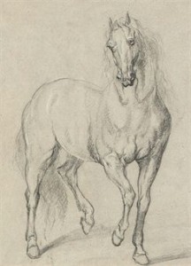
Between the horse’s front limbs are those well-defined paired curves of muscle, the pectorals. Look at how, in this drawing by an unnamed follower of Van Dyck, the double curve of the pectoral muscles is repeated higher up the picture up in the curve of the horse’s lip:
The groove between these right and left pectoral muscles is in the midline. You can make the most of this midline groove to clarify which way the horse’s body is facing. This groove shows the viewer where the front of the ribcage is pointing. Whichever way he twists his neck, limbs and tail, that midline groove is going to stay central.
The curve on the outer aspect of the front leg
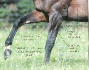
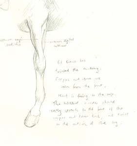
The elegant curve on the outer part of the horse’s upper forelimb appears to be made for artists. This convex sweep of flesh is actually made up of two muscles, the common digitial extensor is on the outer aspect of the leg, and the extensor carpi radialis is at the front. This is often seen and painted as one curving shape though, as you can see from this photograph, the individual muscles may become apparent in a fit horse when weight is put on the leg.
So, which muscle are you actually representing when drawing the upper forelimb with a calligraphic sweeping line? If it is a side-view of the horse, you will be drawing the ext. carpi radialis at the front of the leg. When viewed from the front, the curve represents the common digital extensor.
El Greco’s “St Martin and the Beggar”
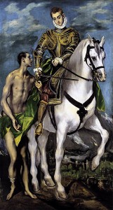
I came across this painting, “St. Martin and the Beggar” by El Greco, in the massive book “The Horse” by Rachel and Simon Barnes. For some reason, the picture is reproduced in my book the reverse way round, with the beggar to the right hand side of the picture. Does anyone know why this would be? Here I show the version with the beggar on the left side:
Simon Barnes writes that “the contrast between the sleek sublimely maintained horse and the skin-and-bones beggar is the story of the saint’s conversion”. On the other hand, it appears to me that the figure of the beggar is deliberately made to echo that of the horse. Look how El Greco has distorted the muscles of the forelimbs (they are all there, just twisted around a bit) so that they resemble the arm and legs of the poor man. The horse and beggar almost appear to be one creature rising up on six legs, while the painting of the clothed wealthy rider is handled more rigidly.
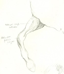
Out of interest, here are diagrams that I made a few weeks ago from my (mirror-image) reproduction of El Greco’s “St. Martin and the Beggar”, showing the twisted anatomy of the forelimbs:
Of course, there is no need to learn muscle names. I am just including a few of them for anyone who may be curious. The joint in the middle of the front leg is called the carpus. The diagonal band of muscle and tendon that crosses the front of this joint is the abductor pollicis longus.
And following my last post about the problem with edges, do I have any solutions? Yes, but I am not sharing these ideas until tomorrow’s workshop…
Simon Barnes
| Tags: anatomy, horses | More: Blog
What is the problem with edges?
April 24, 2012
I’m referring here to the physical boundaries of an object, the “edge” or “contour” of the object between itself and its background. Edges also occur wherever there is a sharp change in plane within a form, even if this would not show up in a silhouette drawing, e.g. the edge of a windowsill, a fold of fabric or the crease across a baby’s wrist.
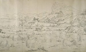
In real life, what we actually see of an edge depends on how the light falls on it. There is often a difference in tone and perhaps colour between the object and its background, and there is often a pool of shadow either beneath or on both sides of certain edges. Occasionally, an edge may appear as a line of highlight if the light is falling directly on it, e.g. the edge of a mug in sunlight.
We rarely see edges as lines in real life, though in itself this fact doesn’t mean that we must not represent them as lines in our pictures.
Well… I love to draw edges
Drawing the edges of things is a wonderfully direct and simple way to represent them. In our culture, children are taught from infancy to draw objects in this way (to draw an “outline”), then perhaps to colour in as a second stage.
As artists, we consider tone, volume and other aspects of representation, though the potential for emphasis of edges is still seductive. The use of edges can suggest a 3-dimensional form while also creating beautiful 2-dimensional shapes within our picture.
Many artists, myself included, love the process of drawing lines. The great profusion of possible linear media available, from bamboo pens to water-soluble pastel sticks, draws us in yet further…
So what is the problem?
Some potential pitfalls when using linear edges (I have been guilty of all of these):
- The edge as visible line rarely exists in nature, so we need to manage our edges in some way to produce a convincing image.
- Edge quality varies depending on the effects of light, so an unvarying line may be inappropriate.
- A solid edge may make the image appear to be “fixed” in space and destroy any suggestion of movement.
- The outline of a thing doesn’t always represent how the weight falls through it and, for that reason, sometimes fails to give the viewer much information.
- The mere outline of a subject does not give much information about its volume in space and can be misleading (e.g. are we looking at a woman or a cardboard cut-out of a woman?)
- A solid unvarying edge sets our image “in stone” as if the artist is saying “this is definitely how I see this thing”. If working in such a way, the artist must get the edges in exactly the right place with exactly correct perspective and foreshortening or the image will look faulty.
- Many edges do not, in real life, mark a change in tone. There may be a pool of shadow on both sides of the edge. This can create a technical problem if the artist attempts to draw an outline first, then shade it in.
- The outer edges of a rounded object represent the parts that are disappearing from view. Perhaps they should be given less emphasis than the centre of the object that bulges towards the viewer.
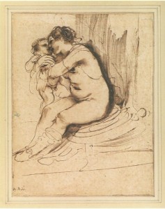 So should we draw edges as lines or not?
Yes, don’t throw away your favourite pens. If we take the above considerations into account then lines can indeed be used to represent edges. Convincing images are possible, and the lines themselves can be beautiful. For example, look at this drawing by Guercino (1591-1666).
In my “What to do about edges” workshop on Friday 27th April, I shall share plenty of suggestions as to how to make this work. There are different strategies that can be used, depending on the aim of the artist. I am currently gathering together some Old Master pictures to illustrate possible methods of working, and we shall discuss these and apply them to still life drawing. Guercino was a master of meaningful edges, and we can refer to the book, “Guercino Mind to Paper” by Julian Brooks. I am also selecting pictures by Henry Moore, Rembrandt, Leonardo da Vinci, Matisse and Raphael among others.
