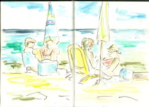
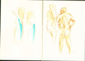
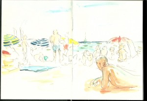
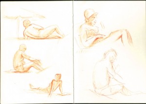
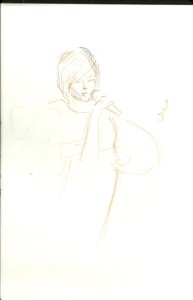
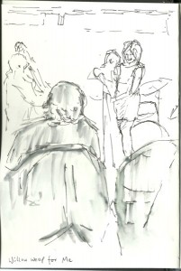
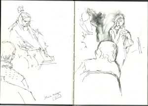
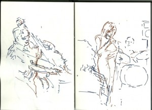
Tips on sketching at the beach: Which materials to use
August 02, 2012
Holiday in southern France
A practical approach to sketching on the beach
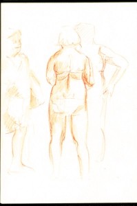
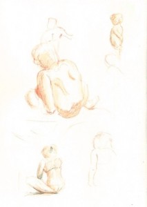
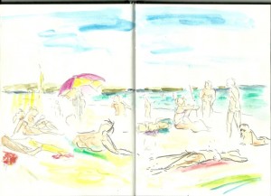
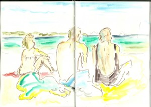
A busy beach is a fantastic place to draw people. Some will rest in one position long enough for a quick sketch, though you may also wish to pay attention to those who are playing, stretching, drying their hair, etc.
Beach sketching has some advantages over life drawing in a studio. For a start, you can usually see the horizon behind the figures and this helps in establishing your eye level within the picture. Secondly, you have a wide choice of “models” at any one time and you can see how they appear either singly or in groups. These people find their own relaxed poses and that is something interesting to observe. Unlike the situation within a studio, an artist on the beach has a choice between drawing people nearby or at a great distance.
From the design point of view, beach sketching is fun. Parasols, towels and bags form blocks of colour within the scene. All kinds of compositions are possible and this is a good time to experiment.
How to go unnoticed
-
Surprisingly, the busier the beach, the less attention people will pay to you.
-
Set yourself up as one of the crowd by turning up with a beach towel and by wearing usual beach clothing.
-
Use an A5 sketchbook as this initially passes as a standard notebook to passers-by. Don’t set up an easel!
-
Wear sunglasses.
-
If you are using wet media, water brushes are less obtrusive than a collection of brushes and a pot of water.
-
Bring simple art materials. People will certainly come and look at what you are doing if you get out a set of paints.
It is good to stay unobtrusive so that people stay happy and relaxed around you. However, do remember to behave in a fair manner. Avoid staring unrelentlessly at anybody, especially topless ladies!
Choice of materials for sketching figures
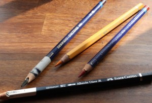
I like the adaptability of water-soluble pencils. They are useful for line work and, once wetted, for areas of tone.
A red or red-brown pencil is good for sunlit figures. I do not attempt to match skin tone in any way, but red contour edges to figure drawings can suggest the glowing effect of skin in sunlight. My favourite is the Derwent Inktense pencil in mid vermilion.
To develop colour further while keeping it simple, I suggest carrying red, indigo blue and yellow water-soluble pencils. Again, I do not attempt to match skin tones, but can use the blue for cool shadow and the yellow pencil for warm highlights on skin.
Pencil marks can be left untouched, or blended with water. I carry a Pentel water brush filled with plain water for this job.
Choice of materials for colour and composition sketches on the beach
When sketching, and especially on holiday, I generally prefer to use bold-coloured media. There is the option of sitting on the beach with a neat box of watercolours, but that would perhaps tie me down to a traditional technique and feel rather limiting. In very bright sunlight (and, indeed, when working while wearing sunglasses) the delicate watercolour hues may be wasted in any case.
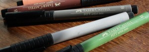
For bold line drawing, consider using Faber-Castell Pitt artist pens. These come in a good range of non-primary colours and are waterproof. If you are a little nervous of their bold lines, then make the first marks in the pale grey coloured pen, Warm Grey III272. This is also the pen to use for distant objects (I do not have the very pale cool grey – perhaps that one would be even better for distant objects).
I work over the pen lines with a variety of water-soluble media. The least obtrusive option is to fill several water-brush pens each with a different colour of diluted ink (I use FW acrylic inks). This is very convenient for general sketching and I do generally carry water-brushes filled with blue and green in my bag. Some brands of pen leak during transport, so be warned. The Pentel seems most reliable.
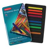
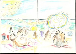
For beach sketching, I enjoy even bolder colours. On holiday in the south of France last week, I used a combination of Inktense colour blocks:
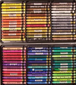
and Neocolour II sticks:
Thanks to Jamie Williams Grossman for the photograph of a complete set of Neocolour II sticks, above. Her blog features many tips on art materials to use when sketching outdoors (follow the link at the bottom of this post).
It is possible to achieve fantastic bright colours with either of these media. Neocolour II sticks can be obtained in a larger variety of colours than Inktense blocks, including rather subtle ones. These media work well in combination and can be overlaid to approximate a mixed colour.
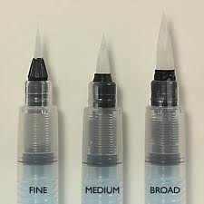
For sketching on the beach, I wipe a water-brush pen over the Neocolour stick or Inktense block and then paint with the brush. To clean the tip of the brush, just squeeze a little water out of the brush pen before picking up a fresh colour.
Above: Brush pens are available in various sizes. These can be filled with water or ink.
Inktense sticks can become messy when wet. I just keep them in their original container and brush the water-brush against them without getting ink all over my hands.
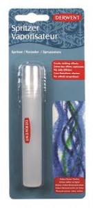
There are plenty of other ways of working with Inktense blocks and Neocolour sticks. Both can be drawn with directly before working into the lines with water, ink or paint. They can also be used for drawing on wet paper. If you do wish to give this technique a try in your sketchbook, then consider getting a Derwent water mist spray:
Links
Jamie Williams Grossman’s sketching blog including tips on choice of materials and how to carry them.
Urban Sketchers website including sketch examples from different artists worldwide.
| Tags: beach, Inktense, Neocolour, sketchbook, sketches | More: Blog, Sketches
How to make yellow oil paint appear to glow, part 2
July 29, 2012
Today we look at the effect of nearby tones and colours
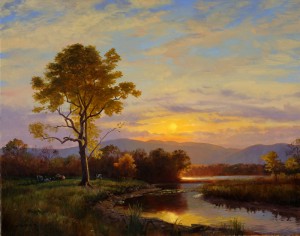
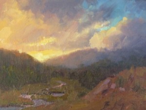
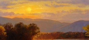
Above: “Sunset over the Catskills” by James Gurney
Can other colours used in the painting make a yellow area appear more vivid?
In my last post, I discussed the choice of yellow paint and ways to apply it. For a look back at that, click here.
Interestingly, a yellow section of a painting can also be made to appear more prominent by the use of other colours and tones in the picture. That is what I shall look at today.
1) Adjacent muted (low chroma) colours
Low chroma colours = Dull, muted, greyed colours
High chroma colours = Vivid, bright, saturated colours
If you use low chroma, dull colours close to your patch of high chroma (i.e. vivid) yellow, this can help the yellow to “sing out” and glow in comparison.
For example, in the landscape below by Becky Joy, the predominant colours in the clouds are muted mauves, and the land is painted using muted, earthy colours. There is a rather high chroma area of blue in the top right corner, but this is kept separate from the bright yellow sun and serves to counterbalance it rather than competing for attention.
Above: “Mountain Light” by Becky Joy
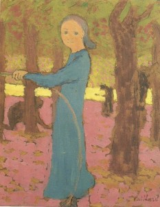
These muted colours of a landscape at sunset are true to life, though we can move to semi-abstraction and still make use of the same concept. In the Vuillard picture, below, the yellow is not just very light in tone but is also more vivid than all of the surrounding colours:
Above:Vuillard “Girl with a hoop” also with a detail from the same painting
At first glance, “Girl with a Hoop” appears full of bright colour, but the pink and blue turn out to be quite muted, dusky colours when we look more closely.
2) Adjacent “cool” colours
“Cool” colours = blues, greens, etc
“Warm” colours = oranges, reds, etc.
If we bring blues or mauves into the area around the yellow, the glowing effect of the yellow can be enhanced. The complementary effect comes into play, as blue and purple are far distant on the colour wheel to yellow. In this instance, the cool colours are often muted by being mixed with white and/or other colours.
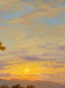
To take an example seen in real life, the glowing effect of the setting sun is enhanced by the cool mauve of distant mountains and clouds, as in the detail, below, of a painting by James Gurney. The full painting is shown at the top of this post. By the way, I highly recommend his blog and website (links listed below) for many more ideas about the use of colour and light in realistic painting.
Above: Detail from James Gurney’s “Sunset over the Catskills”
The tactic of placing small patches of mauves and yellows close together was also used at times by the Impressionists.
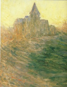
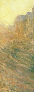
Above: Detail from Claude Monet’s “The Church at Verangeville”
The painting by Claude Monet, above, can be seen at the Barber Institute in Birmingham, one of my favourite galleries. This sunset image glows fantastically. When seen for real, the yellow glow of the painting is quite startling. The effect is partly produced by the colours used in the church and landscape. Though the warm sunset is spilling warm orangey tones over the church and ground, there are definite cool mauve-grey brushstrokes used in the roof of the church. These cool colours seem to enhance the zingy effect of the adjacent yellow sky.
3) Use a fairly bright blue as a contrast somewhere else in the picture
Take another look at the landscape pictures by James Gurney and Becky Joy higher up this page. Both use a patch of fairly high chroma blue at a distance to the glowing yellow sunset. Blue and yellow are almost opposite one another on the colour wheel, and each can be considered to enhance the impact of the other when used in this way.
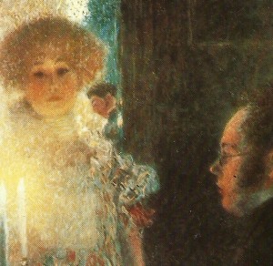
Here is another example of blue used within a glowing warm picture. Notice how the main blue area is kept a little distant from the glowing candle flame itself:
Above: Detail from Gustav Klimt’s “Schubert at the Piano”
4) Dark-toned objects in the foreground make the yellow appear to glow
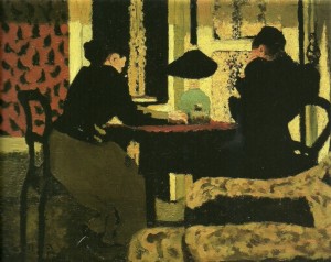
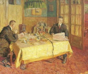
In particular, dark objects in front of the yellow “read” as silhouettes, and suggest that the yellow patch is a glowing light source. Below, for example, is an interior by Eduoard Vuillard in which the light would be expected to emanate from the visible lamp in the centre. However, the dark figures and objects in front of the yellow walls give me the sense that the wallpaper itself is glowing.
Above: Eduoard Vuillard “In the Lamplight”
This glowing yellow wallpaper gives the image an oppressive atmosphere. Look again at the tense postures of the two figures and the way in which the figure on the left is clawing her hand. I wonder what they are thinking.
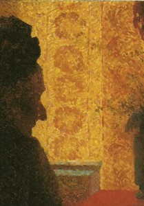
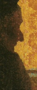
Here is another image in which a dark-toned figure is silhouetted against an apparently glowing yellow background:
Above: Eduoard Vuillard, detail from “Grandmother Michaud in Silhouette”
In this case, the silhouette is not stark black, but has flecks of warm colour over it. This illustrates another helpful point:
5) Warm yellow-orange colour can “spill” over edges of adjacent dark objects
This “spilling” of warm light from a strong light source is an effect that we see in real life. For example, the uppermost edge of a mountain in front of a sunset may appear a warm orangey colour. Take another look at James Gurney’s picture:
Above: Detail from “Sunset over the Catskills” by James Gurney
The colour of the mountains and treetops is warmed (made more orange) and the tonal value of the mountain tops is lightened in front of the setting sun. The effect is quite dazzling. Here is another detail from the same picture, showing the sun’s reflection in water with an amazing orange-red spilling onto the river banks from that bright reflection:
Above: Detail from “Sunset over the Catskills” by James Gurney, showing sun’s reflection and adjacent “warm colour spillage”
Technically, the warm “spillage” of colour over other objects in the picture can be created by glazing over with a warm (orangey) wash of colour or, with opaque paint, by aiming at a diffuse warmer colour when mixing.
Alternatively, little streaks or dots of bright warm colour can be used within this chosen area of the picture. For example, look more closely at Monet’s church picture, in which streaks of warm orange-brown paint are used within the landscape. In the distance, these streaks suggest the “spillage” of warm light from the sky dazzling. Lower in the picture, they suggest the warm light illuminating the ground:
Above: Claude Monet “The Church at Verangeville”, close-up detail
Here is Vuillard’s grandmother again, this time shown in close-up so that you can see the specks of warm light over her silhouette.
Above: a closer look at Vuillard’s “Grandmother Michaud in Silhouette”
6) Warm halo around the glowing yellow: Corona effect
When we look at the setting sun, a candle flame, or any other bright light source in real life, we see a bright halo of coloured light around it. Replicating this in a picture helps to create the illusion of a dazzling light source.
Here yet again is a detail from James Gurney’s sunset picture, this time to illustrate the effect of the corona of orange light around the setting sun:
Detail from “Sunset over the Catskills” by James Gurney
I believe that adding warm colours of increasing redness and darkening tone around your yellow patch can make it appear more luminous, even if you are not trying to replicate the effect of a true light source. Take a look at Vuillard’s picture, below. The near surface of the yellow tablecloth seems wonderfully bright and warm in colour.
Edouard Vuillard, detail from “Portrait of Henry and Marcel Kapferer”, 1912
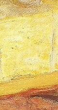
I think that this tablecloth is made to look even brighter and warmer by the band of orange below the front edge, and the sliver of deep red shadow below this. Here it is in close-up:
Close-up detail of edge of tablecloth from Eduoard Vuillard’s “Portrait of Henry and Marcel Kapferer”
7) Warm, darker-toned colour elsewhere in the picture
To suggest that your patch of yellow is glowing like a candle or like the setting sun, bring a darker-toned warm (orange-red) colour into your picture at a little distance from it.
Here is the effect of candlelight as seen in Klimt’s Schubert at the piano. See how the two faces glow a dark reddish colour. The auburn hair of the woman behind the candle accentuates this warming effect:
Detail from Gustav Klimt’s “Schubert at the Piano”, 1899
This is a “trick” for painting candlelight, but consider using the same technique to make any patch of yellow appear to glow warmly, even in more abstract pictures.
8) Light tone from the yellow patch can spill over the edge of adjacent dark objects
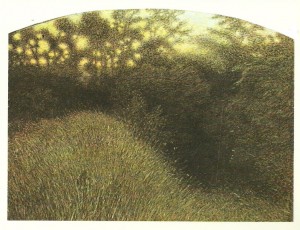
This is another “real life” effect that is seen in sunsets, candlelight, etc. Take a look at the sun gleaming through the bramble bush in this picture:
Above: Giuseppe Pellizza da Volpedo “The Bramble Bush”
The glowing effect is produced by the very bright tone of the sunlight as seen between the bramble stems, but also by the way in which this tone gradually darkens as it spreads out. Stems of the shrub that are in front of the sunlight are lightened in tone instead of being silhouetted. This gives the effect of a very bright light source coming from behind them.
In conclusion
There are many ways in which a patch of yellow can be influenced by other elements of the picture. Some options involve the optical effect of complementary colours, varying brightness and tone. Others involve mimicking the effect of a real-life light source:
-
Place duller, low chroma colours next to your yellow patch.
-
Use cool colours close to your yellow patch.
-
Use a bright blue elsewhere in the picture (not touching the yellow).
-
Put dark-toned shapes in front of the yellow, to mimic a silhouette effect.
-
“Spill” warm yellow-orange colour into adjacent areas of the picture.
-
Mimic a corona effect by surrounding the yellow with a halo of bright orange like a setting sun.
-
Bring a mid to dark-toned warm (reddish) colour into the picture at a distance from the yellow.
-
Lighten the tonal value of dark objects that are adjacent to the yellow patch.
The above tricks and ideas are not rules set in stone, but are helpful to play around with in various combinations when creating either realist or abstract pictures.
Links
James Gurney website and blog (a wealth of information about realistic drawing and painting).
The book, James Gurney’s “Color and Light”, is also fascinating and relevant.
Becky Joy is also interested in colour and light. Her website includes tips for artists and information about her plein air workshops.
Comments (1) | More: Blog
How to make yellow oil paint appear to glow, part 1
July 19, 2012
Here I investigate ways to achieve a stunning yellow glow within an oil painting

Above: detail from Edouard Vuillard “Portrait of Henry and Marcel Kapferer” 1912
Introduction
I am currently reading a wonderful book about Edouard Vuillard (1868-1940), copublished by The Montreal Museum of Fine Arts and the National Gallery of Art, Washington (there is a link at the bottom of this page). Most of his work is reproduced in this enormous volume. I recommend taking a look at Vuillard’s paintings for their psychological intrigue, their interesting take on domestic interiors and their experimental use of lighting, colour and tone.
Vuillard used the colour yellow over and again in different ways. Some of his pictures are notable for containing yellow areas that seem to glow so bright that they almost make the viewer squint with surprise. How did he achieve this effect? I know from experience that yellow, enticing as it looks on the palette, can easily be disappointing if not handled well in a painting.
Back at the “art lab” I have been investigating the topic, and here I list and illustrate ways to make normal yellow oil paint appear to glow. Today I review methods involving the yellow patch of paint itself. Further glow effects are actually enhanced by colours and tones used elsewhere in the same picture and, for ideas about that, check back here at the end of July for my next post.
Make the yellow area light in tone
The “tone” of a painted patch is how light or dark it is. Light-toned yellow areas tend to glow within a picture composed of medium tones.
Above: Edouard Vuillard “Girl with a Hoop” c1891
How can we decide which are the lighter and darker tones within a picture? We can compare different tonal values within a painting by looking at it with half-closed eyes or, if still unsure, by reproducing it as a monochromatic image “in black and white”.
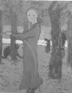
In “Girl with a Hoop”, above, I am amazed by the glowing horizontal band of yellow behind the girl. This seems to shine like metallic gold. What makes the yellow stand out next to the adjacent pinks and blues? Below I have reproduced the image in black and white:
As you can see, the yellow horizontal band is by far the lightest tone in the picture and it still “shines” out in the monochromatic image above.
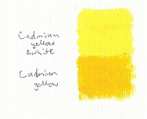
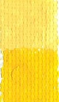
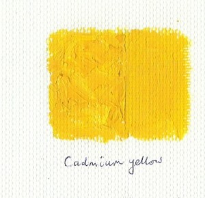
Below, I’ve painted two rectangles of cadmium yellow. The upper one has white added to it in order to lighten its tone. In my opinion, the upper rectangle of lighter-toned cadmium is more prominent and glowing than the patch of pure cadmium yellow neat from the tube:
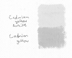
Do you agree with me? Opinions may differ. Here is the same image of two yellow rectangles reproduced in black and white. This demonstrates the tone difference between the two yellow patches:
Here is another example of high tone being dazzling, this time within a picture:
Above: Giuseppe Pelizza da Volpedo”The Bramble Bush”
In da Volpedo’s picture above, the yellow light shining through the hedgerow is dazzling. I have reproduced this image in black and white to show how the glow is caused by tone, not by warmth or intensity of colour. See how the bright light in the upper right of the image is darker in tone than pure white, but still reads as an extremely bright light source. This picture also illustrates the phenomenon of “light spillage” into adjacent dark areas, about which I’ll discuss more in the next post.
Choose a yellow of high colour intensity (high chroma)
A colour of low chroma appears to be greyed-down or “muddied”, whereas a high chroma colour appears to be bright and intense.
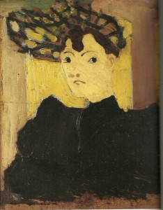
Above: Vuillard “Hat with Green Stripes” c1890
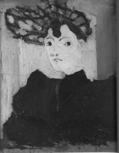
This Vuillard picture is interesting in that it places two yellow patches of similar tone, one apparently in front of the other. To me, the background yellow appears to glow more than the lady’s face. I wasn’t sure which yellow was lighter in tone, and whether tonal differences were affecting the “glow” effect, so I tried reproducing the image in black and white:
In fact the background yellow is very slightly darker in tone and yet, in the colour version, it glows more. This is due to the high chroma value of the bright background yellow compared with the woman’s face. The face yellow is slightly pink-tinged and is perhaps also dulled with white. The glowing background yellow is closest to cadmium yellow with perhaps just a little white added to it. It seems that, in this case, chroma intensity trumps tonal value.
To get a high chroma yellow using opaque oil paints, we need to experiment. There is no scientific way to measure the chroma or vividness of a colour (please add to “comments” if I am wrong in saying this) so comparing chroma values of paint colours is subjective.
Colours are supposed to be vivid (high chroma) if used straight out of the tube, though some are clearly more vivid than others. Some people say that the pure pigment has a very high chroma value and that this is dulled when other pigments are added. For sure, if I were to add a touch of grey or purple to any of my yellow tube paints, they would appear duller.
What about comparing paints used straight from the tube? This must vary between brands. In fact, some of my tube colours already contain more than one pigment and this may reduce their chroma and vividness from the outset. My tube yellows may differ from your own selection:
Lemon yellow (Arylamide yellow 10G PY3) Cadmium yellow hue (Arylamide yellow G 6X; Diarylamide Yellow HR70 PY73/PY83) Naples yellow (PW6/PY154/PBr24) Yellow ochre (iron oxide PY42)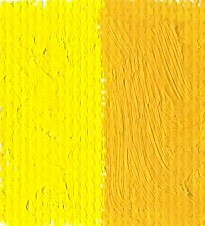
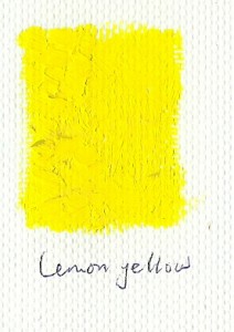
Here is Lemon yellow on the left and Cadmium yellow hue on the right (both Daler Rowney Georgian range). I think that the lemon yellow on the left is more vivid, but this may be partly due to its lighter tone. It is a very subjective decision.
Here is Naples yellow (Van Gogh range) shown above Cadmium yellow hue (D-R Georgian). The cadmium is clearly more vivid though the tones of these two yellows is similar.
Transparent glazes of colour overlaid onto a white ground
Oil paint can be thinned with turpentine and painted onto a white support as a “glaze”. This tranlucent layer if paint is allowed to dry fully (it may take several days), then overlaid with another glaze, and the process repeated until a glowing effect is produced. The white of the support shows through the tranlucent paint and contributes to the effect:
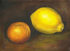
Above: fruit that I painted using some overlaid oil glazes and some opaque oil colour as a (very lengthy) exercise
The glazing process works best with certain tube colours. You need transparent colours for the most glowing glaze effect. In many ranges, lemon yellow, chrome yellow, and aureolin would be suitable for glazing, whereas Naples yellow and cadmium yellow would be too opaque. It is also correct not to add white paint when mixing colour for a glaze.
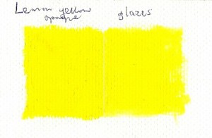
I have attempted to demonstrate an effect of glazing using lemon yellow:
In the image above, the paint was applied in one thick, opaque yellow on the left. It was built up as four turpentine-thinned glazes to the right. I waited until each glaze was just about touch-dry before applying the next, though ideally would have waited at least overnight. Would you agree that the right-hand glazed area glows more than the opaque paint on the left side?
I am convinced that the answer is “yes” when I look at my canvas. This is not so clear to me in the scanned image.
Individual brush strokes of opaque colour
An alternative approach is to use very opaque paint, building up visible juicy brushstrokes. These may be so thick and three-dimensional that they catch the light and appear to scintillate in the finished picture. For an example, take another look at Vuillard’s “Hat with Green Stripes”, above.
Or the individual adjacent brush strokes may vary in tone, brightness and/or hue. This can also give the effect of a twinkling light source as in the sky, below:
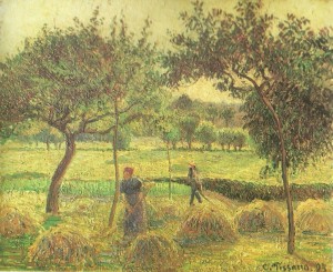
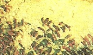
Above: Camille Pissarro “Bountiful Harvest” 1893; Below: A detail from the same painting.
I love the way in which the sky in the above picture appears to glow warmly, without being either extremely light in tone or of maximum chroma intensity. This has something to do with the individual brush strokes used to paint it, but is also due to the colour and tone of the trees (and there will be more information about that effect of adjacent colours in the next post).
Here I have painted rectangles of colour, the sections on the left being somewhat impasto with thick, visible brushstrokes, while the sections on the right are a smooth opaque layer of paint:
In the images above, the impasto strokes seem to make the colour more prominent and glowing. This effect is even more obvious on the original canvas, when light shines across it and catches the ridges of the brushstrokes.
To sum up…how can a patch of yellow be made to glow?
-
Use a yellow of high tonal value compared with everything else in the picture.
-
Choose a high chroma (very vivid) yellow tube colour.
-
Avoid mixing other colours into the yellow if possible as this may dull your colour.
-
Build your colour up in glazes of a transparent yellow diluted with turpentine or another glazing medium.
-
Or lay the colour as thick, visible brushstrokes of opaque paint.
-
Several further tips involving relating the yellow patch to other colours and tones in the picture….Take a look at my next post to find out more.
Comments (2) | Tags: colour theory, oil painting, Vuillard, yellow | More: Blog
The next horse life drawing workshop will be on 30 September 2012
July 14, 2012
Life drawing with a difference: The model is a horse!
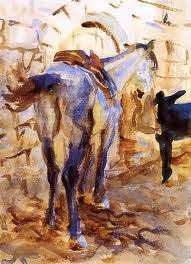
Above: J.S.Sargent “Saddle Horse, Palestine” (watercolour,1905)
What happens in an “equestrian life drawing workshop”?
One or more horses are used as models during the day. These are held as still as possible by experienced handlers.
Artists draw or paint at easels around the horse, just as in a standard life drawing class.
If weather is fine then we work outdoors; if wet then we use a covered barn.
Most materials are supplied (paper, charcoal, chalk, graphite and a few surprise bits).
Plenty of tuition and guidance is given, though you’re also welcome to “do your own thing” if you prefer.
The workshop takes place on a farm with a whole range of animals. You are welcome to wander off and draw other species if you wish.
For a look back at our May 2012 horse life drawing session click HERE.
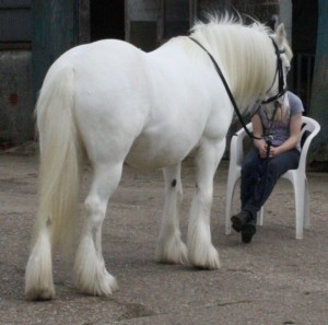
Above: photo of “Polo” the horse durng the May 2012 life drawing session
Who can come?
All are welcome, from novice to experienced artists.
If you do not yet have much drawing experience, a few human life drawing sessions would be good preparation for you before this workshop.
At the other extreme, if you are a very experienced artist you may wish to come just for the experience of having an equine model held for you all day. If you want to work without any tuition or comments then just let me know this when you book (or when you turn up). This could be your chance to do some interesting watercolour or oil studies or whatever you like.
Where, when and how much?
Date: Sunday 30 September 2012
Time: 10-3pm
Place: Standon Green End Farm, SG11 1BW. This is near Hertford and Ware in Hertfordhire, and is close to the A10 and to the A602.
Cost: £25 per person for the whole day including tuition and materials. It is an extra £5 to hire an easel (please bring your own easel and backing board if possible).
How to book
Contact me by clicking here (or by phone or email if you already know me).
I am very happy to answer questions, and can then post or email further details, directions and a booking form to you.
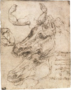
Above: Perino del Vaga “Studies of a Horse Head” (Rome 1501-1547)
Comments (2) | Tags: equestrian life drawing, Herts, horses, workshops | More: Blog, Equestrian Life Drawing, Workshops
Ideas for making cards, and I feature Tim’s the local art shop
July 08, 2012
How should an artist go about making cards?
I am currently putting together some ideas for a workshop on card-making for artists. The more I think about it, the wider the topic seems to be. Whatever the technique used, here are a few general pointers:
“Some golden rules of card-making”
However interesting the image, it needs to be “eye candy” (i.e. very pleasing).
The design as seen from a distance is more important than the detail.
Blank space around your design can be attractive.
When choosing colours, consider how the card will look on a mantelpiece or wall. Lay colours next to each other and check how pleasing the result before starting the image.
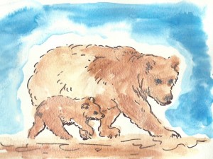
An appealing theme is a good idea (e.g. mother and baby animals) but design trumps theme. An outstanding design using a simple heart or birthday cake silhouette can be quite sufficient.
Getting started
If you already have artwork that looks good from a distance, this can be scanned or photographed and reproduced as cards. To use the original picture directly, mount it onto a card blank using Spray Mount.
Some of your artwork may not be good enough to frame but perhaps contains one or more beautiful sections. These areas can be cut out and used. For example, you may end up with part of a figure, or even just an abstract design with beautiful colours and shapes that can be mounted onto a card blank. This is a really good tip for making use of artwork that would otherwise be discarded.
New ideas for cards
In the workshop, there will be the opportunity to try out three arty craft methods:
Ink and pen images
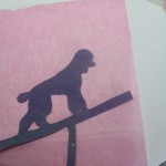
Silhouette techniques
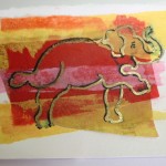
Tissue paper and pen layering (see further down for guided instructions)
Believe it or not, the elephant design (above) was taken from a photo of a pregnant elephant who was trained to do birthing exercises.
Art and craft shopping in Herts: Where to buy your stuff
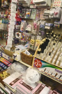
Shopping for card-making is a real pleasure. For these cards, I have used FW acrylic inks, Staedtler Triplus Fineliner pens and various colours of tissue paper, card blanks, PVA glue, various brushes, coloured card and Pilot gold and silver pens.
So, where should one go to buy this stuff in Hertfordshire? I highly recommend Tims Art Shop in Hitchin which is where I source most of my craft products and art materials. You’ll find this shop next to the market in Hitchin town centre.
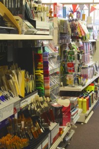
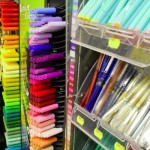
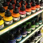
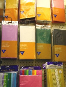
The photos above and below were taken in Tims. Here I’m just showing small sections of their craft selection. They are also really well-stocked in everything you need for the fine arts from dip pens to oil paints.
The staff are always friendly, and over the years have been great at pointing me in the direction of products that do indeed prove to be the most useful.
For the shop’s opening hours, contact details and information about their mail order service, click here to reach Tims Art Shop website.
Instructions for tissue paper layered designs
I do enjoy making these tissue paper designs as it gives me a chance to draw outlines at the same time as playing with colours and shapes. This sounds like nursery-school stuff but please do read on.
You will need:
Small (approx 8 by 8cm) piece of watercolour paper Scrap of opaque paper of your choice, e.g. newspaper or sugar paper Tissue paper in your choice of colours Felt tip pens (I used Staedtler Triplus Fineliner) PVA glue and a small old brush Pilot silver or gold pens (optional) Small “sticky fixers” Card blank and envelope Inspiration for your designMethod
1) The piece of watercolour paper forms the backing for your design. Lay this out, and glue a piece of opaque paper on top. The opaque paper can be torn and placed fairly casually. For sticking, I suggest using PVA glue diluted about 2:1 with water. I make them in batches:
2) Tear off a piece of tissue paper, aiming to get it a little smaller than the glued opaque paper. Use the diluted PVA to glue it on top:
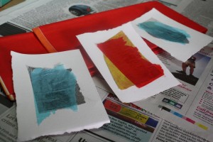
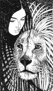
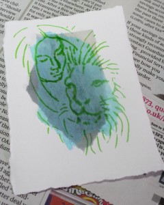
3) Draw the basic design directly onto this tissue paper layer using a felt-tip pen. I recommend using a mid-tone pen (so not pale yellow or jet black) at this stage. In the example below, I have copied the design from my own black and white lady and lion image (see here) that I had drawn some years ago in pen and ink:
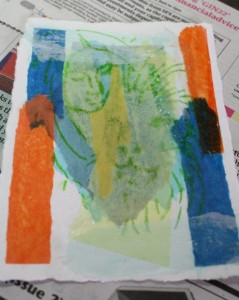
4) Tear off more small odd shapes of tissue paper and glue them, in places, on top of your drawing. Your initial drawing should be just about visible through the fresh layer of tissue paper. Play with “balancing” colours and shapes within the image.
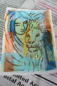
5) Trace over parts of your initial drawing using your choice of pen colour. It often works well to use some black in the final drawing. Some of the underlying drawing shows through, creating an interesting effect. If you make small drawing errors, or if you want to make part of your drawing less prominent, glue a piece of white or other pale tissue paper over that section. You can glue more tissue paper layers and redraw as many times as you like.
6) To finish: Find a card blank of appropriate size, or cut a piece of card and fold it. Attach eight tiny sticky fixers to the back of your design, one on each corner and one at the centre of each edge. Position the design carefully on the blank card and press down to fix in place.
Examples:
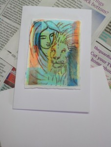
Here is the completed Lady and Lion card. The lion’s expression looks a bit odd here as I have added a little gold pen over his eyes and this has caught the light in the photo:
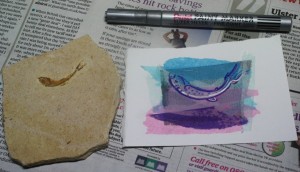
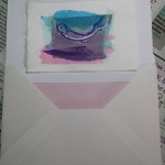
The following design was based on a fossil fish! I added silver pen lines when the glue was dry:
Further ideas
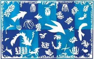
I enjoy looking at the overlap between craft, design and “fine art”. For fantastic inspiration for silhouettes, linear and flat colour card designs, look at these artists among others…
Henri Matisse
Franz Marc
Comments (1) | Tags: cards, collage, Herts, shopping | More: Blog, cards
Workshops for Summer/Autumn 2012
July 05, 2012
Here is a list of themes for upcoming art classes. Please get in touch for more information.
For information about the paintings and drawings within this post, just scroll your mouse over each picture.
Small group art improver course
Themes for upcoming art classes
Six sessions are planned. These can be booked individually or save money by booking as a block:
Drawing children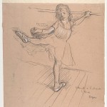 (Fri 10 Aug, 11:30-1:30pm; £10) FULLY BOOKED
Two child models, boy and girl, will pose in gymnastics gear. We’re planning fun poses and interesting balance poses today to reignite everyone’s interest in life drawing.
How to fit people into landscapes (Fri 24 Aug; 11:30-1:30pm; £9)
Do you ever draw or paint a landscape, interior or street scene and try to add a figure? Are you left feeling that the person doesn’t “fit in” in some way? There can be several issues involved here. I’ll discuss them all and shall refer to a variety of pictures, especially Impressionist paintings. Working from photos (supplied or bring your own).
The draped figure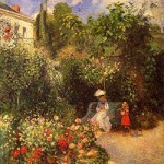 (1) (Fri 7 Sep; 11:30-1:30pm; £12.70)
Adult clothed model this time. If weather fine, we shall work in the garden following on from the previous session. If cold or wet, we work indoors and look at the clothes themselves on the figure, e.g. how do folds and creases appear over limbs and body, and what to do about necklines.
Pen techniques for landscape (Fri 21 Sep; 11:30-1:30pm ; £9)
Mastering the use of the pen involves coming up with a “language” of pen strokes to represent things, from clouds to edges of buildings to foliage to human hair. Landscape drawing is the best way to get started on this. We have the choice of working from photos, views through the windows, or drawing from Old Master paintings (an excellent way to learn).
Pen and wash techniques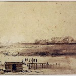 (Fri 5 October; 11:30-1:30pm; £9) FULLY BOOKED
This follows on from the previous session. I’ll show you various techniques of combining pen lines with washes of dilute ink. We’ll take a look at landscape drawings by Rembrandt and figure drawings by Guercino and others and shall work from photos of landscapes and/or figures.
The draped model (2) (Fri 19 October ; 11:30-1:30pm; £12.70)
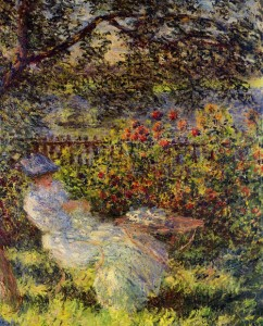 I’ll be sure to cover different material to the previous draped model session. If weather is good then we shall work outside. I’m happy to help those who wish to make use of this and work in colour.
Some further details about these art classes:
Where?
Codicote, Herts, near junction 6 of the A1(M). Please get in touch for address and directions.
When?
Approximately every fortnight from August to October. Friday late mornings, 11:30-1:30pm. For each session, artists are welcome to arrive up to half an hour early in order to grab a coffee and set up, etc.
Cost?
If you pay in advance for the block of six sessions, total cost is discounted to £54.40 (payable by cash or cheque by 10 August). If attending individual classes and paying on the day, the cost of each session is as listed in their description, above. So each class costs in the region of £9 plus a small model fee where applicable.
Who can come?
Artists at any level as I give plenty of individual feedback. If you are a complete beginner, you may prefer to do my foundation sessions first (covers measuring, basic perspective, etc.) to give you more confidence. Contact me here for more information about the foundation classes and/or for the workshops listed in this post.
What happens in a session?
Anyone who wants a chat, a cup of coffee or tea and/ or a better look at my art books can arrive up to half an hour early. Each session has a theme and I always come prepared with ideas and printed notes for everyone to take home with them. After a little discussion, everyone gets down to drawing. For a post about my recent class on “drapery”, click here. As you may gather, I have a library of art books and we often refer to Old Master drawings and paintings.
Comments (5) | Tags: classes, Codicote, Herts, workshops | More: Blog, Workshops
Drapery for artists: Why bother with it?
July 02, 2012
Today I review a few uses of drapery in art and investigate whether or not drapery can be exciting.
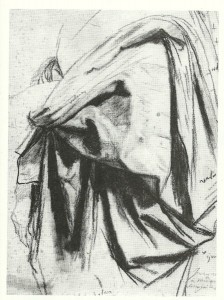
Above: Dominique Ingres (1780-1867) Study for the Drapery of Moliere in the “Apotheosis of Homer”, black chalk with stumping, 12x10in
Last week’s drawing classes on drapery
My initial thought, on being asked to teach classes on drawing drapery, was that this is a dry and uninspiring subject. But do read on, as I eventually started to change my mind.
Fabric folds are complex and it takes sustained concentration and technical skill to create an illusionistic image. I fear starting to draw and getting “lost” in the complexity of the folds, helpless and confused as if in a nightmare involving spaghetti.
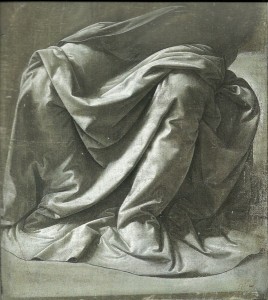
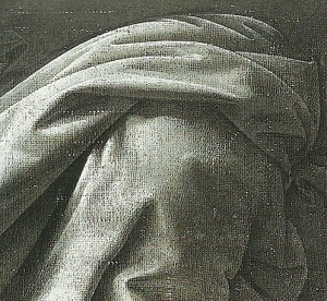
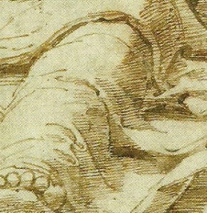
The first drapery images that come to mind are those truly illusionistic studies by Leonardo da Vinci and his contemporaries. Above is one of his drapery studies for a seated figure from the 1470s. The amazing three-dimensional appearance of this fabric is created by the build up of tones of grey and white tempera, indicating the light falling on the intricate folds. It is said that Leonardo would soak fabric in dilute plaster and then arrange it over a mannikin and leave it to set in place, thus allowing study over a long period. This would presumably allow him to return at the same time each day to ensure that the fall of light on the subject did not alter when he was working. Below is a detail from the same image:
Towards the end of the workshop, I shared a method of working in compressed charcoal on white paper that allows a similar build-up of tones. A putty rubber is used to create highlights, and stumping is used to blend tones and to increase the depth of the shadows.
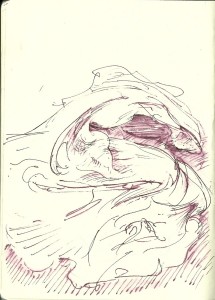
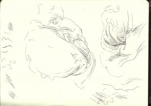
Before getting too engrossed in this rather technical way of working, we discussed how drapes can suggest movement and energy, and attempted some very loose warm-up drawings of fabric based on drawings by Guercino.
Fabric, movement, energy and emotion
The great thing about fabric, for artists, is that we can do what we like with it. While the appearance of figures is limited by anatomy, a scarf or cloak can be arranged with great freedom, swirling or billowing to energise whichever part of the picture that we choose.
A master of this was the great draughtsman Guercino (1591-1666, Italy). His figure drawings are known for conveying great emotion. When working in pen or brush and ink, he would use very free, swirly lines to suggest movement or emotional turmoil and he made great use of any fabric to heighten this effect.
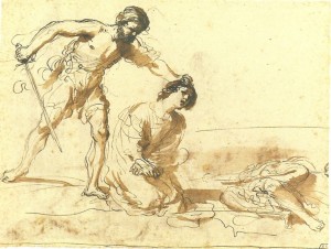
Above is one of Guercino’s studies for a subsequent painting of “The Martyrdom of Saints John and Paul”. One of the faithful men who is about to be beheaded kneels in the centre. His body is suggested by a few pen strokes and sweeps of brown wash that represent the folds of his cloak. The expression on his face is upsetting to view, but the gentle sweeping marks of his cloak suggest a quiet, passive, enclosed figure.
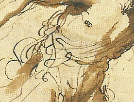
The executioner on the left is viewed at a moment of stillness, grasping the saint by his hair. His hands and feet look, to me, rooted to the spot, but there is an energy bubbling at the centre of this figure. Below is a detail from this image, showing the swirly lines of drapery at his waist. This man is about to make a terrible violent swipe of the sword. This does not look like a cold, calculated execution. The lines around the standing figure suggest bubbling anger and wrath.
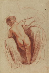
Now take a look at this famous red chalk drawing by Guercino, “A child seen from behind, standing between his mother’s knees”. The fabric of the mother’s skirt forms a warm, enclosed space for the figure of the child. Once again, drapery has been used to suggest emotion:
Fabric and composition
Guercino’s mother and child drawing, above, also demonstrates how the shape of drapery can make an interesting composition. Areas of dark tone form two-dimensional shapes within the picture. This is also the case with light-toned areas bounded by lines. These shapes surround and visually balance the central figure of the child.
Also consider the type of shapes within the fabric. Different shapes in pictures can hint at different emotions. Most of the shapes in this mother and child picture are rather elongated with one or more gently curved edges. Such shapes suggest a peaceful, gentle rocking. There are no explosive-looking jagged or rigid blocky shapes within the fabric of the mother’s skirt here.
For a fabric study with a more explosive feel, take a look at this one in black chalk by Dominique Ingres:
This drawing is a wonderful composition of triangles and boomerang-like forms rotated and repeated around the picture. It is a study of folds within fabric, but has the feel of a successful abstract composition. Indeed, it seems that drawing fabric is one good entry point to the realm of abstraction.
Back to reality
Once we have arranged our fabric on the table, hanging on the wall or on a mannikin, how should we go about drawing it? For the second half of the session, artists in the drawing classes had the choice of working in either pen and ink, or in stumped charcoal.
Pen lines can convey the form of fabric folds and the position of light and shade. Working in pen, the artist rarely aims for pure illusion as blended tone cannot be achieved. Each artist comes up with their own system in which lines are used to suggest structure and tone.
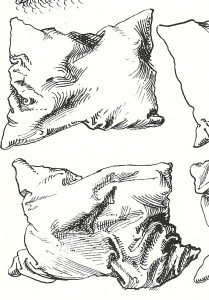
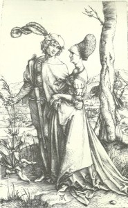
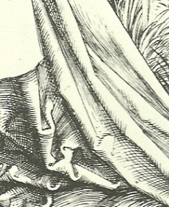
One traditional method is to draw “cross-contour” shading lines curving over the fabric folds. In areas of deep shadow, there are many cross-contour lines and some lines cross-hatched in the other direction. Light-toned areas are kept free of cross-contour lines. This method was used by Albrecht Durer in his pen and ink drawings:
Albrecht Durer: study of pillows (detail)
…and in his engravings:
Albrecht Durer: “Young couple threatened by Death” 1498 (detail of drapery shown below whole image)
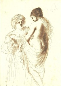
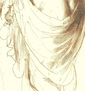
If emphasising the weight or flow of fabric hanging between creases, it is sometimes best to take the shading lines in the direction of that weight or flow. Here is another drawing by Guercino, this time showing how shading lines are can be taken parallel to the main fold lines instead of across them:
Guercino: “Bathsheba attended by her maid” , 1640, pen and ink (detail is shown below main image)
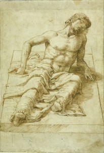
The third method of linear shading involves taking parallel diagonal lines “hatching” across any parts of the image that are in shadow. These hatching lines are combined with some edge lines. In the drawing, below, by Mantegna, almost all of the shading lines within the figure and drapery are taken diagonally from left up towards the right. The shadow on the right side of the stone slab is, though, made of horizontal lines.
Andrea Mantegna: “A man lying on a stone slab” 1470s, pen and ink (detail is shown below main image)
What now?
As an artist, it is encouraging to see that one need never be bored again. All it takes is a scarf, a pillow or any scrap of fabric and a new composition can be formed.
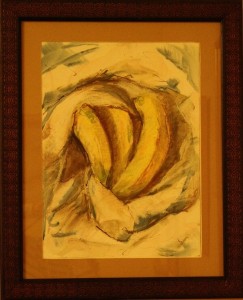
There is a wealth of possibility in arranging fabric and objects or figures. I have started playing with other ideas. What about, for example, wrapped bananas?
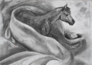
Or wrapped horses?
…the possibilities are limitless….
| Tags: Drapery, Guercino | More: Blog
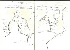
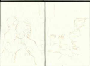
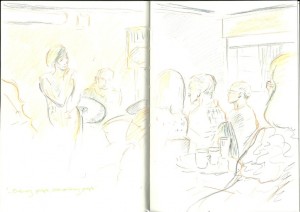
Sketching at last night’s jazz concert: The Georgia Mancio quartet
June 25, 2012
Yesterday’s Herts Jazz Club concert in Welwyn Garden City
Sketches of the Georgia Mancio quartet
My husband and I enjoyed the jazz performance at Campus West last night. I took along my usual sketchbook and few pencils and pens. Here are the resulting sketches. Roll your mouse over each picture for a little extra information.
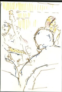
Georgia Mancio led the group. Her voice has a very pleasing warm tone and she relishes the words of the songs. Below she is singing Ann Ronell’s “Willow Weep for Me”. The bassist on the left is Mark Hodgson. As you can see, we didn’t get front row seats:
These Pitt pens by Faber-Castell are fun, bold and permanent, so can be overlaid with a wash of watercolour or ink if desired.
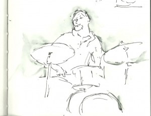
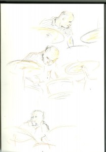
Dave Ohm, on drums, performed some amazing solos:
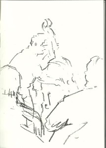
and we were astonished by the skill of the bass player, Mark Hodgson. I used a black chinagraph pencil for these bold lines:
I could not see much of the pianist, Tim Lapthorn, from my seat. There is a glimpse of him with his back to us to the right hand side of this picture:
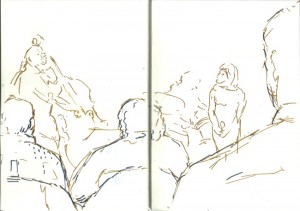
The audience cannot be forgotten. Here is my view of people focusing on Georgia as she sings “I’m Glad there is You”:
“In this world of ordinary people/ extraordinary people / I’m glad there is you”
Links
| Tags: musicians, sketchbook | More: Blog
The Journal of Eugene Delacroix: Ideas and inspiration
June 20, 2012
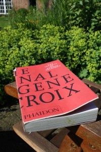
A review of “The Journal of Eugene Delacroix”
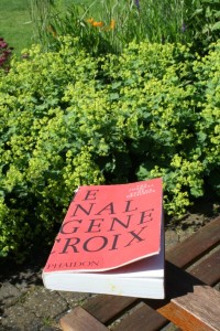
I have thoroughly enjoyed absorbing this book bit by bit over the past few months. It is not only an intimate portrait of Delacroix, but also sparkles with ideas about human nature, art, the natural world, music and philosophy.
My personal interest in Delacroix
It was initially a different book that ignited my interest in Delacroix, Arlette Serullaz’s “Delacroix”, one of the “Louvre Drawing Gallery” series.
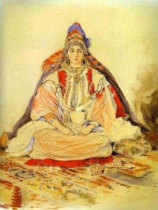
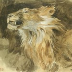
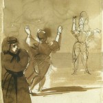
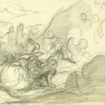
I had been amazed by the variety of drawing styles showcased in Serullaz’s book, from carefully decorative (see “Jewish Bride in Tangier”) to gestural (see “Thrown horseman in a landscape”), and from studies of the natural world (see “Head of Lion Roaring”) to envisioned images (see “Hamlet and his father’s ghost”).
To identify pictures in this and other posts, scroll over them with your mouse.
My first thought was that the artist who produced such a wealth of images must have had a constant stream of ideas and an open mind.
On investigating Delacroix further, I read that he is renowned for his feverish imagination, but also had an unusually logical approach to his work, for example making rigorous notes on colour mixing. This combination of inspiration and logic in an artist is fascinating, so the next step for me was to read his journal.
My copy of the journal
I have the paperback version published by Phaidon, “The Journal of Eugene Delacroix” tranlsated by Lucy Norton, edited and introduced by Hubert Wellington.
A huge amount of content is packed into this slim volume, the text printed on amazingly thin paper followed by 81 black and white plates. Including appendices and index, this portable little book contains a surprising 570 pages.
An overview
The journal runs from 1822 (when Delacroix was 24 years old) to a few months before his death in 1863. Delacroix noted down all kinds of thoughts, from immature ideas about pretty girls or concerns about money, right up to philosphical discussion on what is and is not art.
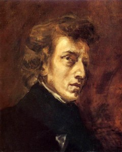
It includes a fantastic cast of famous characters from Delacroix’s social circle. As I have a musical background, the most interesting of these to me is the composer and pianist Chopin (below) who was an intimate friend of Delacroix.
There is also mention of the great violinists Paganini and Ernst, and Delacroix wrote of his conversations with George Sand, Alexandre Dumas, Charles Baudelaire and many others.
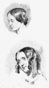 Fascinating to me is the relationship between Delacroix and his servant, Jeanne-Marie le Guillou (“Jenny”), who worked for him devotedly from 1834, cared for him through his illnesses and on his deathbed, and did what she thought was best to safeguard the notebooks after his death.
A Breton peasant woman who had been through great hardship before coming into Delacroix’s service, Jenny nevertheless had a good appreciation of art and, at times, her comments were highly perceptive. For example, in the diary entry from 12 October 1853, Delacroix described how he was walking in the forest with Jenny (they were frequent walking companions) and discussing forest painting, “she remarked with her great good sense: ‘Exact imitation is always colder than the original.'”
Themes covered by the journal
Here I shall list the themes within the journal that most appealed to me. Delacroix had far, far more to say on each subject than the odd snippets that I have included here. If you are curious about one or more of these then get in touch, as I can add details about specific topics in future posts.
What is art?
“Painting is nothing but a bridge set up between the mind of the artist and that of the beholder” (25th January 1857)
On 12 October 1853, Delacroix discussed the way in which the artist can work carefully from a model within the context of an imaginative picture, and in so doing, “…You will have introduced reality into a dream, and united two different arts”.
On 15 September 1854, “How strange painting is, it delights us with representations of objects that are not pleasing in themselves.”
Boredom
It seems that Delacroix fought quite a battle against boredom and had many ideas on the subject. Reproduced in the journal is a letter to his friend and cousin Mme de Forget on 25 August 1854 in which he wrote, “…I seize every opportunity to occupy my mind , even down to discussing the boredom which I so much want to exorcize.”
Complex personalities
Delacroix was fascinated by the variety of human characters. From 23 February 1858: “…The variety of opinions held by different men is astonishing enough, but a man with a sound intellect can conceive every possibility, and can make his own or understand every different point of view…”
Learning, study and knowledge
Delacroix had much to say about learning and knowledge. Although he was forever reading, he wrote on 5 October 1855, “…I can learn far more by looking than the inventions of any scribbler could teach me”.
Notes on picture-making
There are plenty of ideas on the practical process of picture-making, from the laying-in process, to the use of finishing touches, and from the use of tones to specific paint colour choices and thoughts on edges and visible marks.
Observation of nature
Delacroix loved to walk in the countryside and he observed nature closely. Scattered throughout the journal are observations on what he has seen, from the colour of a slug and the behaviour of insects, to the shapes of trees and rocks and the appearance of water and marks in the sand.
Dictionary of Arts
Delacroix hoped to create a dictionary of the fine arts. This task was never completed, but he compiled many ideas and definitions which are included in the journal from 11 January 1857.
Thoughts on other artists
Delacroix discusses the work of other artists. Even those that he loved as “Old Masters” were analysed in a critical way, from Michelangelo to Rubens. His thoughts on writers and composers are also fascinating.
Suppress unnecessary details within a picture
The importance of avoiding too much detail in a picture is a recurring theme throughout this artist’s journal. For me, this is the book’s practical “take home message”.
On April 23, 1854, he talks of the failure of a mediocre artist to “…keep the first pure expression throughout the execution of their work…. Can a mediocre artist, wholly occupied with questions of technique, ever achieve this result by means of a highly skilful handling of details which obscure the idea instead of bringing it to light?”
Realism
What is the importance of accuracy and realism within a painting? This is another recurring theme of the journal, tying in with Delacroix’s thoughts on leaving out unneccessary visual details.
On 9 October 1855, he writes of painting boats: “What I require is accuracy for the sake of the imagination.” He scorns the average marine painter: “Their ropes are mere lines, drawn in hastily and according to formula; they are put there simply as reminders and serve no real purpose.” And he goes on to say, “My kind of accuracy, on the other hand, would consist in strongly sketching in only the principal objects, but in such a way as to show their essential functions in relation to the figures in the painting”.
The aims of the artist
Delacroix has numerous thoughts on this subject. He writes of originality of ideas, seeking perfection and aiming for the impossible. Delacroix discusses instinct, inspiration and discipline, and idealisation, reality and dreams. There is a passage on being beyond ourselves, and another on expressing the effect of the moment. He also writes of imagination, the conception of an image and the supreme image.
Ideas and inspiration
As you might expect, this is a major theme of the journal. Delacroix discusses the matter of conceiving ideas for pictures. He writes of a freedom and wealth of ideas, and of how the artist needs some daring. There is a section on inspiration and ongoing discoveries.
Delacroix describes how inspiration may be suppressed by prejudices and also by habit: “In the arts especially, a man needs to possess very deep feeling if he is to maintain his originality of thought in spite of habits which even talented artists are fatally prone to acquire” (March 1st, 1859).
And take note of this, from 8 March 1860: “An artist should not treat himself like an enemy. He ought to believe that there is value in what his inspiration has given him”.
Other artist’s memoirs and journals
Delacroix’s journal leaves me wanting to draw and paint, and also to look at the world more closely. However, I wonder what is out there for future reading. Can anyone recommend other interesting pieces of writing or discussion by artists?
Delacroix’s journal itself does not include much on his 1832 Moroccan journey. He did make many sketches and notes abroad but only a few pages of this writing (without the corresponding sketches) are included in my Phaidon edition. Perhaps I should get hold of the book, “Delacroix:Moroccan journey“? Any book recommendations would be gratefully received.
| Tags: books, Delacroix | More: Blog
Holiday on Hucklesbrook Farm
June 14, 2012
A week in the New Forest, Hampshire, UK with my family.
Today I share some pictures from my holiday sketchbook.
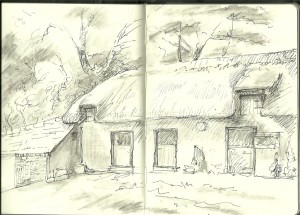
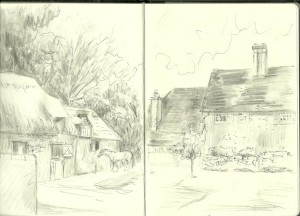
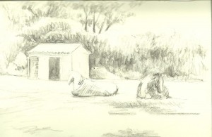
There are four holiday cottages on the farm. We stayed in “Fallow“, just opposite the farm’s thatched stable block. I don’t seem to have drawn our own cottage, but here is the horses’ lovely accommodation as seen from our door:
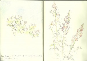
Each of the holiday cottages has its own lawned garden with honeysuckle and other cottage garden flowers:
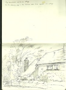
The farm is clean, tidy and chocolate-box pretty. Here is the lovely old farmhouse with its tiled roof and tall chimneys:
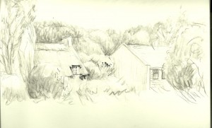
And here a view of the yard bordered by the thatched stables and the farmhouse. In reality, there is a neat wooden fence around the stable block which I have not included:
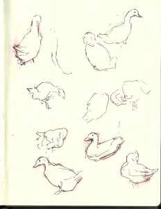
Within limits, the children had the chance to wander around the farm, collect eggs, play football and play on swings. Apart from the horses, there are chickens and these white ducks:
There are countryside views from all of the windows. The bedrooms and kitchen overlook tree-edged fields:
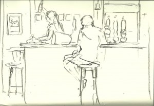
The kitchen in the cottage is well-equipped, but there are also plenty of excellent places to eat out in the area. We enjoyed dinner at The Royal Oak pub:
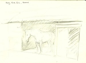
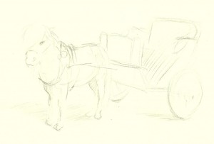
If you stay on Hucklesbrook Farm, I recommend a visit to the Heavy Horse Centre which is a short drive away in Verwood:
On the right is the little Shetland pony, Cinderella, who was busy pulling carriages for children.
There is of course the New Forest itself, which is perfect for walking and picnics:
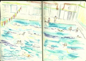
For rainy days there is Ringwood swimming pool:
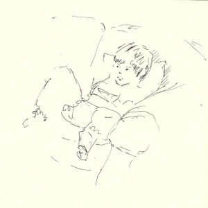
Or just relax on the comfy sofas back at the cottage:
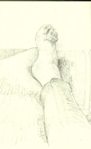
Oh no…I sprained my ankle on the last day:
This was an idyllic setting for a holiday. Many thanks to the owners of Hucklesbrook Farm for making us feel so welcome.
