Portrait drawing: how high is the collar?
October 20, 2012
Some thoughts on necklines in portrait drawing

Above: Picasso “Boy with a Pipe” 1905
The importance of positioning the collar correctly
In our draped model class last week, we looked closely at necklines. Where does the collar cross the back of the model’s neck? How high up does the collar sit? It is very important to judge this well when drawing a portrait, as the position of the collar changes the whole impression of the sitter. It can help to give the viewer an idea of the model’s age, personality and emotional state.
The height of the collar on the “average” person
A standard shirt collar on an “average” adult crosses the neck at about the same level as the centre of the mouth. I understand this from looking at many people in the street and on trains, etc. So the collar comes up rather higher than many people realise. It is a common “beginner’s error” to draw the collar too low, with the head seeming to perch precariously above it.

Above: Bernard Dunstan “Self Portrait”, showing a typical collar height
The top of a shirt collar of this type generally reaches the lower part of the back of the neck. Surprisingly, the neck tends to angle forward so much that this point is level, at the front, with the mouth.
The collar comes up lower on the neck in children
Children typically have a more upright neck posture than adults. A schoolchild’s collar therefore tends to cross the neck well below the mouth. Below is a figure designed to encapsulate the public school ideal of the early 1900s, showing the upright neck and low-sitting collar typical of a boy of this age:

Above: C.Pilkinton Jackson (1887-1973) “The Loretto Boy, 1909, bronze, 68.5cm
The collar comes up higher as the person gets older
As a general rule, the neck and the top part of the shoulders tend to angle forward more and more as a person gets older. Because of this, the collar reaches higher up the head with increasing age.
Below are a few self portraits by Rembrandt. Look at the point at which the collar crosses the back of the neck in each case. Is it level with the centre of the mouth, or is it higher or lower than this?

Above: Rembrandt “Self Portrait”, 1630, oil on copper, 15×12.2cm

Above: Rembrandt self portrait, 1640, oil on canvas, 102x80cm

Above:Rembrandt self portrait 1659, 84.5x66cm
Notice how, in the self portraits by Rembrandt, above, the collar reaches higher up the head as the sitter ages.
In the painting below, the posture of the sitter immediately tells us that he is old. The back of the collar reaches up even higher than the end of the nose:

Above: Quinten Massijs “Portrait of an Old Man” c.1517
If you are looking down on someone, their collar appears to reach higher up the back of their head
The apparent position of the collar is affected by the artist’s eye level. In the drawing below, we are looking down on the boy. Notice how high up the collar appears to reach. The top of the collar crosses his head at the level of his nose. (This boy is also slumping, which contributes to this effect):

Above: John Eardley Philip “The Fat Boy”, c1950, pastel and chalk on paper
When we look up at someone, we see more of their neck emerging from the top of their collar and the collar appears to cross the neck lower down. There is something of this effect happening in the photo of the bronze boy, “The Loretto Boy”. higher up this page.
Athletic people and dancers tend to have a more upright neck position
As a general rule, sports-people and dancers have a more upright neck posture and tend not to round the tops of their shoulders forward. Such well-coordinated people usually have good core muscle tone and supple hips and shoulders, so that they do not feel the need to slump their shoulders and neck.
As a result of this, dancers and athletes tend to have collars that sit lower on their neck, below the level of the mouth.
Some ballet dancers have a relatively long neck in addition to wonderfully upright posture and, taken together, these factors lead to their collar sitting very low on the neck.
For example, look at the shirt collar on the Cambodian ballet dancer, Sokvannara ‘Sy’ Sar in the photo below:
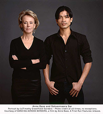
Above: Anne Bass and Sokvannara ‘Sy’ Sar, a photo portrait by Timothy Greenfield-Sanders
Slumped, sloping shoulders and neck suggest negative emotions
When people become weary, their shoulders and neck tend to slump or angle forward a little more. So the back of the collar reaches higher up when the sitter is tired. Watch out for this if you are drawing from life. You may choose to note the collar height of your sitter when they are still “fresh” early on in the sitting, and be aware that their neck may slump a little towards the end of the sitting, perhaps in a slightly unflattering way.
Shoulders and neck may also slump when someone is feeling negative in other ways. We talk about feeling “down”, and such negative feelings can go along with a downward slump of the neck and shoulders. This slump results in the back of the collar reaching higher up when the sitter is feeling depressed, dejected, sulky or generally miserable.
Take, for example, this tramp. He looks world-weary, largely due to his slumped posture and the low position of his head relative to the shoulders:

Above: J.S.Sargent “The Tramp” watercolour on paper, 50×33.5cm
Of course, your sitter may be perfectly cheerful but simply have “bad posture”. Watch out… it is easy for the viewer to make immediate assumptions about someone who has a slumped posture. The collapsed neck and shoulders with a high collar can be very unflattering, suggesting that your sitter is “old and miserly”, or “withdrawn and sulky”. A tailored shirt collar will make the posture even more obvious. In drawing such a person, you may opt to have them looking up and sideways at something interesting, or to draw them from a low viewpoint. These are two suggestions that may help to disguise the unflattering collapsed neck posture.
Upright neck and low collar suggest positive emotions
We sometimes refer to trustworthy, reliable people as “upright characters”. A person with an upright neck posture and thus a low shirt collar position appears to be such a person.
An upright neck also suggests that the sitter is alert and interested.
My first example is a 2008 painting of Nelson Mandela. Notice the low position of his shirt collar relative to his head. He has a wonderful appearance of alertness and control in this image:

Above: Richard Stone “Portrait of Nelson Mandela” 2008, 20x24in
Another example is this drawing of a lady wearing a low-cut neckline and viewed from a low vantage point to accentuate her long, upright neck. Sargent has emphasised her elegant neck posture to give an impression of physical grace, mental alertness and charm:

Above: Portrait drawing of Mrs George Swinton by J.S.Sargent
In summary
Take note of your portrait sitter’s head and neck posture. This posture suggests information to the viewer regarding age, character and mood. Do pay close attention to the level at which the collar crosses the back of the sitter’s neck.
| Tags: blog, portraits, Rembrandt | More: Blog
More art classes in Hertfordshire
October 14, 2012
Art class schedule: November and December 2012

Above: detail from “Head of a Muse” by Raphael c.1490, black chalk over pounce marks, traces of stylus
There is a series of four classes scheduled for Nov/Dec 2012 in Codicote on the theme of tone. If you are interested, then contact me (the sessions are almost fully booked, but we’ll see what we can arrange). Total cost for all four sessions is £30. Unless otherwise advised, all sessions run from 10:30am-12:30.
Nov 2nd: “Shadows and form; advanced pencil techniques”
Understanding light and shade on objects and people. Please bring cartridge-type paper and a small selection of pencils from HB to 6B or even softer.
Nov 16: “Shadows and drama”
We’ll investigate the psychological impact of shadows and consider how to use lighting to create a mood. Please bring pencils and/or charcoal, plus your choice of paper.

Above: Christopher Le Brun “The Departure”
Nov 30: “Shiny things and highlights”
From hair to jewellery, we’ll investigate how to draw shiny things convincingly in monochrome.
Dec 14: “Light and shade in portraiture”
How directional lighting will change the appearance of a head. We’ll consider how to set up lighting for a portrait. Please bring pencil, charcoal or other monochrome media of your choice.

Above: Rembrandt self portrait at age 22 years
| Tags: blog, classes, Codicote, Herts, workshops | More: Blog, Workshops
Lighting the artist’s model…human or equestrian
October 11, 2012
Starting to think about tone, value and mood

Above: Edward Hopper “Seated Male Nude” 1923-4
A tonal approach to life drawing
Going back and forth to repeated life drawing sessions, it is easy for artists to run out of ideas and inspiration. Why not just stay at home and work from photos (we have no shortage of them?). Why bother to organise a model in the first place?
I love to draw from a live model, whether clothed or nude, human or animal. Here are my reasons:
-
I can see how the light is falling on the model and use the interesting effects that this creates.
-
I can move around to different viewpoints (or just move my head slightly) and get a better understanding of the three-dimensional structure of the model within the studio space.
- Life drawing can push me to work in a more spontaneous way because time is limited.
- The model is a real person or animal, and their personality can feed into the picture.
In this article, I shall spur you on to think about the first point in my list, that of making best use of the light. When we look at a life model, we are really looking at the effect of light on them and on the studio around them. Light pools over the skin from one direction while, on the opposite side of the model, there are great swathes of shadow.

Above: Edward Hopper: “Study for Morning Sun” 1952
When we look at a simple tonal picture, we can understand what it represents quite easily. Numerous lines are not always needed:

Above: A rapid warm-up drawing in charcoal
If light is set up so that there is both light and form shadow over the model, it becomes easier for artists to emphasise the 3D structure that is there. This can involve a single main light source (typically from above and to one side of the model). A lamp or bright sunlight from a window can help to emphasise the bold structure of the form as in the Edward Hopper drawing, below:

Above: Edward Hopper “Standing Nude With Drape”, c1923-4, conte
A softer, less glaring light, can highlight the subtle details of the figure. The light will show surface detail most clearly where it falls on the skin at a shallow angle, so try moving your model and/or studio lamp around and see what works best. This gentle study by Leonardo da Vinci is very inspiring:

Above: Leonardo da Vinci “Study of a child’s upper chest and shoulders seen from front and back”, red chalk, c1497-9; the light (perhaps window light?) is positioned between the artist and the model, and it shines from above left. Diagonal hatching represents shadow on the child’s skin, and the detailed form of the child’s chest and shoulders has been built up by this means.
Sometimes more than one light source is used. This can also be interesting, especially if the light from one lamp does not land within the shadows created by the other lamp.
Dramatic lighting
There is something about shadows that really taps into our emotions and imagination. Here are some dramatic lighting situations that you might attempt to set up in your life drawing session.
1) CONTRE JOUR lighting (back-lighting):
The main light comes from behind the model. You can achieve this by positioning your subject in front of a low window on a bright day. (For nude life drawing, do be aware of who else can see them from outside the building!)
How does the back-lit figure appear? Parts of the figure may be silhouetted and lose much of their detail while others appear to glow. This can lead to an interesting Impressionistic approach such as that achieved by Degas, below:

2) CHIAROSCURO EFFECT
Light shines on the model, but the figure seems to emerge from a dark background.
Attractive glowing highlights on the model’s skin contrast with some shadowy, indistinct edges. This is the effect that we see in paintings by Rembrandt, but is not so easily replicated in the studio.

Above: Rembrandt “A Young Woman Trying on Earrings”
To achieve a chiaroscuro effect similar to that seen above, position your lamp not directly at the model but at an angle of about 45 degrees. There should be no other strong sources of light in the room (do cover the windows). The area behind the model should be as dark and non-reflective as possible. Try covering white walls and cupboard fronts with dark drapes.
You might not achieve an exact chiaroscuro set-up in a studio, but can nevertheless start to highlight the model in a dramatic way. The wonderful drawing below, also by Rembrandt, shows how the human figure can be placed in front of a shadowy background:

Above: Rembrandt “Male nude standing, resting his left arm on a cushion”, c.1646, pen and wash in bistre
Another way to achieve a chiaroscuro effect is to put your model just within the doorway of a building and to view them from outside the open door. See how well this works, below, with Polo the horse:

Above: Polo the horse at the equestrian life drawing day last weekend. A chiaroscuro lighting set-up.
If your model (horse or human) has dark skin, then a chiaroscuro set-up can create a great air of mystery.
Take the example of a dark horse in a dark interior. I have long been fascinated by the way in which the horse’s edges, on the less-lit side, merge completely with the dark background. This effect has been used very successfully by Paddy Lennon, below. The pictures that result are thought-provoking:

Above: Paddy Lennon “Three Heads”, charcoal on board, 46x36in

Above: Paddy Lennon “Iberius”, charcoal on board, 38x48in
3) DRAMATIC CAST SHADOWS
When most people talk about their “shadow”, they usually mean their “cast shadow” that is visible next to them on the pavement on a sunny day. Cast shadows can look strange and dramatic (and can, at times, give children nightmares).
If there is just one main light source on the model, then cast shadows should be visible. Bringing the light source low down will lengthen the cast shadows.
I have played around with a Daylight Company art lamp and a Schleich toy horse to investigate some possible effects. Here are some quick pencil drawings of three possible lighting scenarios:


Notice, above, how the mood of the picture can be altered by changing the direction and height of the main light source.
4) COMBINED EFFECTS
Light may fall on part of the figure, while another part remains in shadow. This can give a sense of intrigue and drama, though it is not such an unusual situation in real life. Here is a photo of an Andalusian horse which makes use of direct sunlight, reflected light and interesting shadows. For those who are interested, I have added some tone terminology labels (click on image to view larger version):

Links
Paddy Lennon homepage with more equestrian drawings: click here
Edward Hopper further information: click here
Comments (1) | Tags: charcoal, equestrian life drawing, Hopper, life drawing, lighting, Rembrandt, tonal drawing | More: Blog, Equestrian Life Drawing, Life drawing
How to draw horse eyes part (3): Expression and mood
September 29, 2012

Above: Detail from “Equestrian portrait of Charles I” by Anthony Van Dyck, c1637-8
Some thoughts on horse eye expression for artists
To complete my thread on eyes for equestrian artists, here are some thoughts on eye expression. As any horse handler knows, the mood of a horse can be undertood from their body language. Eye expression does come into this but, in reality, other aspects of horse body language may be more important. Head carriage, ear position, tension around the nose and mouth, and general muscle tone all have very important parts to play. However, when a person (lay person or experienced horse handler) looks at a piece of equestrian art, the expression in the horse’s eyes is of great importance. Controlling that expression can give you, the artist, a great tool for managing the emotion and drama within your picture.
PLEASE NOTE: The ideas in this post relate to how horses appear in pictures. This article is written for artists and for those who enjoy looking at equestrian art. This is not a tutorial on how to judge a horse’s true character from its appearance. For that, you would really need more emphasis on the rest of the horse’s body language.

Above: Detail from “Whistlejacket” by George Stubbs, 1762
In this post, I shall go through various horse eye expressions that have been used in famous paintings. What we are really looking at is the amount of muscle tone around the eye.
When the horse appears relaxed, calm, sleepy, friendly or kind, the muscles around the eyes are softer, with less well-defined edges.
When the horse is alert, apprehensive, angry, crazy or frightened, the muscles around the eye become more tense and have very well-defined edges.
The worried expression
Typically, a worried horse has tense muscles around the eyes. This can have the following effects:
- Well-defined eyebrow muscles above the eye in the shape of an upside-down U or V.
- If the eyebrow has become an upside-down V shape, there may be an obvious pointy shadow under its peak.
- Upper eyelid pulled back a little so that the eyeball becomes a little more prominent.
- A narrow band of the white of the eye “sclera” may show at the top or outer corner of the eye (because the eyelids are pulled back)
- Obvious wedge-shaped or curved highlights in the top half of the eyeball.
The above effects are more prominent in certain breeds of horses ,e.g. Thoroughbreds, who naturally have more muscle tone around their eyes even when they are relaxed. Below is the handsome head of Ted, which I have included here as it illustrates the upside-down V eyebrow. This photo shows him having just been put in a box on an unfamiliar yard so he is feeling a little apprehensive. Ted’s breeding and lean conformation make those peaked eyebrows really stand out. I have labelled the eyebrow, “V”, and the deep temporal fossa, “T”. You may wish to click on the image to better view the labelling and detail:

Above: A Warmblood, “Ted”, looking a little apprehensive
The fearful eye
To create a frightened eye expression, just follow the above list for a worried eye but take everything to a greater extreme.
For example, take a look at the horse ridden by Charles I in the equestrian portrait by Anthony van Dyck, below. A close-up of this horse’s head is at the top of this article. The upper lid is drawn back revealing the white of the eye and a dramatic highlight over the eye surface. This makes the horse look worried, difficult to control and liable to “spook” or take off at any moment.
Above: “Equestrian portrait of Charles I” by Anthony Van Dyck, c1637-8
This is a bit of propaganda…van Dyck was court painter to Charles I from 1632 and was known for his skill at creating glamorous images of his sitters. The king mounted on this horse was painted as a calm and unflustered figure. In giving the horse the appearance of a creature who is difficult to control, van Dyck makes the rider, Charles I, appear to be a masterful horseman.
The terrified eye
How do we show a horse that is truly terrified? The worry signs listed above can all be included. In addition, the eyes may be fixed rather oddly on something. See how the terrified horse, below, is staring so intently ahead that the dark pupil and iris are pulled forward, and the white of the eye is visible behind them. In other cases, a terrified horse might stare at something that is out at the side or behind it, perhaps while turning and running in the other direction.

Above: Detail from “A Horse Frightened by Lightning” by Théodore Géricault, 1817
The angry horse
It is difficult to find photos of really angry horses. I know that their face muscles are supposed to tense right up, with ears pinned back and a tense neck. But what of their eyes? The upsetting painting of two fighting horses by John Wooton, detail below, ticks all factors on my list for a worried eye, but also emphasises the red colour at the inner corner of the eye. In the complete image, this grey horse is facing down another angry stallion. How realistic this is, I’m not sure, but the emotion in the painting is convincing:

Above: Detail from “Two Stallions Fighting” by John Wooton, 1733-6
The intelligent and compassionate horse
There is a way of making horses’ eyes appear to be intelligent and compassionate. This has nothing to do with reading real-life horse-expressions but may be more of an anthropomorphic fantasy. It is an expression that is understood by the viewer of a picture rather than by a horse-handler at the stable.
I am thinking here of the horse in “Saint Martin and the Beggar” by El Greco. In the full picture, the wealthy officer mounted on the horse does a good deed in donating part of his cloak to the naked beggar on the ground below. However, the expression on the officer’s face seems rather detached to me. He is doing a good deed, but is perhaps not really reaching out emotionally to the beggar (am I being fair here?) But El Greco has given the horse an expression of great concern and compassion. There seems to be an emotional connection between the horse and the beggar in this picture. (This was mentioned in a previous article in relation to their legs. If you are curious then click the link here and then scroll to the bottom of that page).

Above: “St Martin and the Beggar” by El Greco, 1597-9. Below: horse head detail from the same painting

Features of an intelligent and compassionate eye expression:
-
Clear peaked eyebrow (an upside-down V shape)
- Upper lid is not raised, so a fringe of upper eyelashes may be visible.
- Highlight on eye surface is small and not over-emphasised
- Subtle skin wrinkles around eyes may be visible
This really creates a parody of a human “worried” expression, with raised brow and lowered upper lids. El Greco knew his anatomy and was not afraid to distort it in order to get his point across.
Some relaxed horses have worried-looking eyes
The eyes of some finely-bred horses show some of the hallmarks of a “worried expression” even when the horse is completely relaxed. Take the example of San Real, below. He has an obvious upside-down “V” of an eyebrow and sometimes quite a pronounced highlight across the eye. This eye expression could be interpreted as worried or frightened, though at the time that this photo was taken, he was happy and relaxed (and was rather hoping that I might have an edible treat in my pocket).

Above: San Real, Dutch Warmblood owned by Tina Layton of Contessa Riding Centre
If painting a horse such as San Real, the artist can include those well-defined muscles around the eyes, but should first make the decision as to whether to give the eyes a “highly-strung, worried” appearance, or alternatively whether to make them look “intelligent and thoughtful”. Spending some time with the horse and owner should give you some idea as to what would be most appropriate in each instance.
Sometimes a pale iris can, to the lay person, suggest a staring, frightened eye. Take the case of Max, below:

Max has blue eyes with beautiful black pigment around the lids. I took the photo just as the blacksmith started to work on him so he was, perhaps, a little apprehensive. However, it is the pale eyes and the dark “eyeliner” that gives this image a startled look. The upper lid is slightly raised, with a little creasing of the eyebrow above, but this is not a horse who is panicking. The true white of the eye is not visible at all. What we are seeing is the pale blue iris.
Look at his fairly relaxed head carriage, etc. in the next shot:

Kind, caring eyes
As a general rule, the muscles around the eyes do soften when the horse is in a kind mood (San Real, above, may be an exception to this). To call a horse eye expression “caring” may be a bit of fantasy, but some horses in paintings do give this impression. See the gentle face of the Arab horse mum in Edwin Landseer’s “The Arab Tent”, below. She’s in the process of nuzzling her foal here:

Above: Detail from Edwin Landseer’s “The Arab Tent”, 1866
What gives horse eyes a kind expression?
-
a soft roundness of the upper lid and eyebrow
-
soft-edged highlight(s) over the mid to lower part of the eye
-
or no visible highlights, as the upper lid and lashes shade the eye
-
Sight blurring to boundary of eye, as lower lid is soft and is not pulled into a rigid edge
-
typically, a dark colour within the eye
-
Upper eyelashes clearly visible as a fringe
People may describe the eye expression as “soft” or “melting”.
And what gives horse eyes a caring expression?
- All of the above (under “kind” expression)
- Plus just a hint of creasing of the eyebrow and/or upper lid.
Some Andalusian horses, in particular, appear to have a gentle eye expression.

Above: Commodin, Andalusian stallion owned by Shelley Liddell
These eyes can remain “soft” during all kinds of playful, energetic antics. Take a look at Commodin jumping about, below. The drama of this lovely photo comes from the horse’s position angled across the shot, and from its flying mane. It is not always necessary to draw a leaping horse with a crazy eye expression. Here the eyes remain quite relaxed despite the horse’s behaviour:

The “smiling” eye
Now I shall stray further from horsemanship and towards pictorial fantasy. Take a look at the beautiful horse, Romeo below, with his owner. They have trained and competed together, and some of this must be hard work, but here they are sharing a quiet moment in the stable. Romeo is so relaxed and happy that he hasn’t even stood up. There is something on this horse’s face that I read as a “smile”, and it has something to do with the almond shape of the eye:

Above: Romeo and Judith, showing a “smiling eye”
The expression on Romeo’s face, above, reminds me of the horse in Picasso’s “Boy leading a horse”. Here again, the horse and human are sharing a quiet moment of companionship. Like El Greco, Picasso knew a whole lot about anatomy but was also happy to stray away from it to make his point. The eye on Picasso’s horse, here, is little more than a symbolic almond-shaped mark, but I read this horse’s expression as contented and companionable.

Above: “Boy leading a Horse” by Pablo Picasso, 1906
The sleepy eye
If you are drawing a horse from life at close quarters, you will probably find that he or she fidgets for a while. When at last the horse relaxes and stays still for you, the expression on its face may have become unflaterringly drowsy. The head may start to droop and the upper eyelid half-close, so that the eyelashes obscure most of the eye. This is one drawback of sketching horses from life. Unless you want your finished drawing to have a drowsy appearance, you may need to do several rapid sketches from different angles and take a few reference photos before returning to the studio to make a finished drawing.
Few great equestrian pictures show a sleepy horse, but here is a drawing by Gainsborough, which may have been a preparatory sketch for his painting “Landscape with Peasants and Horses”:

Above: “An Old Horse” by Thomas Gainsborough, c1755
A stolid, dependable expression
Below is a photo of Caramac, a pony who I used to ride regularly. This picture brings back fond memories of him being a trustworthy, kind chap. There are no worried crinkles and creases around this eye, no apprehensive raised brow or sentimental doe-eyed appearance. I remember once, when riding him nicely forward in the arena, my clothing somehow got caught on the fence. Caramac stopped with no fuss, waited for me to sort myself out, then started off again without complaint. A different photo could well have caught him with a different eye expression, but this image reminds me of his trustworthy character.

Above: Caramac the pony
What makes a horse eye appear dependable and reliable?
- Rounded brow with minimal creasing
- Eye open enough to be alert, but not enough for the white of the eye to be visible
- If a highlight is visible in the upper part of the eye, it fades out just below the upper lid
Note that this the typical appearance of many British native ponies. It is up to the artist either to emphasise this, or to pick out some other character feature, when painting the horse.
A thought on eye shape and composition
Throughout this series of eye articles, I have got rather caught up in detail. We should, however, always remember the overall composition of the picture. Here I must mention the glowing painting, “Arab horseman giving a signal” by Delacroix. This picture is all movement and sharp angles, from the lively little Arab horse, to the rider’s billowing cloak and waving arm. The horse’s eye forms a triangle, and this shape is echoed around and about the picture. The ear and nostril are basically triangles. There are triangle-shaped gaps under the horse’s jaw and beneath the cloak, which itself forms a red triangle. The viewer’s eye is led from the horse’s eye and then around and about the whole energetic image:

Above: “Arab horseman giving a signal” by Eugene Delacroix, 1851
Summary
When a person looks at a picture of a human or animal, they usually try to understand character from the eyes.
Horses have complex personalities. When drawing a portrait, choose which aspect of their character you wish to emphasise.
As horses become more alert or worried, the muscles around the eyes become more tense.
As horses relax, the muscles around the eye become softer.
In the end, the eye is just part of the picture. Remember to check the rest of the horse’s body language, and also to pay attention to the composition as a whole.
Comments and discussion are always welcome
Much of what I have discussed here is very subjective. You are welcome to post a comment with your own views on horse eye expressions which may differ from mine. Please keep within the subject though… this article only addresses horse eyes, not the rest of their body language.
I have not covered “cheeky” eye expression, but imagine that this involves a bright highlight in the eye, and perhaps a look off to one side. When this occurs, I usually seem to be sitting on the horse and so don’t manage to get a photo! If anyone has photos of this or other expressions then do please get in touch.
If you have enjoyed this post then you may be interested in the first two articles in the series. Here are clickable links:
How to draw horse eyes part (1): General structure and position of the eyes
How to draw horse eyes part (2): Close-up detail

| Tags: blog, Delacroix, El Greco, equestrian life drawing, expression, eyes, horses, Van Dyck | More: Blog, Equestrian Life Drawing
September light and the golden hour
September 23, 2012
Some thoughts on September sunlight

Above: detail from Camille Pissarro’s “Mirbeau’s Garden, The Terrace”
Though you may be have been expecting a third blogpost on horse eyes this weekend, I cannot resist going off at a tangent for a moment. The late summer light here in Hertfordshire in the south-east of England has been so special that I must comment on that before returning to the “horse eyes and expression” article.
During the past week or so, the sunlight here has reminded me of the golden light that I enjoyed around the coast if southern France this July. Following our wet, cold mid-summer, each day of British sunshine is an unexpected pleasure. But it is not just that. The special quality of the light is largely due to the sun lingering low in the sky before 9:30am and after 3:30pm, while still being strong enough to cast a golden glow.
Artists need to work quickly as the light changes

Sometimes the sky fills briefly with colour, or I see my surroundings transformed for a few moments by the golden glow of the sun. Special light effects last no more than 20-30 minutes and I do not have the skill to capture them well with my camera. The best option is to sketch as rapidly as possible. The little oil painting above was painted at 6:45am for quarter of an hour on four consecutive clear-weather mornings in early September.
I started this exercise on impulse when the view of the sunrise caught my eye just as I turned to empty the dishwasher one morning. For speed, I threw an old protective sheet over the kitchen worktop and grabbed a canvas just 19cm square.
I attempted a quick snap of the same view on my phone which was to hand. See how the camera reads the sunrise as a complete white-out. This does, however, record some bright colours on my palette:

On another occasion, I noticed the afternoon sunlight slanting low over the backs of the sheep, above, as I was driving home. I skidded to a a halt and grabbed my sketchbook, a graphite stick and and coloured pencils. This was from a sketchbook from last autumn and, from the hungry and woolly appearance of the sheep, I think it may have been from November rather than September:

The “Golden Hour” lengthens in autumn
When we are lucky enough to experience bright autumn sunshine, there is an extended “golden hour” effect. Artists and photographers refer to the golden hour as being the period of dusk or dawn when the sun is low in the sky. Due to the scattering of blue wavelengths of light by the atmosphere, the light from the sun appears more golden-orange than at midday. At the same time, the sky can appear more richly blue.
Objects illuminated by sunlight appear more golden, while their shadows become somewhat blue or purple.

In the Pontoise painting, above, by Camille Pissarro, the grass becomes golden where sunlight falls upon it. The setting sun is, I suspect, just to the right-hand side of this view, which is why the visible sky is yellow rather than blue.
Though I am no photographer, I have attempted to illustrate the September light effect with photos of my garden and surrounding areas. In the morning rooftop picture, below, see how the chimneys are given a golden-orange cast by sunlight falling on them:

Below is a humble dog rose shrub with mid-green leaves. With golden sunlight coming from the right-hand side of the picture at about 8:30am yesterday, part of each sunlit leaf appeared to glow a warm yellow colour:

Below are the tops of shrubs seen yesterday morning, with the sun positioned to the left o the picture. Warm-coloured sunlight cast a golden glow from the left side of the picture onto regions marked (1). The parts of the shrub in shadow are not only darker in tone but are also much bluer in hue, as at (2):

The actual colour of most leaves in the garden here is still green, i.e. the colour that they would appear under white light. The occasional leaf is starting to change to red, brown or yellow. This early autumn leaf colour, in combination with the “golden hour” light effect, contributes to the golden appearance of plants in September. It has been a terrible year for fruit in my garden, but there is one golden quince:

Below are ornamental grasses, Sedum and other garden plants. The tall Calamagrostis Foester grass is loved by gardeners for its ability to “catch the light” on its eye-catching vertical stems. My camera has reduced the golden quality of the light here but, even in this photo, there is the suggestion of a yellow-gold light cast over these plants. In contrast, notice how blue the path looks in shadow here:

And a hot-weather midday picture
The above photos and paintings all relate to “golden hour” lighting around dusk or dawn. In contrast, below is a rapid oil painting that I created around midday on a hot early September day this year. I was looking across a meadow in Gustardwood with the sun itself just out of the picture. There were crickets chirruping in the field, the sun was almost dazzling and the light seemed to shimmer over the plants. Again, my try at photographing the scene just ended in silhouette and the whiting-out of all colour. Here is my experimental attempt to make sense of the midday light effect using marks of mostly unmixed oil paint:

For this one, I worked on a canvas that I had previously painted a warm orange-peach colour (using a mixture of acrylic quinacridine purple and cadmium yellow). The marks of cool blue and green oil paint against the orange ground give the painting some of its vibrancy. In places, I have used bright red paint marks in amongst the green, and these complementary colours together also produce a zingy effect.

| Tags: blog, colour theory, golden hour, light, oils | More: Blog
How to draw horse eyes part (2): close-up detail
September 17, 2012
A closer look at the horse’s eye

Above: a sensitive photo of “Oso”by Shelley Liddell
When is it useful to draw the eye in detail?
In most situations, the general shadow-shape of the eye is almost all that you need when drawing a horse. For advice for artists on the shape and position of the horse’s eyes, click here.
If you are commissioned to draw a portrait of a horse’s head, you will probably be expected to draw or paint the eyes in loving detail. The shape of the lids, the colour of the eyes and lashes and the expression within the eyes all help in achieving a “likeness”. While horses may communicate with one another more with their ears and general body language, it is the eyes that have an emotional “hold” over us humans, so it is as well to get good at drawing them.
In this post, I explain the structure of the horse eye as seen close up. In the next post I shall discuss equine eyes, mood and expression.
Visible parts of the eye
I have labelled a photo to show parts of the eye that equine artists should know about:

The dark central pupil is round in foals but becomes horizontal and rather oblong as the horse matures.
The iris fills most of the visible eye and is usually brown. If drawing in preparation for a close-up portrait, pay attention to its exact colour and make good sketchbook notes e.g. dark chocolate brown or hazel brown. There may be beautiful freckles of darker pigment within the iris, as here. Notice also how the iris is a richer, darker colour around its edge.
The sclera is the white of the eye and may be just visible, in some horses, as a rim of white around the iris.
The upper eyelashes are very prominent. Notice their length and colour when drawing a portrait.
The third eyelid is a whitish membrane that may be just visible at the inner corner of the eye. Note, also, the tiny bit of glistening pink “mucosa” membrane that may also be visible within the inner corner of the eye.
In my experience, the upper and lower eyelids themselves do not vary much in shape from horse to horse. However, do pay attention to any colours that you see when drawing a portrait as this will mean a lot to the horse’s owner. For example, some light grey (almost white) or palomino horses have dark grey upper and/or lower eyelids.
In looking at your horse’s eyes close up, you may some brownish shapes over the top edge of the pupil (see below). These are called either corpora nigra or granula iridica and are usually just normal pigment. In the photo below, someone is lifting the upper eyelid for a better look at the eye, which is why we are seeing so much of the white sclera at the top.

Shape of upper lid and eyebrow
I find the following drawing useful in understanding the shape of the eyelids. It is a detail from plate 9 of “An atlas of animal anatomy for artists” by Ellenberger et. al. Do please ignore the pencil scrawl that I had added to my book:

See how the upper eyelid protrudes and curves over the eye. Notice also how the eyelid has an appreciable thickness. Its free edge is rather rounded and does not appear sharply sheared-off. The graduated highlight on the upper lid helps to describe its shape.
The diagram above also shows how the eye is set under the prominent “eyebrow”. In this case, the brow is formed of muscle in the shape of an upside-down “U”. Horse eyebrows change shape with expression and sometimes look far more pointy than this. Notice how the three-dimensional roundness and structure of the brow is clearly shown here using tonal shadows and higlights.
The roundness of the eye surface
Here is a front view of a horse eye to show how rounded the eye surface is:

The eye surface curves like the surface of a ball or sphere. Notice how much (or little) of the eye is visible from the front view, as part of the “eyebrow” curves in front of it.
The lower eyelid
The lower lid clings closer to the surface of the eye than the upper lid and juts out far less. Take a look at this almost-frontal view of Moonie’s right eye:

From some angles, you will see the free edge of the lower lid as a dark-coloured shiny membrane., and there may be an obvious bright highlight along this edge:

There are no true eyelashes from the lower eyelid. However, there are often some long whiskery hairs that emerge from the skin below the eye, and sometimes other whiskers above the eye as well. The position and colour of these are very specific to each horse, so be sure to make a note of them if you are commissioned to draw a close-up equine portrait. These whiskers may catch the light and become very prominent:

The lower lid is wider at the front (i.e. closer to the “inner corner” of the eye). Here is a side view of the horse, “William”, with his nose positioned to the left side of the photo.:

Highlights and reflections on the eye surface
The surface of the horse’s eye is shiny like a mirror. Amazingly, you often see a complex mirror image of the horse’s surroundings reflected in the eye. This reflection may well include you, the artist, as a dark shape. This can be very confusing, but here are some tips:
- If you insist on working from a close-up photo, be aware that the photographer and camera may be visible in the photo as a mirror image in the eye.
- Do not work from a flash photo of the eye. The flash will completely alter the appearance of eye-surface reflections. It also makes the pupil appear white, and it “flattens” the appearance of the lids by reducing tonal contrast. To avoid using flash, bring the horse outdoors if possible and adjust your camera settings if required. You may need to use a higher ISO setting and shallower depth of field (lower F-stop number) to get the effect that you want.
- Any eye-surface highlights and reflections are curved. This is because the eye’s surface is curved:

- Simplify the reflection in your drawing to some extent. If sky is behind me, I often see a horizontal band of highlight curved over the upper part of the eye. Look closely and mark the shape and position of the main highlight in to start with. You can always add more detail later.
- Any highlight or reflection will extend smoothly over the eye surface (over the black pupil, brown iris and white sclera). It does not stop suddenly at the edge of the pupil or at the edge of the iris.
- The highlight makes the pupil, iris and sclera lighter in tone. It is easy to appreciate a bright highlight over the dark pupil and iris. But the highlight can extend over the sclera, the “white of the eye” too. Most of the sclera is actually off-white (slight bluish or yellowish grey) and a bright highlight extending over it will be lighter in tone than the rest.
- Don’t get too worried about the exact colour of highlights, but do notice whether the highlights are “warm” (yellowish) or “cool” (bluish) in colour. Make good sketchbook notes with the horse in front of you, as you will not get that information reliably from a photo.
- How bright (light in tone) are the highlights? Again, do make good sketchbook notes.
- Some of the reflections on the eye surface are dark shapes. You may see yourself reflected (!) or the dark shape of a building behind you. Decide how much or little of this detail to include. It is your choice. Below is a photo that I have taken of Moonie the pony. If you look closely, you can see me, my camera and much of the stable yard reflected in the eye surface.

Eyelashes
Eyelashes emerge from the upper, not lower, eyelid. Think of the whole set of lashes as one structure to start with. Look back at the eye photos in this article, and notice how they emerge from around the upper edge of the upper eyelid. There is a little gap between the surface of the eye and the point where the eyelashes emerge.
If working towards a horse portrait, do take careful note of the colour, length and general direction of the lashes.
The eyelashes are often lighter in tone than the eye itself. That means that they need to be planned for if working in a translucent medium from light to dark, e.g. watercolour. Don’t just put them in as an after-thought.
Going about drawing horse eyes….some thoughts
When sketching horse eyes from life, you need to be particularly patient. The appearance of the eye changes completely as the horse turns his head and even as he thinks a new thought! I suggest embarking on several sketches per page. Move from one drawing to another, and back again, as the horse moves his head. Here is a spread from my sketchbook:

To see eye detail, you need to be near the horse. If you then extend your drawing (from the same viewpoint) to include more of the horse’s head, remember to take foreshortening into account. This can be a surprising challenge. If you can’t see all of the horse’s head without moving your own eyes, then your picture will be distorted:

Do step back now and again and make sketches of the whole head and neck, indicating the general shape of the eye without any detail. The size of the eye compared with the head, and the distance between eye and mouth, are important in achieving a “likeness”.
Drawing horse eyes from life is a big challenge. If you are working towards an equine portrait, spend a couple of hours sketching the head from several angles and from near and far, draw features close-up and make notes that you yourself understand about colours, etc. By all means do take flash-free photos to supplement your sketches, but don’t rely rigidly on any one photo.
In most horse pictures, details such as individual eyelashes will not be visible. What you do see are shapes suggesting the highlighted curve of an eyelid, a swathe of eyelashes and perhaps a carefully-placed highlight. Below I have reproduced horse heads from celebrated equine paintings. It is surprising how little eye detail has been used:
Above: Detail from Edwin Landseer’s “The Arab Tent”

Above: Detail from Paulus Potter’s “The Piebald Horse”, 1650-4

Above: Detail from Auguste Renoir’s “Horsewoman in the Bois de Boulogne”

Above: Detail from Rosa Bonheur’s “The Horse Fair” ,1853-5
Comments (2) | Tags: blog, eyes, horses, sketchbook | More: Blog
How to draw horse eyes, part 1
September 10, 2012
General structure and position of horse eyes

Above: Leonardo da Vinci’s “Studies of horses’ heads” c.1481, metalpoint
Introduction
This post is the first of a short series on “how to draw horse eyes”. Instead of giving you step-by-step instructions on copying a horse eye, I shall provide plenty of tips and ideas that you can apply to your own horse drawings.
The first thing to get right when drawing a horse’s eye is to position it correctly on the head. However adept you are at getting the eye detail correct, the picture will not look convincing if the eye is poorly positioned. Today I discuss the basics of eye shape and position. In part 2, I shall explain the close-up view of the eye and lids in more detail. In part 3, I shall discuss horse eye expression.
From a little distance away, the eye appears as a shadowy form within the head, and it is the general shape of this that is most important. Here I have scribbled a couple of charcoal sketches of horse heads to show how a dark tonal shape in the right place can by understood as a reasonably convincing eye within the head:


Eye “globe” surrounded by eyelids
The eye itself (the “globe”) is almost spherical. The surface of this sphere forms a rounded dome between the eyelids. Here is a close-up photo showing the front view of a horse’s eye. I hope that you can appreciate the roundness of the eye globe from this picture:
Horse head anatomy, showing eye position
I have drawn two diagrams of the horse’s head to help to illustrate how the eye is positioned. The first is a three-quarter view of the horse’s skull:
 Note, in the diagram above, the rather rounded eye socket (hole) . The eye fits into this socket.
See how the bony rim around the eye socket juts out more above the eye than below it. This can throw the eye itself into shadow in many lighting conditions.
Notice how the “orbital arch” juts out to the side of the head. In fact, this orbital arch (the further-back part of the bony rim of the orbit) is usually the widest point of the horse’s head.
The second view includes the eye itself and some muscles:

The eyelids form an almond-shaped opening for the eye.
That almond shape is angled in relation to the horse’s head. The furthest-back part of the eye juts out to the side.
The furthest-forward part of the eye is often called the inner corner of the eye. This is equivalent to the inner corner of your own eye, where tears emerge. This far-forward part of the eye is tucked in towards the midline of the head. My blue arrow on the photo, below, shows how the eye angles from out to in:

Leonardo da Vinci’s frontal study of a horse head also shows how the eye angles from out to in:

And here is an almost- frontal photo of a horse head. Again, the slant of the eye from out to in is apparent. Also notice how the upper eyelid juts out to some extent and overhangs the eye. The upper eyelashes are very prominent and really overhang the eye. The lower lid does not jut out to the side.

What structures surround the eye?
The facial crest is the prominent ridge of bone on either side of the head. It runs below, and extends in front of, the eye. I have marked it onto Leonardo da Vinci’s drawing below. See how the eye is angled relative to the facial crest on the side and front view:

The muscles above the eye form an upside-down V or C-shaped “eyebrow”. The shape of this brow changes with expression and mood, and I shall discuss that further in part 3 of this series within the next few weeks.

In the above photo, I have marked the eyebrow with a red arrow.
The temporal fossa is marked with a blue arrow. This is a hollow depression above and behind the eye. It is more hollow in some breeds including Arabian horses, and also in old or lean horses.
The zygomatic arch is marked with a yellow arrow. This is a ridge of bone extending back from the eye.
Here is another study by Leonardo da Vinci showing the position and slope of the eye in relation to other structures on the head.

Above: Leonardo da Vinci, detail from “Study of a horse and rider”, Metalpoint, c.1481
Summary
The position of the eye is very important.
The eye itself is a round globe shape that domes out between the eyelids.
The opening between the eyelids is shaped rather like an almond.
The eyelid opening is set at an angle. It slopes from out (further back) to in (further forward).
The upper eyelid juts out much more than the lower lid.
The eyebrow forms an upside-down C or V shape above the eye.
Remember to check back here for the next two parts of this series on drawing horse eyes. I shall discuss the close-up appearance of the eye, lids, lashes, etc. in more detail next time. The third post will be on how eye appearance changes with horse expression.
Comments (2) | Tags: anatomy, blog, equestrian life drawing, horses, Leonardo | More: Blog, Equestrian Life Drawing
Life drawing tutorial: Estimating slopes and angles
August 28, 2012
Which way are bits of your life model tipping?
Why are diagonal lines so important in life drawing?
A great way to bring interest to a life drawing composition (whether human or animal) is to create powerful diagonal lines within the picture. These may be produced by an actual tipping of the body, by limbs crossed or out at an angle, or by positioning the figure well above or below the artist’s own eye level. This last trick results in foreshortening, and that produces the effect of lines being angled away from horizontal or vertical.
Getting those slopes and angles “right” can make a drawing really convincing.
Measuring and checking angles…will this make the drawing boring?
Some artists push themselves to work in a purely inspirational way, aiming to get the gist of what they see straight down onto the paper without much logical thought. That outlook can lead to a free and bold picture, but I do recommend that you “stop and get logical” now and again. If faced with a new pose, a new animal species or a surprising bit of foreshortening, even experienced artists do pause to check proportions and angles.
For example, Vincent Van Gogh, who is thought of by many as an artist who was driven by inspiration to create highly emotive work, actually gave great importance to the measurement of his subjects. One of the first books to inspire him was Cassagne’s “Guide de l’ABC du dessin”, a clear book on perspective, and it is even thought that he used a perspective frame device throughout much of his working life. The fact that Van Gogh thought logically about proportions and angles does not diminish his work but gives it even greater emotional punch. The slopes and angles in his work create such an illusion of real life that the other aspects of his handling are seen as genuinely surprising.
So how do we estimate slopes and angles?
Students are all taught to measure proportions by holding a pencil up at arm’s length. Techniques for checking slopes and angles are, however, sometimes missed out of art courses.
As a separate technique from measuring proportions, I like to hold my pencil up to check angles. This is what I do:
Take a straight drawing tool, whether pen, pencil or straight piece of charcoal:

Hold it up between your own eye and the sloping part of the model that you are checking. Tip the pencil so that it is sloping by the same amount as the sloping part of your model.
For this technique, it is not essential that the pencil is held out at arm’s length (we are not checking proportions here).

In the photo above, I am checking the slope of the front of this terracota horse’s head. As you can see, I am closing one eye during this process. This makes it easier to line the graphite stick up in front of the horse’s head so that, from where I am sitting, the two objects are superimposed.
Top tip: Keep the pencil in the same plane as your own face. What I mean by that, is that you mustn’t have one end of the pencil further away from your face than the other end.
Another top tip: Keep your head fairly upright. Don’t tip it to one side.
Now you need to estimate the angle of the slope. My own trick is to compare angles with the time on a clock face. I think of the minute hand on a clock. A vertical line is like “half past the hour”:


A horizontal line is like “quarter past”:


“Five past”:


Twenty-five minutes past:


The next step is to transfer the sloping line to your page. The edges of your paper are vertical and horizontal. If you have decided that a line on the model is actually vertical, then draw it parallel to the vertical edge of your paper. For tipped lines, think of your clock face again, and draw the slope like the angled minute hand on your imagined clock.
I like the clock-face method because I do not have to stop and think about it too much. Without being a confident mathematician, I can even become quite precise about a degree of slope, e.g. recognising it as “22 minutes past the hour” without giving myself a headache:


Comparing angles on the model to those of background objects
Objects in the background can often help to orientate you when drawing a human or animal figure. Even in a quick sketch, do consider putting in a few background lines behind your figure.
If you lucky enough to be at the beach then do include the horizon. That is a known horizontal line:
")
In the studio, you may be able to include the occasional vertical edge of door frames or window edges. If thinking of angles and clock faces, visible vertical lines in the background are “half past the hour” lines and are useful to compare with sloping parts of the model.
You may notice many horizontal objects behind and around your model, e.g. skirting board edge, horizontal edges of doors and window frames. However, these should mostly not be drawn horizontal on the page! Only those horizontal lines that are at the artist’s eye level will end up appearing horizontal within the picture. All of the others end up as interesting diagonal lines on your paper and canvas. This last point is rather curious. If anyone wants me to focus on that as a post in itself then just let me know.
Key points:
Diagonal lines in your picture help to create an interesting composition.
You can hold up a straight edge to check the slope of an object before you draw it.
Think of angles as the minute hand on a clock as you transfer to the picture.
Remember that lines that are horizontal in real life will almost always need to be tipped/ angled within your picture.
If you are interested in life drawing classes in Codicote, Herts, UK, then get in touch here. I have human models booked for September 7th and October 5th (as well as equine ones for September 30th).
| Tags: blog, life drawing | More: Blog, Life drawing
Mid-August update
August 16, 2012
Summer holidays
")
I am lucky enough to have my children at home with me during the summer holidays. This means a change of pace: There are still plenty of sketching opportunites, but it is less easy to focus on completing any large-scale work. Blog posts cannot come so thick and fast, and there has been a little break in the art classes.
However, plenty of further classes are planned. Some still have the odd place available. Please check below, follow the links, and get in touch if you are interested. To contact me, click “contact” at the top of the page and then complete the contact form.
Daytime art classes on Fridays for those with previous drawing experience
These run on Fridays during the day. Where places are still available, sessions can be booked individually. We focus on a specific topic at each class. There is plenty of discussion and opportunity to bounce ideas off one another as well as the chance to get on with drawing during these two-hour sessions.
All find inspiration here, from those who are still working on the basic techniques right up to very experienced artists.

Above: Pissarro “The Garden at Pontoise”, 1875
Some sessions are fully booked but there is space on others. In particular, would you like to join the workshop on August 24th entitled “How to fit people in to landscapes”? We shall be looking at how to size and position figures within a landscape, and techniques for drawing and painting distant figures convincingly.
For a full list of sessions, dates and prices, click here.
Daytime starter art sessions on Thursdays for beginners

These classes are planned for a group of six adults who wish to get confident in basic art skills, from correct pencil techniques to colour wheels and tones. I am aiming these sessions at people who would love to learn how to create artwork for their own wall, or for friends and family.
Classes are to run about every fortnight from September to early December and are bookable either individually or, to save money, as a block.
If you are interested then please get in touch as soon as possible. I am arranging a late August tea party for everyone who is interested in starter art sessions here. This will be a good opportunity for us all to meet one another, discuss which topics to cover, and to check our diaries before dates and times are finalised. To get in touch for further details, please click here.
Horse drawing classes (equestrian life drawing)
The next horse drawing workshop is booked for 30th September. This will be held at Standon Green End and, once again, the horse(s) will be held still while people draw them. Places are available but are going fast.

For further details about the upcoming session, please click here.
To contact me with questions or to request a booking form, please click here.
For a write-up (with pictures) from our May 2012 equestrian life drawing session, please click here.
Watch this space for more blog posts

My next blog post will give you some hints and tips on life drawing (useful if drawing either people or animals). To start with, I shall be looking at how to judge slopes and angles, whether the angle of a foreshortened figure or the tilt of an outflung arm.
I have also been asked to create a post on how to draw horse eyes. What a fascinating subject! I shall come up with some ideas and get that one online within the next few weeks.
| Tags: blog, classes, Codicote, Herts, workshops | More: Blog
Dogs at the Musée des Beaux-Arts in Nice
August 08, 2012
A gallery visit and some surprise dogs

My sketch of Michel de Tarkowsky’s bronze sculpture, “Les deux amis”, 1901
Nice is a perfect holiday destination for artists. This part of southern France is renowned for its wonderful natural light and has traditionally been a destination for those who wish to paint outdoors. Even if you do not intend to pick up a paintbrush, Nice and the surrounding areas are worth visiting for the numerous public and private galleries and the local artistic atmosphere.
Within Nice itself, we visited the Chagall Museum and the Matisse Museum. My family then dropped me off at the Musée des Beaux-Arts and escaped to the beach, just a short walk away.

Above: The historic building of the Beaux-Arts museum in Nice
Even in tourist season, the Beaux Arts museum is fairly quiet and tranquil. I enjoyed the fun colours of the pastels and oil paintings by Jules Chéret, and the paintings by Raoul Dufy.
There are numerous sculptures, including one of a boy and his dog by Michel de Tarkowsky. I initially dismissed this as overly sentimental, but something about the pose reminded me of how my own little boy used to hold Freddy, our gentle old Border terrier. I did a little pencil sketch of the sculpture (see the top of this post). The trusting way in which the dog rests his chin on the boy’s hand, the child’s distant expression, and the relaxed crossing over of feet and paws all struck me as extremely believable. Is there a story behind this sculpture? I wonder who the little boy was. Please do add a comment if you know.
I eventually wandered out of the fine building with a vague plan to sit and read in the grounds for a little while. The museum is set in a little park which is open to all. I found myself in a dog-enthusiast wonderland. This turns out to be the place where locals come, each with a beautiful pure-bred dog, to sit on a circle of park benches and converse in a most civilised manner.
The dogs are mostly off-lead and take this opportunity to socialise amongst themselves. The atmosphere reminded me of the film, “The Lady and the Tramp”, in which the dogs from the nice part of town meet each day for a kindly chat.
There was a little Bulldog…
")
two very fine Bassett hounds…
")
a very characterful Pug dog

and several others including a fluffy white Spitz-type dog, a Golden Retriever and a slightly growly little hairy thing.
At 6pm, someone came out of the museum to remind us all that it was closing time. People gathered up their dogs and wandered off home, while I walked to the nearby beach to rejoin my family.
Links
Musée des Beaux-Arts website
A general guide to Nice on Wikitravel here
My beach sketches from this part of France here