Dance and art part 2: Some practical approaches to drawing or painting the dancing figure
December 1, 2020
Drawing or painting a dancer presents us with a special problem. How can we use a still image to represent a moving figure?
There are many possible ways to go about this intriguing challenge. Part 1 of this two-part mini series gave tips on suggesting movement and expression when painting or drawing dancers. Part 2 now goes on to focus on some practical approaches to drawing or painting the dancing figure.
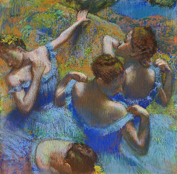
Above: Edgar Degas “Blue Dancers”, 1897, pastel
Approaches to drawing dancers include:
Sketching dancers from life in the theatre or rehearsal room
Drawing from the posed dancer hired to model in costume in the studio
Working in the studio from photos
Working in the studio from video footage
Drawing or painting without a current reference, using a combination of memory and imagined images.
It can be useful to combine at least two of the above methods.
Drawing the moving dancer from life
Sketching someone as they dance is of course extremely challenging: It involves trying to record the present while it is taking place before it can slip into the past. It feels impossible! Why should the artist attempt such a thing?
Drawing from life gives us the opportunity to experience the dance on an emotional level rather than simply recording mechanically. An artist who observes the dancer in real time is in a position to convey the emotional impact of that experience. Resulting images won’t be photorealistic. But perhaps this is not what we are striving for:
“It is the artist who is truthful, while the photograph is mendacious; for, in reality, time never stops cold”
Auguste Rodin
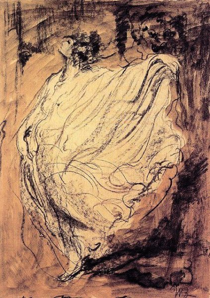
James A.M. Whistler “Louie Fuller dancing”, 1892, pen and black ink
Some practical tips for drawing a moving dancer from life:
Take a little time to observe the dancer(s), to absorb the atmosphere and to listen to the music before starting to draw.
It can help to start by sketching in a few lines to suggest the background. The dancer’s surroundings do not move and can therefore become a helpful reference for you. If outdoors, where is the horizon line? If indoors, lay out a few marks to suggest the floor (e.g. edge of a rug or floorboards), and perhaps mark on the page where the floor meets the edge or corner of the room.
The dancer can be drawn using a rapid almost continuous line, barely lifting the pencil, paintbrush or pastel from the page.
Short sticks of pastel or charcoal could be turned on their side to block in broad directional marks of colour and tone
Do not be too hard on yourself: See if you can capture your immediate visual response to the dancer rather than a “likeness” or totally “realistic” drawing. Some drawings made from the moving figure may look barely human, but they nevertheless capture something of the essence of the dance.
Drawing the posed dancer
Once his studio was well-established, Auguste Rodin (1840-1917) tended to have several models available through each working day. While one might be stretched out on a pedestal, others might be just wandering around. If one made an interesting movement, he would shout out “Halt, don’t move”, and start working. Rodin’s models included dancers and acrobats such as Aldo Moreno.
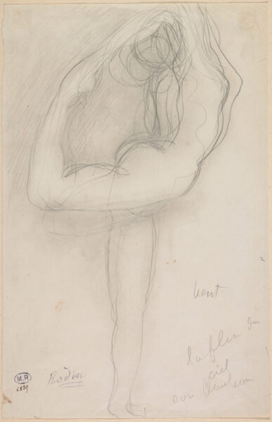
Auguste Rodin “Standing Nude Holding her Right Leg”, c.1903, pencil with stump on paper
Not every artist has the chance to draw from a posed dancer model. If you’re lucky enough to get this opportunity, then discuss in advance how they could best help you. Be reasonable and understanding. Don’t pressurise a dancer to hold a long uncomfortable static pose, e.g. with arms raised or balanced on one leg. This can lead to injury – the last thing that a dancer needs. Give your dancer model plenty of opportunities to pause during the session in order to drink water, to move about or to stretch. One tried and tested approach is as follows:
Ask your dancer to come in costume. They could bring along a prepared section of dance and a recording of its backing music. Offer the chance for the dancer to “warm up” on arrival before you start.
Have the dancer demonstrate a 1-3 minute section of their dance along with its backing music. Observe, or make a fleeting sketch if you wish.
Continue with three 5-7 minute poses in fairly relaxed positions. Standing poses can work well, or the dancer could find a relaxed position on the floor, for example pretending to adjust a shoe.
Then ask your dancer to hold a series of very short poses lasting from between 30 seconds to 3 minutes. Put them in control – As they go into the pose, they’re to tell you how long they’ll be holding it for. This is tiring: Offer plenty of breaks.
You could also ask the dancer to pick out one very short sequence from their dance (nothing too physically extreme) and to perform this repeatedly over a period of around 1-4 minutes. From this, you could draw either a very fleeting sketch, or a semi-abstract looping form that just suggests the nature of the movement.
Complete the session as suits you both. You could request a longer (e.g. 30-45 minute) static pose in costume, with the dancer reclining comfortably against cushions or resting in a chair. Or your dancer may wish to perform their prepared piece again for you, along with backing music. Make fleeting sketches from this, and/or take photos or video footage from various angles for your future reference.
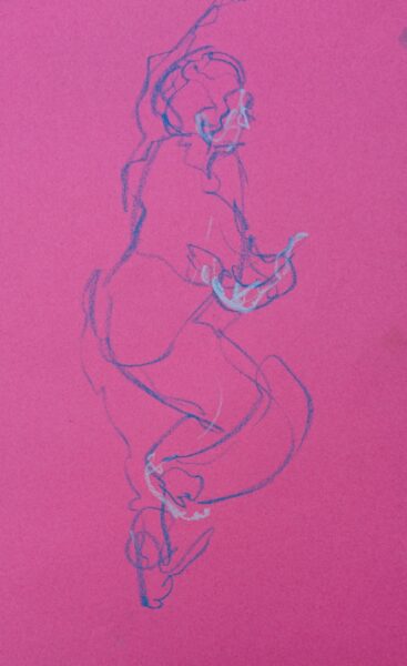
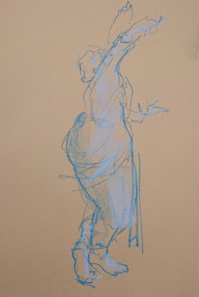
Above: M.Dorn, Three fleeting sketches of the Indian Dancer Fabrizia Verrecchia, pastel on paper
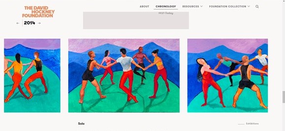
In 2014, David Hockney invited dancers to pose in his studio for a series of paintings, some taking their inspiration from Henri Matisse. This followed on from a period of using multiple viewpoint photography to overcome the “problem” of perspective. He wrote,
“The very first picture of the dancers was of them stood in a circle; it was ok, but they weren’t moving, they weren’t dancing. I got them to go around in a circle, then I would say stop, and draw one and I slowly built it up.”
David Hockney
Posing a group of models enabled Hockney to make anatomical sense of the figures, both as individuals, and as a group holding hands. Unlike a rapid sketch, this thoughtful and controlled approach has helped Hockney to create pleasing finished compositions. Each works on an abstract level, from the shapes between limbs, to the dynamic tension between forms, and the distribution of colours within each painting.
Drawing the dancer from photos
The camera can be an outstanding reference tool for the working artist. It captures vast amounts of information in an instant: For example limb angles, anatomy, patterns of light and shade, and the fall of folds of clothing. However, bear in mind these words of wisdom regarding the photographic representation of movement:
“Movement seized while it is going on is meaningful to us only if we do not isolate the present sensation either from that which precedes it or that which follows it”
Henri Matisse
This does not mean that working from photos must be completely avoided. Rather, photos can be used as an additional back-up reference tool if needed. They must be understood in context. What was happening just before and just after the photo was taken? How was the dancer moving?
To answer the above questions, it can be more useful to work from video footage (which you can then freeze-frame at a moment of your choice or replay on a loop).
Even when working from photos, try to get a sense of the “atmosphere” of the dance. Did the dancer(s) give an impression of easy elegance or exuberance, or tension? Was there a jostling crowd, a rapt audience, or an echoey empty room? It is best to be there at the live performance in order to absorb the experience before returning to the studio with your reference photos or video footage.
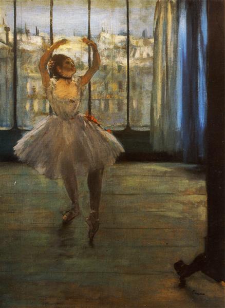
Above: Edgar Degas “Danseuse posant chez un photographe”, 1878, oil on canvas
Drawing the dancer from memory
Creating a picture of a dancer requires some memory drawing. This is the case even when working from the live model. Dancers move faster than any artist can draw or paint. Sketching the moving dancer therefore becomes an act of recording, not what the artist is currently observing, but what the artist remembers from some moments ago.
Perhaps you are working back in the studio after viewing a dance performance. In that case, memory plays a central role. Even with good photographic references to hand, the artist needs to think back to how the dancer was moving, the sense of tension in the dancer’s limbs, and so on.
And of course the artist needs to remember their own emotion on viewing the dancer in the first place. In 1976, Pierre Schneider gave a lecture at the Museum of Modern Art, New York, in which he quoted Matisse as saying,
“My painting is finished when I rejoin the first emotion that sparked it.”
Henri Matisse
In order to work in this way, take note of your first emotional response and then remember it throughout the creation of your piece of artwork.
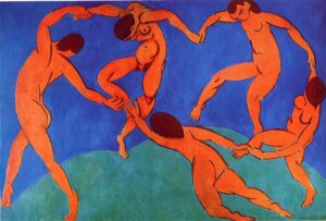
Above: Henri Matisse “Danse”, 1910, oil on canvas, 260x391cm
The artist does not only refer to a posed model or to photos. Whether fully aware of it or not, she also has some internal “reference” – an internalised feeling or response to having watched the dancer.
This internal reference may just be a vague emotional response such as a sense of lilting grace. Or it may be a visualised idea of a highly developed composition ready to be produced on canvas. Or perhaps it is somewhere between these two extremes, akin to a remembered fragment of a dream.
Take note of that dreamlike “internal reference”. This can be the spark that takes an image beyond mere technical drawing and turns it into a work of art.
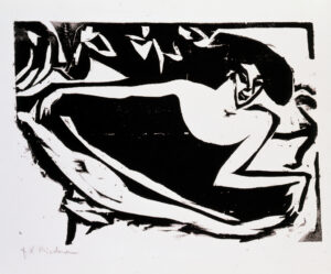
Above: Ernst Ludwig Kirchner, Dancer with Raised Skirt, 1909 woodcut
References
Corbett, R. (2016). You must change your life: The story of Rainer Maria Rilke and Auguste Rodin. WW Norton & Company.
Elderfield, J. (1984) The Drawings of Henri Matisse. Thames and Hudson.
| Tags: dance, life drawing, movement
Dance and art part 1: Expression and movement
September 18, 2020
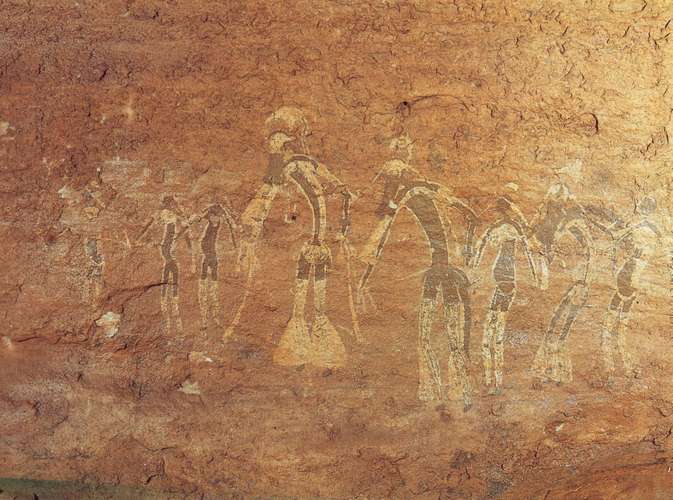
For centuries, the movement, rhythm and beauty of dance has inspired artists. Symbolic and expressive qualities of dance have been conveyed in paint or pigment since prehistoric times.
These two articles look at some of the key ways in which dancers have inspired the creation of two dimensional artwork. In addition, I shall touch on how dancers have in turn been influenced by artists.
Conveying emotional expression
From quiet melancholy to wild abandon, the type of emotion communicated by dancers has long been a source of inspiration to artists.
Even before considering a figure’s facial expression or body posture, emotion can be conveyed on paper or canvas. The range of colours used, the degree of tonal contrast, the technical handling of lines or brush-strokes, and the relationship between the handling of background and figure can all influence the emotion conveyed by the image.
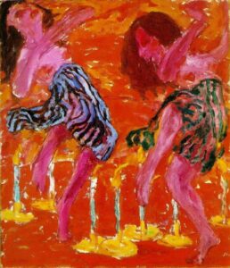
German Expressionist dance paintings of Emil Nolde (1867-1956) suggest at times a wild abandon or a sense of losing control. For example, see his “Candle Dancers”, above.
Though raised as a Protestant, old Germanic legends would have been a key part of Nolde’s upbringing (Jumeau-Lafond, 2008), and indeed some of his dance pictures suggest pagan ritual or demonic possession. Nolde is known to have been influenced by Mary Wigman (Byrne 2012), a pioneering modern German dancer who thought of dance primarily as a means of expressing internal emotional impulses.
The concept of “empathy” was originally closely linked to the way in which people viewed paintings. Robert Vischer, a German aesthetics student, wrote a dissertation in 1873 coining the term “Einfühlung”, literally translating to “feeling into” (Eisenberg 1990, p18). Einfühlung is the projection of people’s ideas, emotions or memories onto objects. The word Einfühlung later got translated into “empathy” in 1909 by the British psychologist Edward Titchener. Robert Vischer was also first to use the term “muscular empathy”: Due to Einfühlung, the viewer of a piece of art unconsciously “moves in and with the forms” (Henderson 2014, p115).
Of course, we also experience muscular empathy when watching dancers perform. The philosopher Theodor Lipps had a particular interest in both empathy and aesthetic enjoyment. Lipps wrote of how he experienced muscular empathy while watching a dance recital: he found himself to be “striving and performing” with the dancers (Lipps 1935, p379).
Representing different types of movement
Speed, direction and quality of the dancer’s movement can be suggested by the nature of repeated shapes and lines within an image. Such lines or shapes could be realistically-rendered folds of clothing, or may instead be bold individual brushstrokes or abstracted forms within the figure or background. Straight, geometric lines tend to suggest static held poses or, when repeated, jerky, start-stop movement. On the other hand, sweeping curves within an image are often used to suggest the effect of a more flowing type of movement.
For example, V.Pervunensky’s painting “In The Vortex of the Waltz”, above, contains many elongated, curved sided shapes that come to a point at one corner. Such shapes hint at the elegant lilting, rotating nature of the waltz. You’ll find these shapes forming zones of highlight or shadow within the white dress of the smiling female dancer, and they are echoed by numerous similar shapes throughout the picture: look at gaps between dancers’ limbs, and look at the shapes formed by white gloves crossing black jackets.
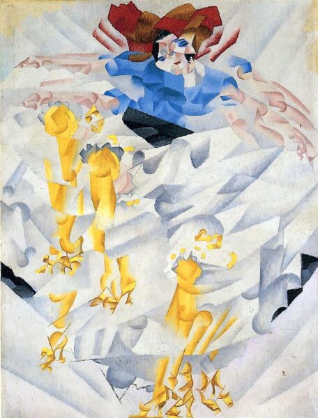
In “Dynamism of a Dancer”, above, we appear to see an arm in one place, and then in another and another. Through an effect similar to stop-motion, such repetition gives the impression of jerky or vibrating movement. Gino Severini was a member of the Futurist group of painters. In addition to celebrating the thrust of technology and the speed of modern life, one of the key visual aims of Futurism was to embody movement on two-dimensional canvas (Kissalgoff 1983).
A picture with regular or irregular repetition of similar shapes, tones or colours can suggest a rhythmic movement pattern. It achieves this by sending the viewer’s eye roving around the image making visual connections.
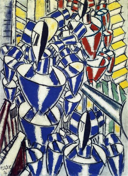
The chosen relationship between similar shapes within an image can hint at the dancer’s type of movement. Shapes may for example appear to tumble or cascade, suggesting that a dancer is doing likewise. Shapes that are distributed equally across the canvas will give a different effect to those that closely abut one another, or to those that are spaced apart at gradually increasing distance. In an image by another Futurist painter, Fernand Leger (1881-1955), “Exit of the Russian Ballet”, above, the dancers are repeated rounded volumes appearing to spin away from us.
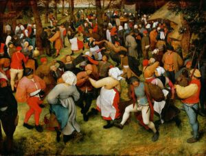
The use of repeated shapes, tones and colours to give the effect of rhythm and movement is not by any means limited to modern artists. For example, there is a clear sense of dance rhythm in “The Wedding Dance”, above. Brueghel (c.1525-1569) used strong tonal contrasts to emphasise the repetition of similarly shaped limbs across his canvas. The distribution of patches of each colour across the image also forms an abstract suggestion of rhythm. Look at the overall pattern created by red, or by white, within this wedding dance.
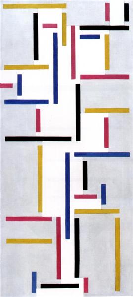
Following the principles of the De Stilj movement, also known as Neoplasticism, Theo van Doesburg (1883-1931) created a picture that is all about dance rhythm. The finished painting, below, uses only horizontal and vertical lines. It represents the rhythmic movement of a single dancer, but has also been compared to the appearance of dance notation (Kissalgoff 1983).
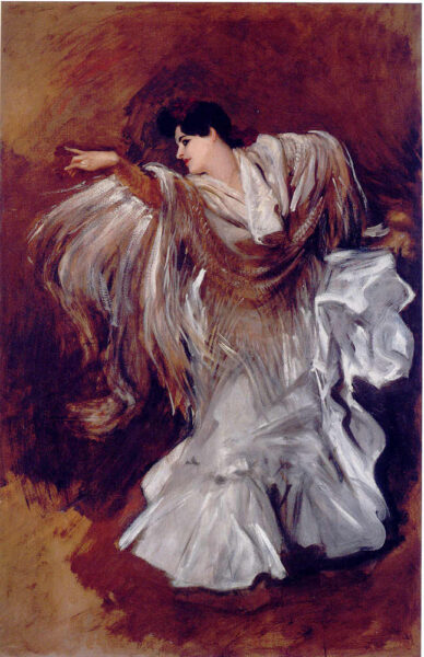
In a bravura display of painting, J.S.Sargent (1856-1925) created a portrait of the famous Flamenco dancer Carmen Dauset Moreno (1868-1910). In this image, below, Sargent not only fulfilled his commission in painting Moreno’s very recognisable face and figure, but he also gave the impression of her having stopped momentarily between dance steps rather than holding a static pose for him in the artist’s studio. The painter used arrays of shapes suggested by the folds of her dress to hint at the various types of movement within Flamenco dancing.
Linking expression and movement in art and dance
American dancer and choreographer Martha Graham (1894-1991) was greatly influenced by a painting by Wassily Kandinsky that she spotted in the window of an art gallery in the early 1920s. “In its most abstract form, it struck her as a brilliant streak of red against a field of blue. Looking at this canvas, she said to herself, ”I will dance like that.”” (Kissalgoff 1983). This experience is said to have inspired Graham’s creation of the 1948 work, “Diversion of Angels”.
Russian painter Wassily Kandinsky (1866-1944) not only influenced dancers, but was himself inspired by dance. He wrote of possible links between dance, colour, and the movement of abstract forms, and developed his own theories of how the colour of a shape affects how it appears to move within an abstract image. In his book, “Concerning the Spiritual in Art”, originally published in 1911, Kandinsky wrote that warm colours appear to advance towards the viewer while cool ones recede. A yellow circle appears to spread out from its centre, while a blue circle seems to move in upon itself like a snail retreating into its shell (Kandinsky 1977, p36-42).
Though primarily a painter, Kandinsky worked closely with dancers and musicians and made a major contribution to thinking about what form a dance of the future might take. One of his central goals was to create a dance that would deal with abstraction (Huxley 2017).
Hungarian dancer and choreographer Rudolf Von Laban (1879-1958) had remarkably similar ideas to Kandinsky regarding the relationships between abstract forms (Dörr 2008, p12).Interested in the space that surrounds the human form, Laban studied architecture at the Ecole des Beaux Arts in Paris and went on to become a pioneering dance theorist. Laban the dancer and Kandinsky the painter both looked closely at how shapes could sweep together, tear apart and change in colour and size, the effect of dark and light, and spatial tensions between shapes and lines.
Some of Kandinsky’s ideas may have been influenced by the teachings of the empathy and aesthetics specialist, Theodore Lipps (see above under “Emotional expression”). Lipps ran a foundational aesthetics course at the University of Munich which was attended by, among others, Brancusi and Kandinsky. (Corbett 2018). Laban the dancer was also based in Munich for a period prior to World War 1, and would at that stage have come across painters from the Blaue Reiter group including Franz Mark and Kandinsky (Maletic 1928). That was certainly a fertile time of collaboration between painters, musicians and choreographers.
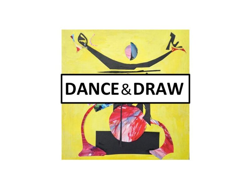
The idea for this blogpost was sparked by the recent creation of “Dance or Draw“. This is an opportunity to dance or to draw/paint dancers. It is run by Mel Simpson, with sessions open to new members and currently held online twice a month.
References
Byrne, B (2012) “Expression through Dance” Aesthetica Magazine, viewed online 10.09.20 at https://aestheticamagazine.com/danser-sa-vie/
Corbett, R. (2016). You must change your life: The story of Rainer Maria Rilke and Auguste Rodin. WW Norton & Company.
Dörr, E (2008) “Rudolf Laban: The Dancer of the Crystal”, Rowman & Littlefield
Eisenberg, Nancy 1990 Empathy and its Development: Cambridge University Press Archive
Henderson, James 2014 “Reconceptualizing Curriculum development” London: Routledge
Huxley, M. (2017). The Dance of the Future: Wassily Kandinsky’s Vision, 1908–1928. Dance Chronicle, 40(3), 259-286.
Jumeau-Lafond, J. 2008 “Emil Nolde 1867-1956” The Art Tribune 11 Nov 2008, viewed online 13.09.2000
Kandinsky, W (1977) “Concerning the Spiritual in Art”. Dover Publications inc.
Kisselgoff, A (1983) viewed online 09.09.20 at https://www.nytimes.com/1983/01/16/arts/dance-view-how-dance-and-other-arts-influence-each-other.html
Lipps, Theodor 1935 “Empathy, Inner Imitation and Sense-Feelings” Translated by Max Schertel and Melvin Rader. In A Modern Book of Esthetics: An Anthology. Edited by Melvin Rader. California: Holt, Rinehart and Winston
Maletic, V. (1928). Body-space-expression: The development of Rudolf Laban’s movement and dance concepts . Approaches to Semiotics Vol. 75. Walter de Gruyter & Co, Berlin.
Comments (2) | Tags: dance, expression, movement
Line and emotion: a warm-up exercise
September 29, 2019
Introduction
Why warm up?
Creating visual art can be a wonderfully free and intuitive process. But, for a bit of “fine tuning”, it’s worth starting off your day in the studio with a warm up exercise or two.
A quick physical warm up is as useful for the artist as it is for the dancer or runner. It frees up the drawing hand and arm in preparation for making sweeping brush strokes, charcoal marks or whatever else is required.
The best warm ups also improve the link between the artist’s mind and her drawing hand. The exercise outlined below not only improves physical brush strokes, but also focuses on the connection between emotional thought and what is put onto paper.
Words, meaning and brush strokes
The quality of brush strokes can infuse an artist’s work with added meaning. This is one way in which the best drawings or paintings go beyond a photographic representation. I’ve mentioned brush strokes, but am referring here to any linear artists’ marks: pen lines, dripped paint, lines of pastel, charcoal, pencil, etc.
Lines drawn with a broad sweep can suggest movement within a picture; halting, jagged ones may hint at fear or tension; smoothly curved sinuous lines can give a sensuous feel to an image. Take a look at Old Master drawings to see how the types of line that they have chosen to use affect the emotional punch of their pictures.
The exercise that follows links words with mark-making. Each artist’s response to this will be different and there is no right or wrong outcome. The idea sprang from an article that I came across in the latest edition of Broadleaf. It’s a beautiful piece of writing by Robert Macfarlane in which he describes his favourite tree, a huge plane under the branches of which he spends time thinking, writing and teaching. “When you step inside, light moves differently – and in my experience, so does the mind…” Below is a paragraph from Macfarlane’s article:
“Like its possible pasts, the plane divides with intense energy. It is vast – about 75ft tall – and from its 20ft-wide trunk extend 15 or so radial branches, and off those come hundreds of secondaries, off which come thousands of tertiaries, and so on. Each has made a distinctive route through the air. The forms of some remind me of lightning bolts, or falling ticker tape, or crocodile backs, of noodley wibbles, of lines of bird flight and hippodrome curves. Paul Klee would have approved of this tree: it takes lines for walks with ceaseless invention.” Robert Macfarlane
The exercise
Materials required
Use any medium in which you’re happy to make linear marks. Brush and ink is perfect. Paint is also a good choice, diluted if needed to a fluid consistency.
Feel free to use your choice of dry medium instead. Charcoal or graphite sticks, soft or hard pastels, pens of any type or oil pastels are great. If working big, consider using very chunky sticks of charcoal, oil sticks or a large brush loaded with paint.
Any support of you choice is fine. I use sheets of old newspaper for this exercise. The fact that they’re destined for the recycling box gives me an extra sense of freedom.
The exercise: Start with words
Choose some words, then simply make some marks in your chosen medium based on those words. Let’s start with Robert Macfarlane’s list of descriptive terms for his tree. These are all perfect for this purpose. Pick just one idea at a time from the following:
- lightning bolts
- falling ticker tape
- crocodile backs
- noodley wibbles
- lines of bird flight
- hippodrome curves
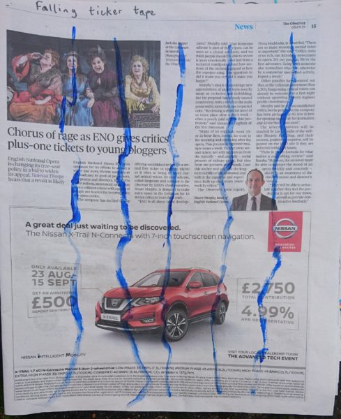
In my example above, I’ve used a brush dipped in paint to make linear marks suggesting “falling ticker tape”. I aimed to have the paint suggest a paper ribbon falling with a few unexpected twists and turns from the top to the bottom of the page, marking time as it falls. Of course, “falling ticker tape” will mean different things to different people. While I understood it as time-marking tape from the physics lab, it could to another artist suggest paper strips thrown in celebration from an open window, and to someone else it may mean strips containing stock market information. The point of the exercise is to have a word-related idea in your mind, and to draw or paint single-line marks to convey this idea.
“draw or paint single-line marks to convey your word-related idea.”
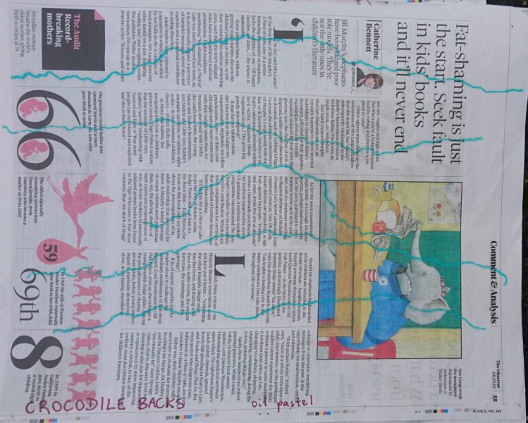
In the next example, I used oil pastel to make lines suggesting bumpy and somewhat arched “crocodile backs” (above).
Adding in new words
The best words to use for this exercise are those that mean something to you, the artist.
Good starting points are words or phrases suggesting something in the real world that is linear. The best examples also suggest movement, the potential for movement, and/or have a strong emotional link. Paul Klee talked about taking lines for a walk. Your lines can also swoop, fall, glide and race.
Here are a few suggestions:
- Slug trails
- Puppys’ tails
- Aeroplane trails
- Wagon tracks
- Horses’ backs
Here are more suggestions:
- Tumbling ribbons
- Vine’s tendrils
- Swans’ necks
- Drizzled honey
- Tops of babies’ heads
And a few more:
- A tear rolling down a cheek
- Trailing blood
- Life-saving rope
- Prison bars
Use your marks to convey your emotional response to the chosen word or phrase. For the “prison bars” exercise above, I wanted the pastel marks to look strong and unbreakable, but also to suggest a sense of frustration and perhaps of violence and oppression. I was not aiming to draw realistic sets of prison bars.
“Use your marks to convey your emotional response to the word or phrase.”
Several lines on a page
Make several marks per page, all based on the same word or phrase. Repetition will allow you to improve as you go along. Adjust as needed the amount of paint on your brush, the speed of movement of your drawing arm, the pressure of your line, the width of your line and so on.
Without spending much time on this, space the marks across the page in a way that both pleases you and feels appropriate. There is no right or wrong way to do this, but consider the shapes of the gaps between the lines as well as the lines themselves. You might decide to space the lines at regular intervals across the page, or perhaps instead prefer to bunch them up together.
If making marks on newspaper, then you may also choose to have your marks interact with the placement of and meaning of the underlying print (as in the prison bars example, above).
Learning from the exercise
Set about this exercise in a playful way and see what happens. Did your marks come out as intended? If not, then feel free to have another go, this time with a different amount of paint on your brush, or with a faster or slower movement of your drawing arm, or applying less or more pressure as you create the mark.
This exercise can also be useful in showing up how we might improve the link between our own mind and mark-making skill. For example, in the crocodile back exercise (above), I’d hoped to use my pastel marks to suggest the incredible stillness of these creature’s backs. This hadn’t worked as intended: instead, my lines appear to be tumbling along. A weightier, more regular line applied more slowly might give a more convincing effect of stillness.
For ideas on how lines can suggest movement and emotion, keep your eye out for marks found within great drawings and paintings.
oil paint on canvas, 143.2 x 133cm. Look at the angular, thrusting quality of the black and red-brown marks within the gates and main building. These brush strokes suggest strength but also, perhaps, some kind of impenetrability or oppression. It is a powerful image with great emotional tension.
| Tags: conveying emotion, exercises, warm-ups
Just Draw! Part 3: Outdoors
April 30, 2015

Above: One of my sketches in an A5 sketchbook using inks, pencils, watercolours and pens, 2010
Countryside and urban landscape are full of inspiration for the artist. Here in the UK, days are lengthening and weather is (sometimes) dry, so this is a great time to consider heading outdoors to draw.
A few practicalities
To get started, you really only need a sketchbook (or other drawing paper) and a pen or pencil. However, I suggest packing a few other bits and pieces to keep you comfortable during your drawing session:
- A lightweight folding stool or chair so that you won’t be restricted to drawing from park benches, etc. if you prefer to draw while seated.
- Layered clothing appropriate to the weather
- Snacks and hot or cold drinks to keep you going
- Rucksack to carry your stuff- you may choose to walk quite a distance between stopping to draw.
- If you wish, a few printed images of inspiring drawings (or download them onto a mobile)
- Tissues and/or wipes for clean-up
- A portable easel is optional, but is particularly useful if drawing on a larger scale.
You may also like to bring a variety of art materials. Here are some suggestions:
- Either a sketchbook or a drawing board plus bulldog clips and loose sheets of various papers
- A few ballpoint, marker and/or nibbed pens
- A few sticks of charcoal and chalk and a putty rubber (this works well with toned paper). Charcoal smudges, so bring greaseproof/parchment paper with which to protect your work on the way home if required. Also do remember wipes for clean-up.
- A little watercolour pan set plus either a water-brush or a normal brush plus screw-top container of water
- A pot of ink (brown is lovely) plus water for clean-up, and a dip pen plus one or more nibs. For ink and wash techniques, also bring a brush and one or more little containers in which you can dilute the ink.
- A graphite stick
- Pencils (coloured or otherwise) plus a good sharpener and a bag or container for any pencil-sharpenings.
Possibilities for outdoor drawing are limitless. Here are a few ideas to get you started:
A broad landscape showing the lie of the land
Above: Vincent van Gogh drawing in pencil, reed pen and brown ink, c1888
Medium: Pen and ink on cartridge-type paper. A ballpoint, cartridge or marker pen are fine. For more characterful lines, try a nibbed dip pen or reed pen plus a bottle of ink. You’ll also need an HB or 2B pencil for a little light under-drawing.
Subject: Any landscape or cityscape in which your view is not obstructed by nearby trees or buildings.
Looking at the subject: Can you see the foreground, middle distance and far distance? Remember that, whether you choose to sit or stand while drawing, the horizon-line will be at you eye level. Can you see any part of the horizon, or do buildings or trees entirely obscure it? Is the ground flat, or does it slope one way or the other? Decide how much of the view you’d like to include in your drawing.
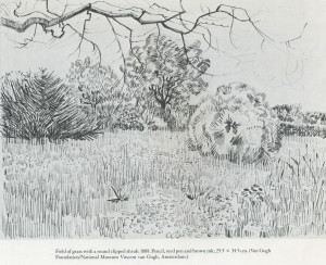
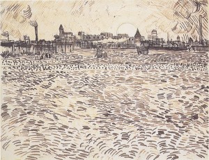
 Above: Three drawings by Vincent van Gogh (1853-1890)
The drawing: In this drawing, you’ll aim to convey a general sense of the “lie of the land” (US: “lay of the land”), i.e. its hilliness or flatness, and a sense of distance. Textures of surfaces can also be suggested.
Start with a few light pencil marks on your page to show where the important bits of the landscape are to be positioned in your drawing. These pencil marks can be erased or forgotten once you have drawn in pen over the top of them. I suggest marking a faint horizontal line across the page to show the level of the horizon. Also use your pencil to indicate where any buildings, hedges, paths are to go. Try to indicate with your pencil the position of slopes in the ground, if any are present.
Now tackle the drawing with pen. I suggest an approach similar to that used by Vincent van Gogh in many of his drawings. Work across the landscape, using whichever pen marks you choose (dots, sweeping strokes, etc.) to suggest the slope or direction of the land and the texture of the surface. Keep your pen marks lively. We are not trying to convey the effects of light here, so laborious cross-hatching or shading are not required.
Pen marks should tend to get smaller as they disappear into the distance in your picture. They may also converge into the distance, e.g. if suggesting rows of corn or edges of a path leading into the picture. This helps to give your picture a sense of distance.
Taking this idea further: You may wish to develop this idea by drawing in colour. Feel free to use the same linear style as described above, this time working in coloured inks, coloured pens or pencils. If you wish, you may choose colours to help emphasise a sense of distance (cool colours tend to recede, while warm ones come forward). Your colours may be based on those of the landscape itself, or you may opt for a more experimental approach, with colour providing a sense of emotion.
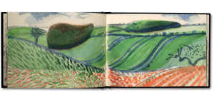
Above: David Hockney, pages from a Yorkshire Sketchbook, c.2004
Like David Hockney (see image above), you could add in blocks of painted colour if you wish. Several of Hockney’s landscape sketches have a similar “lie of the land” approach to those of van Gogh, with an emphasis on distance and topographical features of the landscape, plus touches of surface texture.
A tonal approach to trees
Above: Claude Lorrain “A group of trees on a riverbank” c1640-45, brown ink with underlying black chalk
When the evening light is fading, have a go at drawing the silhouetted shapes formed by trees. These could be very quick, fleeting sketches suggesting the general shape of the tree masses. Charcoal, graphite or brush with ink are all ideal for sketching simple trees, or you could block them in using pen or soft pencil. Try doing several little sketches of different trees (or groups of trees) across a double-page spread of your sketchbook before the sun completely disappears.
Trees do of course form tonal shapes at any time of the day. Look at them with screwed-up eyes to emphasise this effect.
For a more finished drawing, as in Lorrain’s image of trees, above, look out for any more subtle variations in tone. As a whole, the trees and the ground that they stand on may be much darker than the sky behind. However, a closer look reveals some parts to be a deep, almost black shadow, while other parts are lighter in tone.
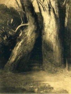
Above: Odilon Redon “Deux Arbres” 1875
Tone can have quite an emotional impact (for example, see the image by Redon, above). When you are exploring woodland, other countryside or urban areas, keep an eye out for those unexpected dark shadows or startling contrasts that make you look twice.
Trees with character
Each tree has its own unique structure depending not only on its species but also on its history, the prevailing wind and so on. They are just as worthwhile to draw as a human or animal figure though, of course, they will neither walk away nor charge you by the hour.
Drawing trees can be approached in a similar manner to life drawing. Just as when drawing the human figure, it helps to check proportions with care:
- Check, for example, whether it is taller than it is wide.
- At which point off the trunk do the lowest branches emerge – a half, a third or a quarter of the way up?
- Do the branches reach up almost vertically to the sky, do they stretch out horizontally, or do they branch off from the trunk at an angle?
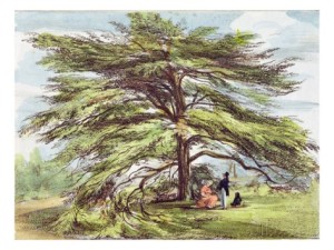
Above: George Ernest Papendiek (1788-1835) “The Lebanon Cedar Tree in the Arboretum at Kew Gardens”
The general structure of the tree should be drawn out before considering adding small details. If attempting to draw the entire tree, do step back far enough so that you can see the entire structure without moving your head, even if this means working from the opposite end of the field.
A few ideas for drawing individual trees:
1) In graphite, pencil or pen. Using the whole double-page spread of your sketchbook, sketch the tree very rapidly using a continuous-line technique, i.e. do not lift your drawing tool off the paper form start to finish. You should end up with a flowing image with an intuitive quality.
2) In pencil, charcoal or graphite, use a more careful, structural approach to drawing a tree. Work much more slowly (e.g. over a period of 40-60 minutes). Make multiple measurements using your outstretched arm to check the proportions of trunk, main branches and masses of foliage, and estimate angles of the main branches. Use the tip of your charcoal or graphite stick to draw edges in once you have worked out where they should go. As you build this drawing up, turn the charcoal or graphite on its side to block in regions of dark tone if you wish.
3) In any medium of your choice, draw from the tree using a mixture of careful measuring marks and more intuitive, flowing lines. A tree that is growing at an unusual angle is a good one to draw to start with. Leave about 30 minutes for this drawing as it is better left uncompleted than overworked. I suggest starting by making a few measurements and checking how your tree will fit onto your paper. Work into the drawing more boldly to emphasise the direction of the trunk and branches and perhaps to suggest movement if it is a windy day.
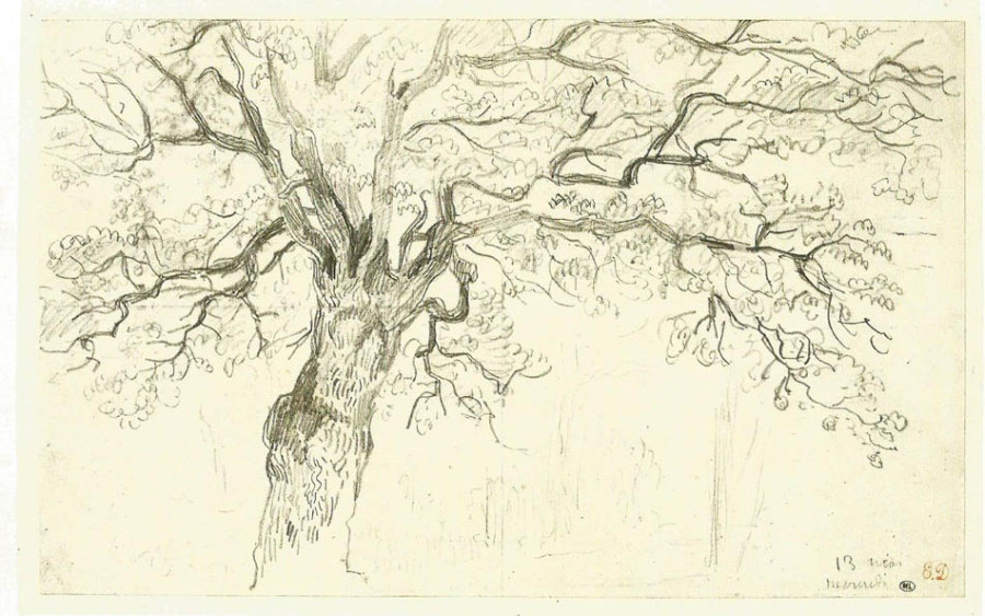
Above: Eugene Delacroix “Study of an Oak”, graphite on wove paper, 21 x 33.8cm, 1857
Just Draw! Part 2: indoors
February 19, 2015
Following on from my recent discussion on returning to drawing, this article presents a variety of suggestions for drawing indoors.
Feel free to pick and choose from this selection of drawing ideas and to approach them in any order. These “exercises” are primarily designed to get people drawing again, but they also encourage us to look at the world afresh and to think.
1) Create a pleasing line drawing from the objects in front of you, Matisse-style
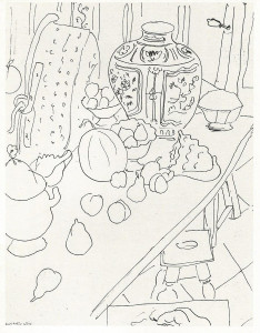
Above: Henri Matisse, “Still Life, Fruit and Pot”, 1940
Medium: Pen on cartridge paper.
Subject: A group of objects, as you find them, in your home or studio. Rounded items, such as pots and fruit, are pleasant to include but not essential. Paint tubes and brushes as you find them on a table, items on a kitchen counter-top or shoes on a rack are a few other suggestions.
Also include the space around the object, which may include the wall behind, a section of floor and perhaps even your own hand (see Matisse’s drawing, above). You can (optionally) move the items around just a little before you start to draw, but do not spend ages setting up a traditional still-life arrangement.
Looking at the subject: Even if the objects do not immediately strike you as beautiful, perhaps their shapes have some pleasing properties. Look both at the objects themselves, and at the negative shapes between them. Are there adjacent areas of pattern (e.g. tiles, wood-grain, wallpaper) that you might like to include? A strong diagonal shape within the image can be helpful but not essential (e.g .the table edge in Matisse’s still life, above, and in Bob Dylan’s image, below). The spaces between the objects and the edge of your drawing are going to be key, so think in advance about how you’ll fit what you see onto your page. You may like to use a cardboard viewfinder to help find the most pleasing composition.
The drawing: You’ll be aiming at a rather decorative line drawing with an emphasis on shape and pattern. Do not worry about the technical “correctness” of your finished drawing. Accurate perspective and measuring are not important here.
If you have used a viewfinder to help plan the composition, then start by checking that your drawing will be in proportion to that viewfinder. You could either use an entire sheet of paper for your drawing, or draw out a rectangle to represent the edges of your image, and then work within that.
Feel free, if you wish, to make a few initial marks in pencil so that you know where your objects will sit within the picture, or perhaps to start with a faint pencil gesture drawing. Then proceed in pen. Keep your pen marks lively and confident. Ignore tone- just represent edges of objects and any patterns that you see. Make sure that your pen lines are not all clustered in one part of the drawing. If necessary omit details and patterns in certain areas of the image and emphasise them in others. A pleasing image will have a balance of lines and quiet spaces.
Optional: Taking this idea further
Above: Bob Dylan, “Still life with peaches”, 2007, mixed media on paper, 76x61cm
If you are yearning for colour, then consider adding some in to your drawing in a rather abstract way. Such a flat style of line drawing provides a good “excuse” for not aiming at photographic realism when adding colour.
Once you are happy with the balanced composition of your pen drawing then you have some options. You may choose to add colour directly to your drawing using marker pens, gouache, crayons, etc.
Alternatively, you could scan and print your uncoloured pen drawing onto artists’ paper, perhaps with some enlargement (a basic computer and printer set-up can be used). Colour is then added to the printed copies using any medium of your choice. If you print multiple copies, then you can try out all kinds of colour combinations and techniques while still retaining your original pen drawing.
For example, Bob Dylan included six differently-coloured versions of his “Still life with peaches” in his “Drawn Blank” series, my favourite of which is shown above. Others were coloured in earthy or warm brown-orange tones. The use of colour changes the emphasis within the composition, and also gives each image its own emotional “punch”.
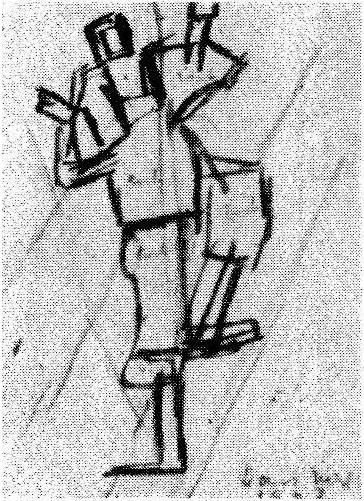
2) An intuitive approach to structural drawing
Above: Alberto Giacometti, “Man Walking”
Medium: Pencil on cartridge-type paper
Subject: Any room with some freestanding furniture on the floor. One or more chairs, and perhaps a standard lamp, an easel and/or general household mess are all great to include (don’t tidy up first!).
Looking at the subject: Find yourself somewhere to sit or stand (you’ll need to settle in one place for the duration of this drawing) and take at least two minutes to look at the room in front of you.
- Which objects are nearest to you?
- Notice that the edges of some objects may seem to overlap the edges of others (simply because some objects are in front of others).
- Notice that some objects appear to be lower down than others because they are nearer or further away from your eyes.
- If the room is not cluttered, look out for sizeable areas of floor or wall in between the objects that act like blank “negative spaces”.
- Try moving your head a little….Does this affect the spaces between the objects?
The drawing: In this exercise, you’ll aim to create a simple line drawing of the room, a bit like Giacometti’s studio drawings (one of which is shown above). The focus here is on spatial relationships, i.e. how the objects are positioned relative to one another. The search for structure is key, so guidelines and overlaid corrected lines can form part of the finished drawing.
Start drawing edges of the main objects using a gentle, “searching” type of pencil mark. Keep looking back at the subject for more clues. In your drawing, mark in where any two objects overlap one another. Feel free to draw faint guidelines between the objects to help align them on the page as follows:
- Do any objects appear to your eyes to be lined up exactly, either one above the other, or lined up horizontally? If so, you may like to draw vertical or horizontal lines to help you position them appropriately within your drawing.
- Look out, as well, for diagonal relationships between objects. E.g. you may imagine a diagonal line running from the corner of a table to the top corner of a cupboard. You could draw this imagined diagonal line into your picture as a structural guide, to help establish the position of cupboard and table (click here for tips on estimating the slope of a diagonal line). If, in real life, the cupboard is behind the table, then you can imagine your diagonal line moving deeper into the picture plane as you draw it travelling from table to cupboard. Feel free to add in as many imagined diagonal lines between objects as you wish…perhaps ending up with a web of light lines suggesting space between near and far objects.
Another way to approach this kind of drawing: Once you get the hang of the structural drawing approach, start to focus more on the negative shapes between the objects. What kinds of negative shapes do you see? Is there a pleasing balance of lines and negative shapes in your picture, as in Giacometti’s studio drawings, or is your entire image too “busy”? You may like to try out more drawings of the same room, perhaps from different viewpoints, with this in mind.
3) Draw your own unmade bed
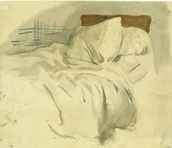
Above: Eugene Delacroix “An unmade bed”, watercolour over graphite, 20.6×24.1cm
Medium: Whatever is to hand (pen or pencil, crayons or watercolour, etc.)
Subject: Your unmade bed, just as you find it. This is a great subject for the following reasons:
- Your own bed is personal to you, the artist.
- It will look different every morning depending on which position the bedding has happened to take.
- Those random twists and folds in pillows, sheets and quilt are interesting and deserve a second look.
- Bedroom lighting (from a lamp, or through half-opened curtains) emphasises interesting masses of tone or pools of light on your bedding.
- This is a good excuse not to make your bed.
Drawing approach: In order to keep this drawing fresh and immediate, I strongly recommend setting yourself a time limit. This could be 10-30 minutes depending on your chosen medium. If there is something that you really want to include (e.g. a directional twist to the sheets, or a dramatic pool of shadow) then be sure to get this in within your time limit.
Include as much or as little of the bed as you wish (if observing it from within a small room, then it may be best to include just one section, as you will not be able to step back far enough to see the whole bed without moving your head).
Other personal subjects in the home or studio: If ever stuck for ideas for what to draw, remember that you need not leave your front door in order to find inspiration. Some of the best subjects are those that are most personal to us. These are often overlooked. Here are a few more examples:
- Your shoes, just as you find them on the floor (perhaps refer to Van Gogh’s shoe paintings).
- Your cup or glass once you’ve finished drinking from it. Notice where it is positioned, as this says something about the hand that has just left it. Do include the edges of any adjacent objects in your sketch.
- Your coat or other clothing on a chair. This could be an energetic image like Cezanne’s watercolour, below. Alternatively, you could think more of the weight of the fabric hanging from the chair.
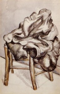
Above: Paul Cezanne “Coat on a chair”, 48x31cm, watercolour, 1892
Draw a room, this time giving light more importance than objects.
Above: Vincent Van Gogh “Interior with woman sewing”, c.1885
Medium: Pen on cartridge-type paper.
The subject: Any medium to large room of your house, or your studio. If drawing during daylight hours then make use of light through the window. If it is dark outside, then light from a directional lamp (e.g. a domestic table or floor lamp) will work better than that from a central ceiling light.
Looking at the subject: Do take at least a couple of minutes to look and think before you start to draw. In this drawing, you’ll be focusing both on the spaces between the objects in the room, and the effect of the light, so there is plenty to think about. Notice the following:
- Where is your own eye level? That is, how high up are your eyes in relation to the rest of the room. I suggest starting by drawing a faint horizontal pencil line across your drawing paper to represent your eye level. Any object which is above your eyes in real life will then be drawn above that line, whereas any object that is below your eyes will be drawn below it.
- Where is the light coming from? Note the position of any sources of light such as window(s), open doorway, lamp(s). Out of all of these, there may perhaps be one main light source. E.g. in Van Gogh’s “Interior with woman sewing”, the light is coming from the upper right side of the picture, with shadows falling to the left of the objects. There is light coming from the window next to the sewing woman, but the fall of the shadows suggests that there is another bright window or open doorway in the far right, not included in the picture.
- Where are the main pools of light and shadow in the room? Screw up your eyes to simplify the tones that you see.
- How much of the room do you want to include in your picture? Use a cardboard viewfinder (or frame the view with your fingers) to help choose a rectangular image from what you can see in front of you. Include some pleasing patches of both light and shade within your chosen composition.
The drawing: Start by laying the picture out with a few faint pencil lines before embarking on the pen drawing. Your pencil marks are just rough guides as to where key parts of the picture will go. Do not make a complete pencil drawing and then slavishly work over it in pen!
Look at the room with screwed-up eyes to check tonal values then, starting in a dark area of the room, start to use pen lines to build up the picture. Vertical and/or horizontal pen lines (as in the Van Gogh picture above) are useful for suggesting tone in the room that is not associated with any particular object. Use thicker or overlaid lines to create darker areas of tone. Leave the paper untouched to suggest pools of light.
Use your pen to add in furniture and a few architectural details but, when doing this, don’t add more pen lines than needed. Give the light and shade in the room more emphasis than the objects themselves. Some of the furniture’s edges may even seem to “disappear” within a pool of hatched shadow.
A view through a window, Matisse-style
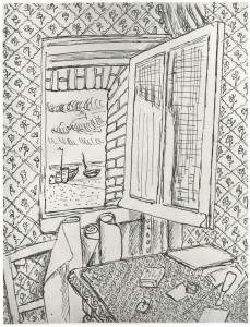
Above: Henri Matisse, “Open window at Etratat”, 1920
Medium: Pen on cartridge-type paper.
The subject: An open or closed window in your house or studio, whatever you can see through that window, plus a view of some of the room’s interior This may just be objects on the window-sill or, as in Matisse’s drawing shown above, you could include space above, below and in front of the window.
Looking at the subject: When looking from the inside of a room at a window, we naturally focus either on the view through it, or on the window-frame plus surrounding walls, etc. For this exercise, the challenge is to look at the interior of the room, the window-frame and the view through the window all at once.
Do the objects outside the window have any relationship to what is inside? Whether you are looking out onto a street, a brick wall or a landscape, see if you can relate outdoor shapes and patterns to those seen indoors.
The drawing: As in the other Matisse-inspired drawing (no 1, above), again use pen lines to create patterns and object edges. Shapes, patterns, and their relationship to one another and to the edges of the drawing, are key to this style of work.
In making this drawing, see if you can make sense of your window image without adding any tonal shading whatsoever. If you do decide to add a little tone (and you may well do if there is bright light streaming through the window) then use it sparingly as Matisse did in “Open Window at Etratat”. Instead of resorting to shading techniques, try adjusting your line thickness or changing the density of your patterned marks to suggest tone.
| Tags: Bob Dylan, Giacometti, Matisse, Van Gogh
Just draw! Part 1: Getting back into drawing.
February 11, 2015
Above: Bob Dylan, “Still life with peaches”, mixed media on paper, 2007
Getting back into drawing
At the best of times, drawing and creativity can seem wonderfully addictive. But there are inevitable periods in every artist’s life when the artwork just seems to stop happening for a while. Perhaps other aspects of life have become more demanding or compelling. This needn’t be a problem unless:
1) Having broken the “habit” of drawing, you start to lose confidence in your ability or in your materials.
or
2) You not only stop drawing, but you stop “looking”, i.e. observing and thinking.
In such cases, the thought of starting to draw again may seem pointless or perhaps even fill the artist with dread. As the ability to create art is tightly-bound to an artist’s sense of self, there tends to be a basic emotional need to continue. Worries about getting back into drawing (or other art-making) typically leave the artist feeling conflicted.
So…how can one best “get back into drawing”?
In this and the next few articles, I’ll offer some practical suggestions for returning to art-making and some relevant drawing exercises. This is a universal issue for artists, so do feel welcome to post comments at the end of the article if you have further suggestions to offer.
A few practical tips on rekindling your old art addiction
If you’ve got “out of the habit” of making art, then just getting down to it again can seem daunting. It is worth pushing yourself through this stage:
- Set aside a regular short time in which you’ll get on with drawing (or using any other chosen medium) in a business-like way. A session as short as 15 minutes per day will suffice if you are busy. A regular half-hour slot may feel more satisfying. Feel free to set a timer to separate your “drawing time” from the rest of the day.
- During your chosen “drawing time”, be very clear with yourself about avoiding distractions such as internet, mindless housework, phone, etc.
- Keep your chosen art materials ready for the next use. Pencil(s) should be left sharp, paper ready-clipped to a board or in a sketchbook. If using paints then aim to leave all equipment clean and ready for the next session. If you have space then do not replace paints and brushes in a drawer, but leave them ready to pick up and use again. If using an easel then leave it set up and ready to go.
Regain the knack of really “looking” at the world:
- It doesn’t matter how boring your surroundings initially appear to be. Click here for an article on looking and seeing. Play around with observing your surroundings in an abstract way, and combine this with taking a few photos if you wish.
- In the words of Bayles & Orland in their highly recommended book, “Art and Fear”, start to “notice the things you notice”. Pay attention to your personal reactions (both to objects and ideas) as these are key to the art that you will go on and make.
Above: Starting to look at the world in an abstract way.
Using drawing both to build confidence and to spark ideas:
Drawing on paper (as opposed to painting, printing, sculpture, etc.) is well-suited to the returning artist who requires a versatile, experimental approach. Pen, pencil or crayons are useful allies: portable, non-messy and adaptable, they are always ready to be picked up and used.
As ever, it is useful to turn to the great artists for inspiration. However, I never aim for a “perfect piece of work” comparable with a known masterpiece. Not only would such an approach inevitably lead to frustration but, in my opinion, a goal of complete perfection has little to do with the artistic thought process. On the other hand, borrowing certain ideas, practical methods and “ways of seeing” from other artists can be extremely useful in getting us back on track.
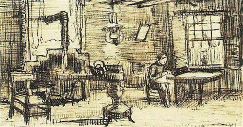
Above: A studio drawing by Alberto Giacometti. Without being in any way overwhelmed by Giacometti’s achievement, we can use this drawing to get us looking at scale, at spatial relationships between objects, and busy versus quiet areas within a composition.
During the past few years, I’ve written down outlines for numerous drawing suggestions for my own use, each inspired by a famous artist’s sketch or drawing. Each drawing idea includes a suggestion for subject, medium and approach. Over and again, these lists of ideas have proved invaluable in getting me drawing again when I feel “stuck”, and are always a good starting-point for completely new artistic approaches.
Poor weather or a lack of inspiring subject need not stop us from drawing. In my next article, I shall share a range of drawing suggestions that can be started and completed indoors, within any home or studio.
| Tags: artist's block, blog
Composition dogs: part 3
November 6, 2014
Dogs and owners: Spaces between
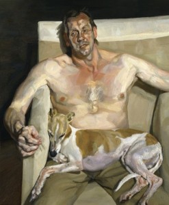
Above: “Eli and David”, by Lucian Freud, 2005-6. A portrait of David Dawson (Freud’s assistant and friend) with his whippet.
I find “Eli and David” remarkable both as a powerful composition and for the way in which it demonstrates a key aspect of human-canine relationships. This man, painted with all his human flaws and concerns, comes under our close scrutiny, but the dog accepts and trusts him regardless. As in several of Freud’s canvases, the dog does not care about the figure’s semi-nakedness or awkward pose. Squashed together within the armchair, dog and owner appear to accept one another’s close presence without criticism or complaint.
Compositionally, this painting has a wonderful abstract quality. It is broken into major sections by the horizontal edges of chair back and dog’s back, with the black background forming a strong inverted “L” shape. The side of the chair forms a vertical barrier against which the dog’s head is squashed, adding a feel of dynamic tension to the whole image. Negative shapes between dog, chair and man echo one another pleasingly.
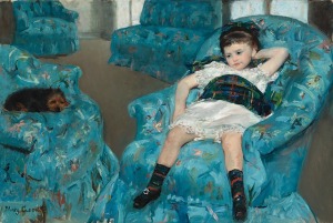
Above: Mary Cassatt “Little girl in a blue armchair”, 1878, oil on canvas
Similarly, the girl sprawled in the chair in Cassatt’s image appears uninhibited in the presence of her canine companion. Both girl and dog are dwarfed in this room of outsize armchairs and this image could represent the strange childhood sensation of feeling out of place. Apparently unaware of the painter, the girl looks to the dog for companionship though, in this case, there is a quite a void of grey carpet between them. Painted as a rounded, enclosed, intensely dark oval, this terrier forms a strong enough shape to counterbalance the image.
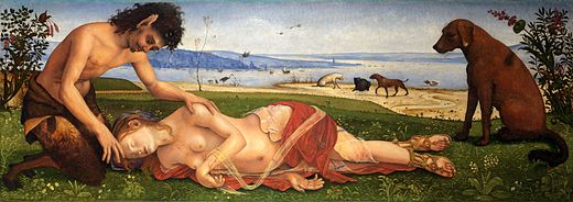
Above: Piero di Cosimo “A Satyr mourning over a Nymph”, c1495, oil on poplar, 65.4 x 184.2cm
In contrast, the final image in this series is otherworldly. The fallen female figure is the nymph, Procris, who in Greek mythology was accidentally shot and killed by her husband, Cephalus. The presence of both satyr and dog is mysterious. A satyr was not present in the original story, and the identity of the dog is unclear.
Between them both, the satyr and foreground dog create a compositional arch above the dead nymph. Look at the curves of their backs clear against the sky. Though the husband (the only human in the story) seems to have disappeared, this arch suggests care, protection and fidelity. The satyr shows compassion and tenderness, but the dog gazes unflinchingly at the strange scene. As probably occurs over and again in real life, this dog has been a silent witness to some strange human drama.
| Tags: blog, Cassatt, composition, dogs, Freud, mythology, negative shapes, shapes
Composition dogs: part 2
October 12, 2014
A dog at the table: two pictures to compare
In this second part of my short series on dogs in composition, lets compare two paintings. Both painted in France in the 1860s, each of these pictures shows figures at a table, and each artist has included a single dog as a key part of the composition. But this is perhaps where the similarities end.
Above: Auguste Renoir “At the inn of Mother Anthony”, Marlotte, oil on canvas, 1866
Painted when he was a young man and not yet famous, Renoir’s “At the Inn of Mother Anthony” shows the artist in thoughtful discussion with fellow painters. The inn itself was a meeting-place for artists of the Barbizon school and for those who had travelled to the Fountainbleau forest to paint outdoors. Artists have painted murals on the walls, and even the maid is portrayed as if she were part of the group, listening to what is being said.
While the four main characters seem engrossed in their own conversation, the only face making any emotional connection with the viewer here is that of the dog. The animal’s appealing, frontal image draws us into the picture. The curve of the dog’s head is echoed by curved shapes throughout the painting, and this keeps my interest, sending my eye up and around the picture, though ultimately giving no clue as to the content of the artists’ discussion. Looking at this image, I am left with a sense of discord, colluding with the dog under the table while the intellectuals talk above our heads. I wonder whether this was Renoir’s intention?
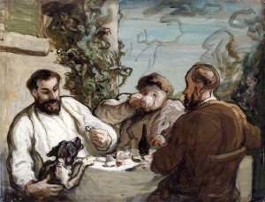
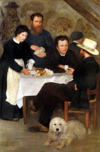
Above: Honoré Daumier “Lunch in the Country”, 1868, oil on board, 26x34cm
Two years later, Daumier’s “Lunch in the Country” made similar use of bold, black and white shapes. In this case, however, the collusion seems to be between the dog and its owner.
Despite the lovely setting of countryside villa with lunch and wine, the hungry creature rearing up above the smart white tablecloth here hints at simmering animal instincts. There is such a close connection between this dog and owner (the man on the left, dressed all in white) that, rather than putting his guests at ease, his focus is all on the animal.
With elongated, slightly curved features, this man’s expression combines both indulgence and potential malevolence. These facial features create distinctive shapes (his highlighted left cheek, and the space between eyebrow and eye) that are repeated in and around the dog (look, for example, at the space between the animal’s two front legs). The closely-comparable black and white paint handling within dog and owner further sets these figures apart from the two guests.
Certainly for the nervous-looking man with the raised coffee cup, this lunch in the country appears to have been a fraught affair. Not only a painter but also a great caricaturist, Daumier was surely making some social comment here. According to Lilian and Dieter Noack, Daumier started spending his summers in Valmondois in 1853 and a house was possibly purchased for him here in 1868 (the year of this painting) by the artist, Corot.
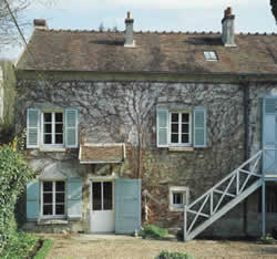
Above: Daumier’s house in Valmondois
| Tags: composition, Daumier, dogs, Renoir
Composition dogs: part 1
October 10, 2014
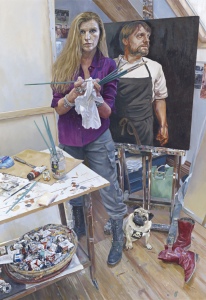
Above: “Henrietta and Ollie” by Tim Hall (Click on the image for a closer view)
Dogs in pictures can be very engaging but, in the hands of an expert artist, their use goes far beyond mere representation. In this and the next post, I’ll discuss complex images in which a dog plays a key role. Our canine companions can form all kinds of picture-worthy shapes, suggest directional movement and add focus and structure to a painting. But it is their complex emotional bond with us humans that makes them particularly valuable within picture compositions.
Dog shapes
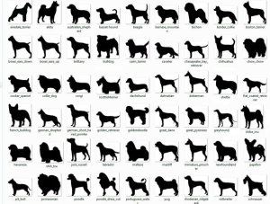
Anyone who has leafed through a book of dog breeds will be familiar with the huge variations in canine shape due to conformation. Over the years, types of dog have been specifically bred not just for function but also for the visual impact of their appearance. Consider, for example, the “…graceful, aristocratic, dignified and elegant” Borzoi, or the “…broad, powerful and compact” Bulldog.
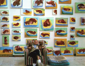
Above: David Hockney with a wall of his dog paintings. Image from his book, “Dog Days” (Thames & Hudson)
When including a dog in a painting, we must also remember that the posture of the animal chosen by the artist will completely alter the nature of its overall shape or silhouette. A browse through David Hockney’s sketches of his own Dachsunds, in each case painted from life, shows the postural variation that he observed. Some of Hockney’s rapid dog paintings are shown above. Considering dog images for a moment as flat, abstract shapes, you’ll see that almost all of these are curve-edged. The straight-backed dog sitting up on his haunches is an exception.
Which of these dogs (or pairs of dogs) has a simple, smoothly-curved outline, and which has a more intricate, playful, notched shape?
Do any of these dog shapes suggest movement to you, perhaps by making your eye flow across the picture? Does one or more of these images make your eye stop or pause on the page like a written punctuation mark?
Dog posed with a human sitter: could the dog offer clues to the sitter’s personality?
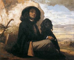
Above: Gustave Courbet “Self portrait with Black Dog”, 1842
People often speak light-heartedly of the similarity between a dog and its owner. Well, a recent study confirms that dog owners indeed tend to believe that their dog has the same personality traits as themselves. Furthermore, other people (or, at least, family members) tend to see a dog and its owner as being alike in personality. For more information about that study you may wish to follow this link.
So, perhaps the viewer can glean interesting information about a sitter from their dog.
To achieve this effect, the artist first needs to suggest a clear emotional bond between the person and the animal. In Courbet’s “Self portrait with Black Dog”, dog and owner are both portrayed as dark, rounded shapes against a bright background. Part of Courbet’s face is illuminated, but his hat, cloak and long, dark hair create a black figure mass similar to that of the nearly-silhouetted dog. The shapes and dark tone of dog and owner are so similar that the viewer cannot resist looking from one to the other and back again repeatedly, and Courbet’s dark-sleeved arm creates a link between the two figures.
This painting of Courbet was one of a series of self-portraits in which he portrayed himself in many guises and with different facial expressions. During this period, Courbet was striving to achieve artistic recognition but, out of many paintings, only this self-portrait was accepted by the judges for the Salon exhibition (in 1844). What impression does Courbet give of himself in this image? The lighting is arranged so that his eyes are mysteriously shaded, but he appears to be looking down his nose at those who are viewing or judging his work. Just like a modern-day selfie, this is the image-conscious pose of a young person who is trying to make their way forward in the world and probably tells us little about Courbet himself.
The face of the dog is perhaps more telling. His or her trusting, appealing expression is not turned to the owner but is directed straight at us, the viewers. Though all sentimentality is avoided by clever use of lighting, the inclusion of this dog at last suggests a sensitive and, ironically, more “human” side to Courbet’s nature during this difficult stage of his career.
A canine link within a clever composition
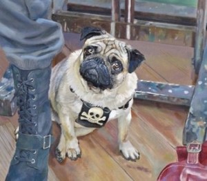
Above: Pug detail from “Henrietta and Ollie” by Tim Hall. For a view of the whole painting, click here
On visiting the BP portrait exhibition in London this year, I very much enjoyed Tim Hall’s portrait of his wife, Henrietta. Standing in front of the painting, which I remember as virtually life-size, the dog at her feet struck me as incredibly well-observed.
These broad-chested dog breeds put a lot of weight through their front legs just as portrayed here and some individuals do tend to sit with their hindquarters swivelled to one side just like this (whether due to stiffness or habit). This posture is so convincing that, as a vet and pet physiotherapist myself, I feel like reaching out into the picture to help relieve his heavily-loaded left front leg.
How does Ollie the dog “help” this composition? A few thoughts:
A vertical line drawn up through the dog’s main weight-support, his left front leg, overlies the main vertical prop of the easel. Follow this line further vertically upwards and your eye is directly led to an image of René Redzepi, here being painted by Henrietta. Although the painting is entitled “Henrietta and Ollie”, it gives prominence to all three figures.
There is a twist/rotation within Ollie’s body, so that the back legs are pointing in a different direction to the front legs. A similar angulation is seen over and again throughout the picture, subconsciously encouraging the viewer to keep looking around the image. An obvious example is the pair of red boots positioned at an angle to one another. Further pairs of objects echo this angulation. Consider the brushes splayed out in Henrietta’s hands, angles between paint tube and palette knife on the table top, or the prominent angle formed by the corner of that table top.
Though the painted artist (Henrietta) and her image of René Redzepi are gazing out in different directions, the weighty little dog forms a compositional link between them. He achieves this by physically leaning against her foot, while also forming a visual base of support for René’s portrait. Intelligently placed, the image of Ollie helps to bring the multiple elements of this picture together.
Reference:
| Tags: composition, Courbet, dogs, Hockney, shapes
Shapes and emotion
May 6, 2014
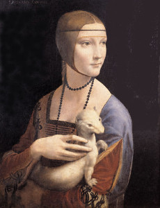
Above: Leonardo da Vinci “Lady with an Ermine”
Shapes are essential to the character of each artistic image. Have you ever glimpsed a painting from a great distance, and understood something of the emotion conveyed by the artist even before discerning the full content of the picture? Along with tone and colour contrast, clear shapes within the image can help to convey this “emotional punch”.
Our innate emotional “understanding” of 2D shapes is perhaps even more profound than symbolic meanings assigned to them in different cultures. I originally read about this idea in “The art of responsive drawing”, an excellent guide to drawing and composition by Nathan Goldstein, and do recommend getting hold of this book if you’d like further ideas on the subject.
When looking at an image (either a full picture, or just a shape on the page) we react to:
- symmetry versus asymmetry
- corners and points of shapes
- curved versus angular shapes
Let’s look further at how artists have used various types of shape for emotional effect.
1) Flowing, lyrical, sensuous shapes
These shapes tend to be:
- Asymmetric
- Curve-edged
- Rather long
- “Organic” rather than geometric shapes
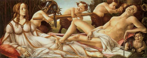
Above: Botticelli “Venus and Mars”, 1487-8, 70.6 x 176.8cm
The bodies and drapery of the two main figures in Botticelli’s “Venus and Mars “provide good examples of long, flowing shapes. Even the male figure of Mars, god of war, is made to look lyrical and sensuous here. Note how rotation through his torso and neck allows the creation of asymmetry and curves.
Meanwhile, clever draping of fabric creates similar shapes associated with the figure of Venus, goddess of love. Look not only at the whole reclining form of Venus, but also at the sections of fabric about her waist and limbs. The atmosphere in the foreground here is of flowing sensuality, though the long, lyrical shapes do not extend to the four cheeky, mischievous little satyrs in this picture.
2) Solid, dependable shapes
These shapes tend to be:
- Symmetrical
- Contain at least one straight edge
- Geometric
- “Blocky”
…but look at the examples in the box, above, and note that rules are sometimes broken! These shapes may also suggest strength and reliability.
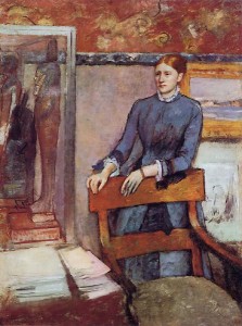
Above: Edgar Degas “Hélène Rouart in her father’s study”, 1886-95, 161x120cm, oil on canvas
Hélène Rouart looks somewhat out of place in her father’s study in the image above. The strength of character of the study’s owner, wealthy collector Henri Rouart, is suggested by the shapes of his belongings. Look at the square-edged mirror, the painting on the wall, piles of papers and perhaps even the Egyptian mummy case. Set at an angle against the blocky structure of her father’s chair, the more lyrical forms of Hélène’s hands and figure contrast with the rest of the room. The young lady projects a sense of unease and seems constrained by the presence of her father even though he was abroad when this was painted.
3)Violent, harsh shapes full of nervous energy
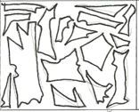
These shapes tend to be:
Angular Irregular Jagged Contain straight edges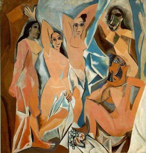
Above: Pablo Picasso “Les Demoiselles D’Avignon”,1907
In Picasso’s rather shocking image, above, the women appear confrontational and perhaps even menacing. Cubist rendering of the forms here creates jagged, irregular shapes that contribute to the potentially-violent atmosphere.
Jagged-edged, irregular shapes are frequently-seen in real life and in photographic snapshots: Think of gaps between tree branches, shadows and building edges seen at an angle. In creating an artwork, decide whether you wish to include, emphasise or suppress such shapes.
4) Gentle, rocking shapes
These shapes tend to be:
- Asymmetric
- Curve-edged, especially with a convex lower edge
- More often rounded than long
Above: Edgar Degas, “Portrait of Giovannina Bellelli”
Gently rounded shapes are easily formed by the play of light and shadow on young faces (see Degas’ portrait of a child, above) and, whatever the subject, they can suggest tenderness and empathy.
Further types of shape
Of course, not all shapes quite fit into these simple categories. Take a look, for example, at Leonardo da Vinci’s “Lady with an Ermine” (reproduced at the top of this page), an image with an atmosphere of lyrical grace and poise and full of strongly-emphasised shapes.
Or consider the carefully-placed structures in Uccello’s beautiful but horrifying image of war, below. This painting is full of curved-edged horses but, where lances cross the picture at an angle, numerous unsettling, angular shapes are created.
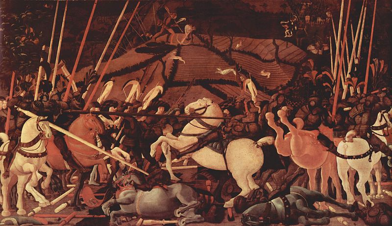
Above: Paulo Uccello “The Battle of San Romano”